Search This Blog

Tuesday, August 19, 2014

QUOTES

Every picture shows a spot with which the artist has fallen in love.

ring the bells that still can ring
forget your perfect offering
there is a crack in everything
that's how the light gets in

~leonard cohen

“If you’re a painter, you’re not alone. There’s no way to be alone.”
Franz Kline - sometimes I wonder...

Friday, August 8, 2014

Wilhelm Sasnal, Lismore Castle Arts Centre, Lismore, Co. Waterford

Set inside a gothic castle, paintings and films in this show were an exploration of how Wilhelm Sasnal has interpreted his memories of  Hans Christian Anderson's books of fairy tales, which he read as a  young boy in Poland. He was  particularly fascinated by the illustrations of Audrzej Strumillo. 
Sasnal is thought to have selected the venue on a visit in 2012 and decided this body of work, emanating from his fascination with the illustrations, would be a great match.
The gallery is long and rectangular with suspended beams across the vaulted ceiling with roof windows. It was very well lit at the time by both natural and artificial lighting and white painted walls. It is contemporary looking and relatively small and intimate in relation to the very large scale of the old castle it resides in.


The sound of ‘Dirt’ 1970 by The Stooges was playing in the background as a soundtrack to a film (playing at one end of the long first room) by Sasnal called Inhuman Finger,  It was about a girl who tries to use a loaf of bread as a stepping stone into another world without getting her shoes dirty. Things go wrong and she ends up falling off in to hell. Perhaps the bread serves as a metaphor for potential path to freedom (in more ways than one)


Among a number of paintings containing floating objects was one containing a large black bike seat bizarrely suspended in mid air on a summery blue and white sky, above a large expanse of green and blue still water. Black silhouetted trees and vegetation travel along the low horizon,  tapering off into the distance. The bike seat totally dominates the scene.
Unitled 2013
http://de.phaidon.com/resource/sasnal-untitled2013.jpg


My favourite, is another painting containing a surreal floating object. A smaller painting, this time (2' x 2') containing a hovering skull, devoid of a jaw, within whose black eye sockets could be a black castle; the castle's black windows acting as its eyes. The skull floats low slung on a  large expanse of jade green sky like background. A thickly painted deep yellow sun, egg yolk like, hovers above to the upper right. Along the bottom is a horizon of jagged acid green mountains.  On first glance is deceptively simple in appearance but on closer inspection I realized there appears to quite an intriguing narrative at work.
http://cristinleach.com/wp-content/uploads/2014/09/photo-52-e1415012045838.jpg


Frequent clever characteristics of his paintings are their sparse brushwork – just enough detail to get the message across by evoking a sense of all the elements belonging where they are on the picture surface as a cohesive whole. Certain distinguishing features of many portraits are what I would describe as half painted, with partly blank or unidentifiable faces. This small portrait of the artist’s brother by Valdemar_Hjartvar_Kobke, is no exception. He was a Danish Golden Age painter  who was a contemporary of Hans Christian Anderson. The only exeptions to the monochromatic palette of black and browns on the head are the red and yellow on the military collar. In Sasnal’s interpretation, a remake of the original he has been very sparing in his description of the facial features; says it all with just a few spontaneous lines and marks. The facial features fade out to a totally blank white area - the lower left side of the face.
Original portrait:


Monochrome landscape 
http://magazynszum.pl/wp-content/uploads/2014/06/SZUM-20140612-00-15-420x280.jpg

View of gallery
http://magazynszum.pl/wp-content/uploads/2014/06/SZUM-20140611-23-27-420x280.jpg

Thursday, July 17, 2014

Part 5 Assignment 5 - first attempt

sketch used for No.1
Prior to starting this assignment, several options were on the cards, My increasing inclination was to move towards abstraction for the assignment series, during my progress through Part 5. The idea to use something relatively humble as a single piece of rock for my motif only began to develop when I was in the process of doing the exercise - Abstraction from natural forms. While trying to pin down a  theme from my list, a chance passing glance at this rock prompted me to study its contours and distinct patterning more closely, setting the process in motion. From the start I intended to use the rock only as a source to explore ways of putting a composition together with various paint techniques and materials. I wanted to incorporate many techniques and materials from earlier exercises in Part 5, plus a few others I had picked up elsewhere along the way through the course.
By attempting sketches from various angles and distances i.e. close-up detail, side views and face on views, including parts of the outer contours, and from playing about with cropping, a long narrow format began to suggest itself. The same motif occurred repeatedly in separate guises, yet I could see plenty of scope for variation, though finding a pleasing composition proved more problematic than first anticipated. It took several sketches before I began to feel comfortable with the subject, which was surprising since I found it so inspiring when I first noticed it in amongst a collection of rocks around the house and made the decision to use it. This could have been due to choosing a detail of something already relatively abstract as opposed to a more identifiable subject. Although, on reflection I don't think there is any difference in reality, it depends on how it's perceived. Subsequently several alternative views materialised, most of them later turning out to be useful, which was not apparent to me at that stage.


The choice to go with a palette of unrealistic colours was made after a spontaneous quick experiment, using up some old paint left over from the previous exercise - from man made form. This amounted to a mixture of tube consistency crimson and vermillion acrylic with additions of cadmium orange,  on the white surface of a sketchbook page, and a tangle of fairly dilute pthallo blue lines applied over from several angles with a long flat bristle brush. I was impressed by the intensity of this combination, played down by the dull blue lines over.  I thought about alternatives but came back to using a combination of the above colours, including some sap green to make dark inky blue/green mixtures with pthallo blue and paynes grey.
After this I also did a number of quick colour and paint application experiments, with
variations of similar colour combinations using paint in different ways. The following, which I mostly incorporated into the series all worked well:
Wash-off technique - placing still damp painted surface under running water spray of a shower head to partially remove the paint in repeated layers.
Oil pastel and glue resist under watery paint.
Resist: leaving selected dry and wet areas on surface before applying dilute paint.
Scratching back into wet paint with paint pusher.
for No.2
Immersing watercolour paper into water then dipping into dilute paint and allowing it to run over the surface.  For this I considered Helen Frankenthaler's and Morris Louis colour stain paintings. I had done several experiments using a similar process, on small A6 sized paper earlier in Part 5 and was very impressed with what materialized.
Mixing matte gel medium with paint and water produced more visible brushstrokes depending on the consistency, especially over a surface of still damp medium.
Masking fluid was a nuisance to work with, it gave variable results and I found it could easily damage the paper on removal.
In addition to wanting to take the above experiments further I was keen to use a mixture of found materials in a least one painting, which transpired into the first (No.1). Thereafter things became a work in progress, one sketch or experiment leading to another, partly influenced by the above experiments.

No.1: acrylic and mixed media on gessoed canvas glued to thin wooden board.
I combined a few pieces of old discarded paintings, brown paper and gesso and glued them down on the surface. The canvas texture was left on view here and there. I combined transparent and opaque layers of paint plus very dilute to dry brushed paint consistencies. I removed some damp paint here and there with a rag at various stages. At this point I had already started to build up the surface layers for No.4, but hadn't begun the other two.


No.2: acrylic and mixed media on gessoed mountboard.
This only emanated from a spur of the moment decision inspired by a tonal sketch. The sketch contained textured areas that brought to mind sand or other rough textured material. This was in sharp contrast to smooth textured areas, giving it a dramatic appearance.
No1
To build areas of relief and texture I glued on bits of otherwise discarded materials: plasterboard tape, offcuts of handmade paper, crepe paper, smooth thick paper, open weave cotton and sawdust, which was mixed with pva. The sawdust is a bit smoother than sand and wonderfully malleable . As I was doing this I was aiming for the right balance. Even so I relish this part of the process, often more so than painting.

No2

 No.3: acrylic and pva on 300gsm watercolour paper
Morris Louis and Helen Frankenthaler's soak-stain paintings and artists using similar techniques had an influence on this one. Also in part from earlier exercises (see above list of experiments) - several of these kind of experiments on small A6 sized paper earlier in Part 5 and was very impressed by what materialized.
First of all I squeezed pva through a nozzle (after a bit of practice) to make basic design outlines.
Then I briefly dipped the paper support in a bath of water. Then I dipped it in dilute paint: dark blues, orange and red, one after another and tilted the paper various directions, encouraging the paint to run over the surface.
No3
Following this I waited to allow the paint to absorb a little. The surface was still well soaked in paint which gave time to manipulate it. I continued adding and removing paint - dripping on paint in fairly dry areas and tilted again to allow it to run over surface and removed in places with a damp rag. Added further dark paint towards the corners with a wide foam brush. Because of the amount of liquid applied the paper buckled. Although it straightened out a little when dry. I think it would have been more successful possibly using pre-stretched paper or even a thicker board like paper, as I have found that even pre-stretched paper often buckles. The glue initially resisted the paint a little more than I wanted, leaving too many white bits scattered around, place so I re-applied paint onto most of it to try and give it a more subtle appearance and it seemed to work reasonably well. Also, the runny paint would have moved around the surface easier if I had mixed flow improver with it - something to bear in mind for the future..

No.4 Acrylic and oil pastel on gessoed 300gsm watercolour paper
Inspired by a technique by Gemma Guasch, from the book: Acrylics - Creative Techniques. It is referred to as the 'wash-off' and basically consists of appliying acrylic paint in various consistencies,  using a range of applicators, then partially removing the paint with water spray, sponges or damp rags.
For this one I kept to roughly the same palette as the other with more white, pale and mid orange and reds, I reduced the amount of blue, restricting it to a rough emulation of the meandering lines running across the rock surface. Just prior to this I added  lines of dark red and white oil pastel, loosely following the painted lines, to add a little more interest and I gently rubbed off any areas painted over from following applications.   I discovered that paint applied with a sponge  roller produced mottled patterns covered in tiny paint spots. When I placed it under the shower the still wet spots were removed leaving the drier areas intact, revealing a particularly interesting textured appearance of the lighter toned layer below. Finally, for subtle shadowed areas, I added some very watery paint using the same inky blues as for the lines. During the layering process I had to be watchful of how dry the paint was. If too dry not enough or no paint would be removable and if too wet most of the paint, if not all would disappear under the running water. Some paint that was pre-mixed with matte gel medium seemed to hold together when mixed with water and resisted water slightly more, which helped a little, but there was no real discernible difference. A lot of it was a case of trial and error, but at least small experiments I had done beforehand put me in good stead, so by then I was quite familiar with the process. A conglomeration of my preliminary work was definitely instrumental in bringing about his particular composition.

No4
Up to a short way into No1 painting I intended to use the same composition for each one in the series. During the painting I decided more interest could be created by varying the views between each one, without too much risk of spoiling the look of continuity, I think this has worked as they all have certain characteristics in common: same basic palette, subject and format. Orange gradually began to creep its way in more and more, until by No4 it was the predominant colour. All the same, I am not altogether comfortable with the colour combinations. No.s 2 and 4 convey a similar diagonal emphasis, very noticeable when placed alongside one another and likewise No.s 1 and 3 a vertical emphasis.
As time went on I suddenly noticed that I had been unconsciously working away from direct observation of the subject. I had already realized, as with the Towards Abstraction project,  this way of working allows for more freedom of interpretation which I feel is a decided advantage in my case, being of a tendency to adopt a rather constrained style normally.
What I intended for the series was essentially four different abstract interpretations of patterns and contours on a piece of flat rock and layers of strata around the sides and in this respect I think it has been successful.
I found the biggest hurdle was achieving cohesiveness in individual paintings, particularly the first three. I think I managed to bring it about by calming down much more, areas towards the corners and repeating areas of colour close in range, such as the oranges and blues in No.3. Concentrating on directing lines towards the focal area also seemed to help - case of constant adding and subtracting. Though the subject is unrecognisable there is a sense of depth in all of them. They also have a tactile quality apart from No.4 which is completely smooth.

Artists whose work  I considered were:


Morris Louis and Helen Frankenthaler soak stain paintings:

http://www.wikiart.org/en/helen-frankenthaler/glow-ii-1968

http://banditblog.com/helen-frankenthaler/

Jackson Pollock
Lee Krasner abstract florals:

http://www.patternpeople.com/pattern-pairs-erdem-x-lee-krasner/

Jose Manuel Broto - Day Celebration 1983

http://www.march.es/arte/palma/coleccion/artistas/jose-manuel-broto.aspx?l=1


Jane Frank, particularly the Aerial Series and Crags and Crevices
Although an abstract expressionist painter, Jane Frank's style of painting is sometimes referred to as 'geomorphic abstraction' (wikipedia - Standing Apart) having a sculptural quality built up with many layers. Described as a laborious process, concerned much with trying to make a three dimensional space on the canvas surface to give the effect of deep voids or passages going back or moving away.
http://en.wikipedia.org/wiki/File:Jane_Frank_Crags_And_Crevices.jpg
http://www.wikiart.org/en/jane-frank

Jaap Wagemaker
http://tunodajyuku2.blogspot.ie/2013/10/jaap-wagemaker-living-desert1957.html
The way Frank and Wagemaker have utilised found materials, I find particularly intriguing.

Angie Zimmerman's fascinating paper sculpture of cast paper pulp (which I would like to make use of in the future), photo collage and wood,  inspired by elements of the natural environment melded together.
http://frankjuarezgallery.files.wordpress.com/2013/01/untitled.jpg


Tuesday, July 15, 2014

Galleries: Crawford Gallery, Cork - Louis Le Brocquy and Barrie Cooke, Crawford Art Gallery, Cork

Louis Le Brocquy - Samuel Beckett 1994, 93x73cm underglass
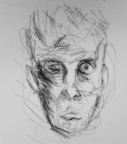
multi directional mark making appears to be done with a fine brush. It is a spare delicate style. There are thin dark underlayers of transparent paint. The eyes look hollow and ghost like. Thick impasto of white paint is applied on the nose, forehead and cheeks. Many layers appear to be built up to develop the whole. 
Ink to a sketch of Samuel Beckett by Louis Le Brocquy
 http://aldin89.files.wordpress.com/2009/11/image_of_samuel_beckett.jpg

This is the actual version on display in the gallery:
 http://www.crawfordartgallery.ie/pages/paintings/LouisleBrocquy2.html


Barrie Cooke, Portrait of John Montague 3'6"x4' Large painting with a lot of impact.  Done in a loose gestural style. Spontaneous looking marks, watery paint, no impasto, Paint a little thicker around the neck,and hand - locations of main colour contrasts. The complementary palette of orange and blue tones appears to be placed exactly where emphasis is needed most. Most of paint looks scrubbed on and allowed to drip on the jumper.  Horizontal black stripes in the sitter's top are echoed nicely by the black and white horizontal band behind. This seems to be balanced out by the slightly diagonal but upright stance towards top right and the vertical dark line to the sitter's left side, also the gaze to the left.  I don't think the paint application can be appreciated  very well in this online image:
http://www.crawfordartgallery.ie/pages/paintings/BarrieCooke3a.html

Wednesday, June 25, 2014

6 Project: Towards Abstraction Exercise 6 Abstracting from man made form

Other artists influential for this exercise were again Jaap Wagemaker and Jane Frank, also Jasper Johns - 'Hateras' and collages of Charles Winebrenner, Maury Haseltine and Katherine Chang Liu http://www.collageartists.org/meetingsarchive/2010_03_Katherine_Chang_Liu.html


Subject: zoomed in area of an oil burner - a mechanical part of an oil heating boiler. This was a broken component taken off the house heating boiler and was lying around in the utility room. I concentrated on various zoomed in areas of my subject, but while doing the first four thumbnail sketches (not shown) I again fell into the trap of trying to represent correct perspective, form, scale etc becoming aware that I was somehow missing the point here. I had to change tack - what I have learned about  abstraction  is that important elements would include simplification, distortion, flattening, exaggeration. In other words changing the subject to a point beyond recognition.

Above - three A4
 pages of final sketches

A transition came about when I made a conscious departure from initial sketches and started to play around with selected features of one area in different arrangements - these are shown to the right. During the final few sketches and the colour studies I was mindful of trying to maintain an essence of the subject's character in this area of the component:  the hollowness of the circles and other geometric shapes and hinting at other small mechanical parts within and behind them. Also to suggest the surrounding area of mostly smooth and distressed grey metal surfaces.  This continued into the final painting.
My colour studies were a big influence on what was to follow for the painting. I used the colours from the second study - vermillion, and mixes of crimson, pthallo blue, magenta, raw umber and titanium white.
Paint and materials application was a similar process to the first study in yellow and blue.I tried to evoke the the underlying hues found  in the object, putting a more vibrant slant on them.
Painting from man made form
Towards the end there were areas I needed to resolve before I could say it was finished. After a bit of close scrutiny I tried the following:
toned down parts of the lightest areas  and tried to further integrate certain other areas using watery glazes of purple with dry a brush. I also
introduced more directional shapes and lines to link up the upper left of the large circular shape with the rest of the composition,
enhanced repeated texture and patterns of the smaller rough circles and dk purple/blue colour blocks.


 Right and below - colour studies


Saturday, June 14, 2014

5 Project: Towards Abstraction Exercise 5 Abstraction from natural forms

In the preliminary stages I went through a long succession of ideas and sketches before finally settling on a piece of textured bark.
simplified tonal sketch
The other items I tried out didn't have the same appeal somehow once I tried sketching them. Days went by, doing sketch after sketch, feeling I had made little or no progress, until I finally tried out a few versions of the flat edge of the tree bark. Out of frustration I left them all alone for a few days then returned for another look and it appeared that many had potential. I was still confused about how to proceed  - questions arose around issues of whether and how to make changes like simplification, flattening , exaggeration, distortion etc.
I cast my mind back to a collagraph project  I did with children at the school where I work not long ago and remembered how I drew a simplified image of guitar  then cut the image  into pieces, turned them around in various directions and stuck them down again using as a basis for collagraph prints. I did another tonal sketch (right), this time more angular and simplified than the others.
painting part complete
It eventually transpired that the final painting contains some of these elements, but not so much flattening - a final frontier I haven't been able to conquer yet. Simplification was also quite a challenge, more so than I expected. Aswell as textures I always feel I have to also describe tones. I guess it largely depends on how abstract the intention is.
Media and materials used for the painting:
acrylic, gesso mixed with all purpose pollyfilla, pva, corrugated card, sand, cement dust mixed with pva and used palette paper.


completed painting


I looked at the work of Jaap Wagemaker in the process of this project
http://nl.wikipedia.org/wiki/Jaap_Wagemaker#mediaviewer/Bestand:Jaap_Wagemaker_(1965).jpg

Accidentally found this image - no offence Jaap but I can't help seeing a uncanny similarity with my own, though I have to admit the palette works on this,whereas on mine the pinks look insipid.
http://www.simonis-buunk.com/sold/zoom/Adriaan_Barend_Jaap_Wagemaker_7879.aspx


Sunday, May 25, 2014

Part 5 Project: Adding other materials, Exercise 4: Mixing materials into paint

I mixed rice, sand, eggshells, rice and gravel individually into a number of mid toned paint colours.

To test them out further I decided to find out how they would translate a painting.
A3 sized gessoed mountboard. Rice was the only material I didn't use. As with the previous exercise this one is imaginary.
Before beginning I contemplated Anselm Kiefer's landscapes of high relief textures.
http://seaofgray.com/2011/10/13/the-commonalities-of-salt-flats-and-anselm-kiefer/
I was attracted to the muted palettes and decided I wanted to use a similar palette to that of Kiefer's. By some coincidence the colours were similar in the materials I had already pre-mixed with paint used for the inital test pieces. The mix of black and burnt sienna acrylic around the perimeter came about as I was thinking of a frame of some kind, reminiscent of so many Howard Hodgkin paintings, some impression of looking out or into something. This combined with other elements seems to set up a kind of ambiguity, which is one aspect I find interesting.  I had secured the materials before applying the dark paint around the edges and the remainder. The sand/rusty orange mix, I spread on with a painting knife/plastic card and scratched through much of it with a blunt knife blade. I extended colours of the high relief mixes into other areas, leaving scattered white patches from the base layer. To this I added watery pale blue dripped from a brush and allowed it to run down the board.
As  I approached completion reminded me of a volcanic landscape. An application of pva in selected areas brought out a little more interest.