Search This Blog

Showing posts with label Galleries. Show all posts

Friday, August 8, 2014

Wilhelm Sasnal, Lismore Castle Arts Centre, Lismore, Co. Waterford

Set inside a gothic castle, paintings and films in this show were an exploration of how Wilhelm Sasnal has interpreted his memories of  Hans Christian Anderson's books of fairy tales, which he read as a  young boy in Poland. He was  particularly fascinated by the illustrations of Audrzej Strumillo. 
Sasnal is thought to have selected the venue on a visit in 2012 and decided this body of work, emanating from his fascination with the illustrations, would be a great match.
The gallery is long and rectangular with suspended beams across the vaulted ceiling with roof windows. It was very well lit at the time by both natural and artificial lighting and white painted walls. It is contemporary looking and relatively small and intimate in relation to the very large scale of the old castle it resides in.


The sound of ‘Dirt’ 1970 by The Stooges was playing in the background as a soundtrack to a film (playing at one end of the long first room) by Sasnal called Inhuman Finger,  It was about a girl who tries to use a loaf of bread as a stepping stone into another world without getting her shoes dirty. Things go wrong and she ends up falling off in to hell. Perhaps the bread serves as a metaphor for potential path to freedom (in more ways than one)


Among a number of paintings containing floating objects was one containing a large black bike seat bizarrely suspended in mid air on a summery blue and white sky, above a large expanse of green and blue still water. Black silhouetted trees and vegetation travel along the low horizon,  tapering off into the distance. The bike seat totally dominates the scene.
Unitled 2013
http://de.phaidon.com/resource/sasnal-untitled2013.jpg


My favourite, is another painting containing a surreal floating object. A smaller painting, this time (2' x 2') containing a hovering skull, devoid of a jaw, within whose black eye sockets could be a black castle; the castle's black windows acting as its eyes. The skull floats low slung on a  large expanse of jade green sky like background. A thickly painted deep yellow sun, egg yolk like, hovers above to the upper right. Along the bottom is a horizon of jagged acid green mountains.  On first glance is deceptively simple in appearance but on closer inspection I realized there appears to quite an intriguing narrative at work.
http://cristinleach.com/wp-content/uploads/2014/09/photo-52-e1415012045838.jpg


Frequent clever characteristics of his paintings are their sparse brushwork – just enough detail to get the message across by evoking a sense of all the elements belonging where they are on the picture surface as a cohesive whole. Certain distinguishing features of many portraits are what I would describe as half painted, with partly blank or unidentifiable faces. This small portrait of the artist’s brother by Valdemar_Hjartvar_Kobke, is no exception. He was a Danish Golden Age painter  who was a contemporary of Hans Christian Anderson. The only exeptions to the monochromatic palette of black and browns on the head are the red and yellow on the military collar. In Sasnal’s interpretation, a remake of the original he has been very sparing in his description of the facial features; says it all with just a few spontaneous lines and marks. The facial features fade out to a totally blank white area - the lower left side of the face.
Original portrait:


Monochrome landscape 
http://magazynszum.pl/wp-content/uploads/2014/06/SZUM-20140612-00-15-420x280.jpg

View of gallery
http://magazynszum.pl/wp-content/uploads/2014/06/SZUM-20140611-23-27-420x280.jpg

Tuesday, July 15, 2014

Galleries: Crawford Gallery, Cork - Louis Le Brocquy and Barrie Cooke, Crawford Art Gallery, Cork

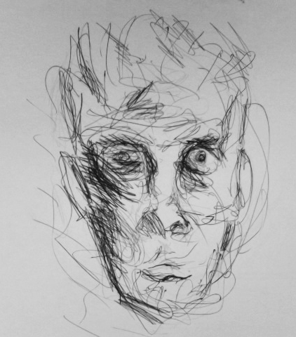
Louis Le BrocquySamuel Beckett 1994, 93x73cm underglass
multi directional mark making appears to be done with a fine brush. It is a spare delicate style. There are thin dark underlayers of transparent paint. The eyes look hollow and ghost like. Thick impasto of white paint is applied on the nose, forehead and cheeks. Many layers appear to be built up to develop the whole. 
Ink to a sketch of Samuel Beckett by Louis Le Brocquy
 http://aldin89.files.wordpress.com/2009/11/image_of_samuel_beckett.jpg

This is the actual version on display in the gallery:
 http://www.crawfordartgallery.ie/pages/paintings/LouisleBrocquy2.html


Barrie Cooke, Portrait of John Montague 3'6"x4' Large painting with a lot of impact.  Done in a loose gestural style. Spontaneous looking marks, watery paint, no impasto, Paint a little thicker around the neck,and hand - locations of main colour contrasts. The complementary palette of orange and blue tones appears to be placed exactly where emphasis is needed most. Most of paint looks scrubbed on and allowed to drip on the jumper.  Horizontal black stripes in the sitter's top are echoed nicely by the black and white horizontal band behind. This seems to be balanced out by the slightly diagonal but upright stance towards top right and the vertical dark line to the sitter's left side, also the gaze to the left.  I don't think the paint application can be appreciated  very well in this online image:
http://www.crawfordartgallery.ie/pages/paintings/BarrieCooke3a.html

Saturday, March 29, 2014

Exhibition: Analyzing Cubism, Crawford Art Gallery, Cork

'After Cubism painting will never be the same' Daniel-Henry Kahnweiler, who first exhibited the cubist work of Braque and Picasso. How true this was in the case of the development of modern painting in Ireland, becoming the dominant influence. Most early writing on Cubism was done by the Salon Cubists. Braque and Picasso did not associate themselves with this movement. The advance of Cubism opened a whole world of freedom, liberating many artists from former constraints.
However, it was late (the 1920s) before it took off in Ireland. Its development there, while related to its centre in Paris, was from a limited contact and was often characterized by a provincial style with local narrative and was, in many cases more representational. Cubism became widely regarded as the style that defined Modernism. Academie d'Andre Lhote was run by artists who followed on from Braque and Picasso and was the influence of most Irish artists involved in Cubism. Yet it was regarded as the most progressive of Parisian academies. It was based on structural methods rather than subject matter. But most Irish artists used traditional subject matter and used Cubist formulas only in a limited way. There was a distinct influence also of other movements such as Impressionism, Futurism and Fauvism. Of all the Irish painters who studied there only Evie Hone and Mainie Jellett were most noted for their originality, absorbing Cubist principles more fully.
Mainie Jellett http://www.crawfordartgallery.ie/pages/paintings/MainieJellet2.html
Evie Hone:
http://www.askart.com/AskART/photos/WHY20071126_5026/68.jpg

Cubism could be understood as deconstructing and rebuilding elements in another way. This exhibition focused on Cubism as it applied to artists in Ireland such as Evie Hone, Mainie Jellett, Mary Swanzy, Paul Egestorff and Elizabeth Rivers, Jack Hanlon, Norah McGuinness and May Guinness. I found it intriguing that works of their European tutors Albert Gleizes and Andre Lhote were also included, and shown alongside that of their pupils, demonstrating how they were influenced. The paintings on display ranged from quite representational to completely abstract in varying degrees. And this was further illustrated with examples of preliminary sketches or workbooks.
There was a list of important dates on display helping to put the featured artists and paintings within the broader context of the local and wider world. One criticism I had  was a virtual absence of work by Braque or Picasso, to help make comparisons, and what little was shown were minor works.
Also, it would have been nice to have more comprehensive information available without having to buy the catalogue.

To me the painting by Jack Hanlon, Still Life c. 1942-45, Oil on canvas, 52.5 x 71.5 cm  is one of the more representational examples of the exhibition. The elements are very recognisable, made up of geometric shapes. There is a hint of light and shadow for instance behind the large narrow necked vessel on the left, and on the onion to the lower right. Visible brushstrokes  appear applied quite loosely. The surface on which the objects stand look ambiguous and closer to Cubism. Saturated and muted hues through to greys are juxtaposed creating a lively atmosphere.
Please note: The only image of this painting I have located is in the exhibition catalogue, so unfortunately possible copyright restrictions prevent me from displaying it and neither can I provide a link as it is nowhere to be found online.
In its place I have supplemented it with another similar painting. It is located on the left hand side, second from top.
http://www.mutualart.com/Artist/Jack-P--Hanlon/67175238302D303D/Artworks?Params=3936382C43757272656E74506167652C312C31


Saturday, February 1, 2014

Exhibition Absence of Realism, Lavitt Gallery, Cork

This was a group exhibition of artists working in the abstract and semi abstract genre.
Displayed on the first floor of a small intimate gallery. While there was an absence of realistic description (as the exhibition title would infer) in any of the works, not all  were described as completely abstract - this was certainly true aswell. For example one artist (Wesley Triggs) described his work as having a sense of looking at something which is  familiar. Even so, it all kept one guessing, which I found compelling.
Carol Hodder's three paintings were predominantly dark with an impression of light emerging from, and described as having a connection with memory and place. In one such painting 'Stroke' it was possible to discern a figure veiled in light mist amongst the darkness, emitting a mysterious ephemeral atmosphere.
http://irishartscape.com/artists/details/51  Carol Hodder

Sabine Weissbech paintings were loose painterly semi-abstracted landscapes in acrylic. On close scrutiny there appeared a combination of layers of opaque and transparent, muted diluted opaque over thicker saturated opaques. Then there are more muted pale thicker opaques, some allowed to drip.  Particularly apparent in the overlayers are scraped and rubbed on paint, possible and process of adding and removing, I would guess with the help of painting knives or spatulas or some kind and large brushes.  Ethereal sketchy loose yet sensitive lines, drawn linear elements and perhaps scratching or 'scraffito' add a linear quality. It all culminates in an atmospheric feeling of natural elements.  
http://www.sabineweissbach.com/landscapes.html

Sam Curtin's work contained no hint of landscape and was very muted, monochromatic and minimal. The fleeting shapes of shadows etc are transformed into something more solid and permanent in the form of geometric shapes alongside and crossing over one another in diagonal directions. 
http://www.lavitgallery.com/page87.htm

I'm not sure if these oil paintings of Tom Climent's were on display at the time, although he is a gallery artist. They appeal to me due to the way geometric shapes are explored through the nature of paint application and colours, the combination of three dimensionality and flatness giving a sense of optical illusions.
http://tomcliment.com/2014/02/18/2013-2/

A general impression emanating  from the exhibition is that most of the paintings on view evoke the essence of landscape, or  aspects of it in one form or another, extracted sometimes from memories and imaginary places in time, with only one or two exceptions. I have found from reading artist's statements over time, this seems to be a popular theme in many genres.


Saturday, March 30, 2013

Exhibition Sean Keating: Contemporary Contexts, Crawford Gallery, Cork

This exhibition was shown in a current climate of economic hardship and emigration, drawing close similarities with social circumstances at the time. Sean Keating made his own later work, post  War of Independence, which was often critical of the governing classes.
The purpose of the exhibition was to re-examine Sean Keating's  longstanding reputation as a political reactionary with strong nationalist beliefs, and attempts to challenge this. It tries to convey that he was infact an astute history painter, during a turbulent time in national politics.   Almost always present was his concern for narrative, which was often subversive and controversial. Much of his work was intended to document the Irish War of Independence and the Irish Civil War which followed. His work, portraying heroic illustrations of hard working people of the Arran Islands or of defiant men and women during troubled times, full of symbolism,   yet also depicting disillusionment. 
Some would say his paintings gave an idealized view of Ireland. Typical examples of these are 'Men of the South' 1921-22. 
http://en.wikipedia.org/wiki/File:Keating,_Men_of_the_South.jpg
This shows a subversive theme depicting men of bravado and defiance, in contrast with another painted in 1924 'On the Run, War of Independence'  show three isolated looking fighters, The atmosphere is one of boredom, apart from the centre figure who looks brooding and pensive  -  unsurprisingly, he could have had a lot on his mind, not to mention  that he is probably on the lookout, while the other two take a break. Unfortunately I have been unable to locate an image of this painting online, so cannot include a link to it.

'An Allegory'  It is intended to be a metaphor related to the madness of the Irish Civil War. The adult figures seem to be in isolation from one another. In the background is an abandoned looking 18th century house, this could be a metaphor for the state of the country.  The men digging the grave are disconnected, one, with his cap pushed back on the head, is wearing a uniform of the Free State National Army. The other in more casual dress of the opposing side, the Irregular Army. A mother and child are symbolic of the damage and suffering of innocents. Though some of the figures are static, the scene seems to be full of energy. Obviously the moving figures make a big contribution but even if I put my hand over that part of the scene, it doesn't lose it completely. I think it's because the other figures and the texture on the tree trunk have an energy of their own, as they are so sensitively depicted, they appear to be almost moving themselves. 
http://www.crawfordartgallery.ie/Sean_Keating_Resource_Pack.html
For several decades, Keating continued to make work reflecting his disillusionment and frustration at the socio-political and economic conditions of the times. 


'Strikers' 1958 and a contemporary Michael Kane's 'Political Speech, Chief Excecutive' 1959, critiques such as 'Ulysses in Connemara' 1947 and 'Economic Pressure and a Bold Peasant being Destroyed' 1948 are particularly  sad indictments of the socio-economic conditions which had only worsened since the foundation of the State. In contrast to the more hopeful themes of his earlier depictions of life in the Arran Islands, his annoyance is evident here at the situation which brought about so much emigration from the West of Ireland.
This theme has great significance today against a background once again of economic hardship and emigration throughout Ireland.
All of Keatings works were displayed in  a contemporary setting and many of the largest paintings situated in a huge lofty rectangular room with old brick walls. The traditionalist nature of the paintings and the ornate frames around them didn't seem to me to sit comfortably with the surroundings. Yet, the large shape and size of the space set them of to good advantage. I couldn't fault the lighting. 
What I noticed about the way Keating paints was how he has portrayed the  figures with great accuracy, while at the same time the brush marks are often quite noticeable, and are very free and fluid. In this way he manages to convey a great depth of feeling, brought about by the characters and their environment. They are full of life and movement.

This collection  was shown in the context of the work of some of his contemporaries, many of whose work  is abstract and highlights the very different approach to respond to the same issues at one time or another.
The Second World War provoked different ways of expression. Two of several works on display are described here: Ralph Cusack's response to the socio economic conditions of the time are depicted in 'The Way of the World' 1945 - a ruined structure, dead trees and an empty boat floating on the water under a dark glowing red/blue angry sky.giving off an all pervading sense of post apocalyptic surreal world, ghostly and empty looking. 
http://imma.gallery-access.com/intl/en/tour.php?a_id=274

Norah McGuiness 'Rivers to the Sea'. 
Very colourful  semi-abstract composition consisting of  contrasting blues and oranges. There is a lone worker in the field and a small cottage behind. Mountains fields and water are split into geometric shapes, with the zig zag of a blue river running through the centre. It would have been a familiar Irish rural scene, with a new twist and is reminiscent of stained glass. Unfortunately I haven't been able to obtain an image of this painting.

Sunday, February 17, 2013

Research Point 3 Optical Effects and Op Artists

Introduction
Impressionism recorded nature in terms of light and colour. Post impressionists rejected these limitations and instead sought to be more expressive. They were not concerned with depicting the effects of light and other visual effects like those seen in the impressionist movement, they were less idyllic. They wanted to express their meaning beyond the surface appearance; they painted with emotion, intellect, and the eye. The post-impressionism painters stressed their personal view of the visual world and had a freely expressive use of colour and form to describe emotions and movement.
http://www.vangoghgallery.com/influences/post-impressionism.html


Impressionists
 
They portrayed overall visual effects instead of details, and used short "broken" brush strokes of mixed and pure unmixed colour—not blended smoothly or shaded, as was customary—to achieve an effect of intense colour vibration.
source - http://en.wikipedia.org/wiki/Impressionism

Post Impressionists 

Post-Impressionists extended Impressionism while rejecting its limitations: they continued using vivid colours, thick application of paint, distinctive brush strokes, and real-life subject matter, but they were more inclined to emphasize geometric forms, to distort form for expressive effect, and to use unnatural or arbitrary colour.
source - http://en.wikipedia.org/wiki/Post-Impressionism


Neo-Impressionists

Georges Seurat was interested in the technical division of light into the colours of the spectrum. He is commonly regarded as the foremost Pointillist. Both Seurat and Paul Signac were founder members of the Neo-Impressionists. Seurat did not agree with some aspects of Impressionism. He did not believe in the practice of Impressionists mixing of pigments based on intuition, but contrary to it, by keeping them pure and using pairs of complementary colours, placing them directly alongside one another requiring the viewer to combine the colours, perceiving them as interfering with one with another..This practice was known as Divisionism. This term was coined in a book written by Signac - 'D'Eugene Delacroix au Neo-Impressionnisme' (1899). Seurat's approach was very logical and scientific and largely influenced by Chevreul's colour theories. He used opaque colours to obtain greater light reflection - this bounces back rather than penetrating first as with a transparent colour.

A contemporary and friend of his Paul Signac, was very similar in approach. which was one of applying unmixed paint in dabs side by side based on the above theory and a scientific analysis of light. The resulting pictures had such a brilliantly luminous quality, their full effects became evident only when viewed from a distance. After Seurat's death in 1891 Signac moved towards more colourful and vibrant effects. Signac and Seurat's experiments with colour division made a great contribution to the development of Fauvism and Abstraction.

Seurat's painting 'Bathers in Asniere' is an early illustration of his developing Pointillist techniques. It depicts male workers bathing on the left bank of the Seine with an industrial scene in the background. On very close inspection of a high resolution web image it is possible to make out some of the effects of optical mixing in certain areas such as on the lower half of the man seated on the orange cushion. Aswell as using complementaries he used small dabs, some going in various directions - cross hatching in the foreground and thin horizontal strokes on the water.

http://en.wikipedia.org/wiki/Bathers_at_Asni%C3%A8res#mediaviewer/File:Baigneurs_a_Asnieres.jpg


Paul Signac
http://www.wikiart.org/en/paul-signac/the-papal-palace-avignon-1900

The dominant colours used here are purples and pinks. Because large areas of dots of analogous colours such as orange and yellow on the main building are juxtaposed with its complementary shades of blue it gives rise to a shimmering vibrant effect.
From about 1900 small mosaic like squares of primary colours took over from dots in his paintings.


The Op Artists

Op Art sprang up in the early 1960s. Among its main sorces were Josef Albers - a former pupil was Richard Avuszkiewcz.


Op art, also known as optical art, is a style of visual art that makes use of optical illusions.

It is a method of painting concerning the interaction between illusion and picture plane, between understanding and seeing. Op art work art abstract, with many of the better known pieces made in red and yellow. When the viewer looks at them, the impression is given of movement, hidden images, flashing and vibration, patterns, or alternatively, of swelling or warping.

Source - http://en.wikipedia.org/wiki/Op_art
Bridget Riley is the most well known of Op Artists. She studied Seurat's pointillist technique which help to spark her interest in optical effects. Her early was in black and white, from 1966 in colour.Typical effects of her paintings would be intensely dazzling optical illusions appearing to vibrate and pulsate, causing the canvas to appear distorted. A typical example is (Cataract 3), a large scale painting in greens alongside reds and areas of grey. The effect of looking at this is quite disorienting. This is her first work in colour. Prior to this Riley paintings were in monochrome.
http://en.wikipedia.org/wiki/File:Riley,_Cataract_3.jpg


Another famous exponant was the late Victor Vasarely. He was very popular and had a major influence on fashion and design. He used warm colours and was most concerned with creating the illusion of movement. 

I later had the good fortune to be able to view one of his op art paintings and one of Bridget Rileys on display in the Museum of Modern Art (IMMA), Dublin. I'm not sure if there was a tremendous advantage in seeing them 'in the flesh' - one would not get a great sense of impasto brushstrokes for instance, as as the brushstrokes are quite smooth. Riley's is a relatively small painting, but Victor Vasarely's is 160x160cm, so the scale difference was worth seeing.
xttp://www.immacollection.com/eMuseumPlus?service=direct/1/ResultDetailView/result.inline.list.t1.collection_list.$TspTitleImageLink.linksp=13&sp=Sartist&sp=SfilterDefinition&sp=0&sp=1&sp=3&sp=SdetailView&sp=16&sp=Sdetail&sp=0&sp=T&sp=0&sp=SdetailList&sp=0&sp=F&sp=Scollection&sp=l86#.VQ69vY6sWHk
Victor Vasarley:
http://www.immacollection.com/eMuseumPlus?service=direct/1/ResultDetailView/result.inline.list.t1.collection_list.$TspTitleImageLink.link&sp=13&sp=Sartist&sp=SfilterDefinition&sp=0&sp=2&sp=3&sp=SdetailView&sp=3&sp=Sdetail&sp=0&sp=T&sp=0&sp=SdetailList&sp=0&sp=F&sp=Scollection&sp=l2047#.VQ6-A46sWHk

http://www.op-art.co.uk/op-art-gallery/victor-vasarely/Vega-Nor


Friday, August 31, 2012

Transparent and Opaque, Colour Field Painting and Mark Rothko


On checking out the effects of opaque and transparent paints it is fascinating to see the  range of effects possible and how they can be used to advantage in painting. For transparent surfaces much depends on the underlying colour.  For example, if layers of thin transparent paint are painted over white the finish has great depth and  the colours appear very vibrant. Transparent paint on a dark surface is dull and indistinct. Mixing white with a colour makes that colour not just lighter but more opaque.  The surface appears dull, flat and advancing.
Here is a link to what I found to be a very helpful video about how the principle works:
http://www.youtube.com/watch?v=eCiMwwxSMZg


Optical mixing - on reading through this illuminating article I can get a real idea of some of the techniques that Mark Rothko was most fond of employing :


In 1958 Mark Rothko accepted a commission to paint a series of murals for the new restaurant in Manhattan's Seagram Building.  By this time colour field painting was an important part of his work. His motif changed to rectangular forms on large colour field within a frame or 2 columns. He would apply numerous thin layers of colour  allowing parts of them to show through the top coat, hence the appearance of light emanating from the surface. Studying the series online,  I get a strong sense of being pulled in and pushed out within the frame or the columns. They seem to be almost pulsating or breathing. He was obviously very interested in optical mixes. The effect must be very powerful and almost overwhelming for many  when viewing such huge canvases at close range.  According to experts Rothko said that he would prefer viewers to be positioned directly infront, about 18 inches away so the viewer could experience an intimacy with the painting. For this reason he also wanted the paintings to be hung in a room with subdued lighting to help the viewer to feel 'enveloped' within the painting. A similar feeling is what he must have got from the vestibule of Michelangelo's library on a trip to Florence where he was further inspired by the feeling he got of  being in a room with the doors and  windows  walled-in shut. Eventually he refused to allow them to be displayed there.
http://www.tate.org.uk/art/artworks/rothko-red-on-maroon-t01165

The Seagram Murals  give some sense of their scale and intensity in spite of the mostly sombre colours:
Black on Maroon
Black and Maroon 1959 http://www.tate.org.uk/art/artworks/rothko-black-on-maroon-t01163


This is a definition of of optical mixtures from
http://www.guardian.co.uk/artanddesign/2009/sep/20/guide-to-painting-optical-colour-mixing - When two hues are placed side by side or on top of each other, your vision produces the illusion of a third colour - this is called optical mixing.Optical mixtures emit an inner glow that you cannot get with physical mixtures - the colours retain their intensity and brightness.


Helen Frankenthaler, amongst others, was strongly influenced by Rothko's techniques and developed her own style of colour field painting called the 'soak stain' technique, where she would pour washes diluted with turpentine onto the canvas. A flat yet luminous effect would result from the layers of merged paint and turps soaking into the surface. There is a detailed description of the inspiration behind her landmark work 'mountains and sea', together with a couple of wonderful images, also how colour field painting later developed is contained in her obituary:  
http://www.guardian.co.uk/artanddesign/2011/dec/28/helen-frankenthaler

Here is a link to seagram murals  - revealing an individual's interpretation of them on a tour through the murals, displayed in sequence.

Thursday, August 30, 2012

Exhibition: Still Lifes? Catherine Hammond Gallery, Glengarriff, Co. Cork


 - August 2012. Upon arrival at the gallery, straightaway I honed in on several mixed media works by Regine Bartsch. It did help that one or two were displayed along a wall facing out to the street through a large plate glass window, about 15 feet inside. It was of particular interest to me at the time because shortly before that I’d been experimenting with paint and pastels in combination during the first project of part 1.
What's also pretty evident are the striking colours used. Apart from their immediate attraction at a distance, viewing them close up was also fascinating because of the variation in texture resulting from the range of finishes from the smooth paint to the grainy matt finish of the pastel. I could also detect traces of graphite pencil. There are passages of both transparent and opaque paint here and taking a guess at the possible media used, I would say watercolour or ink, acrylic in an opaque and possibly transparent way, which I think was applied under the dry media: possibly chalk, oil pastel or similar.  These paintings combine both organic and geometric forms and there is a lot of foreshortening caused by the high viewpoint, giving them an added dimension, along with the intentional distortions and exaggerations of forms.
Click on this link to view more images in the exhibition:
http://hammondgallery.com/wordpress/still-lifes
On researching the artist a little more I found a couple of paintings of interiors in acrylic. These weren't in this exhibition but I decided to give them a mention here as they are quite unlike the still life paintings in that the colours used are mostly muted and the whole composition appears smooth and flowing with an underlying mistiness which gives a look of depth, as well as the use of linear perspective and ,as far as I can tell, an absence of atmospheric perspective.
They’re mostly devoid of organic forms, rather geometric forms seem to dominate – as would usually be the case in the interior of a building. They have a semi-abstract, even abstract appearance.
For a bigger selection of the artist's work visit:
http://bartsch.ie/regine/artist.php

Suzy O’Mullane’s oil paintings appear simplified and even childlike. The way that the perspective is distorted seems to give the compositions a flat appearance but I do like the bold use of paint and colour.
Just as this exhibition contains mixed media, I also have mixed feelings about some of the artwork on display. There was a time when my view of this kind of style  would have been to dismiss it as having little merit, but now I realize just how elusive a skill it is, as an adult to be able to approach a subject almost from  a child’s point of view  to depict something in this way successfully. To have the confidence and conviction to push ahead with it is a real accomplishment. At the same time I think it is probably the case that an artist needs to already be established in order to pull it off…that might sound like I’m contradicting what I've just written - enough said for now.

http://www.katherineboucherbeug.com/biog.html

http://www.hamiltongallery.ie/artist/Jane+O'Malley

Wednesday, August 1, 2012

Exhibition - Bauhaus: Art As Life, Barbican, London


This was the first time I'd visited the venue, and it wasn't long before I became conscious of how the modernist ethos of the Bauhaus movement, even though from a slightly earlier time seemed well matched to the 1960s brutalist architecture of the Barbican building.  The Art as Life exhibition was displayed on two floors, the entrance corridor to the gallery being on the lower floor, which was flanked by dark walls giving a closed in feeling. This led up the staircase to the first part on the upper floor. The upper floor was set out on a mezzanine type circulation area - a balcony overlooking the ground floor exhibition area, backed by objects on display arranged in several alcoves behind. The low ceilings gave off a cosy atmosphere, while the lighting (I think) was directional, as everything appeared well lit, while the surrounding area was dark, echoing the walls, bringing the exhibits more into focus. Downstairs the high lofty ceilings were divided up again by several alcoved areas.
A huge black and white photo of a group of tutors and students took over a wall situated between the upper and lower levels and which was visible  to both. One needed to look down to view it from the upper level and to look up when on the lower floor. I think this photo really encapsulated the community ethos of the movement - something which was illustrated in many of the photographic works downstairs showing social gatherings, parties and theatrical performances. 
There was so much to see in this exhibition, such a comprehensive overview (over 400 works) including painting, sculpture, ceramics, textiles, printmaking, furniture, theatre, architecture, film, photography, graphics and product design ie. metalware. I felt quite overwhelmed at first as almost everything on display had its own fascination and I felt I just could not miss the opportunity to check everything out. Fortunately a small grain of sense prevailed and I made notes about only those I considered to be most noteworthy, however, combined with viewing the works, this was sufficient to take up at least two hours..

The exhibition began from its foundation in 1919 in Weimar, Germany by architect Walter Gropius.  After World War 1 Germany was in turmoil. His vision was to teach freedom and craftsmanship to students there and return to the socialist ideals of the  art and crafts movement. Downstairs the exhibition then went on to map out its progress after moving from there to Dessau in 1925, then onto Berlin where in 1933,  due to pressure from the Nazis who considered it subversive, eventual closure.

Though it was very much a modernist movement, Johannes Itten, who ran its preliminary courses encouraged individual personal expression.  He was replaced in 1923 by a new teacher Laszlo Moholy-Nagy with opposing views, who, combined with pressures from its main funders, the Thuringian state government,  brought about a change in direction  to one more geared towards mass production.

The frontispiece of the Bauhaus manifesto is a  Lyonel Feininger woodcut.  The idea of the cathedral represented an aesthetic ideal and social harmony of William Morris's arts and craft movement. 

One of the first exhibits was an oil painting by Lyonel Feininger also  - The Studio Window 1919. As can be seen he was greatly influenced by Cubism and Expressionism  It was described as 'an architectonic manifestation of the artist's workplace with illuminated window embodying Gropius's vision for the school', much of which was about putting into action the radical ideas of his generation (see also  above). The notes I took at the exhibition about this particular painting is the only snippet of information I've been able to find about this painting so far.

http://www.artesmagazine.com/2012/05/harvard-universitys-a-m-sackler-museum-features-rarely-seen-collection-of-lyonel-feininger-photographs-drawings/dscn6709-2/ - The Studio Window 1919

Moving on to 1923 and a major exhibition in Dessau, showcasing new directions of the school toward industrial design:
Three posters shown here, one designed by Paul Klee and the other two by Oskar Schlemmer and Laszlo Moholy-Nagy  represent two opposing ideals within the school. Paul Klee's leaned towards expressionism and is hand drawn and no attempt is made to be precisely geometric. The rather tottery looking tower leading up to a door or entrance is believed to represent the high ideals of the institution.

http://www.ideastap.com/IdeasMag/all-articles/Bauhaus%20Barbican%20Catherine%20Ince -Die Bauhausmeister auf dem Dach des Bauhauses in Dessau /Masters on the roof of the Bauhaus building, c.1926/1998, courtesy Bauhaus-Archiv Berlin/Centre Pompidou, Paris. Paul Klee, Postcard for the 1923 exhibition, c.1923, courtesy Stiftung Bauhaus Dessau.

 In contrast Oskar Schlemmer and Laszlo Moholy-Nagy's posters reflect their constructivist ideals using intricately measured geometric shapes and on Oskar Schlemmer's, suggestions of men as machines. There is something de-humanizing I think about these which hint at men as automatons. 

 http://www.moma.org/collection/browse_results.php?criteria=O%3AAD%3AE%3A5219&page_number=15&template_id=1&sort_order=1 -Postcard for the 1923 Bauhaus exhibition.

http://www.ipernity.com/doc/57114/8359485/in/album/19388 - Laszlo Moholy-Nagy postcard for the 1923 exhibition


The puppets were definitely also one of the highlights. These are yet another good example of members widely opposing views. For instance Oskar Schlemmar had ideas of super-human perfection resonating through his puppets and costumes designed for performances like the Triadic Ballet, while Paul Klee saw his as organic creations and seeing imperfections as a positive features accentuating their characters and identities. It's no surprise to find that he was very interested in children's art. Lyonel Feininger also made puppets and toys along similar lines. 

 A large amount of photography was displayed downstairs. I didn't expect it to appeal to me, but on closer inspection I found many of them to be some of the most fascinating aspects. Many were taken from unusual angles - which put a different slant on things for me, and others were put together as photo montages or photo collages. Particularly compelling, I thought, was being able to see clearly the joins where the cut and pasted parts of different photographs were stuck on over one another, giving them in actuality, a rich physical texture not visible on a computer screen
An article on  about a book on Paul Klee's puppets showing some fascinating images of them:
http://eachlittleworld.typepad.com/each_little_world/2008/10/lloween-is-an--occasion-devoted-to-creatures-both-silly-and-scary-you-can-see-some-of-each-in--a-new-book-that-showcases.html

There are such a multitude of fascinating elements about Bauhaus, all deserving of attention, but alas, I could only hope to scratch the surface here.

Some further reading, especially about the Triadic Ballet:
http://theatreoffashion.co.uk/2012/05/14/exhibitionism-bauhaus-art-as-life-at-the-barbican/