Search This Blog

Showing posts with label colour mixing. Show all posts

Friday, February 8, 2013

Exercise 8 Exploring Contrasts and Exercise 9 Successive Contrast


1. Harmonious colours: Painted a series of 5 small primary yellow squares along the top of the grey paper from left to right.
then surrounded them with yellow/green, green/yellow, yellow/orange, orange/yellow and red/orange.
2.Complementary colours: Two colours which are tertiary colours - inside yellow/green (brightest) inside square and outside - red/violet, and visa versa, cause one another to appear more vibrant. My eyes seem to jump from one to another. The yellow/green being more saturated than its complementary with white added is more intense.
3. Inside square beige (neutral), outside - 1.orange, 2. blue. The same effect here as no.2. I don't know why - the white frame around the neutral beige appears to anchor the two complementaries above it. The neutral, even seems to be in turn enhanced by the saturated colours. This beige and the surrounding grey ground cause the white frame to appear vibrant.
Harmonious colours (those close on the colour wheel or spectrum) modify one another when juxtaposed. This is the opposite of the effect on complementary colours when juxtaposed, each is enhanced. Neutrals enhance colours on the outside of the colour wheel - saturated colours.
Most colours (apart from yell and orange) look quite strong before dry and acrylics dry a shade darker. The yellow/green is a very bright  but need a second coat to bring this out, as the yellow portion doesn't cover as well as a colour containing the addition of white, because  it  is opaque.


Above - more experiments on white background. In general I think all colours look brighter on a white ground than a neutral or dark one.
The muted orange and orange squares, being harmonious still subdue one another and the complements of the same saturated orange with blue still enhance one another.
Below these the pale violet and green hues makes the blue appear darker. The blue is enhanced by the surrounding black, but I'm not so sure if the same is true when blue is on the outside bordered by white.

Successive contrast

Saturday, December 29, 2012

Exercise 4 Complementary Colours

1. Colour wheel based on Chevreul's colour circle
medium used - oils


2. This part consisted of laying each of the twelve colours contained in the colour wheel next to its opposite (complementary) on the wheel. It was easier to match the tones this way than on a value or colour scale, as sometimes it is only when a darker colour is applied next to the lighter colour that the tonal difference becomes clearer.
3. Mixing complementaries. The resulting colours were all very muted, infact some changed to a different colour completely ie. brown - mixed from equal parts red and green. Others were various shades of brown or very muted forms of saturated colours ie. purple/violet. See key below right for more details.

4. Effects that complementary colours have on one another
When juxtaposed each colour makes the other more vibrant than when alongside another colour - orange will make blue appear brighter. Conversely blue will make orange appear brighter. If seen from a distance there is a dulling effect. 
Mixing one complementary with another has the opposite effect - the dominant colour will be subdued. In some cases (as with red and green) a fairly equal mix will result in brown/grey.

Monday, December 17, 2012

Exercise 3 Broken or Tertiary colours

Scale between orange red and a green blue. I mixed the green blue first to obtain the same tonal value as the orange red. I didn't need much blue as was very strong and a lot of white to maintain the tone, even though had been pre mixed with white. This also occurred in previous exercises at the end of Exercise 2.
Orang to violet: as the tones began leaning more towards violet again had to add further whit to maintain tone with orange and increasing proportion of violet to change the hue adequately when moving from lighter to darker tone such as this one, or from white or yellow.
From about 4 to 7 were murkiest (muted) colours ranging from grey brown to grey green . There is also a murky grey brown at no.4.

Wednesday, December 5, 2012

Exercise 2, Primary and Secondary Colour Mixing

Eventually I found information on how to obtain pure primaries, not before I'd made a long search and getting quite confused in the process. The most straightforward common sense information I discovered to my relief in Ian Sidaway's Colour Mixing Bible.
To locate the most intense hues it was a case of eliminating any trace of other primaries in the hues of colours: out of the yellows mixed I found the most intense to be the primary yellow, which I mixed by combining cadmium yellow and lemon yellow. Incidentally, chrome yellow was the most opaque. Equal quantities of the following mixes made up the primaries:
From the reds: cadmium and alizarin crimson, or cad red deep - which appeared the same as the first two reds (when mixed).
The blues: ultramarine and pthallo blue.
To obtain pure primaries I found that these hues need to be an equal combination of warm and cool.
ie. cad red - warm bias towards yellow
alizarin crimson - cool bias towards blue.
pthallo blue - cool towards yellow
ultramarine blue - warm towards red.
cad yell - warm towards red
lemon yell - cool towards blue.

For the secondaries -  equal amounts of cad red and ultramarine produce a greyish violet, but alizarin crimson and ultramarine: the result is an intense violet.
Primary yellow - lemon and cadmium look transparent against grey ground giving them a light grey tinge.
Around the centre of the scales yellow to blue and red to blue it is hard to discern much difference between the values. I added white to the darker colours - blue and red, to  maintain consistent tonal value along them.
From yellow to red maintaining an even tone was tricky - from the middle to red tones become more rose pink or salmon in tone rather than dark oranges - due to the addition of white.
Yellow to blue - when I half close my eyes I can see that the second colour value is lighter than the first as there's a grey shadow beneath the first due to white being mixed in, causing a darker appearance. In a couple of greens around the centre it's perhaps not immediately apparent, but I think the second and eighth values are much lighter in tone than the others, including the first yellow.

Mixing primaries: yellow to red, yellow to blue, red to blue

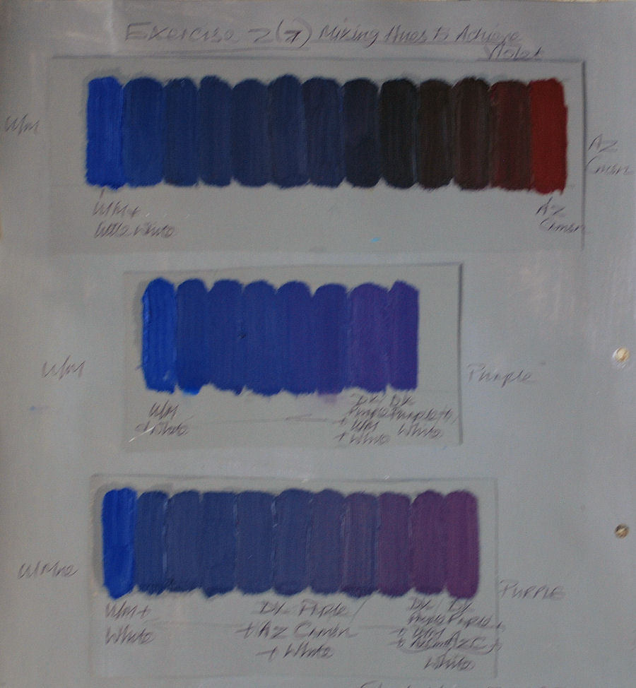
Mixing hues to achieve violet

Maintaining consistent tonal value by adding white

Sunday, November 25, 2012

Exercise 1 (Project 1) Anachromatic scale

Mixing Greys - anachromatic scale
Using the scale in the course book as a guide. After practising the first six gradations I found the values weren't darkening sufficiently in comparison.
After  two mixes I was finding that the value changes are much more subtle after mid-grey (half way) than the light end of the scale adding the same amount of black - between 7 - 13, I need to add proportionately more black paint.
I've been going left right but as I'm left handed I should go right to left so I can see the edge of the previous value (tone) - dopey me, will do from now on......

Third graded (grey scale) from 7 on I was very careful to check repeatedly with dabs of mixed tones near  the example and from previous mixes for comparisons to try to ensure that I had added adequate black to make a noticeable a darkening of tone. Even then they are more subtle between 10 - 13 than from 1 - 9. The middle grey (70 when placed next to white looks darker than in the middle of the scale. This is so apparent because of the extreme contrast in tone next to white and the other gradually darkening values nearby.

Neutral mid-grey
Placed alongside black - though tones have a noticeable contrast it isn't as distinct as at the other (light) end. When I move the 'neutral' grey down and up the scale the contrasts become less pronounced much earlier at the darker end than at the lighter end of the scale.


Thursday, November 22, 2012

Research Point 1 Chevreul's Colour Theories

In 1824  French chemist Eugene-Michel Chevreul was employed as director of dyes for Gobelins Tapestry Manufacturers. While in this position he made intensive investigations and analysis into colour - because of complaints by customers about the dyes being used. He determined that  troublesome colour  interactions were the cause. His most influential contribution to the art world were the three colour theory laws of simultaneous and successive contrast and optical mixing.These discoveries formed part of his famous publication The Principles of Harmony and Contrast of Colours.
1.Simultaneous contrast is an optical illusion created when different tones or colours are placed alongside one another appear to lighten or darken them far more than if they were placed separately  In the case where two similar colours are juxtaposed the complementary of each will affect the other ie. red will irradiate the surrounding space with its complementary (green), but if placed next to a similar colour (orange) the red will appear more violet by a blue (complementary) cast caused by the orange. If placed next to violet, red is more orange due to the yellow (complementary) cast from the violet. Warm colours appear warmer when placed next to a cool colour and vice versa, a dark colour appears darker placed next to a light colour and vice versa. Pure colours and greys alongside one another become more intense. This effect will be immediate.
2. Successive contrast is concerned with after images and optical mixing. An after image is observed after looking at a colour for a while and upon turning away the eye sees a halo effect (or after image) which is the complementary of the colour originally observed. Optical mixing is when two different colours laid side by side produce the impression of a third colour. This is most noticeable when colours are viewed from a distance appearing to produce a combination of the first two colours ie.  primaries - red and yellow = orange, harmonious - blue and green = turquoise. This more pronounced when the colours are viewed from an angle, the further away the colours are observed the more muted the colours become.

These theories led to his development of a colour wheel divided into 72 segments, each one containing 12 main colours, divided into 6 zones around a white inner circle.


Link to experiments with grays http://www.colorisrelative.com/bwbox.html


How did particular artists use Chevreul's theories to expand the possibilities of painting?

Camille Pissaro was a great enthusiast of Chevreul's theories and through this he became a major influence in the development of Impression, a characteristic of which was to use juxtaposed dabs of complementary colour. Eugene Delacroix was another great enthusiast of Chevreul's and he also had a significant effect on Impressionism, experimenting with broken tones in his quest for vibrant and luminous colours. The impressionists followed his methods on optical mixing using broken colour to give an impression of light. Pissaro in turn also influenced  Neo or  Postimpressionist painters to further advance the technique by using a multitude of dots to apply pure pigment.What had been the quite spontaneous methods of the Impressionists became more exacting and scientific in the hands of the Postimpressionist such as Signac, Seurat, Cross and others who also made direct reference to Chevreul's theories. Pissaro adopted this style  in 1886 for a time.  As did Edouard Vuillard - see http://www.wikipaintings.org/en/edouard-vuillard/studio-interior-model-for-the-scenery-of-la-lepreuse#supersized-artistPaintings-241631 
By using Chevreul's teachings on colour theory and simultaneous contrasts Robert Delauney  created a new technique  producing sensations of pure colours in depth and movement. starting with recognizable objects and gradually becoming increasingly abstract. It became known as Orphism.
Other artists later exploited the effects of optical mixing, including Sigmar Polke 'Girlfriends' and Roy Lichtenstein 'Masterpiece 1962'.


Monday, August 27, 2012

Exercise 6: Opaque colour mixing

The intention of this exercise: the effects of mixing white with colours to obtain graded tones. Success at last!
This was much easier to do than the previous exercise. The main reason being - that I stumbled across a video on utube, demonstrating how to do a graded wash with opaque paint. Hey presto! The transition is much smoother - without dark bands. Through following these techniques  I was also able to obtain far better results with both transparent and opaque washes on the very first attempt. It did make me wonder how I could have got it so wrong previously despite numerous attempts. The successful technique was: dampen paper, apply full strength paint at the top, working rapidly down the surface using light pressure on brush and working from side to side (the paint strength becomes weaker) to just below the middle. Then work in an upwards direction from the base with a clean damp brush towards the colour and blend in gradually. I used two different brushes. What seemed to make the most difference were: working rapidly down and up the surface and not being afraid to go back over it a little. Also, making sure the paper is adequately damp beforehand. Previously I was working more slowly and painting parallel horizontal lines, perhaps being too careful.

I know these three are still far from perfect but far better when compared to 
most of my earlier efforts in exercise 5

How could both transparent and opaque methods be used together? 
Opaque over transparent enriches the wash.

Transparent over opaque can be used in a composition using glazes to build great depth. An opaque and textured ground used under transparent glaze or glazes increases luminosity and three dimensional effect. Also for modifying colours below, such as the complementaries of blue and orange.
Transparency is useful in a landscape to give the effect of distance. Moving forwards the paint could gradually become more opaque towards the middle and foreground. 
Transparent - to depict water or glass, opaque for solidity ie, trees, walls.