This assignment is designed to replace my previous endeavour - Version 1. Initially, when I began to think about what kind of approach to take the second time round, I didn't particularly want to depart from the rock theme in Version 1. It wasn't long before another slightly different theme revealed itself as a more inviting proposition.
 |
| Sample of brushwork practice - showing the most extreme contrasts |
I also paid a lot of attention to trying to improve on the previous palette, as my choice had latterly been a bit of an issue with my tutor and (later) myself after I had viewed them an adequate number of times to absorb the palette defects. Moreover, I wanted to concentrate on loosening up the brushwork and paint marks - the message coming through from my tutor as an underlying concern from time to time – my compulsion to over blend and tidy up; trying to make a picture instead of using a more experimental painterly approach - yes even now I am still doing this, but I think a bit less now.
So, I practised with the brushwork in various colour combinations before embarking on the series.
 |
| more brushwork practice |
In an effort to take on board my tutor's suggestion of taking some inspiration from Luc Tuyman
http://www.wikiart.org/en/luc-tuymans/gas-chamber-1986
and Mike Newton’s visible brushwork, I practised with this in various colour combinations using contrasting values and saturations of colour before embarking on the series.
http://www.wikiart.org/en/luc-tuymans/gas-chamber-1986
and Mike Newton’s visible brushwork, I practised with this in various colour combinations using contrasting values and saturations of colour before embarking on the series.
Other influences in this regard were Cecily Brennan, William Crozier,
http://www.bbc.co.uk/arts/yourpaintings/artists/william-crozier-9205/paintings/slideshow#/15
Richard Diebenkorn,
http://uploads8.wikiart.org/images/richard-diebenkorn/untitled-m.jpg these are high resolution images showing the brushwork very clearly
and William Theophilis Brown and the California School painters in general:
https://www.pinterest.com/rhballard/california-school-painters/
Previous exercises 5 and 6 - abstractions from natural and man made forms - had worked well in helping me to seek out the essence of a subject and to simplify, distort and change in several different ways.
 In spite of this, the experimental stage of this version (as with the Version 1) again became quite protracted with a lot of trial and error before I felt confident to proceed to the final painting series.
Initially
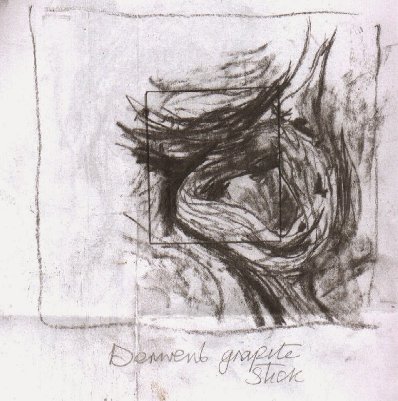
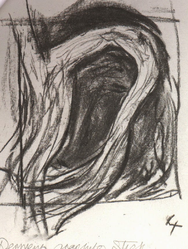
I intended to use sketches I had done, based on one of twisted tangled dead branches of ivy (below and right) that I did in
exploratory stages of Exercise 5, Part 5. My intention was to divide one of them
into 4 and make a painting of each of the 4 parts while varying the palette eg.
Add more yellow for one, more blue for another and so on.. After increasing the
number of sketches of branches from different angles and focusing in on a
particular area as an alternative, the one view divided in 4 seemed to work
better - shown below.
 |
 |
| Influenced by Henry Moore's Standing Figures |
 I
was attracted to the idea of each one flowing into another when placed together
in a square and at the same time working independently.
The sketches - (below right and left) contributed towards No. 1 and No. painting below.
 |
| These 'doodles' appeared during a phone call |
 loosely based on
the sketches of the branches some while back, but mostly from imagination - shown right. This had a strong bearing on No.s 1 and 3. I placed my adjustable viewfinder
on different parts of it, discovering a couple of areas I felt were worth
translating into paint and the same with certain areas of two of the branches sketches that I felt
were worth taking further. I was confident of their potential to complement one another, having similar components.
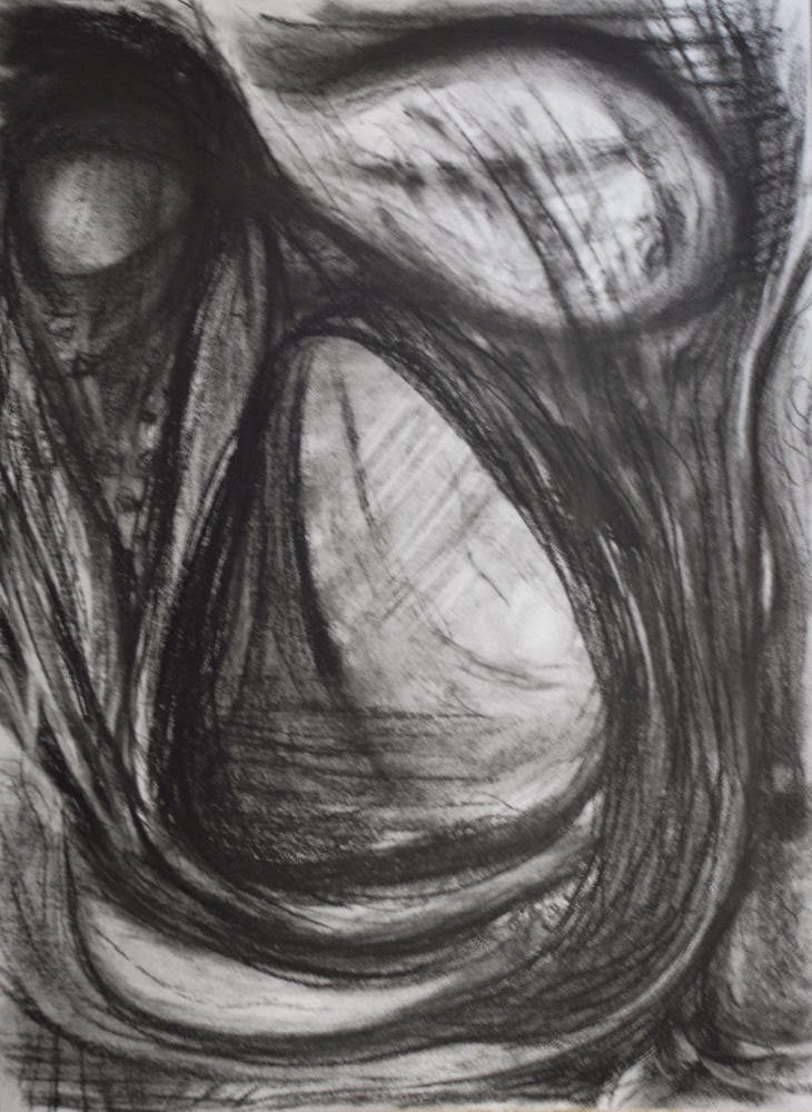
Giacometti’s painting ‘Head
of a Man’ - while randomly flipping through an art book . There are numerous versions:
https://www.google.ie/search?tbm=isch&tbs=rimg%3ACYoh-o9Lb7hEIjhPo8zesw46eeiuL63tRwey7415RFxVwVGuNdzcnnQqRckYf9RxnQkzXDhVHP1_1JDWHKKMONN73QyoSCU-jzN6zDjp5EaGDhMWcUxg1KhIJ6K4vre1HB7IRV0hyCUF1FmIqEgnvjXlEXFXBURFn6yaaTYm7byoSCa413NyedCpFEYylhLjAc1e8KhIJyRh_11HGdCTMRUN2O-G0emXQqEglcOFUc_1X8kNRHRNFHYp-zjQSoSCYcoow403vdDEZ12OKoRuTKQ&q=giacometti%20head%20of%20a%20man%20painting&ei=M4_nVLOUBtGS7Aaq0oHQDw&ved=0CAkQ9C8wAA&qscrl=1
Cecily Brennan’s painting ‘Geyser’ - in an old catalogue I possess of her exhibition at the Douglas Hyde Gallery, Dublin in 1991 - with its palette dominated by muted white/greys through to dark deep greens and lesser amounts of deep aqua like blues and pale yellows to deep ochres and the expressive impasto paint application. Unfortunately I can't display it on this blog for copyright reasons; this was the only image (from the series) I could locate online:
http://virtualgallery.artscouncil.ie/pdf/aspecialplace.pdf - page 15.
There are a few more on this link. This triptych appears to be most similar to 'Geyser': http://www.askart.com/AskART/artists/search/Search_Repeat.aspx?searchtype=AUCTION_RECORDS&artist=11090898
Other sources of intrigue for me were:
a few photos of entrances, bridges and tunnels which I had collected and saved in a folder way back. Also a newspaper article I’d kept with an image of Henry Moore’s 'Standing Figures 1940': http://www.tate.org.uk/art/artworks/moore-standing-figures-n05210 - of particular note were the palette of muted blues, reds and ochres and the dark holes within the figures, as were Barbara Hepworth’s hollow sculptures
http://www.tate.org.uk/visit/tate-st-ives/barbara-hepworth-museum
and Graham Sutherland’s painting ‘Entrance to a Lane’:
http://www.tate.org.uk/art/artworks/sutherland-entrance-to-a-lane-n06190
Pierre Soulages's thick swathes of black also came into the picture, particularly with No 1 and No 3
http://uploads4.wikiart.org/images/pierre-soulages/peinture-23-avril-1963-1963.jpg
and Giacometti again- this time his multitude of wire like tangled lines used in many of his drawings, paintings and sculptures, reminding me of the tangled lines in some of my sketches.
I could go on..
Painting process:
The full series was painted on gessoed mountboard, media: acrylic and charcoal. Additional materials were used in individual paintings. I also changed the palette very slightly between each one. The dominant colours throughout were: Phthalo Blue, Paynes Grey, Cadmium Yellow, Raw Sienna, Titanium White and a touch of Crimson.
Note: The numbers below the images do not necessarily correlate with the order of progression. |
| Number 1 study |
 |
| Number 1 |
It looks to me as though some similar methods of paint application might have been used in Franz Kline's painting C and O. I spotted it after I had completed the series:
http://uploads3.wikiart.org/images/franz-kline/c-and-o-1958.jpg
Also Torches Mauve http://uploads0.wikiart.org/images/franz-kline/torches-mauve-1960.jpg
I wasn't keen on this way of painting before I researched Tachisme but it is really growing on me.
 |
| Number 2 study part done |
 |
| No 2 -study |
 |
| No 2 - completed |
 |
| No 3 study |
 |
| No 3 -completed |
No 4 - completed second in order. The palette has an accent on greens. This was the most problematic and time consuming. The paint was applied in a similar way to No 2. The areas of lightest tones took applications of multiple layers of paint before approaching anywhere near a satisfactory balance - not to appear over quiet or noisy in relation to the rest. Alterations in one place would upset the balance in another area, but because I had high hopes I continued until eventually bringing it to an acceptable conclusion rather than give up. I felt that there needed to be more contrast in the lower third of the study in the final painting and I think this was were I started going off along the wrong track...comparing the two of them now I prefer the study for the most part, as it look quite raw and spontaneous - as No 1. I think I have lost a lot of this in the painting; it is also consequently less interesting than that in the study due to my dulling down of the palette. This one appeals to me least of all.
 |
| No 4 study |
 |
| No 4 completed |
No comments:
Post a Comment