Search This Blog

Showing posts with label Sgraffito. Show all posts

Tuesday, September 30, 2014

Assignment 5 REVISITED


This assignment is designed to replace my previous endeavour - Version 1. Initially, when I began to think about what kind of approach to take the second time round, I didn't particularly want to depart from the rock theme in Version 1. It wasn't long before another slightly different theme revealed itself as a more inviting proposition. 
Sample of brushwork practice -
showing the most extreme contrasts
As further ideas began to reveal themselves - from various sources, the original (rock theme) went on a process of gradual transmutation through a series of sketches and experiments with paint and other materials.
I also paid a lot of attention to trying to improve on the previous palette, as my choice had latterly been a bit of an issue with my tutor and (later) myself after I had viewed them an adequate number of times to absorb the palette defects. Moreover, I wanted to concentrate on loosening up the brushwork and paint marks - the message coming through from my tutor as an underlying concern from time to time – my compulsion to over blend and tidy up; trying to make a picture instead of using a more experimental painterly approach - yes even now I am still doing this, but I think a bit less now.
So, I practised with the brushwork in various colour combinations before embarking on the series. 


more
brushwork practice
In an effort to take on board my tutor's suggestion of taking some inspiration from Luc Tuyman 
http://www.wikiart.org/en/luc-tuymans/gas-chamber-1986 
and Mike Newton’s visible brushwork, I practised with this in various colour combinations using contrasting values and saturations of colour before embarking on the series.

Other influences in this regard were Cecily Brennan, William Crozier, 
http://www.bbc.co.uk/arts/yourpaintings/artists/william-crozier-9205/paintings/slideshow#/15
 Richard Diebenkorn, 
 http://uploads8.wikiart.org/images/richard-diebenkorn/untitled-m.jpg these are high resolution images showing the brushwork very clearly
and William Theophilis Brown and the California School painters in general:  
https://www.pinterest.com/rhballard/california-school-painters/

Previous exercises 5 and 6 - abstractions from natural and man made forms - had worked well in helping me to seek out the essence of a subject and to simplify, distort and change in several different ways.
In spite of this, the experimental stage of this version (as with the Version 1)  again became quite protracted with a lot of trial and error before I felt confident to proceed to the final painting series.

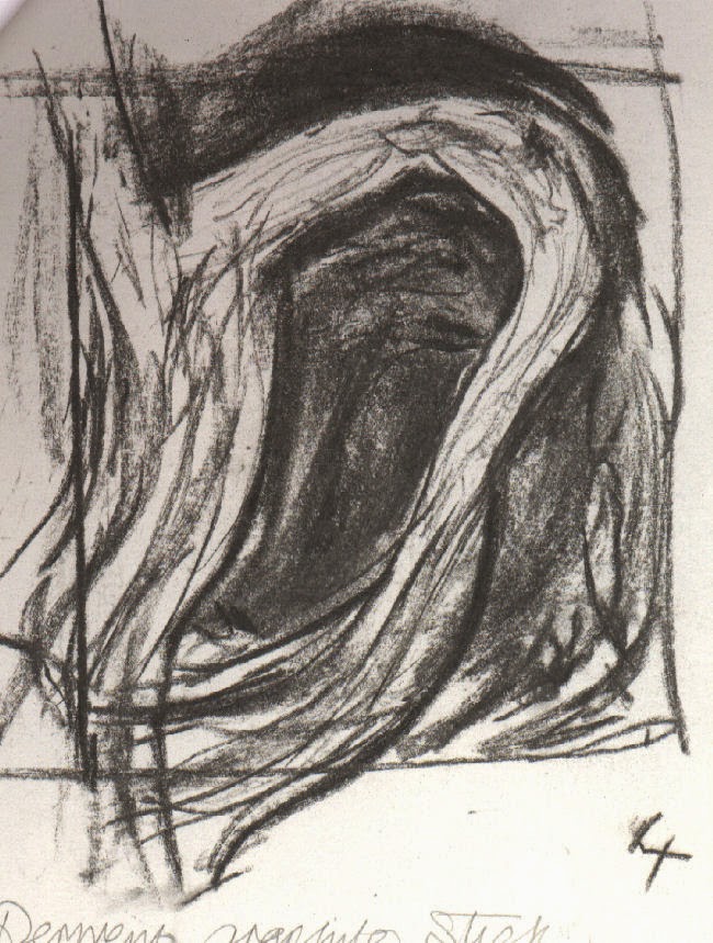
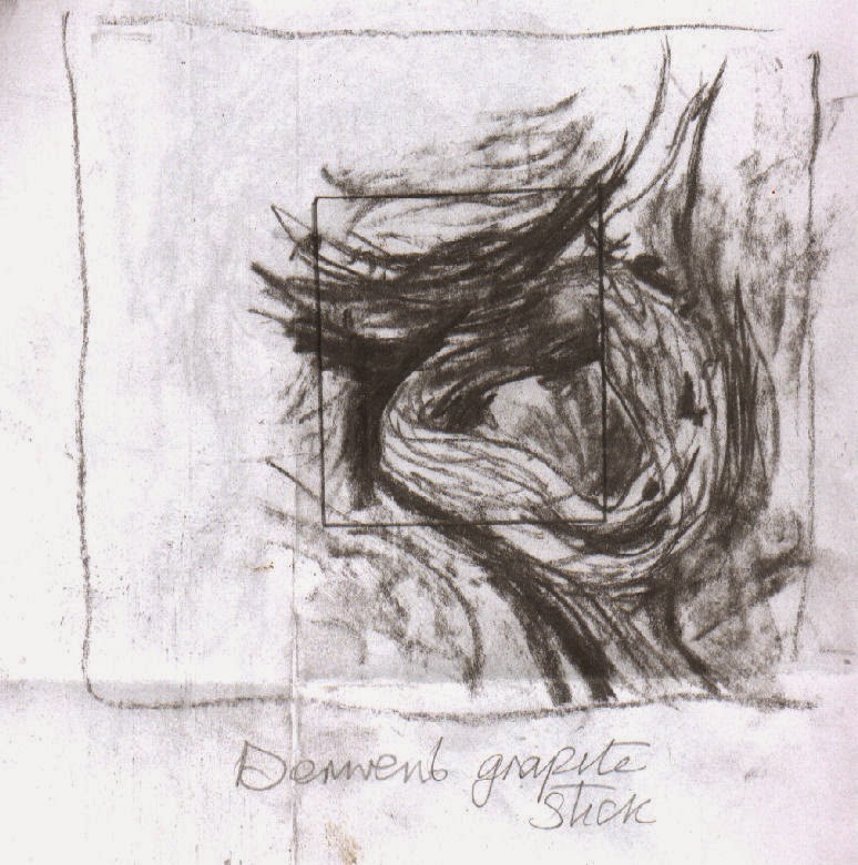
Initially I intended to use sketches I had done, based on one of twisted tangled  dead branches of ivy (below and right) that I did in exploratory stages of Exercise 5, Part 5. My intention was to divide one of them into 4 and make a painting of each of the 4 parts while varying the palette eg. Add more yellow for one, more blue for another and so on.. After increasing the number of sketches of branches from different angles and focusing in on a particular area as an alternative, the one view divided in 4 seemed to work better - shown below.

Influenced by Henry Moore's
Standing Figures
I was attracted to the idea of each one flowing into another when placed together in a square and at the same time working independently.
The sketches - (below right and left) contributed towards No. 1 and No. painting below.
These 'doodles' appeared
during a phone call


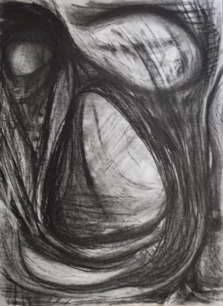
For the studies I toyed around exploring various media, palettes and paint techniques plus various media including cement dust, tissue and magazine papers, card, dripped and splattered paint etc. Going through this process however, I couldn't summon up enough enthusiasm to proceed with this plan – I felt that it was basically not going anywhere – I kept getting ‘stuck’ and I couldn't see a way forward with the palettes I’d picked. So, yet another change of plan.. Around this time my attention was repeatedly drawn to a charcoal drawing  I made previously, 
loosely based on the sketches of the branches some while back, but mostly from imagination - shown right. This had a strong bearing on No.s 1 and 3. I placed my adjustable viewfinder on different parts of it, discovering a couple of areas I felt were worth translating into paint and the same with certain areas of two of the branches sketches that I felt were worth taking further. I was confident of their potential to complement one another, having similar components.


Other contributing factors in helping to reignite my enthusiasm were the palettes and techniques of:
Giacometti’s painting ‘Head of a Man’ - while randomly flipping through an art book . There are numerous versions:
https://www.google.ie/search?tbm=isch&tbs=rimg%3ACYoh-o9Lb7hEIjhPo8zesw46eeiuL63tRwey7415RFxVwVGuNdzcnnQqRckYf9RxnQkzXDhVHP1_1JDWHKKMONN73QyoSCU-jzN6zDjp5EaGDhMWcUxg1KhIJ6K4vre1HB7IRV0hyCUF1FmIqEgnvjXlEXFXBURFn6yaaTYm7byoSCa413NyedCpFEYylhLjAc1e8KhIJyRh_11HGdCTMRUN2O-G0emXQqEglcOFUc_1X8kNRHRNFHYp-zjQSoSCYcoow403vdDEZ12OKoRuTKQ&q=giacometti%20head%20of%20a%20man%20painting&ei=M4_nVLOUBtGS7Aaq0oHQDw&ved=0CAkQ9C8wAA&qscrl=1 

Cecily Brennan’s painting ‘Geyser’ - in an old catalogue I possess of her exhibition at the Douglas Hyde Gallery, Dublin in 1991 - with its palette dominated by muted white/greys through to dark deep greens and lesser amounts of deep aqua like blues and pale yellows to deep ochres and  the expressive impasto paint application. Unfortunately I can't display it on this blog for copyright reasons; this was the only image (from the series) I could locate online:
http://virtualgallery.artscouncil.ie/pdf/aspecialplace.pdf - page 15.
There are a few more on this link. This triptych appears to be most similar to 'Geyser':    http://www.askart.com/AskART/artists/search/Search_Repeat.aspx?searchtype=AUCTION_RECORDS&artist=11090898
Other sources of intrigue for me were:
a few photos of entrances, bridges and tunnels which I had collected and saved in a folder way back. Also a newspaper article I’d kept with an image of Henry Moore’s 'Standing Figures 1940': http://www.tate.org.uk/art/artworks/moore-standing-figures-n05210  - of particular note were the palette of muted blues, reds and ochres and the dark holes within the figures, as were Barbara Hepworth’s hollow sculptures
http://www.tate.org.uk/visit/tate-st-ives/barbara-hepworth-museum
 and Graham Sutherland’s painting ‘Entrance to a Lane’: 
http://www.tate.org.uk/art/artworks/sutherland-entrance-to-a-lane-n06190
Pierre Soulages's thick swathes of black also came into the picture, particularly with No 1 and No 3
http://uploads4.wikiart.org/images/pierre-soulages/peinture-23-avril-1963-1963.jpg
and Giacometti again- this time his multitude of wire like tangled lines used in many of his drawings, paintings and sculptures, reminding me of the tangled lines in some of my sketches.
I could go on..

Painting process:

The full series was painted on gessoed mountboard, media: acrylic and charcoal. Additional materials were used in individual paintings. I also changed the palette very slightly between each one. The dominant colours throughout were: Phthalo Blue, Paynes Grey, Cadmium Yellow, Raw Sienna, Titanium White and a touch of Crimson. 

Note: The numbers below the images do not necessarily correlate with the order of progression.
Number 1 study
No.1 Not including the prior studies, this was turned out to be the quickest painting to complete from the series of 4, taking roughly 1.5 hours. Thinking it was unfinished I put it to one side while I completed the other three, intending to return to it afterwards; by the time I had completed the other three I had decided it didn't need any further work; it has a certain roughness which I find appealing. Anyhow I was certain that if I so much as started to do anything further it would inevitably end up overworked and ruined. As with all the paintings I started off with applications of charcoal lines, and veiling (partially covering the charcoal) with white and dark blue/black acrylic paint alternately, re-applying some charcoal and then the paint again; a technique I picked up from Steven Aimone's book, Expressive Drawing. This was after I had glued on a few pieces of watercolour paper here and there - mostly in the major lighter areas and one or two magazine papers.
Number 1
I continued, using a process of addition and removal of damp and just dry paint with brushes, plastic cards, palette knives, fingers and cloths both damp and dry and I scratched into it with the corners of plastic cards and a small screwdriver.

It looks to me as though some similar methods of paint application might have been used in Franz Kline's painting C and O. I spotted it after I had completed the series:

 http://uploads3.wikiart.org/images/franz-kline/c-and-o-1958.jpg
Also Torches Mauve http://uploads0.wikiart.org/images/franz-kline/torches-mauve-1960.jpg 
I wasn't keen on this way of painting before I researched Tachisme but it is really growing on me.


Number 2 study part done
No 2 - the third one to be completed. It was taken from a zoomed in area of one of my numerous sketches of tangled ivy branches; some are shown above but doesn't include this one. 
No 2 -study
I applied a partially rough textured base to this with polyfilla and paper pulp. This didn't progress as the study and I became conscious of rather more time passing by than on the first painting (No 1). I got to a point where I almost abandoned this. I ploughed on and began to notice things starting to take a more positive turn. 
No 2 - completed
There were areas I didn't want to depart much from the study, but eventually I realized they weren't going to work - the whole thing looked disjointed  so I made repeating elements - areas of similar tone, hue and texture, playing down some highlighting. I thought this had the least promise earlier on but once I had finished it went up the scale, in my estimation. Because I connected a diagonal section going behind the dominant shape  (moving top to bottom) which is textured and highlighted more on one end, this end appears to to be pulling outwards while the darker quieter end looks to be moving away. The shapes appear to be oscillating, bringing about a surface tension. The touches of light at top and top left help to balance the similar toned dominating areas of rough texture in the lower portion.


No 3 study
No 3 This was the last to be completed. I started with an accent on purples, which seemed to feature less towards the end when I added further mid-blues, greys and very dark blue/blacks, continuing to go with the flow of the previous two. I did experience quite a struggle with the central area - it was chaotic and confusing for a lengthy stretch; I had not fully resolved the lower portion in the study and  such a lot was happening in this areas. Through a process of adding and removing paint it eventually began to pull together. I do still think there is room for improvement in the centre. This is more three dimensional than the other three, particularly No. 1.


No 3 -completed

No 4 - completed second in order. The palette has an accent on greens. This was the most problematic and time consuming. The paint was applied in a similar way to No 2. The areas of lightest tones took applications of multiple layers of paint before approaching anywhere near a satisfactory balance - not to appear over quiet or noisy in relation to the rest. Alterations in one place would upset the balance in another area,  but because I had high hopes I continued until eventually bringing it to an acceptable conclusion rather than give up. I felt that there needed to be more contrast in the  lower third of the study in the  final painting and I think this was were I started going off along the wrong track...comparing the two of them now I prefer the study for the most part, as it look quite raw and spontaneous - as No 1. I think I have lost a lot of this in the painting; it is also consequently less interesting than that in the study due to my dulling down of the palette. This one appeals to me least of all.


No 4 study

No 4 completed
In Summary - the joy of spontaneity I'd experienced with the first painting didn't happen with the other three; I spent much more time and effort on them before I could say they were 'finished', despite all the tryouts and studies I made beforehand. I thought that each painting I did would help me more with the next, whereas they seemed to present even more challenging obstacles to be crossed, although I'm sure I learned much from each one as I progressed. I felt there was much scope for experimentation; I was happy with the basic compositions, it was the colour combinations and paint application that needed more work. As with No 1, I used similar paint techniques on all the series, albeit for widely varying a durations. In addition I made use of paint applied transparently, dry brushed; changing shapes and edges, plus thick opaques, especially the lightest tones. I kept going until at last I could see a gradual look of cohesiveness developing. This was true particularly with Nos. 2, 3 and 4. All the while I kept trying to consider important basic elements, such as balance, harmony, contrast, repetition, unity, rhythm, gradation, dominance. Hopefully many of these facets were also included more or less intuitively. Despite a multitude of influences on this series, the influences have major similarities, which I think have come through in the four paintings. I think that by adding certain textural materials in each painting and making a very  conscious effort to use the paint quite expressively, it has I hope, had a more positive effect this time around.  

Wednesday, June 25, 2014

6 Project: Towards Abstraction Exercise 6 Abstracting from man made form

Other artists influential for this exercise were again Jaap Wagemaker and Jane Frank, also Jasper Johns - 'Hateras' and collages of Charles Winebrenner, Maury Haseltine and Katherine Chang Liu http://www.collageartists.org/meetingsarchive/2010_03_Katherine_Chang_Liu.html


Subject: zoomed in area of an oil burner - a mechanical part of an oil heating boiler. This was a broken component taken off the house heating boiler and was lying around in the utility room. I concentrated on various zoomed in areas of my subject, but while doing the first four thumbnail sketches (not shown) I again fell into the trap of trying to represent correct perspective, form, scale etc becoming aware that I was somehow missing the point here. I had to change tack - what I have learned about  abstraction  is that important elements would include simplification, distortion, flattening, exaggeration. In other words changing the subject to a point beyond recognition.

Above - three A4
 pages of final sketches

A transition came about when I made a conscious departure from initial sketches and started to play around with selected features of one area in different arrangements - these are shown to the right. During the final few sketches and the colour studies I was mindful of trying to maintain an essence of the subject's character in this area of the component:  the hollowness of the circles and other geometric shapes and hinting at other small mechanical parts within and behind them. Also to suggest the surrounding area of mostly smooth and distressed grey metal surfaces.  This continued into the final painting.
My colour studies were a big influence on what was to follow for the painting. I used the colours from the second study - vermillion, and mixes of crimson, pthallo blue, magenta, raw umber and titanium white.
Paint and materials application was a similar process to the first study in yellow and blue.I tried to evoke the the underlying hues found  in the object, putting a more vibrant slant on them.
Painting from man made form
Towards the end there were areas I needed to resolve before I could say it was finished. After a bit of close scrutiny I tried the following:
toned down parts of the lightest areas  and tried to further integrate certain other areas using watery glazes of purple with dry a brush. I also
introduced more directional shapes and lines to link up the upper left of the large circular shape with the rest of the composition,
enhanced repeated texture and patterns of the smaller rough circles and dk purple/blue colour blocks.


 Right and below - colour studies


Thursday, April 10, 2014

1 Exercise 1 PART 5 IMPASTO and SGRAFITTO

a) Using a brush - a simple still life.  Oils, colours: burnt sienna, raw sienna, cadmium yellow, cadmium red, ultramarine, titanium white on oil sketching paper. I was a bit confused about the instructions regarding mixing of colours - not sure if the idea was to use unmixed tube colours only or not, but I suspect it was. I know this wasn't exactly what the exercise was about either, but in the end the temptation to mix colours on the palette got the better of me as I wasn't comfortable with the thought of them turning out looking totally unrealistic. For the first attempt I set up an apple, a pear and a banana. The first pear attempt was a disaster as I placed one colour over another so they merged together. They were certainly thick smears as requested in the manual, but they mixed together too early on. The second pear was a little easier and the banana, no problem. By the time I reached the fourth attempt at a piece of fruit: an apple there was a slight improvement in technique as I managed to keep the colours slightly more separate, though the shadow at the base went a little haywire. The paint seemed to have quite a lively appearance, despite colours merging here and there. Although I set up the composition carefully this care soon went into oblivion as I struggled to handle the paint.

b) Acrylics: avocado, mango and onion on canvas paper. The paint was unmixed tube colours this time. I did however mix in heavy body medium to thicken the colours. The process was going okay, apart from when I left it alone for half an hour after applying the darks, so they were virtually dry on my return. I added the mid and light tones and blended the edges a little in the darks. I added a few more darks over the darks so I could blend the edges with other colours. Of course I found it impossible to obtain to obtain accurate matching of the actual colours and tones on my arrangement. I felt more confident this time than I did  with the oils. It could have been due to the different medium - acrylics. I was more certain of where to put the appropriate colours and keep them confined to intended areas.
c) Oils. fruit: apple, pear, lime, banana. Cols: cad red, cad yell, mixed green, white. banana, cols: cad yell, yell ochre, white, touch ultramarine,  pear: raw sienna, cad yell, touch u/mne. and lime, cad yell, touch u/marine and touch viridian - this was ideal to lift the dullness of the green mix I had. on canvas paper. Burnt umber and u/mne for some darks. The colours were mixed this occasion rather using straight from tube.
The paint didn't sink into the surface as the acrylics did, but I was guilty of fiddling about for too long with the paint in attempt to obtain a convincing representation - what it was not for a good part of the process.
The brush sizes ranged between no.s 4 - 8 - a mix of flats, rounds and a filbert.
d) Acrylics. Banana, apple, lime and avocado. Used mostly tube colours, mixing occasionally for dark red and green shades. I couldn't help going over the lime and parts of the apple on the dried paint as the previous colours and tones didn't look at all convincing. Though I employed very rough brushwork and, as with the other three thick paint the acrylic did sink into the surface a bit, unlike oils. Acrylic is deceptive in the sense that also shrinks on drying.

2. Using a painting knife. Oils were used for all of these experiments. I basically just messed around with various styles of painting knife.
They are great for defined ridged or smooth contours and edges. Also fantastic for quicly obtaining texture with two or more colours wet on wet yet the colours don't blend as they would with a brush. Each colour seems to keep its own integrity.
Paint was pulled along  to make parallel lines with a flat straight blade. This produced thick straight linear marks. A rather three dimensional effect resulted.I twisted it from side to side in different ways - one of which produced interesing wiggly lines rather like a gnarled tree trunk and  branches.Another was hit and miss smooth and ighly textured surface in parallel lines reminiscent of aged posts or columns perhaps. When I pulled the paint and knife across these at 45 degrees.  When the paint was double loaded (two colours on the knife blade) they went on adjacent to one another. When I pulled and pushed the flat of the blade from side to side the colours intermixed gave off a beautiful effect.


In a simple woodland landscape I used a knife and scratching with end of a brush handle/crochet hook or fishing hook. Used various knives - including thin rectangular bladed one for the tree branches. Dark thick paint over light base of acrylic. Easily able to sculpt and scrape the paint producing very raised and textural surface. And for extended time due using oils. Acrylics would have needed retarder to do this and would shrink when dry. However the oil paint used in this took several weeks before it was even touch dry in the thickest parts. Having said that I think this method and medium would have improved a previous woodland painting I did in Part 4 I think would have been tactile and more expressive with both brush and/or knives. I used cards to apply the paint on some rocks in another landscape painting in Part4 (Ex2 hard/soft landscape), though I think the whole painting looking at it now, was completely overdone. Also some previous still life exercises in Part 2, but I got the impression the emphasis in the course manual was on using just brushes. The particular painting was of an onion and garlic, using oil paints . I did obtain some raised texture but I did use a knife to increase the raised effect. I tried scratching the paint in the garlic but wasn't enough contrast with the colour of the underlayer and the paint could have been thicker without fighting with the onion for attention. I had some trouble with both acrylic and oil on canvas. Though surface was well prepared the paint sunk in. Think could have enhanced some light areas with a painting knife. Knowing what I know now I would have used a surface like primed paper or card, not canvas, and a much darker underlayer. Again in this section, with another experiment on thick paper, I tried out a quick study of a vase useng fairly thick light toned oil paint on a smooth textured surface. I scratched away some of the paint around the contours and patterned areas to reveal the dark base layer. Using this method proved easy to obtain an effect I was happy with. I would certainly like to use oils again in this way.
The simple landscapes from imagination, I did at the start of this course, I think could have been made a bit more expressive if I had used other ways of applying paint apart from brushes, as indeed could many other exercises.
Partly because it  was on my mind, at the end of this exercise I did an experimental painting of imaginary still life - bottles and 'other' objects in acrylics. I used a card and rough loose brushmarks of white, pink, red and green paint on a dried green painted ground. Plus scratched into semi-dry paint on the left bottle and tonked wet red paint - using pressure to remove paint with a piece of paper. The process of chance and discovery was quite fun, some accidental effects emanated. The end result leaves a bit to the imagination,  which I was pleased about, leaving me with a keenness to try and approach more of my work in the same way - not so easy when I know something's going to be critiqued though.
Another part of my motive was that I had been looking at some of Cy Twombley, Willem de Kooning and Howard Hodgkin's work and was in admiration of the loose gestural brushmarks. I was also intrigued by the way de Kooning and Hodgkin used the effect of a frame or opening into a room or entrance or view on something. There was also some influence there, I think of Mel McCuddin (described as a figurative expressionist) in the way he paints his quirky figures from the imagination, akin to carving positive shapes out of negative space.
http://www.spokanehowsbusiness.com/news/archiveStory.asp?theArticle=1054


SGRAFFITO is a technique of ornamentation in which the surface layer of paint is scratched into to reveal areas (usually contrasting) of the surface underneath. Historically it has been used in several areas, such as in wall design and ceramics and glass manufacture for many centuries, where it has been used to scratch back an area of glazing or plaster.
Cy Twombley is a notable 20th century artist who made use of this technique in his multi layered paintings, using many different media and materials. 
http://www.theartsdesk.com/visual-arts/twombly-and-poussin-arcadian-painters-dulwich-picture-gallery

As a contemporary artist using scraffito, part of Robert Joyner's technique is often to scratch back into the paint as part of his loose and painterly style.http://napavalleyartcamp.blogspot.ie/2011/07/making-lines-with-robert-joyner.html


I scratched back through the wet oil paint
into the dried dark backgroundof acrylic in this quick study
of a vase.
Scraffito could be described as scratching into a layer of usually wet thick paint with a tool such as the end of a brush handle, a piece of card or even a fingernail to reveal a layer or layers of an underlying surface. The colour or tone of this surface usually contrasts with the paint being scraped off. It can be used for a whole range of effects, from complex pattern to a single thin line. This technique can even work with dry paint using very sharp tools and as long as the support is sufficiently resilient and thick to withstand the pressure. Wet impasto oil paint is a typical example of where it would be easy to use. Dried acrylic would take a bit more working out.