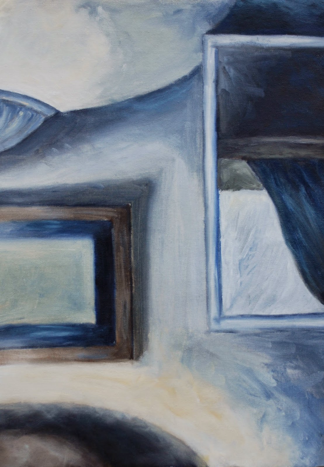
Search This Blog

Showing posts with label Assessment. Show all posts

Tuesday, September 30, 2014

Assignment 5 REVISITED


This assignment is designed to replace my previous endeavour - Version 1. Initially, when I began to think about what kind of approach to take the second time round, I didn't particularly want to depart from the rock theme in Version 1. It wasn't long before another slightly different theme revealed itself as a more inviting proposition. 
Sample of brushwork practice -
showing the most extreme contrasts
As further ideas began to reveal themselves - from various sources, the original (rock theme) went on a process of gradual transmutation through a series of sketches and experiments with paint and other materials.
I also paid a lot of attention to trying to improve on the previous palette, as my choice had latterly been a bit of an issue with my tutor and (later) myself after I had viewed them an adequate number of times to absorb the palette defects. Moreover, I wanted to concentrate on loosening up the brushwork and paint marks - the message coming through from my tutor as an underlying concern from time to time – my compulsion to over blend and tidy up; trying to make a picture instead of using a more experimental painterly approach - yes even now I am still doing this, but I think a bit less now.
So, I practised with the brushwork in various colour combinations before embarking on the series. 


more
brushwork practice
In an effort to take on board my tutor's suggestion of taking some inspiration from Luc Tuyman 
http://www.wikiart.org/en/luc-tuymans/gas-chamber-1986 
and Mike Newton’s visible brushwork, I practised with this in various colour combinations using contrasting values and saturations of colour before embarking on the series.

Other influences in this regard were Cecily Brennan, William Crozier, 
http://www.bbc.co.uk/arts/yourpaintings/artists/william-crozier-9205/paintings/slideshow#/15
 Richard Diebenkorn, 
 http://uploads8.wikiart.org/images/richard-diebenkorn/untitled-m.jpg these are high resolution images showing the brushwork very clearly
and William Theophilis Brown and the California School painters in general:  
https://www.pinterest.com/rhballard/california-school-painters/

Previous exercises 5 and 6 - abstractions from natural and man made forms - had worked well in helping me to seek out the essence of a subject and to simplify, distort and change in several different ways.
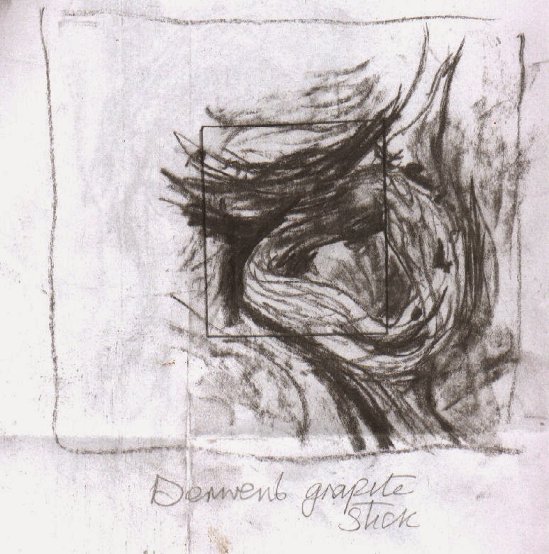
In spite of this, the experimental stage of this version (as with the Version 1)  again became quite protracted with a lot of trial and error before I felt confident to proceed to the final painting series.

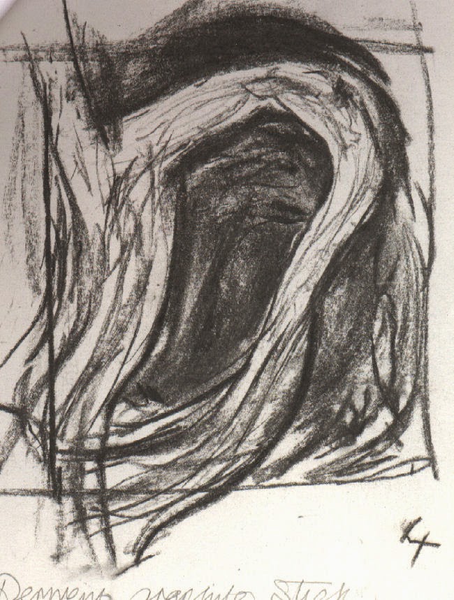
Initially I intended to use sketches I had done, based on one of twisted tangled  dead branches of ivy (below and right) that I did in exploratory stages of Exercise 5, Part 5. My intention was to divide one of them into 4 and make a painting of each of the 4 parts while varying the palette eg. Add more yellow for one, more blue for another and so on.. After increasing the number of sketches of branches from different angles and focusing in on a particular area as an alternative, the one view divided in 4 seemed to work better - shown below.

Influenced by Henry Moore's
Standing Figures
I was attracted to the idea of each one flowing into another when placed together in a square and at the same time working independently.
The sketches - (below right and left) contributed towards No. 1 and No. painting below.
These 'doodles' appeared
during a phone call


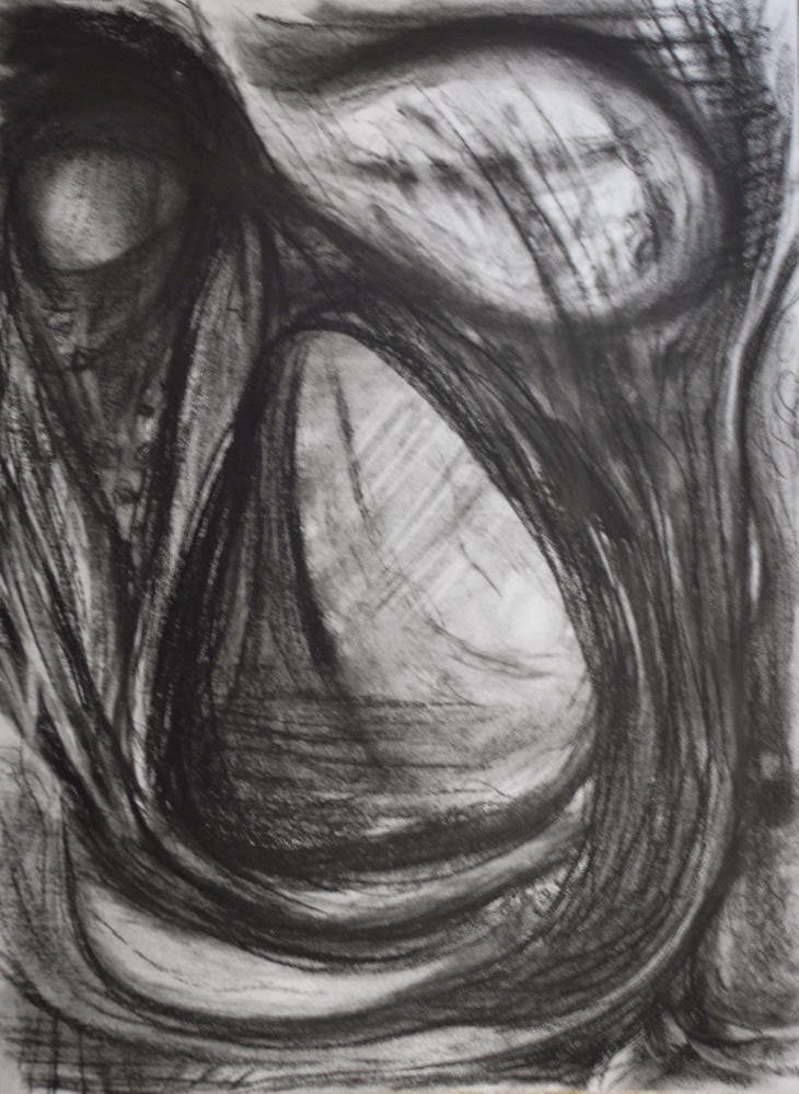
For the studies I toyed around exploring various media, palettes and paint techniques plus various media including cement dust, tissue and magazine papers, card, dripped and splattered paint etc. Going through this process however, I couldn't summon up enough enthusiasm to proceed with this plan – I felt that it was basically not going anywhere – I kept getting ‘stuck’ and I couldn't see a way forward with the palettes I’d picked. So, yet another change of plan.. Around this time my attention was repeatedly drawn to a charcoal drawing  I made previously, 
loosely based on the sketches of the branches some while back, but mostly from imagination - shown right. This had a strong bearing on No.s 1 and 3. I placed my adjustable viewfinder on different parts of it, discovering a couple of areas I felt were worth translating into paint and the same with certain areas of two of the branches sketches that I felt were worth taking further. I was confident of their potential to complement one another, having similar components.


Other contributing factors in helping to reignite my enthusiasm were the palettes and techniques of:
Giacometti’s painting ‘Head of a Man’ - while randomly flipping through an art book . There are numerous versions:
https://www.google.ie/search?tbm=isch&tbs=rimg%3ACYoh-o9Lb7hEIjhPo8zesw46eeiuL63tRwey7415RFxVwVGuNdzcnnQqRckYf9RxnQkzXDhVHP1_1JDWHKKMONN73QyoSCU-jzN6zDjp5EaGDhMWcUxg1KhIJ6K4vre1HB7IRV0hyCUF1FmIqEgnvjXlEXFXBURFn6yaaTYm7byoSCa413NyedCpFEYylhLjAc1e8KhIJyRh_11HGdCTMRUN2O-G0emXQqEglcOFUc_1X8kNRHRNFHYp-zjQSoSCYcoow403vdDEZ12OKoRuTKQ&q=giacometti%20head%20of%20a%20man%20painting&ei=M4_nVLOUBtGS7Aaq0oHQDw&ved=0CAkQ9C8wAA&qscrl=1 

Cecily Brennan’s painting ‘Geyser’ - in an old catalogue I possess of her exhibition at the Douglas Hyde Gallery, Dublin in 1991 - with its palette dominated by muted white/greys through to dark deep greens and lesser amounts of deep aqua like blues and pale yellows to deep ochres and  the expressive impasto paint application. Unfortunately I can't display it on this blog for copyright reasons; this was the only image (from the series) I could locate online:
http://virtualgallery.artscouncil.ie/pdf/aspecialplace.pdf - page 15.
There are a few more on this link. This triptych appears to be most similar to 'Geyser':    http://www.askart.com/AskART/artists/search/Search_Repeat.aspx?searchtype=AUCTION_RECORDS&artist=11090898
Other sources of intrigue for me were:
a few photos of entrances, bridges and tunnels which I had collected and saved in a folder way back. Also a newspaper article I’d kept with an image of Henry Moore’s 'Standing Figures 1940': http://www.tate.org.uk/art/artworks/moore-standing-figures-n05210  - of particular note were the palette of muted blues, reds and ochres and the dark holes within the figures, as were Barbara Hepworth’s hollow sculptures
http://www.tate.org.uk/visit/tate-st-ives/barbara-hepworth-museum
 and Graham Sutherland’s painting ‘Entrance to a Lane’: 
http://www.tate.org.uk/art/artworks/sutherland-entrance-to-a-lane-n06190
Pierre Soulages's thick swathes of black also came into the picture, particularly with No 1 and No 3
http://uploads4.wikiart.org/images/pierre-soulages/peinture-23-avril-1963-1963.jpg
and Giacometti again- this time his multitude of wire like tangled lines used in many of his drawings, paintings and sculptures, reminding me of the tangled lines in some of my sketches.
I could go on..

Painting process:

The full series was painted on gessoed mountboard, media: acrylic and charcoal. Additional materials were used in individual paintings. I also changed the palette very slightly between each one. The dominant colours throughout were: Phthalo Blue, Paynes Grey, Cadmium Yellow, Raw Sienna, Titanium White and a touch of Crimson. 

Note: The numbers below the images do not necessarily correlate with the order of progression.
Number 1 study
No.1 Not including the prior studies, this was turned out to be the quickest painting to complete from the series of 4, taking roughly 1.5 hours. Thinking it was unfinished I put it to one side while I completed the other three, intending to return to it afterwards; by the time I had completed the other three I had decided it didn't need any further work; it has a certain roughness which I find appealing. Anyhow I was certain that if I so much as started to do anything further it would inevitably end up overworked and ruined. As with all the paintings I started off with applications of charcoal lines, and veiling (partially covering the charcoal) with white and dark blue/black acrylic paint alternately, re-applying some charcoal and then the paint again; a technique I picked up from Steven Aimone's book, Expressive Drawing. This was after I had glued on a few pieces of watercolour paper here and there - mostly in the major lighter areas and one or two magazine papers.
Number 1
I continued, using a process of addition and removal of damp and just dry paint with brushes, plastic cards, palette knives, fingers and cloths both damp and dry and I scratched into it with the corners of plastic cards and a small screwdriver.

It looks to me as though some similar methods of paint application might have been used in Franz Kline's painting C and O. I spotted it after I had completed the series:

 http://uploads3.wikiart.org/images/franz-kline/c-and-o-1958.jpg
Also Torches Mauve http://uploads0.wikiart.org/images/franz-kline/torches-mauve-1960.jpg 
I wasn't keen on this way of painting before I researched Tachisme but it is really growing on me.


Number 2 study part done
No 2 - the third one to be completed. It was taken from a zoomed in area of one of my numerous sketches of tangled ivy branches; some are shown above but doesn't include this one. 
No 2 -study
I applied a partially rough textured base to this with polyfilla and paper pulp. This didn't progress as the study and I became conscious of rather more time passing by than on the first painting (No 1). I got to a point where I almost abandoned this. I ploughed on and began to notice things starting to take a more positive turn. 
No 2 - completed
There were areas I didn't want to depart much from the study, but eventually I realized they weren't going to work - the whole thing looked disjointed  so I made repeating elements - areas of similar tone, hue and texture, playing down some highlighting. I thought this had the least promise earlier on but once I had finished it went up the scale, in my estimation. Because I connected a diagonal section going behind the dominant shape  (moving top to bottom) which is textured and highlighted more on one end, this end appears to to be pulling outwards while the darker quieter end looks to be moving away. The shapes appear to be oscillating, bringing about a surface tension. The touches of light at top and top left help to balance the similar toned dominating areas of rough texture in the lower portion.


No 3 study
No 3 This was the last to be completed. I started with an accent on purples, which seemed to feature less towards the end when I added further mid-blues, greys and very dark blue/blacks, continuing to go with the flow of the previous two. I did experience quite a struggle with the central area - it was chaotic and confusing for a lengthy stretch; I had not fully resolved the lower portion in the study and  such a lot was happening in this areas. Through a process of adding and removing paint it eventually began to pull together. I do still think there is room for improvement in the centre. This is more three dimensional than the other three, particularly No. 1.


No 3 -completed

No 4 - completed second in order. The palette has an accent on greens. This was the most problematic and time consuming. The paint was applied in a similar way to No 2. The areas of lightest tones took applications of multiple layers of paint before approaching anywhere near a satisfactory balance - not to appear over quiet or noisy in relation to the rest. Alterations in one place would upset the balance in another area,  but because I had high hopes I continued until eventually bringing it to an acceptable conclusion rather than give up. I felt that there needed to be more contrast in the  lower third of the study in the  final painting and I think this was were I started going off along the wrong track...comparing the two of them now I prefer the study for the most part, as it look quite raw and spontaneous - as No 1. I think I have lost a lot of this in the painting; it is also consequently less interesting than that in the study due to my dulling down of the palette. This one appeals to me least of all.


No 4 study

No 4 completed
In Summary - the joy of spontaneity I'd experienced with the first painting didn't happen with the other three; I spent much more time and effort on them before I could say they were 'finished', despite all the tryouts and studies I made beforehand. I thought that each painting I did would help me more with the next, whereas they seemed to present even more challenging obstacles to be crossed, although I'm sure I learned much from each one as I progressed. I felt there was much scope for experimentation; I was happy with the basic compositions, it was the colour combinations and paint application that needed more work. As with No 1, I used similar paint techniques on all the series, albeit for widely varying a durations. In addition I made use of paint applied transparently, dry brushed; changing shapes and edges, plus thick opaques, especially the lightest tones. I kept going until at last I could see a gradual look of cohesiveness developing. This was true particularly with Nos. 2, 3 and 4. All the while I kept trying to consider important basic elements, such as balance, harmony, contrast, repetition, unity, rhythm, gradation, dominance. Hopefully many of these facets were also included more or less intuitively. Despite a multitude of influences on this series, the influences have major similarities, which I think have come through in the four paintings. I think that by adding certain textural materials in each painting and making a very  conscious effort to use the paint quite expressively, it has I hope, had a more positive effect this time around.  

Thursday, May 1, 2014

2 Exercise 2 Dripping, dribbling and spattering

Jackson Pollock, as far as I can ascertain, used enamel gloss paints. These were synthetic resin based paints and new in the U.S. at the time and I think were a factor in why his methods developed as they did. He experimented with the viscosity of the paint and diluted it to differant viscosities to suit the result he wanted. Mostly he diluted them to low viscosity (quite runny) to achieve his signature 'drip' effects.
He applied his 'drip' methods famously using a can or cans of paint with a hole in the bottom attached to a piece of string.

Initially I played around with watery paint on a sketchbook page A4 (above). Paint - watery blue-green on decorator's brush applied loosely, virtually dripped on. Purple-red in spaces in between applied same way and allowed to overlap  blue-green in places - dark margin appeared -  I like the contrast set up by the darker red values and the splattered dark red on same brush against the mid tone blues . It reminds me of woodland or abstracted figures but wasn't conscious of producing anything recognisable. The colours contrast, while not to extremes as are mostly of the same value   - (not quite opposite one another on the colour wheel), they are subdued and I think they work well together.

1. A2 white cartridge paper.
Red and yellow were splattered from large brushes - had to water down the paint sufficiently to get this to work - thick blobs with long streaks emanated. Blue was flicked through fingers - result large and small spots, without streaks. Yellow then poured on from a jar. It mixed appealingly with the paint under, which was wet. Would have been a better idea to have first let it dry.
Some colours intermingle when applied wet on wet. This happened with a watery blue splattered onto yellow and red, resulting in a dull murky brown green. However, being a transparent colour aswell (ultramarine) didn't help. It was also partly to do with the consistency of the paint. At this point I was in two minds about whether to abandon this painting, but I carried on just to see what would happen and was glad I did.  I used another more viscous and opaque blue mixed with acrylic matte medium mixture not containing ultramarine. Although quite runny it held together much better.As I added further layers of colour, some on wet paint, others on dry paint it began to take on a pleasing richness and depth that I hadn't expected. Eventually, after I had added white poured through a 5cm hole in the corner of a freezer bag, the white blobs over the thinner paints below completed the picture nicely, as it were, and I reckoned  it was time to stop. I'm just sorry I didn't use better quality paper.


No. 1

2. A1 black gessoed thick cartridge paper.
Splattered from large brushes and dribbled from containers various reds and blues wet on wet.
It was fascinating to see the way the  blue paint, of different viscosities, intermingled with the  red paint below.
Further mixes of magenta and ultramarine and white  flicked on with side of 5cm brush created lines of spots, flicked from close quarters also developed long thin streaks.
White dripped and flicked a little,  from end of brush mingled interestingly with the more transparent wet purple mix below. The purple crept into some edges developing fascinating delicate veins.
No. 2 with avocado showing scale 

detail on No. 2

3. Surface: dull pink (red/black mix acrylic) painted background of A1 thick cartridge paper.
U'mne/cad yell (green) dripped, spattered. Tried to suggest vague figure of eight - as Pollock sometimes did. After a few minutes some of the yellow part of the mix separated resulting in interesting combination of green and yellow. Attempting a semi-control by placing brush into container while pouring white - became blobs which splattered when touched the paper, merging with previously yellow/blue mix. Two consistencies of white paint were used. Added several more colours - blue, red, yellow. Syringe used to dribble paint, attempting to create continuous thin lines similar to Pollock, but the syringe was too small to cover an A1 sized surface, so I had to work quickly, causing a broken line  of dark red. Tried same process with a green and took out the syringe plunger too early causing large blob, so did the same thing elsewhere so as to balance it out. The more layers and depth that I built up the more their appearance improved. The green didn't look too appealing lying around in large watery puddles, mixing with some of the red, so I dabbed it a little with a rag and voila! it was a success. I couldn't resist adding further white flicked on at close range with fingers. In general I was slightly disappointed at not getting a few longer thin streaks or lines in amongst the marks made.
No. 3 with avocado showing scale

On all three paintings: flicking paint energetically at very close range seemed to work well. I found the immediacy and freedom of this way of painting very liberating and enjoyable and I was very pleased and surprised with the results obtained.


A novel way to use action painting:
Lee Krasner abstract florals:
http://www.patternpeople.com/pattern-pairs-erdem-x-lee-krasner/

This kind of technique could be used to build up interesting surface textures for backgrounds inside or around objects, even over objects. It may need to be masked off if only required in certain areas of a painting.
For making collage papers.
Henri Lamy is a French who artist drops liquid acrylic paint onto the canvas from a knife or throws paint directly at it, combining with his figurative portraits. The facial features appear to be built up with unblended impasto beforehand.
http://figurativeartists.blogspot.ie/2012/11/henri-lamy-figurative-drip-paintings.html
Dave White uses watercolour in a similar way for his animal paintings, culminating in paintings full of vitality, developed out of a most fascinating range of mark making.
http://www.mymodernmet.com/profiles/blogs/dripping-and-splattering-watercolor-paintings
John Worthington drips, sometimes pours and splatters liquid paint over an underlying  framework of shapes forming a realistic landscape.  This process has the effect of  transforming them into something quite poetic, evoking the natural elements. His series 'Low Tide', he says, is layer upon layer poured, wiped away and abraded paint. The pools of liquid paint are often left to dry overnight on the floor. Depending on how they look once dry he decides if they have been successful or not. At least, with practice the happy accidents become more frequent.
 A strong sense of energy and movement is emitted in the series 'Low Tide', by his use of paint pours, drips and splatters over the often strong underlying colours. A great variety of  textures are created by both opaque and watery transparencies. These combine well with calmer flatter areas. I think the stronger base colours and occasional pours in the top layers, help to give a great sense of depth and contrast.
http://johnworthingtonstudio.com/
No. 3 detail
William Baziotes, Gerome Kamrowski and Jackson Pollock did a collaborative painting, 1940-41,  which appears to demonstrate great control over the process of 'action' painting. The calm areas could have been masked off to isolate them from the 'action' painting or painted around afterwards to make defined borders. My guess is it was produced from a combination of these methods and more.
http://www.weinstein.com/artists/gerome-kamrowski/

Advantages (and disadvantages) over more conventional methods of painting:
Could have several paintings on the go at any one time, space permitting - limited by the amount of floor space and protective covering available.
The pre-mixed colours in containers are easy to isolate from one another. Mixing of tonal variations not as important.
If things didn't seem to be working out I found that adding further layersgenerally resolved the situation.
Disadvantage - hard to control the results, I found I just had to go with the flow. However, with plenty further experience I'm sure more control would come about.
Messy process, but this to me is part of the fun - until it's time to clean up that is!

Thursday, January 16, 2014

Assignment 4 - large landscape VERSIONS 1 AND 2

Version 1 (not for Assessment)
Before I had finished the previous exercise (from doing a few sketches and studying the various photos of it) I had decided that I wanted to paint a view of the local field where the barn resides. This is mostly because I estimated that the view contains a range of elements waiting to be exploited, such as: aerial and linear perspective, a feeling of space, contrasting textures, an obvious focal point and fundamentally, a well arranged composition. Also, I adjusted certain features slightly. As there is quite a range of textures, I reckoned I could utilize a few different techniques I had tried out in previous exercises as mentioned above, particularly the rocks in Hard or soft landscape - a good candidate for using a knife/cards, Aerial Perspective – effects of and Painting outside – visible brushstrokes. I added some course texture paste to the list of materials for some clumps of long grass in the foreground.

Oil paint was the medium of choice for this, as I found it very amenable to building up textures for the rocks of Exercise 2: Hard or soft landscape and I like its thick buttery texture. Also I wanted try working in oils wet on wet again, after Aerial perspective, Painting outdoors and Squaring up. Although I did find it quite challenging (sometimes impossible) to avoid ending up with blended mud, this is something I want to master, if at all possible – easier not to use one complementary colour over another. Then again, another advantage of oils is having plenty of time to blend paint. Whether this subject would lend itself well to a large scale as this Assignment required I wasn’t sure of.
So, on the surface of an A1 piece of mountboard I went ahead with the above plans and applied a coat of mid tone pink for the ground and used acrylics for the underpainting. The paint certainly didn’t stretch very far on such a large area. I estimated I would be able to cover large areas more easily with oils, particularly on this type of subject, with so many elements and nuances. The basic colour palette was cobalt blue, napthol crimson, cadmium red, yellow ochre, chrome orange, naples yellow and titanium white. Although I wasn’t concerned about getting an exact reproduction of the existing shades, as I understand these can vary anyway depending on different factors ie they can look totally different from one moment to the next when the weather is changeable, altering the light from one moment to the next,  which it was. Yet it still took me some time to find what I thought was a convincing hue for the field stubble. In the end I settled on using several similar colours and values and by some freak accident it seems to have given it a little more interest than otherwise. As it was a showery changeable day the contrasts were quite strong much of the time. The finished painting seems to have captured a more settled moment however. The middle and background areas in places became quite blended, but I think they work on the whole, as they are not fighting with fussy areas like the foreground.
painting part finished in acrylics

There was a lot of contrasting detail in front of the barn, so I toned down the darks and blended the edges further, as I did with the field on the right of the barn. I was mindful of the need to also warm up the colours and increase contrast towards the foreground, but the rear mid ground trees on the right are quite dark, though I have made them much lighter than they looked in reality. I got a bit ‘bogged down’ in the field to the left of the barn and with the perspective of the stripy field patterns. Even now they don’t look as natural as those in the sketches. The barn contrasts strongly with the sky and the dark sharp edge of the bluish bush to the right contrasts with the orange of the field. Neither did I place the barn as far over to the left as in the sketches, so had more space to fill – and somehow I got confused with it. This wasn’t the only place. Other challenging aspects were: the puddles of water and mud on the track and the centre margin of the track and the rough grass to the right. I scraped all the paint off these two areas at one point. When I tried them again I used a more methodical approach and a delicate touch. It made all the difference, the next day when I wasn’t tired and running out of patience – a good lesson.
First attempt - finished

.
In this part of the course I didn’t find any of my attempts particularly groundbreaking as I was hoping for, but I can’t expect miracles.

There are certain techniques I used in previous paintings which seem to work well ie. knives and cards for the rocks in the Hard or soft landscape exercise, the scumbling on the windowsill in the first exercise: View through a window, the glow of the sunlight against the dark trees in Mood and Atmosphere, the intentionally ambiguous perspective in Squaring up, a colour study from Aerial perspective – the clouds and foreground texture.
Artists who have influenced my approach in this part (4) are fairly numerous, but amongst the most notable ones are: Emil Nolde, Van Gogh, Gustav Klimt and more  contemporary artists are: Mary Canty, Richard Clare, Stan Smith, Richard Pikesley http://www.russell-gallery.com/richardpikesley2009/images/27%20-%20Summer%20Evening,%20West%20Bay%20-%204x13.jpghttp://www.russell-gallery.com/richardpikesley2009/images/27%20-%20Summer%20Evening,%20West%20Bay%20-%204x13.jpgPikesley http://www.pinterest.com/pin/117375134008414817/
and Al Gury. http://www.algury.com/?cat=1 
A common characteristic of most the landscapes by these artists would be their expressiveness - loosely painted and textural marks. Some of them would use knives, cards, fingers and other implements for certain passages. Their palettes vary from vivid to muted. I like both, it depends on a range of factors such as subject and technique used.

In the future I would like to try out more painting using alternative materials, collage, abstracts and painting with materials like those mentioned already.  I would particularly like to try knives and cards for woodland paintings. Al Gury’s woodland paintings partly inspired this idea. Also to try the technique of scraping back with oils to produce misty effects, similar to those in Tonalism. Two particular artists whose techniques I would like to try and emulate are Mary Canty in her ability, with the help of her brushwork, to convey an essence of a place rather than be very descriptive:  http://hammondgallery.com//artist-information/mary-canty
and Emil Nolde – using vivid colours to try some landscapes similar to those I did in the Aerial perspective exercise.

Finally, I think I have learned a lot from this experience and particularly from the response of my tutor.
In short, I should now realize that much work on a painting doesn't necessarily bring appropriate reward, sometimes less is more....this is connected to the painting in its early stages (photo 1 above) - lesson learned? I certainly hope so!

Version 2 - for Assessment
This second attempt was another version of the same scene. Ironically, in this attempt at Assignment 4 (below),  I think I was unconsciously influenced much more by some of the artists I mentioned above than in the first attempt. Anselm Keifer's paintings of landscapes such as Nigredo, 1984 
http://www.arthistory.cc/auth/kiefer/nigredo.jpg
had quite a big part to play. Of course he is well known for his extensive use of fillers - in his paintings I must stress. His preferred choice of materials would often include lead, clay, straw and wires to name but a few...I made use of rough texture producing materials - sand, sawdust, cement dust mixed with pva glue and heavy gel medium. Tools used to apply them were mostly plastic cards and painting knives as well as bristle brushes for some of the later stages, mainly for glazes in parts of the track and the odd smaller detail here and there.
sketch 1 & 2

sketch 3


This time I used a portrait format intending to make the track appear longer and more dominant. The background was again red to contrast with the sky and fields so as to set up some chromatic tension.
For the early stages of the sky I applied the very light blues around the horizon line just above the mountains which I had already applied beforehand.
I took care to model the barn with defined texture and the sky and field surfaces so as to create volume and depth; plastic cards worked very well for this. To vary the textures I used different thicknesses and combinations of textural materials with the glue. Had to be mindful of not completely covering the red background while finding a balance between blandness, fussiness and monotony. Sometimes I covered too much of the red ground, so I scraped away a little textured paint to bring back its visibility.The colour and tonal combinations of the foreground of the track proved most challenging in this regard. I went over and over with thick opaque mixes and thin glazes in places - a delicate balance. I used a bristle brush, floating lightly over the ridges of thick textures with a little paint on the side of a flat bristle brush; it had more flexibility than a knife or card and helped to break up large areas of uniform colour.

The barn was relatively larger than the barn in the first painting, giving the illusion of it being closer, with more impact. At the same time, this illusion seems to be countered by the long narrowing perspective of the farm track leading towards it.
I later went back to the sky, adding more textural variety with different fillers, including heavy gel medium mixed with paint, which still has plenty of body but is smoother and easier to manipulate than the more gritty fillers. The paint this time was dulled down to blue greys with more raw umber. Burnt sienna was used again very sparingly on the mountains.
I am still a little concerned about the colours in the sky, I think they might still be a bit too blue, although this time it was a warm sunny late spring day rather than mid winter - as in the first version. I dulled down what I could see with ultramarine and phthalo blue with burnt umber,  but it does still seem to look a bit bright. Cadmium yellow was mixed with the blues, raw and burnt umbers to make varied greens. The barn is a mixture of burnt sienna and cadmium red. This time I think the barn has worked much better; it looks more ramshackle than the first and although rather large, I think it sits more comfortably in its environment. The look of movement set up in the clouds and the  ridges of parallel lines in the field help to add dynamism and depth.

Second version - for Assessment Ironically, in my second attempt at Assignment 4,  I think I was unconsciously influenced  more than in the first, by some of the artists I mentioned above


Sunday, January 5, 2014

Exercise 9 Working from a photograph

Version 1 - not for assessment.
For an increasingly irritating amount of time I was looking for a photo to use. Nothing I saw seemed ‘quite right’ – trees in the mid ground or hills/mountains in the background. Ironically after all the searching round I settled on a view of a field just next to my house. It appeared to contain all the right elements. The photo is a few years old from a time when there were fence posts receding to the mid ground. These have now disappeared and the track is now more well used and worn. The field is all crop stubble, whereas it was pastureland before. Now I have plenty photos of both of views, taken from various angles.
 Not long after, I found another photo I wanted to try, from a newspaper.  Its allure was the dark silhouetted trees and buildings, but most of all the mist.


This looks like a field containing a crop of some kind, so I mixed dried crushed leaves with pva and applied these to the foreground area for texture and thinner mixture in middleground field and the line of trees. If there are any leaves on the trees, the leaves echo probably these. I took a little used stay wet palette paper with dried on paint and stuck these down for some texture in the trees.
I tried to break away from the original photo by cropping it with a viewfinder and masking off the area I decided to use.

version 1
Just by using sketches, I couldn’t seem to obtain satisfactory results with from the misty look. I suggested faint directional tracks like those on the first sketch, these weren’t in the photo but they looked out of place. So, I felt compelled to keep referring back to the photo to try and work out where I was going wrong, adding glaze after glaze, over the opaque paint base, scumble after scumble, rubbing some back with a rag just before dry, but none appeared to solve things. Funnily enough, after the point I think may be beyond repair I discovered Tonalism, but all the examples I found were done using oil paints. I may make a further attempt at improving it after some thinking time has passed.

I regretted slightly that I didn't choose an oil painting medium as a base and oil paints over the top, as I think the medium with the oil paint would be more conducive to creating a misty atmospheric effect. This is something I will have to try out on another occasion.


Version 2 -assessment
Two colour sketches
The reference photo for this as taken at a warmer time of year on a sunny day. It is a view of silage bales in a nearby field. This was the first painting I did totally using knives. I kept to a strictly limited palette and quite small surface dimensions because of the large amount of paint needed for each colour. This can also create with adequate room for mixing on the palette itself. I usually find I need at least two large tear of palettes. I also wanted to focus on practicing knife techniques here rather than worry too much about the colour palette. I found this to be one of the more enjoyable paintings. One major fault is the aerial perspective I think is lost a little due to the darkness of the distant mountains against the deep yellow next to it across the middle distance. However, I think the linear marks of the field patterns help to balance this out to some degree, lending perspective and give a look of recession into the far distance.
Changes:
As the sky was very blue all the way to the horizon, I took the advice of my tutor again and practised with some quick studies of skies as loosely as I could allow myself. Colours used cobalt blue, then prussian blue, both mixed with  a little burnt umber, gradually adding more whit approaching the horizon and a little yellow ochre - this was added to reflect the ochres of the earth tone in the field stubble. The mountains were very dark so I lightened them a little with some sky tones and to give them light reflection from the sky. This, and the gradation in the sky gave the background further depth and recession. The touch of yellow ochre has a warming effect without advancing unduly. The white, yellow ochre and prussian blue produced  attractive muted hues, compared to ultramarine used alone for instance, which is very intense.


finished version before alterations to the sky


After alterations to sky - there 
is quite a lot of light reflection off this photograph;
I don't think the sky is so bright in actuality.
The photo was dulled
down slightly


Friday, December 6, 2013

Exercise 7 Painting from a working drawing

linear sketch 1
Painting from a working drawing
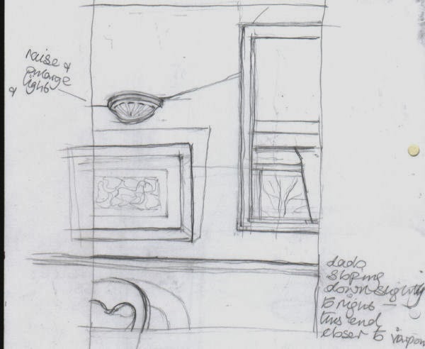
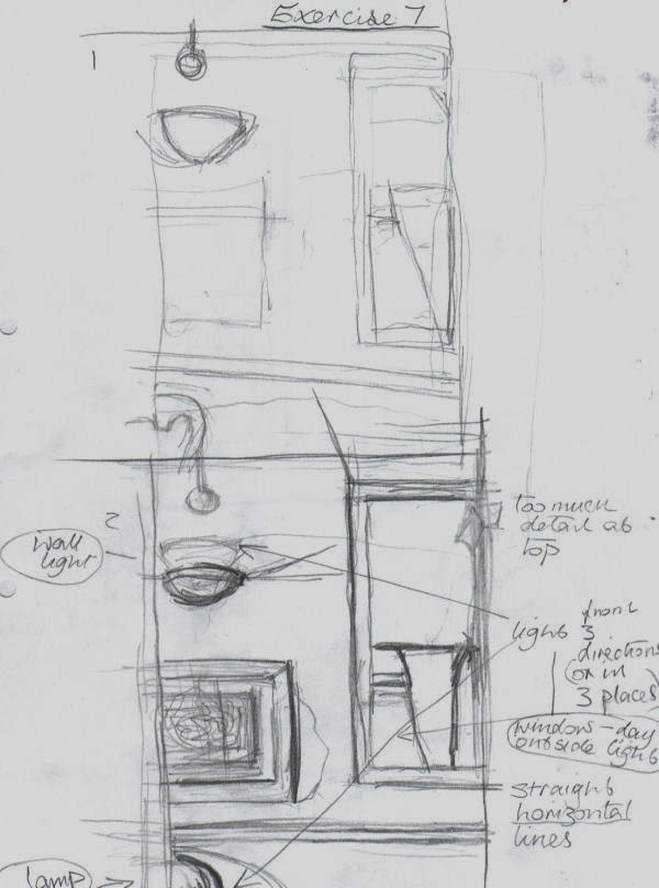
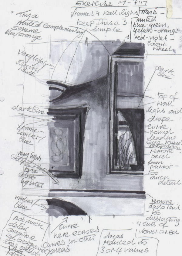
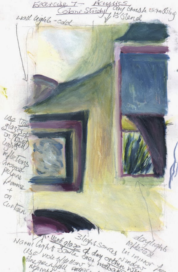
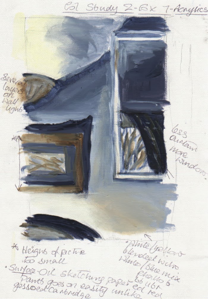
I began by studying several views in my house using a viewfinder to frame them from various angles and to zoom in and out. After tweaking a few elements within my view, of all of them this one appeared to offer the most possibilities. Unfortunately I temporarily lost my instructions for the exercise and the colour studies I made were probably rather more detailed than they should have been, though I think I did describe the objects with minimum detail I thought was necessary. The main concern was getting the colour palette to my liking. The colour study with the plainest palette seemed the most suitable, especially as there was already a lot going on in the lighting of the composition. It was basically a complementary scheme. For the palette I made three different darks – all ultramarine mixed with orange in various quantities. In certain places two, or all three of them were combined until I obtained a tone that looked comfortable in its location. As I progressed through the prep sketches I also moved objects around, adjusted their size and removed them altogether, as with the dado rail.


 Soon after I started the painting I began to realize that despite having thought that some colour sketches were too detailed, ironically they helped me to simplify things. I had quite adequate information from them and didn’t feel any need to also refer to a photograph. In fact if I had used a photograph I think I would have been tempted to put more detail into every element.
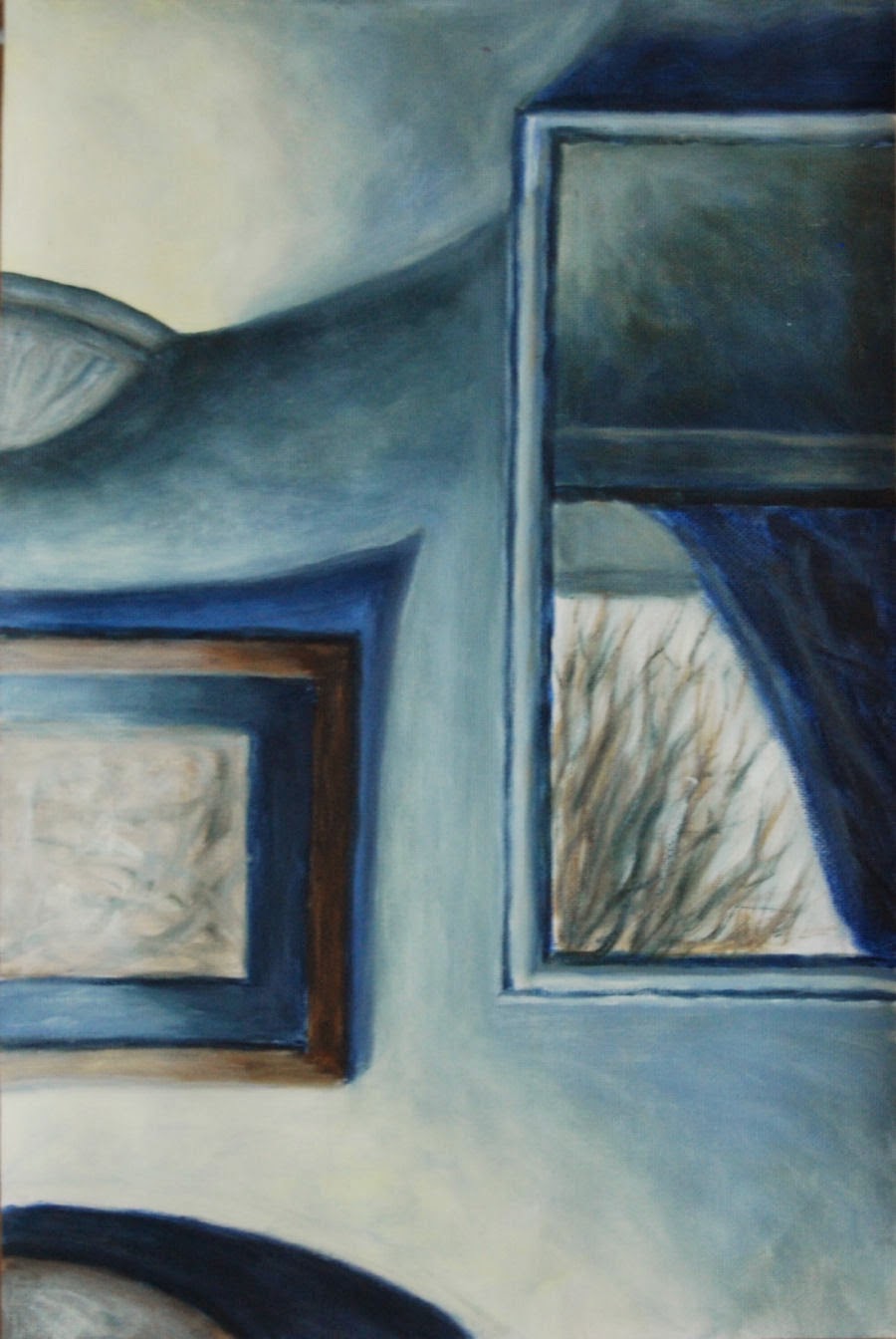
After experimenting with the lighting in various ways on the subject I eventually found the most pleasing light and dark balance by  directing it from a lamp on the bottom left – the only source not visible unlike the top left – wall light and the middle right  - reflection of daylight in a wall mirror.

I think the lighting in this composition makes it perhaps fairly unusual. Because the view is on a flat wall surface it could have lacked depth (I did try other viewpoints beforehand but none of them worked) but the view in the mirror helps to alleviate this. For the painting surface I used oil sketching paper, as I had for a colour study, as the acrylic paint goes on with comparative ease. The addition of a drying retarder made blending easy.

colour study 

colour study
 I played down certain detail in the picture to draw more attention to the view of the bare winter tree through window reflected in the mirror. I also like the repeating curves and shapes in this. The shadow above the picture points roughly towards the reflection, but is maybe a bit too pointed.


finished result - 
version 1

Redone - version 2


The first version(1) didn't go down too well with my tutor - I have to agree, it is frustrating that I couldn't see the faults myself, they look so obvious now. Although on plus side there were positive comments about the loose brush marks on the colour study/ies.

In view of the above, I attempted a complete new version (above). The composition was the same but larger. This time, as suggested by the tutor I made an effort to explore the brush marks and leave them visible as opposed to what I did in the first attempt. I allowed a mania for blending/smoothing them away to take over removing any previous potential for personality and basically becomes and exercise in neatness and tidiness. Although the gradations are smooth in the first version it has no liveliness. I have to admit it was a real effort to leave many of the visible brush marks alone. 
Though it appeared to work well in the preliminary stages, I found what complicated matters now was the shadow area above the chair at the bottom left contrasting extremely with the very  light/bright area above. After leaving it alone for a few days I blended it in with the light area above in pale white/yellow, scrubbing on some lighter tones to reduce the hardness and contrast. In this respect it worked but seemed to make other contrasting lights and darks in the picture more exaggerated, so I carefully toned many of the darkest darks down with a little medium to light tones. Hopefully this looks reasonably balanced now, and perhaps even a little painterly.


Tuesday, August 6, 2013

Assignment 3 Self Portrait

Arrangements in portraits are many and varied. They can range from a full figure, or a number of figures, to an extreme close up portion of a face. Described below are several that have helped to give me some inspiration for a self portrait and (hopefully) others in the future: 

Lucien Freud – Self portrait – Reflection with two children 1965. He must have painted this one from a high viewpoint with the mirror very low or even on the floor. He has portrayed himself as a huge domineering figure in relation to his own two tiny children at the bottom left; from this angle his domineering presence is further accentuated. The impression is one of him looking down at them while simultaneously looking at his own reflection in the huge mirror, perhaps a little anxiously. The two lamps, one above his shoulder and the other behind, give a sense that they are high above on the ceiling, contributing to the sense of scale. The colours, in muted, tones tend to add an air of brooding calmness.
http://www.wikipaintings.org/en/lucian-freud/reflection-with-two-children-self-portrait-1965

Freud - Man's Head - self portrait 1963. This is like a halfway house between his early and mature style. Thick buttery paint applied, without the gritty texture of later on. The paint - sensuous and smoothly flowing,  seeming to repeatedly encircle the face and background creating the impression of  turbulence . This negative space is carefully delineated against the face and neck making it more pronounced. Though the background contains mostly the midtones and colours used on the head and neck it has a life of its own. The whole thing has very tactile quality. Painting one's own face from this angle, with eyes looking downward from above, almost inevitably causes one to look a little arrogant, as I have discovered with my own self portrait in this assignment, yet the expression here also looks tired and slightly drawn.
http://www.wikipaintings.org/en/lucian-freud/man-s-head-self-portrait-1963
William Orpen - Self Portrait, Multiple Mirrors 1924.  There is a series of his self portraits displayed on the following linked web page, which were completed at different stages in his career. This particular one is situated roughly half way down the page: 
http://www.articlesandtexticles.co.uk/2006/06/26/painters-i-should-have-known-about-6-william-orpen-part-1/
Orpen's reflection recedes within multiple repetitions of the same mirror, until it almost disappears into the distant skyline, outside the open window behind. He was fond of using all sorts of tricks to created optical illusions in mind bending ways. 
The brushwork appears to have been applied quickly with some transparent washes in the lower half. I think the paint has been applied thickly on the main foreground face. At the same  time it has a certain luminosity. More attention seems to be drawn to this area because of the relatively large amount of detail and the pinky tones, contrasting with the green top.The sky in the background gives a feeling of airiness and space.


A Self Portrait
Thinking back to the early stages of this part of the course, when I tried out some exercises based on Emily Ball's book Drawing and Painting People a Fresh Approach, I was still hankering after trying a portrait or two in paint by using a roughly similar process. The head studies in this book are like nothing I've ever seen. At first glance I wasn't sure about the artwork in the - childlike, even primitive, but now this is what particularly attracts me to them,  they seemed to grow on me as I found out more about the thinking process behind them and corresponding techniques.
Here is an example of one in charcoal (below), in acrylic (right) and another of Vincent Van Gogh I tried out for myself:
The techniques used give extraordinary results to put it mildly - will have to work further on this....

Vincent Van Gogh - sorry Vincent


 In Jeffrey Camp's book - Paint a Manual of Pictorial Thought and Advice, a self portrait by Daniel Millar and the two self portraits by Lucien Freud (above) found the high viewpoints in the three paintings very intriguing, not to mention the brushwork is loose and free. The viewpoints were major factors in my decision to try out a similar angle; using myself as a model rather than another individual was relatively straightforward.

Mostly I chose a self portrait because the last one took me out of my comfort zone in the sense of having to scrutinize my own face at very close quarters, then transferring what I saw onto a surface with paint. I wanted to see if this time round the process would be any easier - it wasn't. Sketches didn't affect me the same way - I think it was the prolonged intensive study of a painting which made the difference. The other reason for a self portrait was having a captive model, so if there was any aspect I wanted to re-check I could easily do so. Otherwise, with another person, they would need to be present, or one would need good photograph/s to refer to, naturally these have their limitations.


another viewpoint
- tonal sketch
Also, I wanted to be more methodical than with some previous colour mixing tests with flesh tones. Two or three short videos on utube helped to steer me back in the right direction. One recommended just using three colours (including white), an earthy red and yellow ochre, pulling colours  into one another to get a full range of skin tones. From another a useful tip was to mix raw umber and ultramarine with white to make general grey tones to reduce the chroma of any mixes which appear too bright.  I found that this didn't really happen on this occasion apart from the rims of the eyes. Conversely a little cadmium red came in handy at times to brighten mixes or 'pinkify' them. These tips were particularly helpful.  I did add a touch of raw umber and ultramarine in various quantities, to thin mixtures of  white and burnt sienna around the outlines of the eyes to tone down. Glazes were also used in one or two other isolated places such as the eyebrows. I like the way the perspective has worked in the background. It plays an important part as it serves to extend the negative space into the distance, adding to the feeling of recession.

Summary
No tonal underpainting on this one - for a change. Proportions were a bit of a struggle in the initial stages, yet I did think I'd solved the conundrum before me until.....almost as soon as I'd finished the painting I realised there still was something wrong. The irony of it was that I think the rough colour study looks much better proportioned, yet no measurements were taken for this - just judged by sight.  I know looking up at the face through a mirror tilted at low angle wasn't exactly the easiest angle to use. But I went ahead with it because I wanted to attempt a different angle from previously, just to see what would happen.
 a colour study
I managed to spot about half way through that the eyebrows were too high, but even after moving the eyebrows down, something was still niggling away that seemed not quite right, yet I could't figure out what. Getting the proportions correct with figures and faces is crucial and when something is out it shows without necessarily identifying itself until later on - exactly what happened here with the eyebrows, but not with the lower face until it was too late to alter things. Despite taking comparative measurements of most areas, there was one I must have forgotten...when I compared by measuring the length of the neck to the face with my own reflection, I found that the lower half of the face is too short in relation to the neck and the upper half of the  head. I thought the neck was too long initially, but it seems to agree with the height of the upper half of the head. This is surprising because I still think it looks too long.  I got a photo taken of my head at the same angle and this helped to confirm things. I am quite irritated with myself for not spotting the discrepancy earlier. At least now I know where I went wrong. 
final painting
before alterations
The outlines of the eyes look too prominent - as if I'm wearing eye liner  which is not the case. It is just shadow, but despite repeated efforts to soften them with various glazes (as above) it isn't enough. And because they looked too light on the colour study I darkened them on the painting, but evidently went over the top. I think the angle of the spotlight on my face tended to iron out some wrinkles and other imperfections, which  is undeniably an aspect I'm in favour of, but admittedly, it is a little removed from reality. The colours are derived from the self portrait of Daniel Millar's. Though he seems to be a virtually  unknown artist I think he's used a great colour combination, giving off a mysteriously moody atmosphere - unfortunately I can't display it for copyright reasons. The brushwork contributes much to this. I think if there is anything else to recommend my own painting, apart from the background area, I think it is the light on the left side of the face, the texture and tones of the hair and the way tones on the lower part  and on the neck seem to swirl round in slightly abstract, rather than realistic way. 

Later alterations - the face is now better proportioned in relation to the neck. I gave the whole painting a makeover and there is now no area completely untouched by alteration or addition of some sort. The rims of the eyes have been softened. The background has been toned down, as advised by my tutor. The neck was too long so I raised the shoulders. I lowered forehead, widened the left nostril and narrowed the left curve of the chin, sketching in lightly with pencil.
The parts to be altered (or re-proportioned) I covered in white paint acrylic, then yellow ochre including the background. The skin tones were too yellow so I 'pinked' them up.
Alterations:
Eye rims - softened using small brush and mal stick with thinned white and yell ochre
Shoulders  re-painted, with burnt sienna and cadmium red.
For flesh tones used a base mix (or mass tone) of white/raw sienna and yellow ochre (touch). I managed to pick up some advice in this regard from an expert on the online forum Wet Canvas. Though I shortly after revised this as it was too yellow even minus the yellow ochre, so I added a small amount of raw umber to the raw sienna and white instead - this appeared to look more in tune with my own basic skin tone.  Following the information I also neutralized the tones under the nose and around the jaw area adding a tiny amount of a mixture of raw umber and black to the mass tone above. The cheeks, nose, lips and ears:
I mixed a touch of cadmium red with the mass tone. Under the chin - touches of alizarin crimson and viridian with the mass tone.
Final painting - post alterations
Note: On my previous attempt, because the warm light was making the flesh tints appear warmer I used an over predominance of yellow ochre in mixes, which include cad red, ultramarine and burnt sienna with white, hence my model (me) had quite a jaundiced look. The reflected light is a little confusing as well as adjacent colours - red  in the top, and green (background. The only reflections i could make out were red from the top onto the neck and lower face. There was no reflection of green as you would expect, because I exaggerated the background green. Hence I manufactured a subtle hint of it later on the skin. I added a retarder to most of the mixes to help prevent the paint drying up too quickly on the palette and so I could work with the paint longer on the painting surface - this helped enormously. I noticed at times, problems with the tonal ranges - often slightly too dark or light, the transitions were jolting. Fortunately I found a magic ingredient - matt gel medium. I didn't appreciate its capabilities at all beforehand, but found that it was very useful in making opaque paint more transparent and easier to blend. It was most useful for semi-transparent mixes used for subtle reflections i.e of the hair colour on parts of the face and neck. 
The light was confusing on the first portrait version. I could see this time that was there was in actuality a good deal of light reflection on the hair and the left side of the face. I lightened some of the hair with burnt sienna and cadmium red adding a little white later to the mix - gel medium added to this appeared to work well for subtle light reflections in the hair. The following glazes enhanced the light reflections on the face and neck and top:
rose pink (cadmium red/raw sienna/white), green (phthalo blue/cadmium red/yellow ochre) then cobalt blue/ yellow ochre - this glaze was thinner and included glazing medium (gloss). I found that the glaze medium was ideal for adding translucency and depth over previous glazes.
The slight changes of skin tone described above, for different areas of the face were something I was prepared to try out and it seemed to work on the whole, despite finding that I needed to alter the occasional small area and go over with a couple of slightly coloured glazes near the end.
I realize what a very subtle balance needs to be achieved with skin tones, for them to look true to the sitter's own and one often has to go through a good deal of trial and error to get there:  the end result (above right)