Search This Blog

Saturday, March 29, 2014

Exhibition: Analyzing Cubism, Crawford Art Gallery, Cork

'After Cubism painting will never be the same' Daniel-Henry Kahnweiler, who first exhibited the cubist work of Braque and Picasso. How true this was in the case of the development of modern painting in Ireland, becoming the dominant influence. Most early writing on Cubism was done by the Salon Cubists. Braque and Picasso did not associate themselves with this movement. The advance of Cubism opened a whole world of freedom, liberating many artists from former constraints.
However, it was late (the 1920s) before it took off in Ireland. Its development there, while related to its centre in Paris, was from a limited contact and was often characterized by a provincial style with local narrative and was, in many cases more representational. Cubism became widely regarded as the style that defined Modernism. Academie d'Andre Lhote was run by artists who followed on from Braque and Picasso and was the influence of most Irish artists involved in Cubism. Yet it was regarded as the most progressive of Parisian academies. It was based on structural methods rather than subject matter. But most Irish artists used traditional subject matter and used Cubist formulas only in a limited way. There was a distinct influence also of other movements such as Impressionism, Futurism and Fauvism. Of all the Irish painters who studied there only Evie Hone and Mainie Jellett were most noted for their originality, absorbing Cubist principles more fully.
Mainie Jellett http://www.crawfordartgallery.ie/pages/paintings/MainieJellet2.html
Evie Hone:
http://www.askart.com/AskART/photos/WHY20071126_5026/68.jpg

Cubism could be understood as deconstructing and rebuilding elements in another way. This exhibition focused on Cubism as it applied to artists in Ireland such as Evie Hone, Mainie Jellett, Mary Swanzy, Paul Egestorff and Elizabeth Rivers, Jack Hanlon, Norah McGuinness and May Guinness. I found it intriguing that works of their European tutors Albert Gleizes and Andre Lhote were also included, and shown alongside that of their pupils, demonstrating how they were influenced. The paintings on display ranged from quite representational to completely abstract in varying degrees. And this was further illustrated with examples of preliminary sketches or workbooks.
There was a list of important dates on display helping to put the featured artists and paintings within the broader context of the local and wider world. One criticism I had  was a virtual absence of work by Braque or Picasso, to help make comparisons, and what little was shown were minor works.
Also, it would have been nice to have more comprehensive information available without having to buy the catalogue.

To me the painting by Jack Hanlon, Still Life c. 1942-45, Oil on canvas, 52.5 x 71.5 cm  is one of the more representational examples of the exhibition. The elements are very recognisable, made up of geometric shapes. There is a hint of light and shadow for instance behind the large narrow necked vessel on the left, and on the onion to the lower right. Visible brushstrokes  appear applied quite loosely. The surface on which the objects stand look ambiguous and closer to Cubism. Saturated and muted hues through to greys are juxtaposed creating a lively atmosphere.
Please note: The only image of this painting I have located is in the exhibition catalogue, so unfortunately possible copyright restrictions prevent me from displaying it and neither can I provide a link as it is nowhere to be found online.
In its place I have supplemented it with another similar painting. It is located on the left hand side, second from top.
http://www.mutualart.com/Artist/Jack-P--Hanlon/67175238302D303D/Artworks?Params=3936382C43757272656E74506167652C312C31


Saturday, February 1, 2014

Exhibition Absence of Realism, Lavitt Gallery, Cork

This was a group exhibition of artists working in the abstract and semi abstract genre.
Displayed on the first floor of a small intimate gallery. While there was an absence of realistic description (as the exhibition title would infer) in any of the works, not all  were described as completely abstract - this was certainly true aswell. For example one artist (Wesley Triggs) described his work as having a sense of looking at something which is  familiar. Even so, it all kept one guessing, which I found compelling.
Carol Hodder's three paintings were predominantly dark with an impression of light emerging from, and described as having a connection with memory and place. In one such painting 'Stroke' it was possible to discern a figure veiled in light mist amongst the darkness, emitting a mysterious ephemeral atmosphere.
http://irishartscape.com/artists/details/51  Carol Hodder

Sabine Weissbech paintings were loose painterly semi-abstracted landscapes in acrylic. On close scrutiny there appeared a combination of layers of opaque and transparent, muted diluted opaque over thicker saturated opaques. Then there are more muted pale thicker opaques, some allowed to drip.  Particularly apparent in the overlayers are scraped and rubbed on paint, possible and process of adding and removing, I would guess with the help of painting knives or spatulas or some kind and large brushes.  Ethereal sketchy loose yet sensitive lines, drawn linear elements and perhaps scratching or 'scraffito' add a linear quality. It all culminates in an atmospheric feeling of natural elements.  
http://www.sabineweissbach.com/landscapes.html

Sam Curtin's work contained no hint of landscape and was very muted, monochromatic and minimal. The fleeting shapes of shadows etc are transformed into something more solid and permanent in the form of geometric shapes alongside and crossing over one another in diagonal directions. 
http://www.lavitgallery.com/page87.htm

I'm not sure if these oil paintings of Tom Climent's were on display at the time, although he is a gallery artist. They appeal to me due to the way geometric shapes are explored through the nature of paint application and colours, the combination of three dimensionality and flatness giving a sense of optical illusions.
http://tomcliment.com/2014/02/18/2013-2/

A general impression emanating  from the exhibition is that most of the paintings on view evoke the essence of landscape, or  aspects of it in one form or another, extracted sometimes from memories and imaginary places in time, with only one or two exceptions. I have found from reading artist's statements over time, this seems to be a popular theme in many genres.


Thursday, January 16, 2014

Assignment 4 - large landscape VERSIONS 1 AND 2

Version 1 (not for Assessment)
Before I had finished the previous exercise (from doing a few sketches and studying the various photos of it) I had decided that I wanted to paint a view of the local field where the barn resides. This is mostly because I estimated that the view contains a range of elements waiting to be exploited, such as: aerial and linear perspective, a feeling of space, contrasting textures, an obvious focal point and fundamentally, a well arranged composition. Also, I adjusted certain features slightly. As there is quite a range of textures, I reckoned I could utilize a few different techniques I had tried out in previous exercises as mentioned above, particularly the rocks in Hard or soft landscape - a good candidate for using a knife/cards, Aerial Perspective – effects of and Painting outside – visible brushstrokes. I added some course texture paste to the list of materials for some clumps of long grass in the foreground.

Oil paint was the medium of choice for this, as I found it very amenable to building up textures for the rocks of Exercise 2: Hard or soft landscape and I like its thick buttery texture. Also I wanted try working in oils wet on wet again, after Aerial perspective, Painting outdoors and Squaring up. Although I did find it quite challenging (sometimes impossible) to avoid ending up with blended mud, this is something I want to master, if at all possible – easier not to use one complementary colour over another. Then again, another advantage of oils is having plenty of time to blend paint. Whether this subject would lend itself well to a large scale as this Assignment required I wasn’t sure of.
So, on the surface of an A1 piece of mountboard I went ahead with the above plans and applied a coat of mid tone pink for the ground and used acrylics for the underpainting. The paint certainly didn’t stretch very far on such a large area. I estimated I would be able to cover large areas more easily with oils, particularly on this type of subject, with so many elements and nuances. The basic colour palette was cobalt blue, napthol crimson, cadmium red, yellow ochre, chrome orange, naples yellow and titanium white. Although I wasn’t concerned about getting an exact reproduction of the existing shades, as I understand these can vary anyway depending on different factors ie they can look totally different from one moment to the next when the weather is changeable, altering the light from one moment to the next,  which it was. Yet it still took me some time to find what I thought was a convincing hue for the field stubble. In the end I settled on using several similar colours and values and by some freak accident it seems to have given it a little more interest than otherwise. As it was a showery changeable day the contrasts were quite strong much of the time. The finished painting seems to have captured a more settled moment however. The middle and background areas in places became quite blended, but I think they work on the whole, as they are not fighting with fussy areas like the foreground.
painting part finished in acrylics

There was a lot of contrasting detail in front of the barn, so I toned down the darks and blended the edges further, as I did with the field on the right of the barn. I was mindful of the need to also warm up the colours and increase contrast towards the foreground, but the rear mid ground trees on the right are quite dark, though I have made them much lighter than they looked in reality. I got a bit ‘bogged down’ in the field to the left of the barn and with the perspective of the stripy field patterns. Even now they don’t look as natural as those in the sketches. The barn contrasts strongly with the sky and the dark sharp edge of the bluish bush to the right contrasts with the orange of the field. Neither did I place the barn as far over to the left as in the sketches, so had more space to fill – and somehow I got confused with it. This wasn’t the only place. Other challenging aspects were: the puddles of water and mud on the track and the centre margin of the track and the rough grass to the right. I scraped all the paint off these two areas at one point. When I tried them again I used a more methodical approach and a delicate touch. It made all the difference, the next day when I wasn’t tired and running out of patience – a good lesson.
First attempt - finished

.
In this part of the course I didn’t find any of my attempts particularly groundbreaking as I was hoping for, but I can’t expect miracles.

There are certain techniques I used in previous paintings which seem to work well ie. knives and cards for the rocks in the Hard or soft landscape exercise, the scumbling on the windowsill in the first exercise: View through a window, the glow of the sunlight against the dark trees in Mood and Atmosphere, the intentionally ambiguous perspective in Squaring up, a colour study from Aerial perspective – the clouds and foreground texture.
Artists who have influenced my approach in this part (4) are fairly numerous, but amongst the most notable ones are: Emil Nolde, Van Gogh, Gustav Klimt and more  contemporary artists are: Mary Canty, Richard Clare, Stan Smith, Richard Pikesley http://www.russell-gallery.com/richardpikesley2009/images/27%20-%20Summer%20Evening,%20West%20Bay%20-%204x13.jpghttp://www.russell-gallery.com/richardpikesley2009/images/27%20-%20Summer%20Evening,%20West%20Bay%20-%204x13.jpgPikesley http://www.pinterest.com/pin/117375134008414817/
and Al Gury. http://www.algury.com/?cat=1 
A common characteristic of most the landscapes by these artists would be their expressiveness - loosely painted and textural marks. Some of them would use knives, cards, fingers and other implements for certain passages. Their palettes vary from vivid to muted. I like both, it depends on a range of factors such as subject and technique used.

In the future I would like to try out more painting using alternative materials, collage, abstracts and painting with materials like those mentioned already.  I would particularly like to try knives and cards for woodland paintings. Al Gury’s woodland paintings partly inspired this idea. Also to try the technique of scraping back with oils to produce misty effects, similar to those in Tonalism. Two particular artists whose techniques I would like to try and emulate are Mary Canty in her ability, with the help of her brushwork, to convey an essence of a place rather than be very descriptive:  http://hammondgallery.com//artist-information/mary-canty
and Emil Nolde – using vivid colours to try some landscapes similar to those I did in the Aerial perspective exercise.

Finally, I think I have learned a lot from this experience and particularly from the response of my tutor.
In short, I should now realize that much work on a painting doesn't necessarily bring appropriate reward, sometimes less is more....this is connected to the painting in its early stages (photo 1 above) - lesson learned? I certainly hope so!

Version 2 - for Assessment
This second attempt was another version of the same scene. Ironically, in this attempt at Assignment 4 (below),  I think I was unconsciously influenced much more by some of the artists I mentioned above than in the first attempt. Anselm Keifer's paintings of landscapes such as Nigredo, 1984 
http://www.arthistory.cc/auth/kiefer/nigredo.jpg
had quite a big part to play. Of course he is well known for his extensive use of fillers - in his paintings I must stress. His preferred choice of materials would often include lead, clay, straw and wires to name but a few...I made use of rough texture producing materials - sand, sawdust, cement dust mixed with pva glue and heavy gel medium. Tools used to apply them were mostly plastic cards and painting knives as well as bristle brushes for some of the later stages, mainly for glazes in parts of the track and the odd smaller detail here and there.
sketch 1 & 2

sketch 3


This time I used a portrait format intending to make the track appear longer and more dominant. The background was again red to contrast with the sky and fields so as to set up some chromatic tension.
For the early stages of the sky I applied the very light blues around the horizon line just above the mountains which I had already applied beforehand.
I took care to model the barn with defined texture and the sky and field surfaces so as to create volume and depth; plastic cards worked very well for this. To vary the textures I used different thicknesses and combinations of textural materials with the glue. Had to be mindful of not completely covering the red background while finding a balance between blandness, fussiness and monotony. Sometimes I covered too much of the red ground, so I scraped away a little textured paint to bring back its visibility.The colour and tonal combinations of the foreground of the track proved most challenging in this regard. I went over and over with thick opaque mixes and thin glazes in places - a delicate balance. I used a bristle brush, floating lightly over the ridges of thick textures with a little paint on the side of a flat bristle brush; it had more flexibility than a knife or card and helped to break up large areas of uniform colour.

The barn was relatively larger than the barn in the first painting, giving the illusion of it being closer, with more impact. At the same time, this illusion seems to be countered by the long narrowing perspective of the farm track leading towards it.
I later went back to the sky, adding more textural variety with different fillers, including heavy gel medium mixed with paint, which still has plenty of body but is smoother and easier to manipulate than the more gritty fillers. The paint this time was dulled down to blue greys with more raw umber. Burnt sienna was used again very sparingly on the mountains.
I am still a little concerned about the colours in the sky, I think they might still be a bit too blue, although this time it was a warm sunny late spring day rather than mid winter - as in the first version. I dulled down what I could see with ultramarine and phthalo blue with burnt umber,  but it does still seem to look a bit bright. Cadmium yellow was mixed with the blues, raw and burnt umbers to make varied greens. The barn is a mixture of burnt sienna and cadmium red. This time I think the barn has worked much better; it looks more ramshackle than the first and although rather large, I think it sits more comfortably in its environment. The look of movement set up in the clouds and the  ridges of parallel lines in the field help to add dynamism and depth.

Second version - for Assessment Ironically, in my second attempt at Assignment 4,  I think I was unconsciously influenced  more than in the first, by some of the artists I mentioned above


Sunday, January 5, 2014

Exercise 9 Working from a photograph

Version 1 - not for assessment.
For an increasingly irritating amount of time I was looking for a photo to use. Nothing I saw seemed ‘quite right’ – trees in the mid ground or hills/mountains in the background. Ironically after all the searching round I settled on a view of a field just next to my house. It appeared to contain all the right elements. The photo is a few years old from a time when there were fence posts receding to the mid ground. These have now disappeared and the track is now more well used and worn. The field is all crop stubble, whereas it was pastureland before. Now I have plenty photos of both of views, taken from various angles.
 Not long after, I found another photo I wanted to try, from a newspaper.  Its allure was the dark silhouetted trees and buildings, but most of all the mist.


This looks like a field containing a crop of some kind, so I mixed dried crushed leaves with pva and applied these to the foreground area for texture and thinner mixture in middleground field and the line of trees. If there are any leaves on the trees, the leaves echo probably these. I took a little used stay wet palette paper with dried on paint and stuck these down for some texture in the trees.
I tried to break away from the original photo by cropping it with a viewfinder and masking off the area I decided to use.

version 1
Just by using sketches, I couldn’t seem to obtain satisfactory results with from the misty look. I suggested faint directional tracks like those on the first sketch, these weren’t in the photo but they looked out of place. So, I felt compelled to keep referring back to the photo to try and work out where I was going wrong, adding glaze after glaze, over the opaque paint base, scumble after scumble, rubbing some back with a rag just before dry, but none appeared to solve things. Funnily enough, after the point I think may be beyond repair I discovered Tonalism, but all the examples I found were done using oil paints. I may make a further attempt at improving it after some thinking time has passed.

I regretted slightly that I didn't choose an oil painting medium as a base and oil paints over the top, as I think the medium with the oil paint would be more conducive to creating a misty atmospheric effect. This is something I will have to try out on another occasion.


Version 2 -assessment
Two colour sketches
The reference photo for this as taken at a warmer time of year on a sunny day. It is a view of silage bales in a nearby field. This was the first painting I did totally using knives. I kept to a strictly limited palette and quite small surface dimensions because of the large amount of paint needed for each colour. This can also create with adequate room for mixing on the palette itself. I usually find I need at least two large tear of palettes. I also wanted to focus on practicing knife techniques here rather than worry too much about the colour palette. I found this to be one of the more enjoyable paintings. One major fault is the aerial perspective I think is lost a little due to the darkness of the distant mountains against the deep yellow next to it across the middle distance. However, I think the linear marks of the field patterns help to balance this out to some degree, lending perspective and give a look of recession into the far distance.
Changes:
As the sky was very blue all the way to the horizon, I took the advice of my tutor again and practised with some quick studies of skies as loosely as I could allow myself. Colours used cobalt blue, then prussian blue, both mixed with  a little burnt umber, gradually adding more whit approaching the horizon and a little yellow ochre - this was added to reflect the ochres of the earth tone in the field stubble. The mountains were very dark so I lightened them a little with some sky tones and to give them light reflection from the sky. This, and the gradation in the sky gave the background further depth and recession. The touch of yellow ochre has a warming effect without advancing unduly. The white, yellow ochre and prussian blue produced  attractive muted hues, compared to ultramarine used alone for instance, which is very intense.


finished version before alterations to the sky


After alterations to sky - there 
is quite a lot of light reflection off this photograph;
I don't think the sky is so bright in actuality.
The photo was dulled
down slightly


Friday, December 20, 2013

Exercise 8 Squaring up

Squaring up
I wanted to use a photograph containing linear perspective to find out if using a grid would make it easier to obtain accuracy. I tried this out with a black and white photo of an art installation, part of which I had cropped from an art journal. I also replaced one or two elements with others taken from another part of the complete photo.


By dividing the height into 10 and the width into 8 equal sized squares and numbering them, it helped me enormously to follow and decide what goes where. It was especially useful to obtain accuracy in linear perspective, though I didn’t get too worried about placing everything in exactly the same place as in the photo.


Friday, December 6, 2013

Exercise 7 Painting from a working drawing

linear sketch 1
Painting from a working drawing
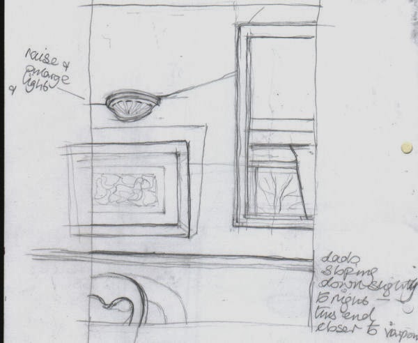
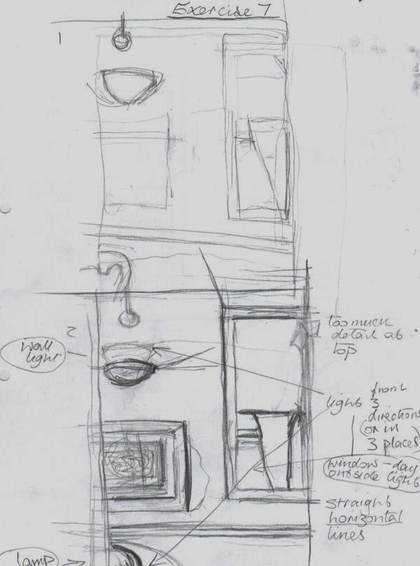
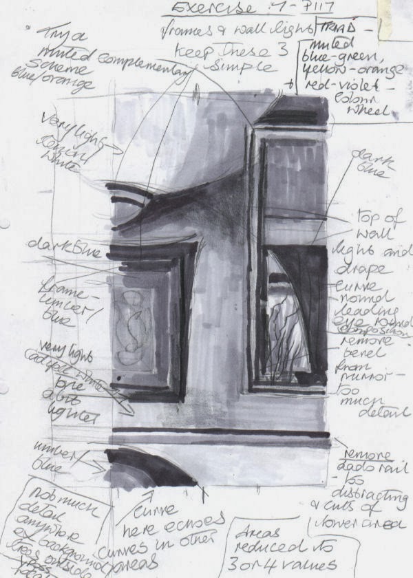
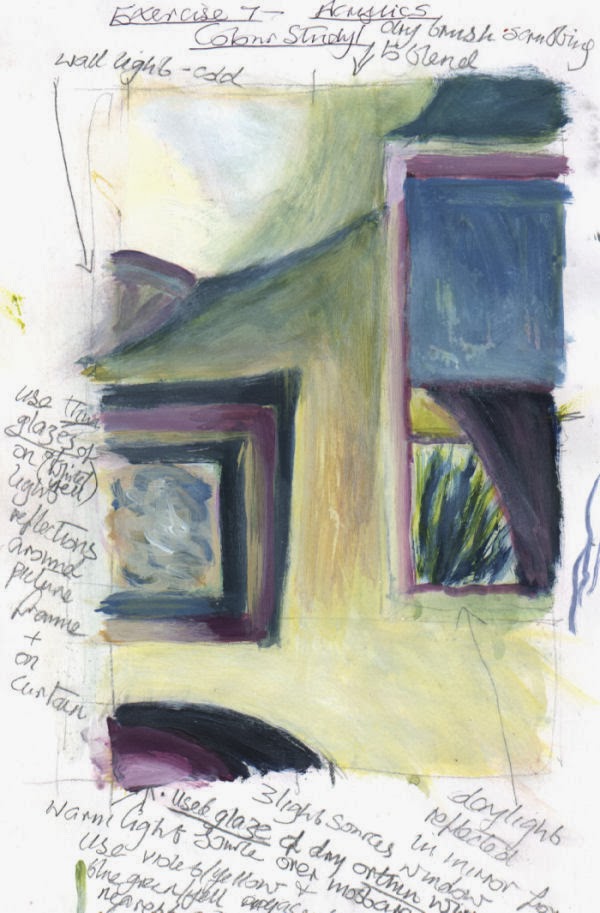
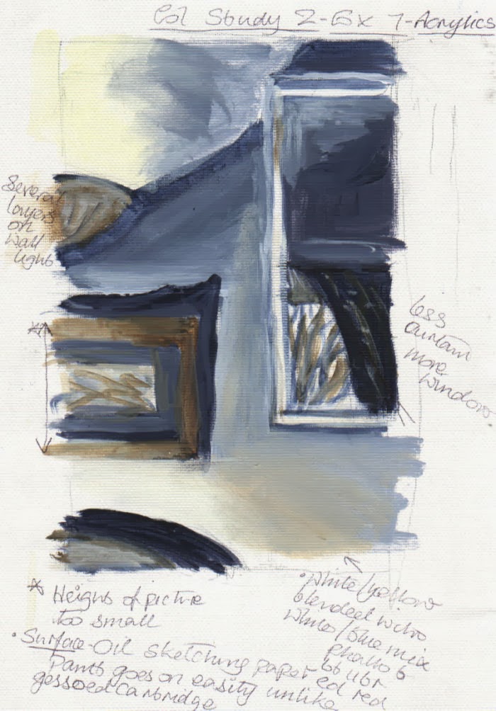
I began by studying several views in my house using a viewfinder to frame them from various angles and to zoom in and out. After tweaking a few elements within my view, of all of them this one appeared to offer the most possibilities. Unfortunately I temporarily lost my instructions for the exercise and the colour studies I made were probably rather more detailed than they should have been, though I think I did describe the objects with minimum detail I thought was necessary. The main concern was getting the colour palette to my liking. The colour study with the plainest palette seemed the most suitable, especially as there was already a lot going on in the lighting of the composition. It was basically a complementary scheme. For the palette I made three different darks – all ultramarine mixed with orange in various quantities. In certain places two, or all three of them were combined until I obtained a tone that looked comfortable in its location. As I progressed through the prep sketches I also moved objects around, adjusted their size and removed them altogether, as with the dado rail.


 Soon after I started the painting I began to realize that despite having thought that some colour sketches were too detailed, ironically they helped me to simplify things. I had quite adequate information from them and didn’t feel any need to also refer to a photograph. In fact if I had used a photograph I think I would have been tempted to put more detail into every element.
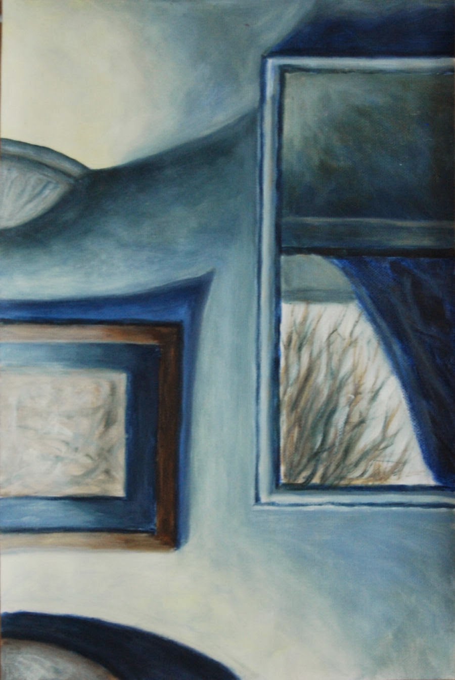
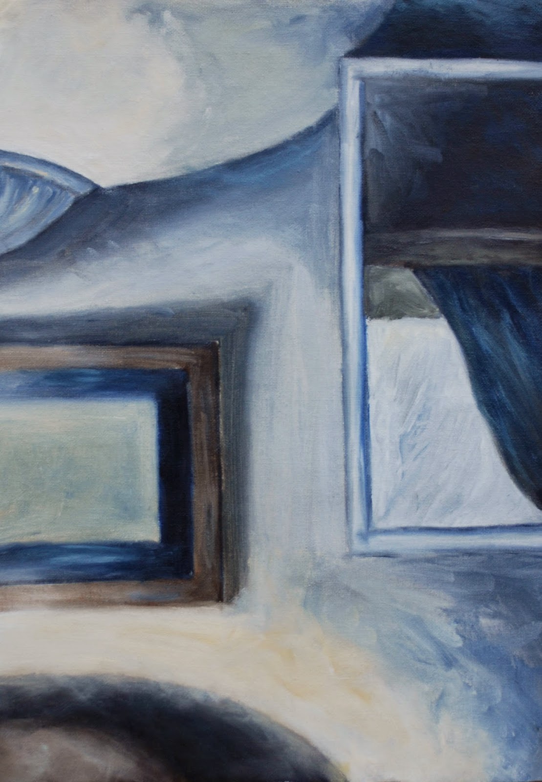
After experimenting with the lighting in various ways on the subject I eventually found the most pleasing light and dark balance by  directing it from a lamp on the bottom left – the only source not visible unlike the top left – wall light and the middle right  - reflection of daylight in a wall mirror.

I think the lighting in this composition makes it perhaps fairly unusual. Because the view is on a flat wall surface it could have lacked depth (I did try other viewpoints beforehand but none of them worked) but the view in the mirror helps to alleviate this. For the painting surface I used oil sketching paper, as I had for a colour study, as the acrylic paint goes on with comparative ease. The addition of a drying retarder made blending easy.

colour study 

colour study
 I played down certain detail in the picture to draw more attention to the view of the bare winter tree through window reflected in the mirror. I also like the repeating curves and shapes in this. The shadow above the picture points roughly towards the reflection, but is maybe a bit too pointed.


finished result - 
version 1

Redone - version 2


The first version(1) didn't go down too well with my tutor - I have to agree, it is frustrating that I couldn't see the faults myself, they look so obvious now. Although on plus side there were positive comments about the loose brush marks on the colour study/ies.

In view of the above, I attempted a complete new version (above). The composition was the same but larger. This time, as suggested by the tutor I made an effort to explore the brush marks and leave them visible as opposed to what I did in the first attempt. I allowed a mania for blending/smoothing them away to take over removing any previous potential for personality and basically becomes and exercise in neatness and tidiness. Although the gradations are smooth in the first version it has no liveliness. I have to admit it was a real effort to leave many of the visible brush marks alone. 
Though it appeared to work well in the preliminary stages, I found what complicated matters now was the shadow area above the chair at the bottom left contrasting extremely with the very  light/bright area above. After leaving it alone for a few days I blended it in with the light area above in pale white/yellow, scrubbing on some lighter tones to reduce the hardness and contrast. In this respect it worked but seemed to make other contrasting lights and darks in the picture more exaggerated, so I carefully toned many of the darkest darks down with a little medium to light tones. Hopefully this looks reasonably balanced now, and perhaps even a little painterly.


Saturday, November 30, 2013

Exercise 6 Painting a landscape outside

Painting a landscape outside

On thinking about where to go and what kind of view to use for this painting:
I wanted a location which would be sheltered. As it would most likely be during November when I did the outdoor painting, I took into consideration whether it would sheltered from wind and rain and if isolated and quiet, or busy and noisy. As it happened, I was fortunate enough to spot a location while out walking one day September/October. There were good open views on the side of a haill . it was elevated above a valley, yet sheltered, as surrounded by trees on three sides. It was a quitet spot and there were two long benches end to end. I wasn’t likely to be disturbed by passers-by, especially if I chose a week day.
sketch 1
As far as equipment went I didn’t possess any kind of easel for outdoor painting, so I did a little research on them in books and online. Initially I considered a sketching easel but I found the relatively high price and weight rather off putting. I was more concerned about having something much more maneuverable as well as having a box for storing materials. Fortunately I found the item to meet my preferred criteria when I spotted pochade boxes in a book ‘Oils Workshop’ by Richard Pikesley. In many respects these are designed to be balanced on the knees as they are not self supporting.  However, when doing a comparison between the two it was an easy decision to opt for the latter. Since I would need to walk up quite a steep incline for about 15 to 20 minutes there was no competition really.  Pochade boxes also have the advantage of containing slots in the lid where several painting boards can be stored behind one another with a gap between them.
During my outing to do the painting I found it was fairly easy to transport all the equipment I needed with the assistance of a small rucksack. Just before setting off I discovered that a container of turps had leaked all over the bottom of the bag so it was transferred to another container in kitchen paper and a thick plastic bag.
Firstly I took a few photographs to help me frame the views in one way, then used my viewfinder to help me find views from which I made three sketches from varying angles.
I also used them to zoom the views in and out a little. It was a fresh windy day, but fairly overcast and the sun was shining intermittently from my left. Initially I tried a low horizon line, but raised it after realizing that the sky on that day was relatively uninteresting compared to the ground: hills down to the valley and upwards again to the stone and earth banking just a couple of metres in front to me. So, after the third sketch I decided to raise the horizon line.
sketch 3
outdoor painting
The view that I chose to do was similar to the third sketch, as it seemed to have a good range of interesting features, while not too fussy. After outlining roughly the largest shapes in thin paint I used undiluted paint to lay in the large masses.  There wasn't much contrast of light and shade due to the weather being quite overcast. It wasn't too difficult to make some out on the foreground wooden posts, banking and trees, but I had to half close my eyes, looking hard to pick out the value changes in other areas. I rearranged and altered some of the existing elements to suit my desired composition. I didn’t want to take more than an hour painting, partly because there was the danger of it looking too laboured if I continued beyond a certain stage. It wasn’t such a difficult decision to make as I started to feel the cold and knew before long my hands would be numb, even though I was wearing thin woolly gloves. In total I was there for 1.5 hours, including making the three sketches and a painting. When I got home and looked over the photos I had taken while there, I was surprised to see how much the light had changed during the time as I didn’t notice much then. I felt that the painting looked unfinished, like a quick study. In fact that’s what it was, but it had taken slightly longer – about 30 to 40 minutes.


second version painted indoors
I went ahead with a second version as I had a hankering to try to see how much progress I could make with a longer version based on the first. The second version took a bit longer to do – about two hours. Even then I had omitted a lot of detail and moved some elements around and left out the wooden posts in the foreground. It turned out that I went back to it a couple of days later to finish the detail in the stones because I had been getting the wet on wet paint turning into a muddy mess. I also added further shadows to the lower clouds, and later realized they became too heavy looking.  I should have left them as they were beforehand..