Search This Blog

Friday, December 20, 2013

Exercise 8 Squaring up

Squaring up
I wanted to use a photograph containing linear perspective to find out if using a grid would make it easier to obtain accuracy. I tried this out with a black and white photo of an art installation, part of which I had cropped from an art journal. I also replaced one or two elements with others taken from another part of the complete photo.


By dividing the height into 10 and the width into 8 equal sized squares and numbering them, it helped me enormously to follow and decide what goes where. It was especially useful to obtain accuracy in linear perspective, though I didn’t get too worried about placing everything in exactly the same place as in the photo.


Friday, December 6, 2013

Exercise 7 Painting from a working drawing

linear sketch 1
Painting from a working drawing
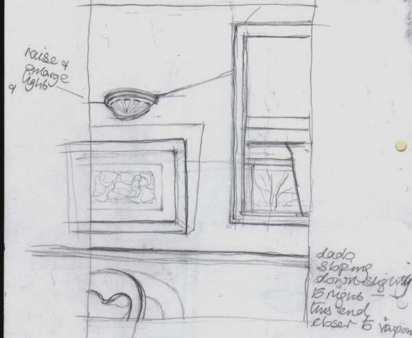
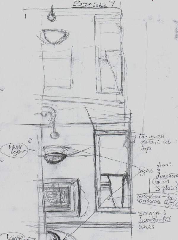
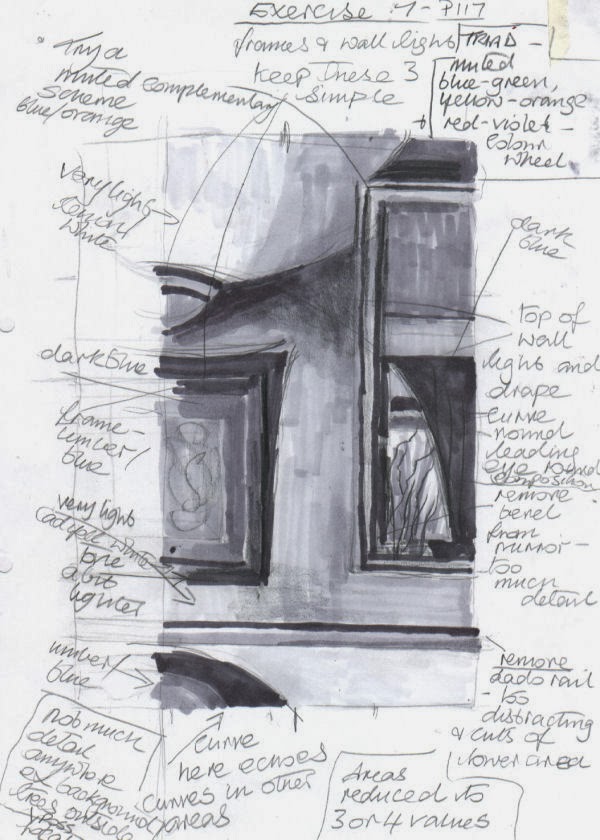
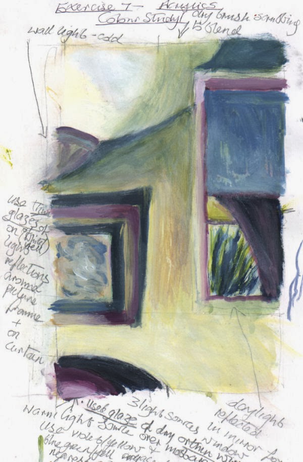
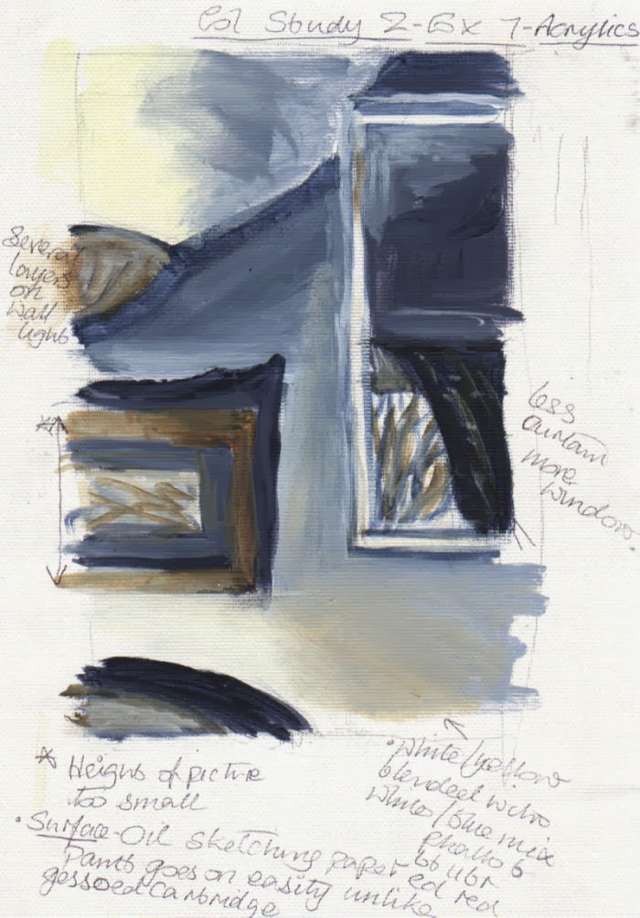
I began by studying several views in my house using a viewfinder to frame them from various angles and to zoom in and out. After tweaking a few elements within my view, of all of them this one appeared to offer the most possibilities. Unfortunately I temporarily lost my instructions for the exercise and the colour studies I made were probably rather more detailed than they should have been, though I think I did describe the objects with minimum detail I thought was necessary. The main concern was getting the colour palette to my liking. The colour study with the plainest palette seemed the most suitable, especially as there was already a lot going on in the lighting of the composition. It was basically a complementary scheme. For the palette I made three different darks – all ultramarine mixed with orange in various quantities. In certain places two, or all three of them were combined until I obtained a tone that looked comfortable in its location. As I progressed through the prep sketches I also moved objects around, adjusted their size and removed them altogether, as with the dado rail.


 Soon after I started the painting I began to realize that despite having thought that some colour sketches were too detailed, ironically they helped me to simplify things. I had quite adequate information from them and didn’t feel any need to also refer to a photograph. In fact if I had used a photograph I think I would have been tempted to put more detail into every element.
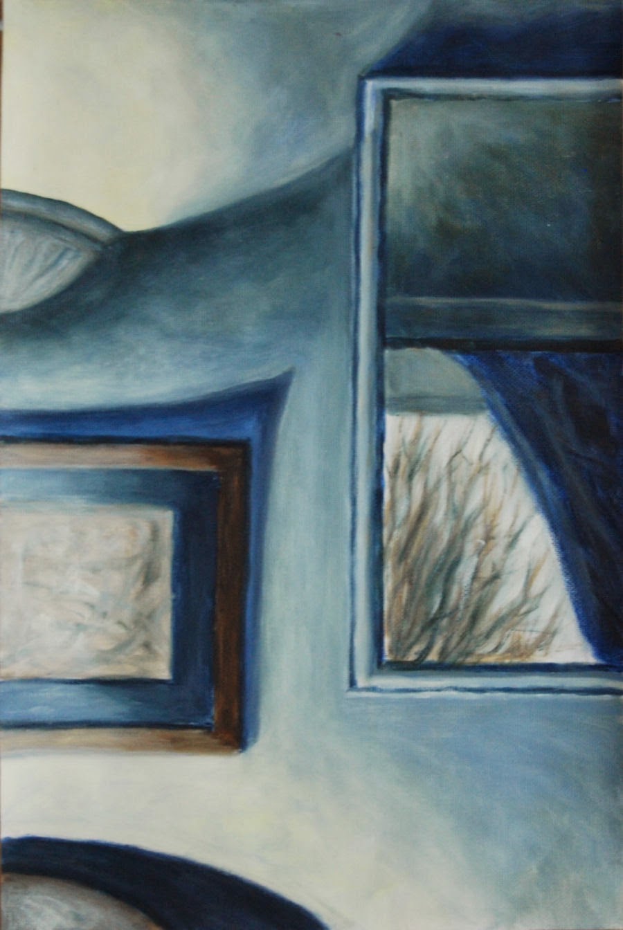
After experimenting with the lighting in various ways on the subject I eventually found the most pleasing light and dark balance by  directing it from a lamp on the bottom left – the only source not visible unlike the top left – wall light and the middle right  - reflection of daylight in a wall mirror.

I think the lighting in this composition makes it perhaps fairly unusual. Because the view is on a flat wall surface it could have lacked depth (I did try other viewpoints beforehand but none of them worked) but the view in the mirror helps to alleviate this. For the painting surface I used oil sketching paper, as I had for a colour study, as the acrylic paint goes on with comparative ease. The addition of a drying retarder made blending easy.

colour study 

colour study
 I played down certain detail in the picture to draw more attention to the view of the bare winter tree through window reflected in the mirror. I also like the repeating curves and shapes in this. The shadow above the picture points roughly towards the reflection, but is maybe a bit too pointed.


finished result - 
version 1

Redone - version 2


The first version(1) didn't go down too well with my tutor - I have to agree, it is frustrating that I couldn't see the faults myself, they look so obvious now. Although on plus side there were positive comments about the loose brush marks on the colour study/ies.

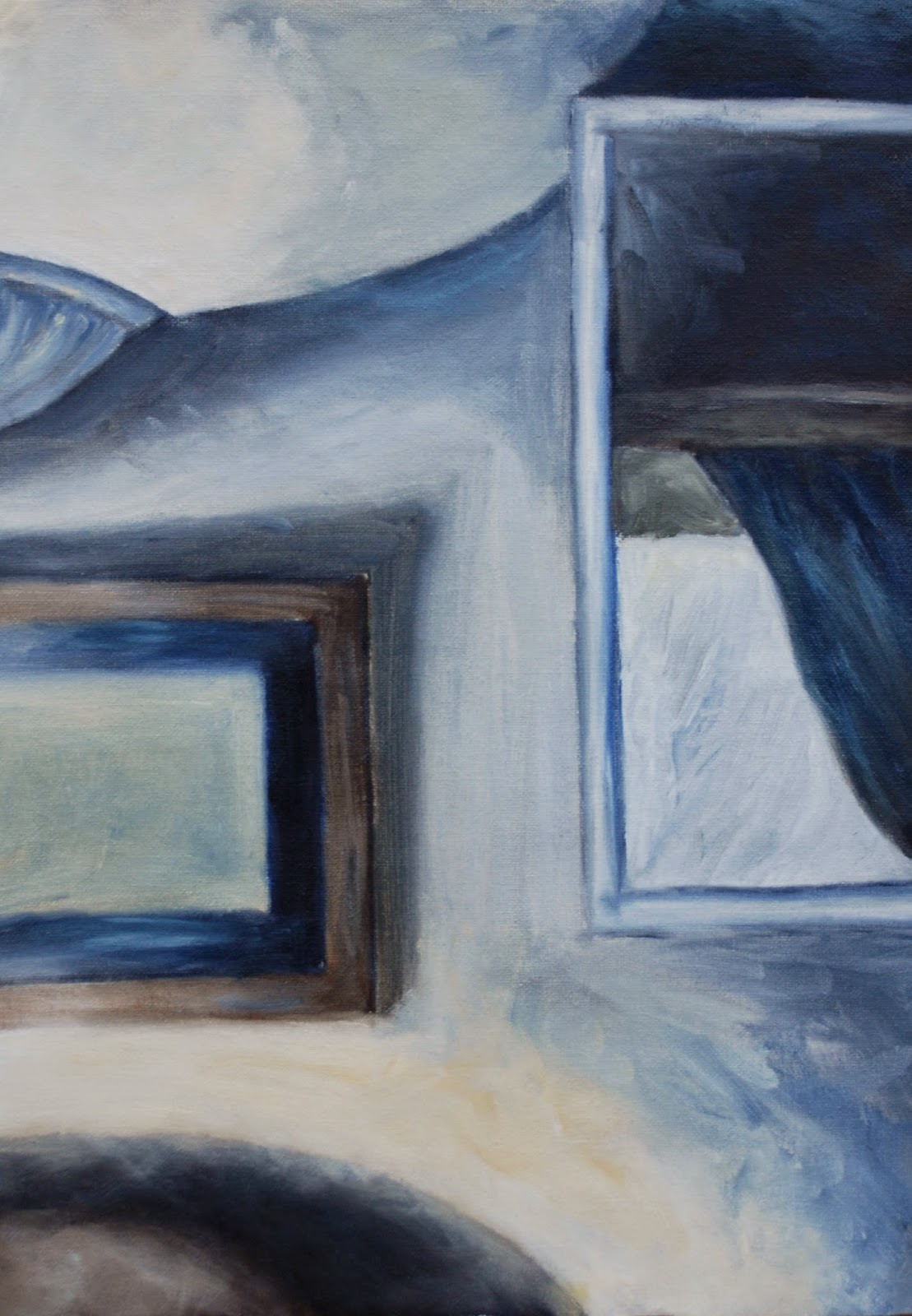
In view of the above, I attempted a complete new version (above). The composition was the same but larger. This time, as suggested by the tutor I made an effort to explore the brush marks and leave them visible as opposed to what I did in the first attempt. I allowed a mania for blending/smoothing them away to take over removing any previous potential for personality and basically becomes and exercise in neatness and tidiness. Although the gradations are smooth in the first version it has no liveliness. I have to admit it was a real effort to leave many of the visible brush marks alone. 
Though it appeared to work well in the preliminary stages, I found what complicated matters now was the shadow area above the chair at the bottom left contrasting extremely with the very  light/bright area above. After leaving it alone for a few days I blended it in with the light area above in pale white/yellow, scrubbing on some lighter tones to reduce the hardness and contrast. In this respect it worked but seemed to make other contrasting lights and darks in the picture more exaggerated, so I carefully toned many of the darkest darks down with a little medium to light tones. Hopefully this looks reasonably balanced now, and perhaps even a little painterly.


Saturday, November 30, 2013

Exercise 6 Painting a landscape outside

Painting a landscape outside

On thinking about where to go and what kind of view to use for this painting:
I wanted a location which would be sheltered. As it would most likely be during November when I did the outdoor painting, I took into consideration whether it would sheltered from wind and rain and if isolated and quiet, or busy and noisy. As it happened, I was fortunate enough to spot a location while out walking one day September/October. There were good open views on the side of a haill . it was elevated above a valley, yet sheltered, as surrounded by trees on three sides. It was a quitet spot and there were two long benches end to end. I wasn’t likely to be disturbed by passers-by, especially if I chose a week day.
sketch 1
As far as equipment went I didn’t possess any kind of easel for outdoor painting, so I did a little research on them in books and online. Initially I considered a sketching easel but I found the relatively high price and weight rather off putting. I was more concerned about having something much more maneuverable as well as having a box for storing materials. Fortunately I found the item to meet my preferred criteria when I spotted pochade boxes in a book ‘Oils Workshop’ by Richard Pikesley. In many respects these are designed to be balanced on the knees as they are not self supporting.  However, when doing a comparison between the two it was an easy decision to opt for the latter. Since I would need to walk up quite a steep incline for about 15 to 20 minutes there was no competition really.  Pochade boxes also have the advantage of containing slots in the lid where several painting boards can be stored behind one another with a gap between them.
During my outing to do the painting I found it was fairly easy to transport all the equipment I needed with the assistance of a small rucksack. Just before setting off I discovered that a container of turps had leaked all over the bottom of the bag so it was transferred to another container in kitchen paper and a thick plastic bag.
Firstly I took a few photographs to help me frame the views in one way, then used my viewfinder to help me find views from which I made three sketches from varying angles.
I also used them to zoom the views in and out a little. It was a fresh windy day, but fairly overcast and the sun was shining intermittently from my left. Initially I tried a low horizon line, but raised it after realizing that the sky on that day was relatively uninteresting compared to the ground: hills down to the valley and upwards again to the stone and earth banking just a couple of metres in front to me. So, after the third sketch I decided to raise the horizon line.
sketch 3
outdoor painting
The view that I chose to do was similar to the third sketch, as it seemed to have a good range of interesting features, while not too fussy. After outlining roughly the largest shapes in thin paint I used undiluted paint to lay in the large masses.  There wasn't much contrast of light and shade due to the weather being quite overcast. It wasn't too difficult to make some out on the foreground wooden posts, banking and trees, but I had to half close my eyes, looking hard to pick out the value changes in other areas. I rearranged and altered some of the existing elements to suit my desired composition. I didn’t want to take more than an hour painting, partly because there was the danger of it looking too laboured if I continued beyond a certain stage. It wasn’t such a difficult decision to make as I started to feel the cold and knew before long my hands would be numb, even though I was wearing thin woolly gloves. In total I was there for 1.5 hours, including making the three sketches and a painting. When I got home and looked over the photos I had taken while there, I was surprised to see how much the light had changed during the time as I didn’t notice much then. I felt that the painting looked unfinished, like a quick study. In fact that’s what it was, but it had taken slightly longer – about 30 to 40 minutes.


second version painted indoors
I went ahead with a second version as I had a hankering to try to see how much progress I could make with a longer version based on the first. The second version took a bit longer to do – about two hours. Even then I had omitted a lot of detail and moved some elements around and left out the wooden posts in the foreground. It turned out that I went back to it a couple of days later to finish the detail in the stones because I had been getting the wet on wet paint turning into a muddy mess. I also added further shadows to the lower clouds, and later realized they became too heavy looking.  I should have left them as they were beforehand..

Wednesday, November 20, 2013

Exercise 5 Creating Mood and Atmosphere

On  looking through a book ‘Alla Prima’ by Al Gury I felt quite inspired by his paintings portraying woodlands. To me they evoke differing moods and plenty of atmosphere – intriguing and mysterious. Consequently I couldn’t resist having a try at my own version. Gustav Klimt’s woodland paintings also probably had a part to play.
The next hurdle was to find my own subject material. I had a browse through some woodland photos taken during a walk a couple of miles away from where I live. Eventually found something which appeared to fit the bill.  After a couple of rough sketches from different photos I did a monochrome study. I thought it was a good idea as the source photos looked almost devoid of colour and very dark in the foreground. I reckoned it would be easier to pick out the values for my painting from this, rather than from the photos. I mixed 6 values, initially 8 but found it was too complex, so I cut the number down a little more. Firstly I painted in the darks for the tree trunks and some main branches. These were simplified and reduced somewhat from the photo.
 For the second (colour) study I experimented with oils to get and idea if I would find them suitable for my chosen approach this subject.  Early on in the process I had put on the paint for the middle background. This was a midtone, covering a large area. It was more diffucult to obtain the same amount of brightness from the palest tones as in the upper half, though I kept adding thick paint with a light touch of the brush. Eventually it appeared to work. After finding acrylic worked well on the monochrome study and struggling to avoid dullness, even mud with the oils, I decided on acrylic for the next painting of woodlands.

For this I got the ‘not’ so bright idea of sketching in the forms with inktense blocks first, then covering the ground with yellow ochre acrylic. In the meantime I had forgotten that inktense is not waterproof when wetted, so when a river of mud began to appear I had to try and seal them using dark acrylic, losing time unnecessarily. Fortunately it was relatively plain sailing after this near catastrophe. There was only one further small hiccup along the way: after a fairly short while into the process it became increasingly clear to me that my brushwork looked mechanical in comparison to the previous studies. I remembered that I’d rotated my wrist much more in those studies, so once I did this it soon began to take on a more varied and interesting appearance. I used transparent and opaque paint consistencies in layers, scumbling some areas to blend edges and leaving hard edges in others. I intended all the tree branches to be opaque but as some of them became transparent I decided I quite liked them, so left them alone. I was aiming for an impression of something elusive and curious and hopefully have at least gone a good part of the way to achieving this.
final painting

Friday, November 15, 2013

Part 4 Research Point 2: EXPRESSIVE LANDSCAPE

Expressive Landscape

1.After WW2 the Surrealist Max Ernst moved to Arizona where he began to paint strange landscapes. In 'Europe after the Rain 2', 1941 he used a collage technique which he had invented, called decalcomania. This produces a multilayered effect by pressing gouache  onto a surface with paper. After his bad experiences in Europe during the war he produced this painting very reminiscent of the war. It portrays a twisted landscape in which there appears to be inhabited by ruins, broken figures and wreckage. If this is what the painting is about, it is a powerful denouncement of the ravages of war.
http://uploads7.wikipaintings.org/images/max-ernst/europe-after-the-rain-ii(1).jpg

Giorgio de Chirico I will have to assume this is the original as there are many copies out there apparently:
http://lucaantara.blogspot.ie/2005/11/enigma-of-autumn-afternoon.html
Founded the style of Metaphysical painting in the early 1900s. Had a profound influence on the Surrealists. His early paintings juxtaposed the familiar with the strange or fantastical. This was partly due to influences of Arnold Bocklin and Max Klinger. His paintings became more realistic in style from the 1920s onwards.
The early paintings such as 'Enigma of an Autumn Afternoon' 1910 are strange simplified scenes of old towns, with large empty spaces occasionally inhabited by one or two isolated figures, pieces of old classical sculpture, buildings with exaggerated perspective and foreshortening. Usually the colours are sombre greens, greys and ochres. There is either a distant view, sometimes containing a train in the distance going across a landscape. Sometimes there is a high wall, behind which might be the top of a figure or other object and long shadows as in 'The Long Shadows of an Afternoon'. The skies are  dark, dramatic and threatening.

Salvador Dali  a Surrealist noted as one of the most versatile artists of the 20th century who was successful in many areas from sculpture to fashion design. He was fascinated by classical and Renaissance art, evident in his style of hyper realism. He built up very detailed images with thin layers of paint using thin brushes. The themes he used were symbolic of eroticism, death and decay, influenced by Freuds's theories on psychoanalysis.


2.Paul Nash 'Pillar and Moon'. Nash had an interest in Surrealism. He often placed apparently unrelated objects together in unusual situations, although this isn't as mark in this painting. http://www.tate.org.uk/art/artworks/nash-pillar-and-moon-n05392
Nash was interested in Surrealism and was very affected by his experiences of World War as a soldier and artist. His landscapes were largely symbolic and he often placed apparently unrelated objects together in unusual situations. In 'Pillar and Moon' this isn't as apparent as in others. Dominating the scene is a tall stone crumbling pale toned old pillar with a sphere on the top which is situated almost centrally and reaches almost to the top of the painting. To the right, on the same level is a white yellow ringed full moon in a mid blue sky. This seems to set up a sort of mysterious connection between the two. At the base of the pillar is a stone wall going across from one side to the other. Behind the pillar are lines of tall bare trees receding into the distance, again going across the whole composition. The moon casts a yellow eerie glow onto the large empty space on both sides of the trees. The colours are muted blues, greys, reds and ochres. There is a diagonal downward slope on the far right of the wall, echoing the shadows cast by the trees on the banking filling the large empty space behind it. This combination sets up a desolate looking lonely kind of scene.

John Piper
http://www.tate.org.uk/art/artworks/piper-glaciated-rocks-nant-ffrancon-t06446


Graham Sutherland who, as well as Nash, was also affected by his experiences of World War I. Many of his landscapes contain contorted forms and appear to portray nature's constant struggle.
'Entrance to a Lane' 1939 is semi-abstract in appearance. A certain feeling of tension existing between the elements. It shows a small arched entrance or doorway in the centre with bright toned small amorphous shapes above and to its right suggesting a light source. This is enveloped in tightly knit overhanging shapes in muted colours and tones. The overhanging dark branches and leaves are the only indication that they are trees forming and arched entrance as the forms are more like smooth bending walls. The directional lines and shapes of the 'walls' wrap themselves around the scene like a protective blanket emerge outwards with a strong linear perspective, towards the viewer. On the left, underneath a mysterious object hanging from a branch, and inside a long dark menacing looking shadow, there is a strange reflection from the yellow area in the entrance.
https://www.tate.org.uk/art/artworks/sutherland-entrance-to-a-lane-n06190


3.Gustav Klimt's symbolist landscapes have a characteristically square format and standard size. Many of his woodland paintings appear quite flattened, highly stylized and full of intricate patterning, rather similar to his portraits. 'Fir Forest II' is one such scene - quite dark and claustrophobic, containing  a multitude of tall narrow trees, with only small glimmers of light towards the top. The colours are uniformly muted greens and browns and the tree trunks appear to merge into one another. Although it is very detailed  and I think, is a good example of his pointillist technique:
http://www.klimt.com/en/gallery/landscapes/klimt-tannenwald2-1901.ihtml
'Roses Under the Trees' 1905 is another example of pointillism. This time the colours are more cheerful, though still a flattened composition devoid of light and shadow:
http://www.wikipaintings.org/en/gustav-klimt/roses-under-the-trees


Emil Nolde was for a short time, a member of the Die Brucke group of German Expressionists. When I googled Nolde's landscapes I was taken aback by a veritable feast for the eyes at the stunning vibrancy of colours on display.
During the 1910s Nolde painted powerful almost abstract seascapes in oils,. In 'The Sea III' 1913 depicts an unsettled deep blue sea with dramatically defined surf capped waves rising up in sharp peaks to a high horizon. Moving forwards the waves, topped by chunky white ridges of surf containing hints of green and yellow from the sky, decidedly increase in size, as do the dark and deeply undulating spaces underneath and between. The effect is increased by the use of thickly applied paint. The sky is a relatively small area, but still has great impact as it has been painted in a vivid green over dark blue and contrasts with the dark blue of the sea. To me, these elements combined promote such a strong impression of movement, that if I looked at this image for long enough I could imagine getting sea sickness.
http://www.thearttribune.com/spip.php?page=docbig&id_document=1341
Here is a vivid landscape depicting an isolated vivid and dramatic landscape. I think it has a great sense of space resulting from the large flat area of green, while also claustrophobic from the dark low looming sky:
http://www.thearttribune.com/spip.php?page=docbig&id_document=1337

J

Saturday, October 26, 2013

Exercise 4 Aerial Perspective

This is taken from Wikipedia, which I think sums up the meaning in detail but very clearly: Aerial perspective or atmospheric perspective refers to the effect the atmosphere has on the appearance of an object as it is viewed from a distance. As the distance between an object and a viewer increases, the contrast between the object and its background decreases, and the contrast of any markings or details within the object also decreases. The colours of the object also become less saturated and shift towards the background color, which is usually blue, but under some conditions may be some other color (for example, at sunrise or sunset distant colors may shift towards red).
In addition the colours become gradually  cooler.
.
Before putting together the final painting, I tried out some techniques of aerial perspective in two simple acrylic colour studies of nearby moorland. I found in these it was necessary to try and use all three principles - moving into the distance what we should be able to see is: controlled loss of focus, reduction of contrasts and cooler colours.
no 1 - acrylic

I used the same sequence in all three paintings – beginning with the sky, reducing the size of the clouds towards the horizon line. Next I used a slightly darker mixture on the distant mountains and blended the edges into the sky. I continued in this fashion, gradually adding warmer tones ie. from pale cool blue in the far distance to warm purple-reds or dark yellowy greens in the foreground, thicker more textured paint and stronger contrasts.
Colourwise, I used cool blues in one painting and purples in the two colour studies, adding more white to reduce contrasts towards the horizon. In the colour studies I also added more white paint towards the horizon. The ground is cool blue shade so I didn’t need to add any of this.
no 2 - acrylic

I one of them (no 2) I like the small dark blotches of nearer clouds. They really seem to add  a sense of receding space and movement to the sky. This was an idea inspired by the artist Richard Pikesley who is very fond of doing the same thing with the clouds in his paintings, giving them what I would call a distinctive quirky look.
In the final one (no3) I laid a ground of artist's painting medium (linseed oil and petroleum distillate) on the surface beforehand. I found this idea in a book called All About Techniques in Oils by Parramon publishers, various artists. According to the project instructions, painting over a base of oil helps to create hazy atmospheric effects. Certainly the paint went on smoothly and it was very easy to blend, but not too much so. The only drawback was the extra drying time and the resulting very shiny surface - this could always be alleviated by a matt varnish when the painting is fully dry. The brushes were a combination of flats and a new filbert brush size 6 which I found to be very versatile and best for depicting tree tops and texture in the foreground.  I also moved the still wet paint around in places with paint pushers and fingers. When the acrylic colour studies were partly dry I rubbed off some paint to expose the ground of streaky cyan and ultramarine on gessoed paper.
However of all three paintings I would say my preference is for no.2. I prefer the palette and I think the overall paint application is more interesting.
painting (no3) - oil


Saturday, October 5, 2013

Project Perspective Exercise 3 Linear Perspective

This is a definition of linear perspective taken from the Collins English Dictionary:
n
1. (Art Terms) the branch of perspective in which the apparent size and shape of objects and their position with respect to foreground and background are established by actual or suggested lines converging on the horizon
Collins English Dictionary – Complete and Unabridged © HarperCollins Publishers 1991, 1994, 1998, 2000, 2003


I made use of a nice morning and went to a nearby village to make sketches and take a few photos. When I arrived there despite looking around for quite a while I had a little difficulty in settling on a view which was to my liking. I wanted to find something with curving lines of buildings for added interest and with a low horizon line to give a sense of space and distance, but it seemed impossible to come by. Finally I chose a spot with a good view of some interesting looking old ramshackle buildings in an alleyway off a crossroads on the main street. Somewhere that I could sit down to sketch relatively undisturbed, or so I thought.. Anyhow, the first sketch  focused only on the old buildings. I decided this looked rather closed in and although the building were receding into the distance there wasn't  much depth. When I zoomed out with my viewfinder a bit more so that the view of the street on my side of the crossroads was visible there was a big improvement in this respect. It also brought into view what I thought was an interesting juxtaposition of angles and shapes. There was  a curve on the edge of the pavement and some beer barrels outside a pub on the corner where there was a tall street lamp outside. Also, being a bright clear morning, there were good contrasts of light and shade, evident in the long shadows. Both the sketch displayed on here and the more finished composition were completed using watercolour pencils and crayons.

 As there is a lot going on below the horizon line I didn’t intend to do much with the sky. As it happened it was blue and cloudless at the time. However I did put some scribbly lines in which possibly detract from it. The foreground shadow is very dominant as it is large and dark and runs from one side to the other. I’m not sure if this is acting as a barrier to the elements behind it. Also the beer barrels – they don’t seem to look as spontaneous and convincing as I would like. Otherwise I do like the way the medium has reacted with the surface watercolour paper giving a broken almost shimmering effect.  I think I have the perspective and proportions reasonable accurate and the composition seems to work.


The second sketch in wax crayon of a street in Kinsale.  Thinking about the techniques Giacometti used in his paintings and drawings I decided to add directional perspective lines from the buildings, continuing out to the edges of the paper, in as many places as possible. It was an interesting exercise. I would also like to try out a painting using a similar technique to one Raoul Dufy would often use - to quote a sentence from the exercise guidelines: using painting diluted to washes to create a sense of indeterminate space that is structured just by line.