Search This Blog

Saturday, December 29, 2012

Exercise 4 Complementary Colours

1. Colour wheel based on Chevreul's colour circle
medium used - oils


2. This part consisted of laying each of the twelve colours contained in the colour wheel next to its opposite (complementary) on the wheel. It was easier to match the tones this way than on a value or colour scale, as sometimes it is only when a darker colour is applied next to the lighter colour that the tonal difference becomes clearer.
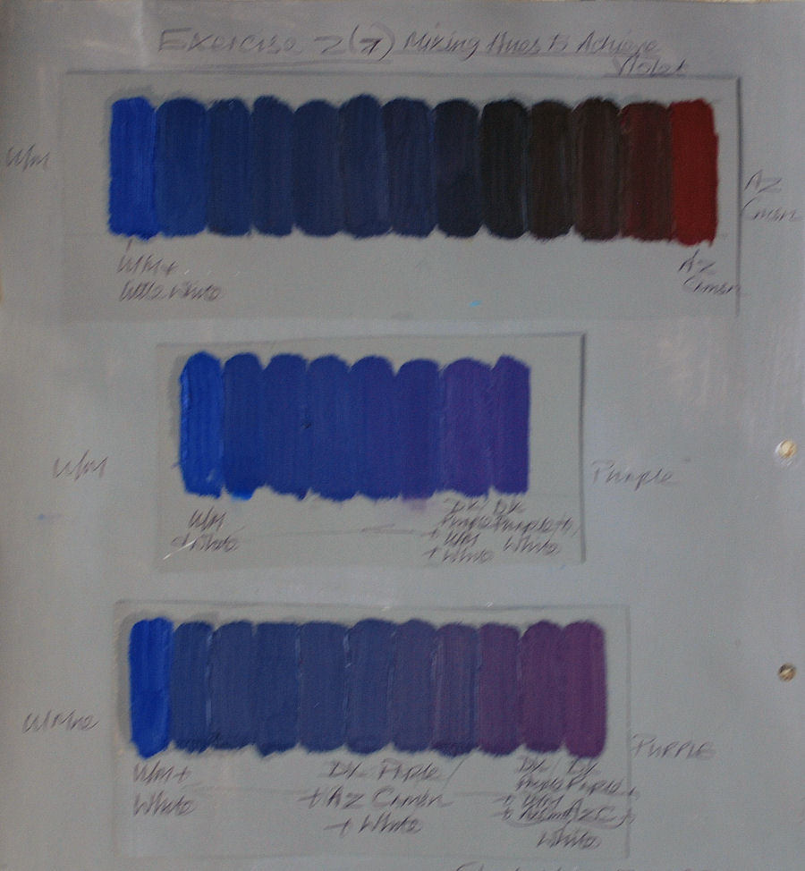
3. Mixing complementaries. The resulting colours were all very muted, infact some changed to a different colour completely ie. brown - mixed from equal parts red and green. Others were various shades of brown or very muted forms of saturated colours ie. purple/violet. See key below right for more details.

4. Effects that complementary colours have on one another
When juxtaposed each colour makes the other more vibrant than when alongside another colour - orange will make blue appear brighter. Conversely blue will make orange appear brighter. If seen from a distance there is a dulling effect. 
Mixing one complementary with another has the opposite effect - the dominant colour will be subdued. In some cases (as with red and green) a fairly equal mix will result in brown/grey.

Monday, December 17, 2012

Exercise 3 Broken or Tertiary colours

Scale between orange red and a green blue. I mixed the green blue first to obtain the same tonal value as the orange red. I didn't need much blue as was very strong and a lot of white to maintain the tone, even though had been pre mixed with white. This also occurred in previous exercises at the end of Exercise 2.
Orang to violet: as the tones began leaning more towards violet again had to add further whit to maintain tone with orange and increasing proportion of violet to change the hue adequately when moving from lighter to darker tone such as this one, or from white or yellow.
From about 4 to 7 were murkiest (muted) colours ranging from grey brown to grey green . There is also a murky grey brown at no.4.

Wednesday, December 5, 2012

Exercise 2, Primary and Secondary Colour Mixing

Eventually I found information on how to obtain pure primaries, not before I'd made a long search and getting quite confused in the process. The most straightforward common sense information I discovered to my relief in Ian Sidaway's Colour Mixing Bible.
To locate the most intense hues it was a case of eliminating any trace of other primaries in the hues of colours: out of the yellows mixed I found the most intense to be the primary yellow, which I mixed by combining cadmium yellow and lemon yellow. Incidentally, chrome yellow was the most opaque. Equal quantities of the following mixes made up the primaries:
From the reds: cadmium and alizarin crimson, or cad red deep - which appeared the same as the first two reds (when mixed).
The blues: ultramarine and pthallo blue.
To obtain pure primaries I found that these hues need to be an equal combination of warm and cool.
ie. cad red - warm bias towards yellow
alizarin crimson - cool bias towards blue.
pthallo blue - cool towards yellow
ultramarine blue - warm towards red.
cad yell - warm towards red
lemon yell - cool towards blue.

For the secondaries -  equal amounts of cad red and ultramarine produce a greyish violet, but alizarin crimson and ultramarine: the result is an intense violet.
Primary yellow - lemon and cadmium look transparent against grey ground giving them a light grey tinge.
Around the centre of the scales yellow to blue and red to blue it is hard to discern much difference between the values. I added white to the darker colours - blue and red, to  maintain consistent tonal value along them.
From yellow to red maintaining an even tone was tricky - from the middle to red tones become more rose pink or salmon in tone rather than dark oranges - due to the addition of white.
Yellow to blue - when I half close my eyes I can see that the second colour value is lighter than the first as there's a grey shadow beneath the first due to white being mixed in, causing a darker appearance. In a couple of greens around the centre it's perhaps not immediately apparent, but I think the second and eighth values are much lighter in tone than the others, including the first yellow.

Mixing primaries: yellow to red, yellow to blue, red to blue

Mixing hues to achieve violet

Maintaining consistent tonal value by adding white

Sunday, November 25, 2012

Exercise 1 (Project 1) Anachromatic scale

Mixing Greys - anachromatic scale
Using the scale in the course book as a guide. After practising the first six gradations I found the values weren't darkening sufficiently in comparison.
After  two mixes I was finding that the value changes are much more subtle after mid-grey (half way) than the light end of the scale adding the same amount of black - between 7 - 13, I need to add proportionately more black paint.
I've been going left right but as I'm left handed I should go right to left so I can see the edge of the previous value (tone) - dopey me, will do from now on......

Third graded (grey scale) from 7 on I was very careful to check repeatedly with dabs of mixed tones near  the example and from previous mixes for comparisons to try to ensure that I had added adequate black to make a noticeable a darkening of tone. Even then they are more subtle between 10 - 13 than from 1 - 9. The middle grey (70 when placed next to white looks darker than in the middle of the scale. This is so apparent because of the extreme contrast in tone next to white and the other gradually darkening values nearby.

Neutral mid-grey
Placed alongside black - though tones have a noticeable contrast it isn't as distinct as at the other (light) end. When I move the 'neutral' grey down and up the scale the contrasts become less pronounced much earlier at the darker end than at the lighter end of the scale.


Thursday, November 22, 2012

Research Point 1 Chevreul's Colour Theories

In 1824  French chemist Eugene-Michel Chevreul was employed as director of dyes for Gobelins Tapestry Manufacturers. While in this position he made intensive investigations and analysis into colour - because of complaints by customers about the dyes being used. He determined that  troublesome colour  interactions were the cause. His most influential contribution to the art world were the three colour theory laws of simultaneous and successive contrast and optical mixing.These discoveries formed part of his famous publication The Principles of Harmony and Contrast of Colours.
1.Simultaneous contrast is an optical illusion created when different tones or colours are placed alongside one another appear to lighten or darken them far more than if they were placed separately  In the case where two similar colours are juxtaposed the complementary of each will affect the other ie. red will irradiate the surrounding space with its complementary (green), but if placed next to a similar colour (orange) the red will appear more violet by a blue (complementary) cast caused by the orange. If placed next to violet, red is more orange due to the yellow (complementary) cast from the violet. Warm colours appear warmer when placed next to a cool colour and vice versa, a dark colour appears darker placed next to a light colour and vice versa. Pure colours and greys alongside one another become more intense. This effect will be immediate.
2. Successive contrast is concerned with after images and optical mixing. An after image is observed after looking at a colour for a while and upon turning away the eye sees a halo effect (or after image) which is the complementary of the colour originally observed. Optical mixing is when two different colours laid side by side produce the impression of a third colour. This is most noticeable when colours are viewed from a distance appearing to produce a combination of the first two colours ie.  primaries - red and yellow = orange, harmonious - blue and green = turquoise. This more pronounced when the colours are viewed from an angle, the further away the colours are observed the more muted the colours become.

These theories led to his development of a colour wheel divided into 72 segments, each one containing 12 main colours, divided into 6 zones around a white inner circle.


Link to experiments with grays http://www.colorisrelative.com/bwbox.html


How did particular artists use Chevreul's theories to expand the possibilities of painting?

Camille Pissaro was a great enthusiast of Chevreul's theories and through this he became a major influence in the development of Impression, a characteristic of which was to use juxtaposed dabs of complementary colour. Eugene Delacroix was another great enthusiast of Chevreul's and he also had a significant effect on Impressionism, experimenting with broken tones in his quest for vibrant and luminous colours. The impressionists followed his methods on optical mixing using broken colour to give an impression of light. Pissaro in turn also influenced  Neo or  Postimpressionist painters to further advance the technique by using a multitude of dots to apply pure pigment.What had been the quite spontaneous methods of the Impressionists became more exacting and scientific in the hands of the Postimpressionist such as Signac, Seurat, Cross and others who also made direct reference to Chevreul's theories. Pissaro adopted this style  in 1886 for a time.  As did Edouard Vuillard - see http://www.wikipaintings.org/en/edouard-vuillard/studio-interior-model-for-the-scenery-of-la-lepreuse#supersized-artistPaintings-241631 
By using Chevreul's teachings on colour theory and simultaneous contrasts Robert Delauney  created a new technique  producing sensations of pure colours in depth and movement. starting with recognizable objects and gradually becoming increasingly abstract. It became known as Orphism.
Other artists later exploited the effects of optical mixing, including Sigmar Polke 'Girlfriends' and Roy Lichtenstein 'Masterpiece 1962'.


Wednesday, October 24, 2012


“Drawings have a featherlike quality. Sometimes you think of something and it is so light, so slight, that you don’t have time to make a note in your diary. Everything is fleeting, but your drawing will serve as a reminder; otherwise it is forgotten.”

Louise Bourgeois, Drawings & Observations

Sunday, September 30, 2012

Assignment 1: Still Life


The options available here were to choose one from a range of areas such as landscape, interiors, still life etc. and to paint it in a representational rather than abstract way. A still life painting was to me the most attractive choice because at least I would be able to control the lighting, background and subject matter without too much risk of it changing or of items being moved around by accident. I was eager to try and incorporate at least two of the techniques I tried out during Part 1, such as chiaroscuro, graded washes and to include both transparent and opaque finishes in one painting.  
Starting with a few line sketches, I later progressed to tonal sketches and colour studies. 
Some people might view this choice as rather conventional and boring, but I think it is a very absorbing genre and style and as well worthy of some exploration as any other area.
Charcoal line sketch 1
Line sketch 3?


charcoal tonal sketch 1
1. Pumpkin and candlestick - charcoal. Pumpkin looks too dominant and overbearing. Tried a few more arrangements with it but none seemed to look balanced. I added part of a circle going off the paper to the upper right. I think this helped to balance the arrangement a little, but not quite enough. 2. Removed pumpkin and replaced it with glass jug, two apples and half  a lemon, removing and reintroducing things in varied combinations. Up to this point the background was light in tone. NB not all the sketches are shown just yet, as I sent them off to my tutor without photographing them first.  3. etc. and Charcoal tonal sketch 1:
 a dark background was introduced at this point and with  it, making a comeback was the pumpkin. With an increasing sense of my lack of real progress decided to try again using the dark background. Don't know why I didn't think of this in the first place - I could now obtain the chiaroscuro effect I was toying with beforehand, much more easily. It instantly added drama, along with the artificial strong light from a spotlight at the right side. It was angled to the lower half of the set up and slightly downwards, intensifying the contrast of tones. The pumpkin  materialised on the off chance, but this time it didn't appear so dominant because there were three objects to the side and infront as well as a glass jug. To vary the texture and break up the loosely rounded forms I placed the tall narrow curved clear glass jug slightly behind to the right side. The pumpkin being only partly visible also seems to help prevent it from being over dominant.
Following this I did two colour studies in chalk pastel, then acrylic. Chalk pastel: the range of some hues was limited - couldn't get the acid greens of the apples with what I had. Used yellow and blues mixed with some greens - just couldn't get close to the actual green, similarly with the pear and pumpkin. They are actually much more luminous and bright than in the colour study. The trouble was, that all the greens and yellows I had were cold. Late discovery of an old greyhound warm green pastel helped but not enough - should have used it earlier. The real reason is most likely my lack of accurate colour judgement with pastels. Had a feeling when I used paint, things would work out differently, which fortunately they did...
part finished acrylic
colour study


finished 
For the painted colour study and the final painting I painted the dark background with phtallo blue and burnt umber using an old kitchen sponge. I now realize that this is an excellent way of covering the area quickly and relatively smoothly, naturally two coats were necessary. I scumbled over the background colour (phtallo blue, burnt umber and white)  for the lighter areas of the background. In the foreground area added a little ultramarine to warm up the blue and bring the surface forward. Then added more white to the mix for lighter areas. On the lightest parts of the objects - applied a thick white underpainting. Midtone greens on the apples from two old green mixes stored in jars, one of which was quite a very yellowy green. Added a little more blue and yellow occasionally to vary the colours. Orangey reflected shadows - raw sienna/raw umber. 
Part completed final
panting

Initially I thought this was the completely wrong hue but decided to leave it on the apples to pick up reflections from the pumpkin and pear. On the smaller colour study I tried some lighter versions of background colour in the shadows and less yellowy green on apple at back so the front one stands out in comparison. The rear apple looked artificial though. I think the mix was lacking variety in application. Pumpkin - main colour: alizarin crimson/lemon yellow used as produces more muted perhaps colder orange than from a mix of cadmium red/cadmium yellow. Cadmium yellow/pthallo blue/raw umber/cadmium for shadows on apples. Colours used on pear: raw sienna/cadmium yellow/touch of white, shadows as other fruit. Some obvious colour mistakes, in moments of madness, were made along the way, especially in shadows, which were not too difficult to cover up, thanks to acrylics being what they are. Generally throughout the painting, with the exception of the pear. the lightest areas were done with opaque underpainting of white and the overlying colours were either transparent or scumbled with both thin and opaque paint. I added touches of neighbouring colours in each piece of fruit and in the bottle.

Final painting - finished
will take another photo of this as
the reflection in the upper portion
is irritating..


Looking again at the charcoal sketch, I think it may have been a better idea to leave the bottle overlapping the back of the pumpkin because the ellipse on the bottom links the continuity of  the round shapes across to the apple on the right. I was overly concerned with using transparent glazes so as not to obliterate what little there was of the areas of white ground at the cost of some spontaneouty. I spent too much time fiddling around trying to balance lights and darks - as on the pear where I used glazes to play down the shadows then had to darken the darkest shadows again and brighten up some of the lightest areas with opaque paint. Part of the difficulty may have been much to do with using titanium white in certain glazes. I have now acquired some mixing white, which is more transparent, and hopefully will help to cure this problem in future. 

On reflection, my painting for Assignment 1 has a few features that I would like to change or do differently if attempting it again:
For reflected shadows  I would add subtle touches of colours from adjacent objects, for instance a hint of green from the apples on the facing surface of the pumpkin.
In the pear I would build up the highlighted areas with white, then cover it with a thin glaze of raw sienna and lemon yellow. I think this would give it much more luminosity. I discovered this was a trick that many of the old masters used.
The shadow behind the pear, on the apple doesn't have much depth as it is too opaque.

I can see what my tutor meant about the ellipse on the glass vessel and the top left of the pumpkin potentially benefiting from being eased back into the shadows more.
Later on I did alter the glass jug and a few other elements. On the glass jug, deciding its spout looked a bit vague, I defined it further. Then on the ellipse at the base I painted over the original with dark blue in as near as I could get to the existing hues to its surroundings - it took a few layers of paint to cover the previous one. For the revised ellipse I used a fairly dry brush paint consistency. I applied small amounts of thin glazes  in slightly varied tones to some of the dark blue background and surface tones, partly to blend in with the new mix I had applied around the base of the glass jug and to enhance some areas of light reflection, while keeping to cooler blues, blending them more than in the foreground, and to help enhance the look of depth and atmospheric perspective. This mixture/s for the glazes was added to shadowed areas of the apples and pear to suggest reflections from the dark blue cloth and on the shadow at the base of the pumpkin. I managed to push the top left of the pumpkin further into the shadows using a combination of the thin and slightly thicker glazes. Looking at it again later I think the effect would have been increased if had also darkened its left side, still it is a definite improvement on the earlier version.
Final painting post alterations NB There is 
more glare on this image than on the image above, causing it to
appear lighter  - which is not the case, I will have to try some other way ...