Search This Blog

Monday, February 4, 2013

Exercise 7 Still life man made objects

Although I did consider other subjects, somehow I had a strong compulsion to paint glassware. Viewing images of Morandi's bottles and jars for the research of still life painting, must have got into my head somehow.
When I experimented with a few connotations I noticed the combination of straight and curved contours and reflective clear and dark glass surfaces formed interesting negative shapes and juxtaposition of angles. When I did a few very simple line sketches of these arrangements  each one inspired me enough to consider perhaps using in the future as part of a series. On studying my small tonal sketches I was impressed by the air of static calm the subject emitted  The reason for my final choice of a square format was that it appears to balance the arrangement of verticals and horizontals. On a very dark blue ground I used mostly calming (analogous) colours such as blues, purples and greens, with the exception of yellow ochre and white on the supporting surface, also ceruleum blue and yell ochre on the wall behind both under the paint on the right and in a thin wash over the paint towards the centre to give an impression of reflection. Ceruleum blue was added to other colours to cool them down and help them recede, if necessary. Cobalt blue was added in the same way for the warmer hues to help them advance. Other colours were alizarin crimson, burnt umber, pthallo blue and a touch of cadmium red.  All the background surfaces were painted using plastic and cardboard cards. They were very enjoyable to use and produced a very textured effect. Curves were more difficult but possible with smaller cards, tending to producing quite angular marks. I did find them quite liberating and easier to handle than palette knives.
In the background I had trouble getting the correct tone directly behind the objects. So, I toned down the overly warm and then overly light tones with glazed  of pthallo blue, then pthallo blue mixed burnt umber. The majority of the objects surfaces were painted with a brush as I think this created a pleasing contrast of textures with the background.
The highlights on the rim of the drinking glass where fiddly and I had to adjust and re-adjust it several times. It still seems to look a bit heavy.
Before further glazes
The tall jar was the most challenging to get the tones to look convincing. I think I got there eventually, but not before applying quite dry layers in multiple tones (it looked too broken up and very unappealing to me), then covering it all with opaque blue to try and reflect the colour behind. This caused it to look dull a flat, so I then varied this effect with dark blue using smooth wavy movements of the brush and wrist. I think the cause of most of my problems here were due to getting confused with the tones by following all three of the below:
1. the actual objects in front of me.
2. a monochrome photograph.
3. the sketch,
ie. the tones on the photo looked different to those on the actual objects and I feel now that I should have followed just one, probably the sketch.
After alterations -
glazes
I changed some of the background's colours but kept to the tonal values as much as possible. It looks more true to the charcoal tonal sketch - which I had simplified to broad areas of tone.
Of the two paintings - this one and the previous still life natural objects, this is my preference. To me it exudes a look of calmness and  at the same is time inviting. The colours and tones, I think play a big part in this. The lighter toned areas in the background prevent it from becoming what would otherwise be a dark and sombre  atmosphere.
Natural Objects: In comparison - I'm not sure if I like the colours used - dominated by muted green of the underlying cloth and the muted brown purple of the onion which look a bit hard together. I've also left a hard boundary between the green surface and the light area behind it. Even so, though the objects are quite mundane they have very interesting features.

LATER:
The blue behind the bottles looked quite heavy and my tutor suggested  it would be possible to alleviate this by going over with layers of glazes.
Glaze experiments

Several layer of mixes of cerulean blue, alizarin crimson, yellow ochre and white were applied thinly in combination with a little matte medium to help maintain the integrity of the paint. Certainly I think the glazes have had the intended effect; the blue has calmed the deep yellow and the yellow ochre has calmed the blue. The dark red/blue over most areas seem to add some cohesiveness. The pale blue area and the yellow orange in the lower part, were popping out a bit too much in relation to the rest of the composition. The glazes seem to have had the desired effect, though have dried to a fairly dull finish. Of course this change later if I decided, maybe with glaze medium, varnish or similar.

Another variation the above


On this second version, the shadow on the left side of the far left bottle was softened after I took a photo of this one. I followed a very similar techniques as in the first. I prefer this one in many ways: more harmonic - colours seem to balance better especially the lower surface, apart from the tall bottle, which I think is slightly too close to the top

Wednesday, January 23, 2013

Part 2 Research Point 2


17th Century Dutch Still Life and Flower Painters: The genre of still life painting was extremely popular in Holland during the 17th century. I have to admit that I am not a number one fan of paintings with such a high degree of realism but I can't help but admire them for the obvious skill involved in achieving them.

These paintings usually featured opulent and exotic object reflecting the life style of collectors for example Willem Kalf 'Still Life with Lobser, Drinking Horn and Glass'. This is full of texture and great depth with very fine detail. The light is soft and warm and the luxurious objects have a jewel like quality.
http://www.nationalgallery.org.uk/paintings/willem-kalf-still-life-with-drinking-horn

Symbolic/Iconographic (Vanitas) Paintings:
Pieter Claesz 'A Vanitas Still Life'

Painted in warm monochromatic tones, again bathed in warm light seemingly sunlight from a window above, also sugested in the reflection off the glass. The theme is meant to be the transience of earthly life. Te skull represents death - feature of many 'Vanitas' paintings. The watch symbllized time forever moving on and the overturned glass - life flowing away.

Jan Davidsz de Heem 'Still Life of Dessert'
This is incredibly detailed. The objects are arrenged to give a look of casual abandon as though they are the leftovers of a sumptuous feast - the increase in affluence among Dutch society  was due to improved efficiencies in food production and increased manufacture, exportation and importation of goods. Though the subject of leftover food might sound mundane it was the remains of such a sumtuous feast as to appear quit tempteing. Along with the white tablecloth, it emerges from andcontrasts strongly with the dark background. The shiny ornate looking vessels ans plated at add to the ostentatious look as do the rich drapes in the dark background.

History
Still Life only became a subject in its own right early in the 17th Century after the Reformation, which brought about the end in popularity of religious paintings in Northern Europe. Before this time still life usually formed only part of a larger scene.


Still Life was also popular in Spain during the 17th century, less so in Italy with the odd exception ie. Carravagio. It didn't catch on in France until the18th Century where trompe l'oeil was commisioned French Aristocrats containing opulent arrangements of food and drink.
In contrast Jean-Simeon Chardin chose to paint ordinary humble items on a small scale bringing with the effect of bringing their great beauty to life.

In the 19th Century certain continued to paint still life subject, which fell from favour for a while in comparison to other genres. Although many famous artists included still life in their work. The changed with the experimental techniques of the Impressionists and Post-Impressionists. Notable amongst them were Paul Cezanne whou was at forefront of reviving still life as an important art form. His style greatly influenced the development on Cubism. Van Gogh's 'Sunflowers', 1888 is another well known still life example. Those of Henri Matisse who belonged to the group of 'Fauves' artists, otherwise known as the Wild Beasts, loved to explore the use of bold colour, simplified perspective and forms and in many cases the use of shapes with bold outlines.

20th Century
Georges Braque and Pablo Picasso were regarded as the pioneers of Cubism in the early 1900s, though, being great admirers of  Cezanne, they were influenced by his methods. Braque invented the use of paper colle (pasted paper) in a way which went against conventional perspective  and modelling methods, creating a flat appearance. Their approach (like Cezanne's) was concerned more with how to arrange colour to give flat abstract look than the rules of perspective. They would use multiple viewpoints for a subject rather than only one, painting many still lifes bordering on abstract. Juan Gris developed his own unique version of Cubism.

 Picasso - STILL LIFE   WITH BASKET OF FRUIT c.1910
Many more styles have evolved and flourished since then and a wide range of approaches have been tried.

Some artists combined realism with abstraction, such as the American artist Georgia O'Keeffe in her flower painting close-ups, and the more abstract orientated Stuart Davis.
Giorgio Morandi very successfully made a long running and thorough exploration of everyday objects such as bottles, boxes and jars in muted colours. MC Escher was famous for his creations of optical illusions, one such being 'Still Life and Street'.

Morandi - STILL LIFE WITH JUG AND BOTTLE
Joan Miro is well known for surrealist floating images but this particular still life painting, full of  symbolism about political oppression, is quite realistic in style.
http://www.actingoutpolitics.com/joan-miro-sees-the-violent-end-of-the-tradition-of-still-life-as-a-symbol-of-harmony-with-nature-in-western-painting-%E2%80%93-miro%E2%80%99s-%E2%80%9Cstill-life-with-old-shoe%E2%80%9D-1937/

Wayne Thiebaud began slightly before pop art but is often regarded as a pop artist, producing work in a very similar vein. Well known are his paintings of mass produced food displays - simplified to their basic shapes. He has been influenced by both proto pop and abstractionism.
There are quite an array of tasty looking goodies on this site:
http://www.theswellelife.com/swelle_life/2013/01/the-delicious-world-of-wayne-thiebaud.html

Moving along to the present, Glenn Brown - is known for his modern, often distorted and sometimes controversial reinterpreted abstractions of well known artworks by famous artists.

'I do not feel embarrassed at attempting to express sadness and loneliness' is meant to be based on a painting of a vase of flowers by Van Gogh, I suspect it is the famous painting of sunflowers.

William Scott


Sunday, January 20, 2013

Exercise 6 Still life with natural objects

Since I did the tonal study on the white ground I have learned to blend edges more where I want to play them down in relation to edges in areas that I prefer to draw attention to. Though I used oils for this exercise, as opposed to acrylic in the tonal study, I have become more used to using acrylic retarder with acrylics which extends the drying time of the medium giving extra time for blending. I discovered these advantages when I did a painting for my daughter before Christmas.
For shadow areas, I am aware of a growing confidence in using touches, and sometimes entire mixes, of the objects complementaries on neighbouring surfaces, although not always successful I  seem to having less of a  problem working out a solution than previously - hopefully this will continue...(see also below - problems).
I completed the painting in a couple of sessions, so it meant I had to apply fresh paint over still wet layers below. Exercise 5 - Drawing in paint  - also in oils, entailed using the same method in places, but I don't think I was as successful there, as I made the mistake of painting over some areas which were starting to dry and this had the effect of causing the paint to sink, resulting in a comparatively dull looking surface. Whereas, on this occasion I was mindful not to make the same mistake and the result was more successful.
Nevertheless, I think partly due to the layers of wet paint I couldn't seem to obtain adequate contrast between the highlights and mid-tones even though I tried to use the brush with very light pressure at a low angle to canvas so as not to disturb the paint underneath, a certain amount of it did sink in, but the result was better than in Exercise 5, I think because the paint underneath was still workable. I will probably have more confidence to use the same method after doing this painting.
Another problem for me was with the cast shadows: I tried mixes of dark green and alizarin crimson for the garlic's cast shadows together with the garlic's complementary - purple which resulted in a muddy brown. I should have realised this would happen as the amounts of each complementary were too equal. So, I rubbed off as much as possible with a rag and tried dark green, with just a hint of crimson. Later I lightened the tone further with a paler mix of green which was less dominant and, I think, much easier on the eye. I definitely still have a long way to go but perhaps this will become second nature eventually. I think it was mainly a case of softening some of the tones with a lighter mix the effect was much less jarring than before. I have left the edge  of the green cloth at the back but I think this would also benefit from some softening of the edges.


Finished

Adjustments made later somehow didn't include the above mentioned idea of softening the rear edges of the green cloth. Re- the the right side of background cloth, I received comments in my tutor report that it misinforms and looks confusing due to overworking.  Yes I could see this fault on reflection; it did look too fussy, so I applied some mid-green, light cream and a small amount of dark green tones, blending them into the overworked area. I really concentrated on simplifying the myriad of dark little marks around the larger garlic. However, doing this caused it to look out of balance against the other green areas - the hues didn't exactly match with what was there. So I tentatively added some of the same colours to the rest of the cloth, including the front edge, which looked a sickly yellow beforehand, not picking up anything in the composition, looking as though it didn't belong. Once I had made these alterations it the back of the cloth appeared to fit in better. Hopefully I have changed the cloth area enough to make a difference for the better. I'm not sure if  I've done enough but I knew I could easily get carried away if I did much more, then regret it.


Tuesday, January 8, 2013

Exercise 5 Drawing in Paint

For this exercise I wrote more notes than usual in my sketchbook. Early experiments with composition didn't seem to work. I felt I also needed to be positioned somewhere I could have materials to hand and be relatively comfortable. Anyhow, when I finally made a choice of composition they were ornaments in a corner of a window sill, so I don't think they look too contrived. However available space to move objects around in different positions was quite restricted. At the same time I wanted to take advantage of what possibilities for the negative spaces were available to me. The bird which was one constant almost throughout my preparatory work, was something I couldn't move around much as I want it to appear as though looking out of the window.
Throughout the sketches and preliminary drawings I tried to retain a constant position during each, relative to the object to try and reduce the riskk of distortions caused by moving. I marked the floor around the easel and around the front of my feet. I don't think I fully understood what exactly was required from this exercise. I got the impression that the aim was partly to produce a painting emphasising linear aspects. But I couldn't see any mention of inclusion of tone or form, so I decided to include it anyway right or wrong.
Using acrylics I drew in the objects outlines with a fine brush in dilute raw umber on a tinted ground of raw umber.
I continued with the remainder of the painting using oils, roughly applying darkest tones first, then the lightest. During in this painting I felt inhibited most of the time and I had the urge to loosen up my technique but was unable to. Alas this is nothing new..

It wasn't long before the lines around contours completely disappeared under the thicker paint. I meant to re-assert them at the end but couldn't build up enough confidence, not to mention enthusiasm. The peachy orange on the surface to the right, I think is too bright and overpowering and needs toning down. Overall, I was disappointed with the final result, considering all the preparation work I'd done for this. Now that some considerable time has passed since I completed this painting, I feel aforementioned extras  need to be done to improve matters and perhaps help to give me another perspective on it.
There is an example of a very flat still life by Picasso on this link. I find the effect intriguing and I would like to try out the technique sometime soon..

Picasso's Dish of Pears is located towards the end of this link's page:

Saturday, December 29, 2012

Exercise 4 Complementary Colours

1. Colour wheel based on Chevreul's colour circle
medium used - oils


2. This part consisted of laying each of the twelve colours contained in the colour wheel next to its opposite (complementary) on the wheel. It was easier to match the tones this way than on a value or colour scale, as sometimes it is only when a darker colour is applied next to the lighter colour that the tonal difference becomes clearer.
3. Mixing complementaries. The resulting colours were all very muted, infact some changed to a different colour completely ie. brown - mixed from equal parts red and green. Others were various shades of brown or very muted forms of saturated colours ie. purple/violet. See key below right for more details.

4. Effects that complementary colours have on one another
When juxtaposed each colour makes the other more vibrant than when alongside another colour - orange will make blue appear brighter. Conversely blue will make orange appear brighter. If seen from a distance there is a dulling effect. 
Mixing one complementary with another has the opposite effect - the dominant colour will be subdued. In some cases (as with red and green) a fairly equal mix will result in brown/grey.

Monday, December 17, 2012

Exercise 3 Broken or Tertiary colours

Scale between orange red and a green blue. I mixed the green blue first to obtain the same tonal value as the orange red. I didn't need much blue as was very strong and a lot of white to maintain the tone, even though had been pre mixed with white. This also occurred in previous exercises at the end of Exercise 2.
Orang to violet: as the tones began leaning more towards violet again had to add further whit to maintain tone with orange and increasing proportion of violet to change the hue adequately when moving from lighter to darker tone such as this one, or from white or yellow.
From about 4 to 7 were murkiest (muted) colours ranging from grey brown to grey green . There is also a murky grey brown at no.4.

Wednesday, December 5, 2012

Exercise 2, Primary and Secondary Colour Mixing

Eventually I found information on how to obtain pure primaries, not before I'd made a long search and getting quite confused in the process. The most straightforward common sense information I discovered to my relief in Ian Sidaway's Colour Mixing Bible.
To locate the most intense hues it was a case of eliminating any trace of other primaries in the hues of colours: out of the yellows mixed I found the most intense to be the primary yellow, which I mixed by combining cadmium yellow and lemon yellow. Incidentally, chrome yellow was the most opaque. Equal quantities of the following mixes made up the primaries:
From the reds: cadmium and alizarin crimson, or cad red deep - which appeared the same as the first two reds (when mixed).
The blues: ultramarine and pthallo blue.
To obtain pure primaries I found that these hues need to be an equal combination of warm and cool.
ie. cad red - warm bias towards yellow
alizarin crimson - cool bias towards blue.
pthallo blue - cool towards yellow
ultramarine blue - warm towards red.
cad yell - warm towards red
lemon yell - cool towards blue.

For the secondaries -  equal amounts of cad red and ultramarine produce a greyish violet, but alizarin crimson and ultramarine: the result is an intense violet.
Primary yellow - lemon and cadmium look transparent against grey ground giving them a light grey tinge.
Around the centre of the scales yellow to blue and red to blue it is hard to discern much difference between the values. I added white to the darker colours - blue and red, to  maintain consistent tonal value along them.
From yellow to red maintaining an even tone was tricky - from the middle to red tones become more rose pink or salmon in tone rather than dark oranges - due to the addition of white.
Yellow to blue - when I half close my eyes I can see that the second colour value is lighter than the first as there's a grey shadow beneath the first due to white being mixed in, causing a darker appearance. In a couple of greens around the centre it's perhaps not immediately apparent, but I think the second and eighth values are much lighter in tone than the others, including the first yellow.

Mixing primaries: yellow to red, yellow to blue, red to blue

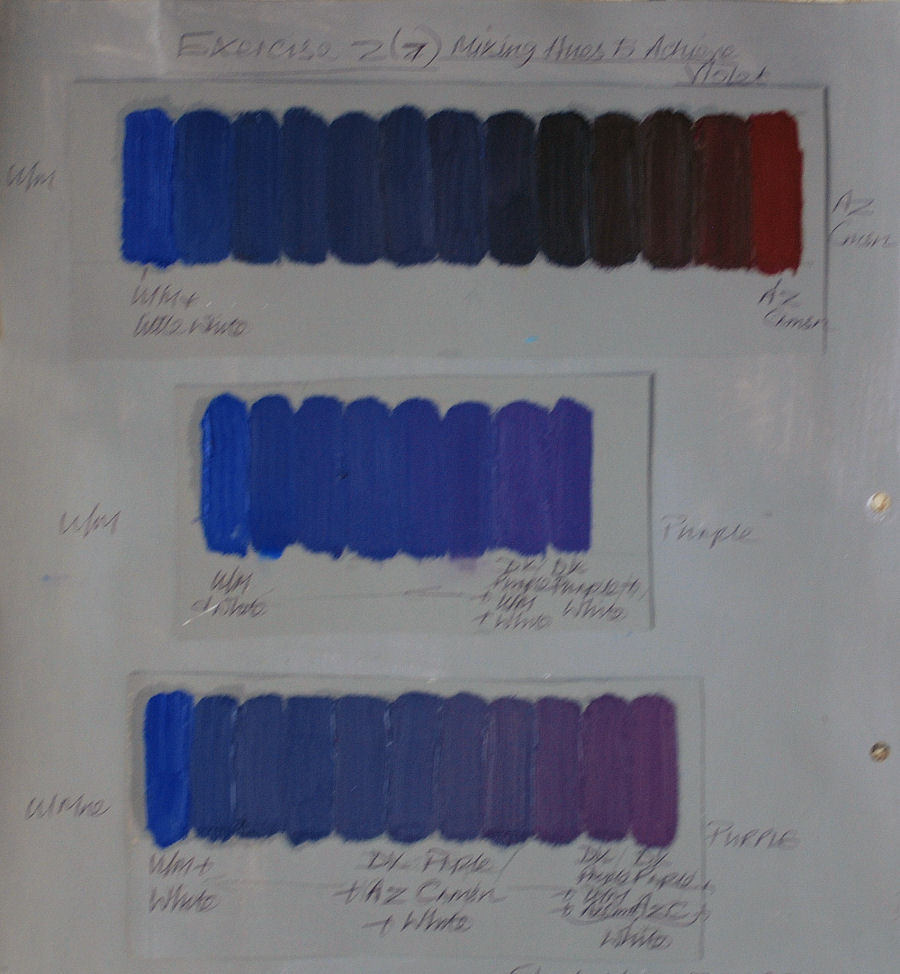
Mixing hues to achieve violet

Maintaining consistent tonal value by adding white