Search This Blog

Showing posts with label Research. Show all posts

Tuesday, May 20, 2014

Research Point 2: Abstract Expressionism - Tachisme and 'Action Painting'

Famous for his technique of 'all over painting' , Jackson Pollock employed exciting gestural marks - emitting a feeling of almost being able to step into them; they seem both calm and energetic at the same time. These paintings were done on a huge scale, painted on the floor, usually on massive canvases. Greatly inspired by the energy of ethnic art and later, Mexican muralists, European artists like Cezanne and Picasso also had an effect on him. His motivation came from within his head rather than from the real world. He is identified with pioneering the drip technique, very radical at the time and attracting a lot of attention, often criticism. Even so, some work is quite figurative; often I find it possible to discern figures,sometimes faces, in amongst the tangled mass of lines, as in the painting below:


Jackson Pollock, Black and White Number 5, 1952, 142.87x80.645cm, Modern Art Museum of Fort Worth
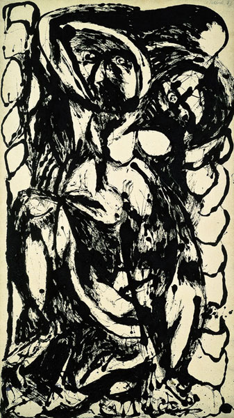
http://themodern.org/sites/default/files/pollock4a.jpg
His work was generally defined  by liquid paint flicked, dripped and poured onto the huge horizontal unstretched canvases. He would work on all sides, sometimes walking through it. At first glance it was seemingly uncontrolled but looks are sometimes  deceptive, and infact culminated in a complex interrelationship. As he became more experienced with the techniques he was able to precisely control the nature of the lines. Swirling lines appear to go on into infinity. Yet he didn't do preparatory drawing or studies.
Anything to produce the intended effect was used, including tools such as syringes, brushes and sticks in addition to his well known paint pouring from a container, which he sometimes had a hole cut in and swung from the end of a rope suspended from above.
Later on the paintings included a lot of black and white and had echoes of earlier works. Following this period he returned to colour.
Behind the scenes his life followed a destructive pattern which ended prematurely in a violent death.

Tachisme is translated from the French for spot or blob. It was a term first coined around 1951 and has many affinities with Art Informel, often the umbrella heading of Abstract Expressionism - intuitive and spontaneous, though it developed independently.
Paris based artists of note included: Georges Mathieu, Jean Fabrier and Wols. The general difference was their more carefully handled, subtle style than the raw energy of Abstract Expressionism. Franz Kline and Hans Hartung are also closely associated with Tachisme.  I find there are such a vast amount of fascinating artists whose work falls under this category, I can only scratch the surface here. I find them well worthy of further research and that is my intention.
Franz Klines's style was vigorous with large sweeping gestures on a large scale. It was energetic and crisp, even brusque - quite the opposite of subtle. He typically used calligraphic yet bold thick black lines crossing over one another, on a white background, and made many small preliminary brush drawings. These are often referred to as his 'signpost' technique. Tools used were: large decorator's brushes and commercial house paint. He included colour later in life. This one is a good example of his typical style - described as collage but I can't detect any signs. The name is New York 1953:
http://www.wikiart.org/en/franz-kline/black-and-white-png#supersized-artistPaintings-277514
This one is not described as a collage but yet it appears to have been used. Perhaps it was created using an old painting/s. It is simply named Black & White:
http://www.wikiart.org/en/franz-kline/black-and-white-png#supersized-artistPaintings-277497

Hans Hartung had a strong belief that his work should be a reflection on his innermost self, usually extreme emotion. The paintings were often on a large scale and with a plain calm background.
T 1956-9, 1956 180x157cm is painted in an energetic and dramatic manner, setting up a visible tension. Mid toned browns are  trapped between heavily applied dense blacks. It is made up of a web of roughly parallel agitated strokes crossing over one another in slight diagonals from one end of the canvas to the other. They reach out toward the edges, sometimes going off the edges.
http://arttattler.com/Images/Europe/Spain/Barcelona/Museu%20dArt%20Contemporani/B-Bomb/hartung.jpg

http://images.tate.org.uk/sites/default/files/styles/grid-normal-8-cols/public/images/fig-14_0.jpg?itok=PSxCGgA-
Following a stroke in 1986 he became wheelchair bound yet his output was absolutely prolific, producing 360 paintings in his final year (1989)! This is a very interesting article about the experience:
http://www.tate.org.uk/research/publications/tate-papers/very-late-style-hans-hartung

Pierre Soulages   

 Illustrating some of the hallmarks of the artist's style in the early 1950s are:
 http://www.telegraph.co.uk/luxury/art/10024/art-sales-eyes-of-the-world-turn-to-londons-art-fairs.html
http://www.tate.org.uk/art/artworks/soulages-painting-23-may-1953-n06199
  These paintings are dominated by black, interspersed with glimmers of white, pale yellow and bronzes, setting up dramatic contrasts. The backgrounds are calmer which appear to be scumbled on a dark ground.  As with Hartung, bands begin and end within the confines of the picture plane, occasionally crossing over the the edges, resulting in a strong impact. At the height of Abstract Expressionism during the 1950s and 60s he was regarded as a kind of French equivalent to the New York School. To apply  his broad straight swathes of heavily applied paint he uses special rubber spatulas, house painting brushes and rollers.
Soulages still uses a limited colour palette and is often referred to as the Master of Black, quoted as saying:
“Black is the color of the origin of painting — and our own origin. In French, we say the baby ‘sees the day,’ to mean he was born. Before that, of course, we were in the dark.”

Other artists of interest connected with this style of painting:
Gerard Schneider
http://www.wikiart.org/en/gerard-schneider/82c-1958#supersized-artistPaintings-313501
Jean-Paul Riopelle
http://www.tate.org.uk/art/artworks/riopelle-perspectives-t00123
Lee Krasner
http://www.metmuseum.org/toah/works-of-art/1995.595
John Hoyland
http://www.johnhoyland.com/


Hartung - sensuous free-flowing lines
vibrant - thick black

Thursday, April 10, 2014

1 Exercise 1 PART 5 IMPASTO and SGRAFITTO

a) Using a brush - a simple still life.  Oils, colours: burnt sienna, raw sienna, cadmium yellow, cadmium red, ultramarine, titanium white on oil sketching paper. I was a bit confused about the instructions regarding mixing of colours - not sure if the idea was to use unmixed tube colours only or not, but I suspect it was. I know this wasn't exactly what the exercise was about either, but in the end the temptation to mix colours on the palette got the better of me as I wasn't comfortable with the thought of them turning out looking totally unrealistic. For the first attempt I set up an apple, a pear and a banana. The first pear attempt was a disaster as I placed one colour over another so they merged together. They were certainly thick smears as requested in the manual, but they mixed together too early on. The second pear was a little easier and the banana, no problem. By the time I reached the fourth attempt at a piece of fruit: an apple there was a slight improvement in technique as I managed to keep the colours slightly more separate, though the shadow at the base went a little haywire. The paint seemed to have quite a lively appearance, despite colours merging here and there. Although I set up the composition carefully this care soon went into oblivion as I struggled to handle the paint.

b) Acrylics: avocado, mango and onion on canvas paper. The paint was unmixed tube colours this time. I did however mix in heavy body medium to thicken the colours. The process was going okay, apart from when I left it alone for half an hour after applying the darks, so they were virtually dry on my return. I added the mid and light tones and blended the edges a little in the darks. I added a few more darks over the darks so I could blend the edges with other colours. Of course I found it impossible to obtain to obtain accurate matching of the actual colours and tones on my arrangement. I felt more confident this time than I did  with the oils. It could have been due to the different medium - acrylics. I was more certain of where to put the appropriate colours and keep them confined to intended areas.
c) Oils. fruit: apple, pear, lime, banana. Cols: cad red, cad yell, mixed green, white. banana, cols: cad yell, yell ochre, white, touch ultramarine,  pear: raw sienna, cad yell, touch u/mne. and lime, cad yell, touch u/marine and touch viridian - this was ideal to lift the dullness of the green mix I had. on canvas paper. Burnt umber and u/mne for some darks. The colours were mixed this occasion rather using straight from tube.
The paint didn't sink into the surface as the acrylics did, but I was guilty of fiddling about for too long with the paint in attempt to obtain a convincing representation - what it was not for a good part of the process.
The brush sizes ranged between no.s 4 - 8 - a mix of flats, rounds and a filbert.
d) Acrylics. Banana, apple, lime and avocado. Used mostly tube colours, mixing occasionally for dark red and green shades. I couldn't help going over the lime and parts of the apple on the dried paint as the previous colours and tones didn't look at all convincing. Though I employed very rough brushwork and, as with the other three thick paint the acrylic did sink into the surface a bit, unlike oils. Acrylic is deceptive in the sense that also shrinks on drying.

2. Using a painting knife. Oils were used for all of these experiments. I basically just messed around with various styles of painting knife.
They are great for defined ridged or smooth contours and edges. Also fantastic for quicly obtaining texture with two or more colours wet on wet yet the colours don't blend as they would with a brush. Each colour seems to keep its own integrity.
Paint was pulled along  to make parallel lines with a flat straight blade. This produced thick straight linear marks. A rather three dimensional effect resulted.I twisted it from side to side in different ways - one of which produced interesing wiggly lines rather like a gnarled tree trunk and  branches.Another was hit and miss smooth and ighly textured surface in parallel lines reminiscent of aged posts or columns perhaps. When I pulled the paint and knife across these at 45 degrees.  When the paint was double loaded (two colours on the knife blade) they went on adjacent to one another. When I pulled and pushed the flat of the blade from side to side the colours intermixed gave off a beautiful effect.


In a simple woodland landscape I used a knife and scratching with end of a brush handle/crochet hook or fishing hook. Used various knives - including thin rectangular bladed one for the tree branches. Dark thick paint over light base of acrylic. Easily able to sculpt and scrape the paint producing very raised and textural surface. And for extended time due using oils. Acrylics would have needed retarder to do this and would shrink when dry. However the oil paint used in this took several weeks before it was even touch dry in the thickest parts. Having said that I think this method and medium would have improved a previous woodland painting I did in Part 4 I think would have been tactile and more expressive with both brush and/or knives. I used cards to apply the paint on some rocks in another landscape painting in Part4 (Ex2 hard/soft landscape), though I think the whole painting looking at it now, was completely overdone. Also some previous still life exercises in Part 2, but I got the impression the emphasis in the course manual was on using just brushes. The particular painting was of an onion and garlic, using oil paints . I did obtain some raised texture but I did use a knife to increase the raised effect. I tried scratching the paint in the garlic but wasn't enough contrast with the colour of the underlayer and the paint could have been thicker without fighting with the onion for attention. I had some trouble with both acrylic and oil on canvas. Though surface was well prepared the paint sunk in. Think could have enhanced some light areas with a painting knife. Knowing what I know now I would have used a surface like primed paper or card, not canvas, and a much darker underlayer. Again in this section, with another experiment on thick paper, I tried out a quick study of a vase useng fairly thick light toned oil paint on a smooth textured surface. I scratched away some of the paint around the contours and patterned areas to reveal the dark base layer. Using this method proved easy to obtain an effect I was happy with. I would certainly like to use oils again in this way.
The simple landscapes from imagination, I did at the start of this course, I think could have been made a bit more expressive if I had used other ways of applying paint apart from brushes, as indeed could many other exercises.
Partly because it  was on my mind, at the end of this exercise I did an experimental painting of imaginary still life - bottles and 'other' objects in acrylics. I used a card and rough loose brushmarks of white, pink, red and green paint on a dried green painted ground. Plus scratched into semi-dry paint on the left bottle and tonked wet red paint - using pressure to remove paint with a piece of paper. The process of chance and discovery was quite fun, some accidental effects emanated. The end result leaves a bit to the imagination,  which I was pleased about, leaving me with a keenness to try and approach more of my work in the same way - not so easy when I know something's going to be critiqued though.
Another part of my motive was that I had been looking at some of Cy Twombley, Willem de Kooning and Howard Hodgkin's work and was in admiration of the loose gestural brushmarks. I was also intrigued by the way de Kooning and Hodgkin used the effect of a frame or opening into a room or entrance or view on something. There was also some influence there, I think of Mel McCuddin (described as a figurative expressionist) in the way he paints his quirky figures from the imagination, akin to carving positive shapes out of negative space.
http://www.spokanehowsbusiness.com/news/archiveStory.asp?theArticle=1054


SGRAFFITO is a technique of ornamentation in which the surface layer of paint is scratched into to reveal areas (usually contrasting) of the surface underneath. Historically it has been used in several areas, such as in wall design and ceramics and glass manufacture for many centuries, where it has been used to scratch back an area of glazing or plaster.
Cy Twombley is a notable 20th century artist who made use of this technique in his multi layered paintings, using many different media and materials. 
http://www.theartsdesk.com/visual-arts/twombly-and-poussin-arcadian-painters-dulwich-picture-gallery

As a contemporary artist using scraffito, part of Robert Joyner's technique is often to scratch back into the paint as part of his loose and painterly style.http://napavalleyartcamp.blogspot.ie/2011/07/making-lines-with-robert-joyner.html


I scratched back through the wet oil paint
into the dried dark backgroundof acrylic in this quick study
of a vase.
Scraffito could be described as scratching into a layer of usually wet thick paint with a tool such as the end of a brush handle, a piece of card or even a fingernail to reveal a layer or layers of an underlying surface. The colour or tone of this surface usually contrasts with the paint being scraped off. It can be used for a whole range of effects, from complex pattern to a single thin line. This technique can even work with dry paint using very sharp tools and as long as the support is sufficiently resilient and thick to withstand the pressure. Wet impasto oil paint is a typical example of where it would be easy to use. Dried acrylic would take a bit more working out.


Thursday, January 16, 2014

Assignment 4 - large landscape VERSIONS 1 AND 2

Version 1 (not for Assessment)
Before I had finished the previous exercise (from doing a few sketches and studying the various photos of it) I had decided that I wanted to paint a view of the local field where the barn resides. This is mostly because I estimated that the view contains a range of elements waiting to be exploited, such as: aerial and linear perspective, a feeling of space, contrasting textures, an obvious focal point and fundamentally, a well arranged composition. Also, I adjusted certain features slightly. As there is quite a range of textures, I reckoned I could utilize a few different techniques I had tried out in previous exercises as mentioned above, particularly the rocks in Hard or soft landscape - a good candidate for using a knife/cards, Aerial Perspective – effects of and Painting outside – visible brushstrokes. I added some course texture paste to the list of materials for some clumps of long grass in the foreground.

Oil paint was the medium of choice for this, as I found it very amenable to building up textures for the rocks of Exercise 2: Hard or soft landscape and I like its thick buttery texture. Also I wanted try working in oils wet on wet again, after Aerial perspective, Painting outdoors and Squaring up. Although I did find it quite challenging (sometimes impossible) to avoid ending up with blended mud, this is something I want to master, if at all possible – easier not to use one complementary colour over another. Then again, another advantage of oils is having plenty of time to blend paint. Whether this subject would lend itself well to a large scale as this Assignment required I wasn’t sure of.
So, on the surface of an A1 piece of mountboard I went ahead with the above plans and applied a coat of mid tone pink for the ground and used acrylics for the underpainting. The paint certainly didn’t stretch very far on such a large area. I estimated I would be able to cover large areas more easily with oils, particularly on this type of subject, with so many elements and nuances. The basic colour palette was cobalt blue, napthol crimson, cadmium red, yellow ochre, chrome orange, naples yellow and titanium white. Although I wasn’t concerned about getting an exact reproduction of the existing shades, as I understand these can vary anyway depending on different factors ie they can look totally different from one moment to the next when the weather is changeable, altering the light from one moment to the next,  which it was. Yet it still took me some time to find what I thought was a convincing hue for the field stubble. In the end I settled on using several similar colours and values and by some freak accident it seems to have given it a little more interest than otherwise. As it was a showery changeable day the contrasts were quite strong much of the time. The finished painting seems to have captured a more settled moment however. The middle and background areas in places became quite blended, but I think they work on the whole, as they are not fighting with fussy areas like the foreground.
painting part finished in acrylics

There was a lot of contrasting detail in front of the barn, so I toned down the darks and blended the edges further, as I did with the field on the right of the barn. I was mindful of the need to also warm up the colours and increase contrast towards the foreground, but the rear mid ground trees on the right are quite dark, though I have made them much lighter than they looked in reality. I got a bit ‘bogged down’ in the field to the left of the barn and with the perspective of the stripy field patterns. Even now they don’t look as natural as those in the sketches. The barn contrasts strongly with the sky and the dark sharp edge of the bluish bush to the right contrasts with the orange of the field. Neither did I place the barn as far over to the left as in the sketches, so had more space to fill – and somehow I got confused with it. This wasn’t the only place. Other challenging aspects were: the puddles of water and mud on the track and the centre margin of the track and the rough grass to the right. I scraped all the paint off these two areas at one point. When I tried them again I used a more methodical approach and a delicate touch. It made all the difference, the next day when I wasn’t tired and running out of patience – a good lesson.
First attempt - finished

.
In this part of the course I didn’t find any of my attempts particularly groundbreaking as I was hoping for, but I can’t expect miracles.

There are certain techniques I used in previous paintings which seem to work well ie. knives and cards for the rocks in the Hard or soft landscape exercise, the scumbling on the windowsill in the first exercise: View through a window, the glow of the sunlight against the dark trees in Mood and Atmosphere, the intentionally ambiguous perspective in Squaring up, a colour study from Aerial perspective – the clouds and foreground texture.
Artists who have influenced my approach in this part (4) are fairly numerous, but amongst the most notable ones are: Emil Nolde, Van Gogh, Gustav Klimt and more  contemporary artists are: Mary Canty, Richard Clare, Stan Smith, Richard Pikesley http://www.russell-gallery.com/richardpikesley2009/images/27%20-%20Summer%20Evening,%20West%20Bay%20-%204x13.jpghttp://www.russell-gallery.com/richardpikesley2009/images/27%20-%20Summer%20Evening,%20West%20Bay%20-%204x13.jpgPikesley http://www.pinterest.com/pin/117375134008414817/
and Al Gury. http://www.algury.com/?cat=1 
A common characteristic of most the landscapes by these artists would be their expressiveness - loosely painted and textural marks. Some of them would use knives, cards, fingers and other implements for certain passages. Their palettes vary from vivid to muted. I like both, it depends on a range of factors such as subject and technique used.

In the future I would like to try out more painting using alternative materials, collage, abstracts and painting with materials like those mentioned already.  I would particularly like to try knives and cards for woodland paintings. Al Gury’s woodland paintings partly inspired this idea. Also to try the technique of scraping back with oils to produce misty effects, similar to those in Tonalism. Two particular artists whose techniques I would like to try and emulate are Mary Canty in her ability, with the help of her brushwork, to convey an essence of a place rather than be very descriptive:  http://hammondgallery.com//artist-information/mary-canty
and Emil Nolde – using vivid colours to try some landscapes similar to those I did in the Aerial perspective exercise.

Finally, I think I have learned a lot from this experience and particularly from the response of my tutor.
In short, I should now realize that much work on a painting doesn't necessarily bring appropriate reward, sometimes less is more....this is connected to the painting in its early stages (photo 1 above) - lesson learned? I certainly hope so!

Version 2 - for Assessment
This second attempt was another version of the same scene. Ironically, in this attempt at Assignment 4 (below),  I think I was unconsciously influenced much more by some of the artists I mentioned above than in the first attempt. Anselm Keifer's paintings of landscapes such as Nigredo, 1984 
http://www.arthistory.cc/auth/kiefer/nigredo.jpg
had quite a big part to play. Of course he is well known for his extensive use of fillers - in his paintings I must stress. His preferred choice of materials would often include lead, clay, straw and wires to name but a few...I made use of rough texture producing materials - sand, sawdust, cement dust mixed with pva glue and heavy gel medium. Tools used to apply them were mostly plastic cards and painting knives as well as bristle brushes for some of the later stages, mainly for glazes in parts of the track and the odd smaller detail here and there.
sketch 1 & 2

sketch 3


This time I used a portrait format intending to make the track appear longer and more dominant. The background was again red to contrast with the sky and fields so as to set up some chromatic tension.
For the early stages of the sky I applied the very light blues around the horizon line just above the mountains which I had already applied beforehand.
I took care to model the barn with defined texture and the sky and field surfaces so as to create volume and depth; plastic cards worked very well for this. To vary the textures I used different thicknesses and combinations of textural materials with the glue. Had to be mindful of not completely covering the red background while finding a balance between blandness, fussiness and monotony. Sometimes I covered too much of the red ground, so I scraped away a little textured paint to bring back its visibility.The colour and tonal combinations of the foreground of the track proved most challenging in this regard. I went over and over with thick opaque mixes and thin glazes in places - a delicate balance. I used a bristle brush, floating lightly over the ridges of thick textures with a little paint on the side of a flat bristle brush; it had more flexibility than a knife or card and helped to break up large areas of uniform colour.

The barn was relatively larger than the barn in the first painting, giving the illusion of it being closer, with more impact. At the same time, this illusion seems to be countered by the long narrowing perspective of the farm track leading towards it.
I later went back to the sky, adding more textural variety with different fillers, including heavy gel medium mixed with paint, which still has plenty of body but is smoother and easier to manipulate than the more gritty fillers. The paint this time was dulled down to blue greys with more raw umber. Burnt sienna was used again very sparingly on the mountains.
I am still a little concerned about the colours in the sky, I think they might still be a bit too blue, although this time it was a warm sunny late spring day rather than mid winter - as in the first version. I dulled down what I could see with ultramarine and phthalo blue with burnt umber,  but it does still seem to look a bit bright. Cadmium yellow was mixed with the blues, raw and burnt umbers to make varied greens. The barn is a mixture of burnt sienna and cadmium red. This time I think the barn has worked much better; it looks more ramshackle than the first and although rather large, I think it sits more comfortably in its environment. The look of movement set up in the clouds and the  ridges of parallel lines in the field help to add dynamism and depth.

Second version - for Assessment Ironically, in my second attempt at Assignment 4,  I think I was unconsciously influenced  more than in the first, by some of the artists I mentioned above


Thursday, September 5, 2013

Research Point 1 Evolution of Landscape Painting

Evolution of landscape painting from the eighteenth century to the present day.
Historically landscape painting once ranked quite low on the list of important genres. Indeed painting/sculpture wasn't even considered as 'art' until about 1400.
In Europe it wasn't generally taken seriously in relation to most other genres until the 18th century when 'view' paintings became more fashionable, exemplified by the 'Grand Tour' in Italy, reflecting the climate of prosperity. However, it was an 'ordered' form of landscape compared to what was to follow later. Gainsborough and others would make preparatory sketches on the spot before completing their paintings in the studio. In the late 18th century Jean Baptist-Camille Corot was one artist who benefited from this new found popularity, also partly brought about by the popularity of a book in France by Pierre-Henri de Vallenciennes - 'Elements de perspective practique' which stressed the importance of the study of real nature.

Landscape painting in the 19th century  experienced unprecedented changes and enjoyed a major rise in popularity. This was  brought about by economic and social changes connected with events such as the Industrial Revolution in Britain and the Revolution in France. Idealized classical scenes became less and less important .
Watercolour as a medium became more prominent along with a trend towards feeling in landscape rather than exact representation. John Robert Cozens sought to emphasize the amazing vastness and atmospheric effects of the landscape. Both Alexander Cozens and his son John Robert were leading proponents in this regard. . Alexander Cozens was famous for developing the 'ink blot' technique based on a product of accident as opposed to design and which was quite cutting-edge for the time. Excellent examples and more information shown here:http://www.tate.org.uk/context-comment/blogs/watercolour-alexander-cozens-aka-blot-man
Other artists who dominated watercolour landscape painting at the time were:  John Constable, J.M.W. Turner, John Sell Cotman and Thomas Girtin. Cotman's work was exacting, yet the way he painted shapes and forms was bordering on the abstract.
Turner had a fascination with the elements and his watercolours were also often quite abstract.
Norham Castle, Northumberland: Sunrise. As with many of Turner's paintings there is at least one watercolour version and a painting in oils. It is bathed in a warm golden glow and an atmospheric haze, there is an impression of vast space and minimal detail. In the foreground there are soft warm yet clear contrasts. The tones are warm yellows and subtle pinks and there is a grazing animal in warm orange yellow. Warm yellow tones to each side and in the reflections on the central area of still water  bring the area forward. Moving back, the middleground contains some cooler blues. The horizon is very blurred and colours merge even more. Golden reflection on the water from the sun is quite noticeable and contrasts with the blue of the castle, while it is also very subtle. The background is bluer still and so indistinct as to give only a slight suggestion of a high object (the castle?) and distant hills, giving the illusion of great distance.
http://evermore.pwp.blueyonder.co.uk/artists/images/turner/turner_norham_castle_sunrise.html
Constable like to capture the weather at certain times of day, then used them as references for his watercolour paintings. There's a good range of his work, including many cloud studies, on this link:
By this time artists increasingly sketched out of doors and the immediacy and portability of this medium was ideal for the purpose of capturing fleeting moments. Their watercolours became more experimental, often painting with bold sweeping strokes on rough textured papers. Skies and atmosphere played a prominent part in most of these artist's compositions.

Some of the ways in which modern and contemporary artists have chosen to interpret this genre are through reflecting social, political and environmental concerns for example:

Sophie Iremonger  is one such artist who uses post apocalyptic vision of animals taking over urban landscapes:
http://www.artfetch.com/edition/168/order-in-chaos/

Of her work she is quoted as saying on  http://fagcity.blogspot.ie/2012_08_01_archive.html

"Glamour, the erotic and nostalgia: those are the building blocks of my practice," says painter Sophie Iremonger, who moved to Berlin after finishing art school in her native Dublin in 2008. "I'm not an old master painter," she asserts. "I'm a woman. And I'm here now." Well that's a revelation!


Bernard Pras
Pras uses found discarded objects in his work to recreated classic paintings such as Hokusai's famous woodcut 'The Great Wave'
and Van Gogh's 'Starry Night'.  His technique follows the historic system of anamorphosis. 

A clear description of the term can found on here: http://www.anamorphosis.com/what-is.html
To quote wikipedia: Anamorphosis is a distorted projection or perspective requiring the viewer to use special devices or occupy a specific - . vantage point to reconstitute the image. http://en.wikipedia.org/wiki/Anamorphosis
When viewed from afar they appear like authentic paintings, but on closer inspection, instead of paint or paper collage, we see old drinks cans, barbie dolls, toilet rolls, coloured wires and old plastic bags to name but a few. He takes a photo of the finished work and uses these for display purposes. These huge striking constructions give new purpose to things meant for the landfill.
 http://www.mnn.com/lifestyle/arts-culture/photos/14-artists-with-a-green-message/bernard-pras


Friday, August 30, 2013

Exercise 1 View from a window or doorway

It's easy to find many images online views looking out of windows. Many artists over the years must have been inspired by these views which, if it is a view seen everyday can easily be taken for granted. All of them seem to convey to me a sense of contemplation and solitude. There are adequate views from my own house to choose from but all seemed to have their drawbacks but find it hard to be enthused. I had t o start somewhere, so did a few small sketches and a colour sketch of slightly differing views from kitchen window, dining room - of conifers and finally, from the lounge. A charcoal sketch of this view worked out more to my liking, so went ahead with this. A colour study and a painting later, I feel generally pleased with how things have turned out.

charcoal sketch
A view onto garden from lounge. This has the edge over the other views I think. The elements seem to balance better and there is a line leading the eye into the distant dark shadows behind the white garden pillar. The perspective of the hedge promotes a sense of recession.
Acrylics - on a ground of ultramarine and red mix.
During process I sprayed the canvas surface frequently when needed more time to blend the paint, it worked well.
I discovered that by using a dry brush with the paint on the background trees was very effective with the darks. After applying basic mid tone using repeated layers of paint (not just glazes) the paint kept on sinking into the canvas, virtually drinking it up, despite having three layers of gesso - albeit homemade from emulsion paint and pva. Whereas on paper I've found that the sinking reaction doesn't occur as long as one or two coats are applied first.
The time of day was around late afternoon. The sky looks a bit turbulent with a strange light as though just before a storm - it wasn't but that's how it turned out. As it happened it was a false alarm. I think this appearance is due to the fuzzy edges, especially in the garden, sky and the reflection on the windowsill.

Paul Nash Pink Hyacinth http://www.bbc.co.uk/arts/yourpaintings/paintings/pink-hyacinth-30020
I admire the way he has depicted the vase of flowers on the windowsill, my attention is drawn to this, hence the reason for the title.  It looks to have been done with just a few quick casual lines, asymmetrical, off balance and quirky. Alternating thick black contours balance it up well. It is quite simple looking and has a
very limited palette of muted colours - warm oranges and pinks with just a touch of green.

As a fauvist painter Raoul Dufy's main interests were saturated colour and decorative design. This is certainly evident in his painting 'Interior with Open Windows', where both the interior and exterior seem to have equal prominence. These kind of scenes actually became his hallmark and he was criticized for his paintings lacking substance, yet they were also a reflection of his optimistic personality. They depicted a sunny side of life, inviting luxurious interiors often looking out onto luxurious resort/locations, such as the French Riviera.http://uploads7.wikipaintings.org/images/raoul-dufy/open-window-1928.jpg!Large.jpg

In contrast, Edward Hopper had a spare manner of painting. He depicted realistic scenes of urban life, containing isolated figures and highly contrasting light and shadow. There is almost always a certain sense of isolation about at least one of them even when two of the characters appear to be in conversation with one another, as in 'Nighthawks'. http://en.wikipedia.org/wiki/File:Nighthawks_by_Edward_Hopper_1942.jpg
His viewpoints were often unusual and exude a sense of of mystery and loneliness. Some of the people in his paintings could easily have been on the margins of society in some way.

I noticed that 'Corner of the Artist's Room' by Gwen John, painted during her affair in Paris with Auguste Rodinis, is displayed in several colour schemes on various websites. This one particularly appeals to me, a quiet, almost monochromatic scheme. It seems to be shrouded in a veil of mist, giving a feeling of mysterious isolation, the same time it looks inviting and restful.
https://www.museumwales.ac.uk/en/whatson/?event_id=3648
colour study


completed painting

Tuesday, August 6, 2013

Assignment 3 Self Portrait

Arrangements in portraits are many and varied. They can range from a full figure, or a number of figures, to an extreme close up portion of a face. Described below are several that have helped to give me some inspiration for a self portrait and (hopefully) others in the future: 

Lucien Freud – Self portrait – Reflection with two children 1965. He must have painted this one from a high viewpoint with the mirror very low or even on the floor. He has portrayed himself as a huge domineering figure in relation to his own two tiny children at the bottom left; from this angle his domineering presence is further accentuated. The impression is one of him looking down at them while simultaneously looking at his own reflection in the huge mirror, perhaps a little anxiously. The two lamps, one above his shoulder and the other behind, give a sense that they are high above on the ceiling, contributing to the sense of scale. The colours, in muted, tones tend to add an air of brooding calmness.
http://www.wikipaintings.org/en/lucian-freud/reflection-with-two-children-self-portrait-1965

Freud - Man's Head - self portrait 1963. This is like a halfway house between his early and mature style. Thick buttery paint applied, without the gritty texture of later on. The paint - sensuous and smoothly flowing,  seeming to repeatedly encircle the face and background creating the impression of  turbulence . This negative space is carefully delineated against the face and neck making it more pronounced. Though the background contains mostly the midtones and colours used on the head and neck it has a life of its own. The whole thing has very tactile quality. Painting one's own face from this angle, with eyes looking downward from above, almost inevitably causes one to look a little arrogant, as I have discovered with my own self portrait in this assignment, yet the expression here also looks tired and slightly drawn.
http://www.wikipaintings.org/en/lucian-freud/man-s-head-self-portrait-1963
William Orpen - Self Portrait, Multiple Mirrors 1924.  There is a series of his self portraits displayed on the following linked web page, which were completed at different stages in his career. This particular one is situated roughly half way down the page: 
http://www.articlesandtexticles.co.uk/2006/06/26/painters-i-should-have-known-about-6-william-orpen-part-1/
Orpen's reflection recedes within multiple repetitions of the same mirror, until it almost disappears into the distant skyline, outside the open window behind. He was fond of using all sorts of tricks to created optical illusions in mind bending ways. 
The brushwork appears to have been applied quickly with some transparent washes in the lower half. I think the paint has been applied thickly on the main foreground face. At the same  time it has a certain luminosity. More attention seems to be drawn to this area because of the relatively large amount of detail and the pinky tones, contrasting with the green top.The sky in the background gives a feeling of airiness and space.


A Self Portrait
Thinking back to the early stages of this part of the course, when I tried out some exercises based on Emily Ball's book Drawing and Painting People a Fresh Approach, I was still hankering after trying a portrait or two in paint by using a roughly similar process. The head studies in this book are like nothing I've ever seen. At first glance I wasn't sure about the artwork in the - childlike, even primitive, but now this is what particularly attracts me to them,  they seemed to grow on me as I found out more about the thinking process behind them and corresponding techniques.
Here is an example of one in charcoal (below), in acrylic (right) and another of Vincent Van Gogh I tried out for myself:
The techniques used give extraordinary results to put it mildly - will have to work further on this....

Vincent Van Gogh - sorry Vincent


 In Jeffrey Camp's book - Paint a Manual of Pictorial Thought and Advice, a self portrait by Daniel Millar and the two self portraits by Lucien Freud (above) found the high viewpoints in the three paintings very intriguing, not to mention the brushwork is loose and free. The viewpoints were major factors in my decision to try out a similar angle; using myself as a model rather than another individual was relatively straightforward.

Mostly I chose a self portrait because the last one took me out of my comfort zone in the sense of having to scrutinize my own face at very close quarters, then transferring what I saw onto a surface with paint. I wanted to see if this time round the process would be any easier - it wasn't. Sketches didn't affect me the same way - I think it was the prolonged intensive study of a painting which made the difference. The other reason for a self portrait was having a captive model, so if there was any aspect I wanted to re-check I could easily do so. Otherwise, with another person, they would need to be present, or one would need good photograph/s to refer to, naturally these have their limitations.


another viewpoint
- tonal sketch
Also, I wanted to be more methodical than with some previous colour mixing tests with flesh tones. Two or three short videos on utube helped to steer me back in the right direction. One recommended just using three colours (including white), an earthy red and yellow ochre, pulling colours  into one another to get a full range of skin tones. From another a useful tip was to mix raw umber and ultramarine with white to make general grey tones to reduce the chroma of any mixes which appear too bright.  I found that this didn't really happen on this occasion apart from the rims of the eyes. Conversely a little cadmium red came in handy at times to brighten mixes or 'pinkify' them. These tips were particularly helpful.  I did add a touch of raw umber and ultramarine in various quantities, to thin mixtures of  white and burnt sienna around the outlines of the eyes to tone down. Glazes were also used in one or two other isolated places such as the eyebrows. I like the way the perspective has worked in the background. It plays an important part as it serves to extend the negative space into the distance, adding to the feeling of recession.

Summary
No tonal underpainting on this one - for a change. Proportions were a bit of a struggle in the initial stages, yet I did think I'd solved the conundrum before me until.....almost as soon as I'd finished the painting I realised there still was something wrong. The irony of it was that I think the rough colour study looks much better proportioned, yet no measurements were taken for this - just judged by sight.  I know looking up at the face through a mirror tilted at low angle wasn't exactly the easiest angle to use. But I went ahead with it because I wanted to attempt a different angle from previously, just to see what would happen.
 a colour study
I managed to spot about half way through that the eyebrows were too high, but even after moving the eyebrows down, something was still niggling away that seemed not quite right, yet I could't figure out what. Getting the proportions correct with figures and faces is crucial and when something is out it shows without necessarily identifying itself until later on - exactly what happened here with the eyebrows, but not with the lower face until it was too late to alter things. Despite taking comparative measurements of most areas, there was one I must have forgotten...when I compared by measuring the length of the neck to the face with my own reflection, I found that the lower half of the face is too short in relation to the neck and the upper half of the  head. I thought the neck was too long initially, but it seems to agree with the height of the upper half of the head. This is surprising because I still think it looks too long.  I got a photo taken of my head at the same angle and this helped to confirm things. I am quite irritated with myself for not spotting the discrepancy earlier. At least now I know where I went wrong. 
final painting
before alterations
The outlines of the eyes look too prominent - as if I'm wearing eye liner  which is not the case. It is just shadow, but despite repeated efforts to soften them with various glazes (as above) it isn't enough. And because they looked too light on the colour study I darkened them on the painting, but evidently went over the top. I think the angle of the spotlight on my face tended to iron out some wrinkles and other imperfections, which  is undeniably an aspect I'm in favour of, but admittedly, it is a little removed from reality. The colours are derived from the self portrait of Daniel Millar's. Though he seems to be a virtually  unknown artist I think he's used a great colour combination, giving off a mysteriously moody atmosphere - unfortunately I can't display it for copyright reasons. The brushwork contributes much to this. I think if there is anything else to recommend my own painting, apart from the background area, I think it is the light on the left side of the face, the texture and tones of the hair and the way tones on the lower part  and on the neck seem to swirl round in slightly abstract, rather than realistic way. 

Later alterations - the face is now better proportioned in relation to the neck. I gave the whole painting a makeover and there is now no area completely untouched by alteration or addition of some sort. The rims of the eyes have been softened. The background has been toned down, as advised by my tutor. The neck was too long so I raised the shoulders. I lowered forehead, widened the left nostril and narrowed the left curve of the chin, sketching in lightly with pencil.
The parts to be altered (or re-proportioned) I covered in white paint acrylic, then yellow ochre including the background. The skin tones were too yellow so I 'pinked' them up.
Alterations:
Eye rims - softened using small brush and mal stick with thinned white and yell ochre
Shoulders  re-painted, with burnt sienna and cadmium red.
For flesh tones used a base mix (or mass tone) of white/raw sienna and yellow ochre (touch). I managed to pick up some advice in this regard from an expert on the online forum Wet Canvas. Though I shortly after revised this as it was too yellow even minus the yellow ochre, so I added a small amount of raw umber to the raw sienna and white instead - this appeared to look more in tune with my own basic skin tone.  Following the information I also neutralized the tones under the nose and around the jaw area adding a tiny amount of a mixture of raw umber and black to the mass tone above. The cheeks, nose, lips and ears:
I mixed a touch of cadmium red with the mass tone. Under the chin - touches of alizarin crimson and viridian with the mass tone.
Final painting - post alterations
Note: On my previous attempt, because the warm light was making the flesh tints appear warmer I used an over predominance of yellow ochre in mixes, which include cad red, ultramarine and burnt sienna with white, hence my model (me) had quite a jaundiced look. The reflected light is a little confusing as well as adjacent colours - red  in the top, and green (background. The only reflections i could make out were red from the top onto the neck and lower face. There was no reflection of green as you would expect, because I exaggerated the background green. Hence I manufactured a subtle hint of it later on the skin. I added a retarder to most of the mixes to help prevent the paint drying up too quickly on the palette and so I could work with the paint longer on the painting surface - this helped enormously. I noticed at times, problems with the tonal ranges - often slightly too dark or light, the transitions were jolting. Fortunately I found a magic ingredient - matt gel medium. I didn't appreciate its capabilities at all beforehand, but found that it was very useful in making opaque paint more transparent and easier to blend. It was most useful for semi-transparent mixes used for subtle reflections i.e of the hair colour on parts of the face and neck. 
The light was confusing on the first portrait version. I could see this time that was there was in actuality a good deal of light reflection on the hair and the left side of the face. I lightened some of the hair with burnt sienna and cadmium red adding a little white later to the mix - gel medium added to this appeared to work well for subtle light reflections in the hair. The following glazes enhanced the light reflections on the face and neck and top:
rose pink (cadmium red/raw sienna/white), green (phthalo blue/cadmium red/yellow ochre) then cobalt blue/ yellow ochre - this glaze was thinner and included glazing medium (gloss). I found that the glaze medium was ideal for adding translucency and depth over previous glazes.
The slight changes of skin tone described above, for different areas of the face were something I was prepared to try out and it seemed to work on the whole, despite finding that I needed to alter the occasional small area and go over with a couple of slightly coloured glazes near the end.
I realize what a very subtle balance needs to be achieved with skin tones, for them to look true to the sitter's own and one often has to go through a good deal of trial and error to get there:  the end result (above right)


Thursday, July 18, 2013

Research Point 3 - Figures in interiors

19th Century

Berthe Morisot - In the Dining Room
Cultural restrictions of her gender at the time limited what subjects Morisot could paint, in the sense that it was regarded as taboo for a woman of her class to be seen alone in many public places.  So, the subjects she painted were mostly of domestic life, family and friends. This particular one is of her maid servant, neatly dressed, looking alert and ready to serve. However I think the artist had a way of bringing sparkle to an otherwise  mundane subject matter. And despite 'respectable' female artist's limitations, Morisot broke away from conventional realism with her lively painting style. As a member of the Impressionist movement she had her own distinctive style characterised by very loose brushwork
The shape of the picture frame echoes the vertical rectangles, which are the dominant shapes. The largest areas of darkest values are balanced between the upper and lower centre of the fugure's clothes. Dark horizontal lines on the window frames and the wall clock direct the viewer's attention to the central figure. Although there is a lot going on in the background, it looks well balanced. This busy scene has been successfully simplified, I think, because of using the same colours and sketchy brushwork as in the figure, so that it doesn't take over the figure as the focus of attention.. Only the areas of orange and flesh tones are picked out in the fruit and other isolated areas, dotted around randomly. In this way attention is drawn to the little dog at the heels of the figure (maid) by the flesh colour of its only visible ear.

The Dining Room, National Gallery of Art, Washington DC, 1875
No description available
"Berthe Morisot 003" by Berthe Morisot - The Yorck Project: 10.000 Meisterwerke der Malerei. DVD-ROM, 2002. ISBN 3936122202. Distributed by DIRECTMEDIA Publishing GmbH.. Licensed under Public domain via Wikimedia Commons - http://commons.wikimedia.org/wiki/File:Berthe_Morisot_003.jpg#mediaviewer/File:Berthe_Morisot_003.jpg


19th/20th Century

Walter Sickert

http://www.wikipaintings.org/en/edward-hopper/sunlights-in-cafeteria

20th Century

Richard Diebenkorn 
Diebenkorn alternated between figure and abstract painting. He didn't want to be associated with any particular art movement, though at different times was associated with Abstract expressionism (earlier work) and the Bay area figurative movement of 1950s and 60s. Heavily influenced by Matisse his depiction of figures in interiors contained plain areas of colour in geometric shapes,  roughly rectangular, quite vivid, one colour often painted over an underlayer of its complementary, parts of which are very often left visible.
 Woman in Mirror - the main spatial relationships in background are formed by rectangular shapes. The triangle occurs at least twice as a secondary shape, of which orange ones lead the eye to the sitter's head and its reflection in the mirror. No two shapes are exactly alike. Horizontal, vertical and diagonal lines combine to lead the eye to the focal point - the woman's reflection. Coffee is constructed in a similar way:
http://www.wikiart.org/en/richard-diebenkorn/coffee
On studying a number of Diebenkorn's figure paintings I was trying to work out how he applied the paint - they are all done in a similar fashion. I tried to emulate it myself in my own painting of a figure in an interior (practicing on some pieces of gessoed scrap paper) but without much success. Some of the surfaces in these paintings, while looking very textured, they don't look raised. I think the texture is created by the way the paint has been applied rather than the thickness of it. I think now, on looking again later on after a couple of weeks have gone by, that he quite possible used a scrubbing motion, scumbling the paint thinly to achieve the parts of the underlayers still visible. For instance the blue over the orange on the dress is greyed down a little as a result. The muted greys and browns at the top and bottom of the frame intensify the more saturated tones next to them. The intense violets, reds and oranges only fill small parts of the whole but have a big impact, especially the reds and oranges juxtaposed against their complementaries.  This also applies to the reds in the painting on the left. In total their is a good balance of shapes, intense and muted tones.
Link to Woman in Mirror - http://paperimages.tumblr.com/post/7810167224/fineartstef-richard-diebenkorn
This blogsite also contains a large selection of other, mostly large, images of the artist's work, showing the brushwork in great detail. Hopefully this will prove useful to me on future attempts.


21st   Century 

Bradley Wood uses thickly textured oil paint in painterly way. Looking closely at the buttery texture of his painted surfaces I get a sense of how much he must revel in the paint’s thick consistency and the process of  moving it around. His enjoyment of the process is almost tangible in the end result.
He paints scenes (either imagined or real?) inside the large houses situated in a neighbourhood of the ‘well to do’ on the  outskirts of New York city.
It is difficult to pick out any one scene which I like the most but these two are intriguing:
I can't find a title for this one or a link that works - frustrating not being able to locate it. I think it must have been removed from the site. That's a pity as I find this one particularly intriguing. Not to worry though, as there are plenty of other paintings equally deserving of close inspection. In this scene however, all I can offer is a description of my own impression of it:
I get an impression of large space from the sharply receding perspective of the borders between ceiling, wall and floor. It is a decadent looking room, in which a sparsely dressed man is standing at a window holding a pet dog or cat under one arm. The other arm is holding up a viewing instrument of some kind - I would guess he possibly spying on his neighbours. Though I can't see it in this painting, in others the artist occasionally uses distorted perspective and the paint is allowed to drip in places.
This more evident in Reclined 2007 -
http://bradleywoodnyc.com/75812/667080/gallery/unavailable-and-some-older-work
 in a darkened room a woman stands near the edge of the picture frame, with a cigarette in hand, looking out of what is suggested as a window, judging by the lace curtain next to her, flapping about in the breeze and the sunlight from the window illuminating her face. Her whole stance suggests someone deep in thought. behind her the room recedes to a wall with two more brightly lit windows. There are some flowers in a vase on the table in the middle of the room at the left of the painting, helping to break up the space and balance the figure on the other side. But I also see a large dark silhouetted shape on the left edge, quite sinister looking - a real air of mystery and suspense.  Throughout this collection of paintings, contours are wobbly giving them a look of fragility.To me, it all adds up to an impression of a surreal and unearthly world, about to melt like warm ice cream.
Detailed views of his many paintings are available on this link:
http://www.bradleywoodnyc.com/
More information also on these:
http://partsgallery.blogspot.ie/2011/10/bradley-wood-oct-12-nov-6.html
http://www.bradleywoodnyc.com/75812/667080/gallery/unavailable-and-some-older-work


Saturday, June 8, 2013

Research point 2 Looking at faces 2 Paintings conveying a distinctive mood or atmosphere

Picasso's blue paintings: Pablo Picasso's blue period lasted about four years - from 1901- 04. But what triggered it? Partly, it is believed, that the suicide of his closest friend Carles Casagemas was a major factor.
Jaime Sabartes, a close friend at the time, wrote:“Picasso believed Art to the son of Sadness and Suffering… that sadness lent itself to meditation and that suffering was fundamental to life… If we demand sincerity of an artist, we must remember that sincerity is not to be found outside the realm of grief.”
In these moving paintings, he portrayed sad, destitute people. The colour blue is all pervading. It is a very subdued and cold blue. He used it very effectively to exude a mood of despair and hopelessness. These people were regarded as outcasts of society - beggars, itinerants, prostitutes, circus people, disabled people and out of work actors. The figures wear dark sombre clothing contrasting with the icy paleness of their skin tones. Their mood reflects Picasso's own poor and lonely circumstances at the time - it is ironic that these are some of his most popular works now.
Drunk Woman is Tired:
http://uploads1.wikiart.org/images/pablo-picasso/drunk-woman-is-tired-1902.jpg!Large.jpg
Seller of Gulls:
http://uploads4.wikiart.org/images/pablo-picasso/seller-of-gul.jpg!HD.jpg
The potato eaters 1885
oil on canvas,
82cm x 114 cm,
Van Gogh Museum, Amsterdam

Van Gogh - The Potato Eaters 1885 and  Peasant woman cooking by a fire 1885:
http://www.metmuseum.org/collection/the-collection-online/search/436531
. He has depicted these people as simple and unpretentious. Heavy contours emphasize the boney hands and faces to show they work on the land and indicate that they are the very hand that helped to put the food on their plates. It is almost as though he could feel the contours as he was painting them or was carving them out from wood. This reinforces the weariness of each person. The steam rising from the platter and the lamplight help to soften the rough hewn features of the painting.
It really encapsulates the hard labour involved to earn their food.
The rather sombre feeling is captured wonderfully also by the contrasting light
and deep shadows in earth tones.


Rembrandt - Aristotle Contemplating the Bust of Homer c1653
http://en.wikipedia.org/wiki/File:Rembrandt_Harmensz._van_Rijn_013.jpg
This contains much more background detail than many of his usual head and shoulder portraits. It is said to shows the philosopher looking weary and deferring to the bust of the humble Homer.
It is possible to zoom in very closely and check the fine detail, the quality of this image on wikipedia is so good. The layers of glazing are quite visible - I can see the undulating depths of the dark blues and umbers in the background and there is a beautiful misty quality about the whole image, characteristic of Rembrandt's paintings. The two faces are the main focal points as they are the most brightly illuminated. The illusion is one of a spotlight on the faces. This is chiaroscuro, an effect typically characteristic of Rembrandt's work.The surrounding background areas particularly, are very dark.  as the overall light effect is quite soft when compared to, for example the dramatic contrasts of Carravaggio. Rembrandt's painting here, to me exudes an air of understanding, gentleness and quiet contemplation.


Van Gogh, the Fauvists and Expressionists: 

Both the Fauvist and German Expressionist painters were heavily influenced by Van Gogh in the use of bright contrasting colours and thick impasto brushwork and he is noted for introducing this method.
He tried to explain to his brother, Theo: "Instead of trying to reproduce exactly what I have before my eyes, I use color more arbitrarily, in order to express myself forcibly. ...
Many in the art world of the time were very critical of  the work of Van Gogh, the Fauvists and Expressionists and even regarded some of it as grotesque. How times have changed....
Amongst members of the Fauvist movement were of course Matisse and Derain, also Charles Chamoin, Louis de Vlaminck, Georges Roualt and Raoul Dufy.
The work of Georges Roualt, who was also an Expressionist,  usually consisted of glowing colour and heavy black contours, probably influenced by his earlier apprenticeship as a glass painter and restorer. Most of his subjects have a haunted look.
The work of both Fauvists and German Expressionists were influenced by primitive art and would typically be dominated by flat unbroken areas of saturated colour and simplified forms. They used colour in portraits in an experimental way, creating their own equivalent of traditional skin tones in bright saturated mostly complementary colours. The German Expresssionists also used colour to evoke emotions with their dramatic, powerful colours, dynamic compositions. They were divided into two groups: Der Blaue Reiter (Blue Rider) in Munich. Wassily Kandinsky was a member. and De Brucke (The Bridge) based in Dresden and Berlin.
Ernst Ludwig Kirchner often depicted uncomfortable looking figures in movement. His outlook that powerful destructive forces were behind western civilisation affected his techniques.
http://www.wikiart.org/en/ernst-ludwig-kirchner/street

In this landscape it is possible to get a real close up view of the brushwork, while not impasto, it has been applied very freely.
http://www.sothebys.com/en/auctions/ecatalogue/2012/impressionist-modernt-art-evening-sale-l12002/lot.37.html
In another one he appears to have used sgraffito, impasto and scraped back some of the paint to expose the texture of the canvas here and there.
http://lifeodyssey.net/art-kirchner-expressionism/


Karl Schmidt-Rottluff  used intense thick  impasto brushwork and strong colour in his early paintings. In this self portrait, the colours are unmixed, yet work effectively as skin tones. Although the colours used here are muted, in spite of that they are strong and mostly unrealistic. The detail shows just how thickly he applied the paint:


Detail of brushwork
http://www.germanculture.com.ua/december/dec1.htm
http://www.tate.org.uk/art/artworks/schmidt-rottluff-woman-with-a-bag-n05953