Search This Blog

Showing posts with label Drip painting. Show all posts

Thursday, July 17, 2014

Part 5 Assignment 5 - first attempt

sketch used for No.1
Prior to starting this assignment, several options were on the cards, My increasing inclination was to move towards abstraction for the assignment series, during my progress through Part 5. The idea to use something relatively humble as a single piece of rock for my motif only began to develop when I was in the process of doing the exercise - Abstraction from natural forms. While trying to pin down a  theme from my list, a chance passing glance at this rock prompted me to study its contours and distinct patterning more closely, setting the process in motion. From the start I intended to use the rock only as a source to explore ways of putting a composition together with various paint techniques and materials. I wanted to incorporate many techniques and materials from earlier exercises in Part 5, plus a few others I had picked up elsewhere along the way through the course.
By attempting sketches from various angles and distances i.e. close-up detail, side views and face on views, including parts of the outer contours, and from playing about with cropping, a long narrow format began to suggest itself. The same motif occurred repeatedly in separate guises, yet I could see plenty of scope for variation, though finding a pleasing composition proved more problematic than first anticipated. It took several sketches before I began to feel comfortable with the subject, which was surprising since I found it so inspiring when I first noticed it in amongst a collection of rocks around the house and made the decision to use it. This could have been due to choosing a detail of something already relatively abstract as opposed to a more identifiable subject. Although, on reflection I don't think there is any difference in reality, it depends on how it's perceived. Subsequently several alternative views materialised, most of them later turning out to be useful, which was not apparent to me at that stage.


The choice to go with a palette of unrealistic colours was made after a spontaneous quick experiment, using up some old paint left over from the previous exercise - from man made form. This amounted to a mixture of tube consistency crimson and vermillion acrylic with additions of cadmium orange,  on the white surface of a sketchbook page, and a tangle of fairly dilute pthallo blue lines applied over from several angles with a long flat bristle brush. I was impressed by the intensity of this combination, played down by the dull blue lines over.  I thought about alternatives but came back to using a combination of the above colours, including some sap green to make dark inky blue/green mixtures with pthallo blue and paynes grey.
After this I also did a number of quick colour and paint application experiments, with
variations of similar colour combinations using paint in different ways. The following, which I mostly incorporated into the series all worked well:
Wash-off technique - placing still damp painted surface under running water spray of a shower head to partially remove the paint in repeated layers.
Oil pastel and glue resist under watery paint.
Resist: leaving selected dry and wet areas on surface before applying dilute paint.
Scratching back into wet paint with paint pusher.
for No.2
Immersing watercolour paper into water then dipping into dilute paint and allowing it to run over the surface.  For this I considered Helen Frankenthaler's and Morris Louis colour stain paintings. I had done several experiments using a similar process, on small A6 sized paper earlier in Part 5 and was very impressed with what materialized.
Mixing matte gel medium with paint and water produced more visible brushstrokes depending on the consistency, especially over a surface of still damp medium.
Masking fluid was a nuisance to work with, it gave variable results and I found it could easily damage the paper on removal.
In addition to wanting to take the above experiments further I was keen to use a mixture of found materials in a least one painting, which transpired into the first (No.1). Thereafter things became a work in progress, one sketch or experiment leading to another, partly influenced by the above experiments.

No.1: acrylic and mixed media on gessoed canvas glued to thin wooden board.
I combined a few pieces of old discarded paintings, brown paper and gesso and glued them down on the surface. The canvas texture was left on view here and there. I combined transparent and opaque layers of paint plus very dilute to dry brushed paint consistencies. I removed some damp paint here and there with a rag at various stages. At this point I had already started to build up the surface layers for No.4, but hadn't begun the other two.


No.2: acrylic and mixed media on gessoed mountboard.
This only emanated from a spur of the moment decision inspired by a tonal sketch. The sketch contained textured areas that brought to mind sand or other rough textured material. This was in sharp contrast to smooth textured areas, giving it a dramatic appearance.
No1
To build areas of relief and texture I glued on bits of otherwise discarded materials: plasterboard tape, offcuts of handmade paper, crepe paper, smooth thick paper, open weave cotton and sawdust, which was mixed with pva. The sawdust is a bit smoother than sand and wonderfully malleable . As I was doing this I was aiming for the right balance. Even so I relish this part of the process, often more so than painting.

No2

 No.3: acrylic and pva on 300gsm watercolour paper
Morris Louis and Helen Frankenthaler's soak-stain paintings and artists using similar techniques had an influence on this one. Also in part from earlier exercises (see above list of experiments) - several of these kind of experiments on small A6 sized paper earlier in Part 5 and was very impressed by what materialized.
First of all I squeezed pva through a nozzle (after a bit of practice) to make basic design outlines.
Then I briefly dipped the paper support in a bath of water. Then I dipped it in dilute paint: dark blues, orange and red, one after another and tilted the paper various directions, encouraging the paint to run over the surface.
No3
Following this I waited to allow the paint to absorb a little. The surface was still well soaked in paint which gave time to manipulate it. I continued adding and removing paint - dripping on paint in fairly dry areas and tilted again to allow it to run over surface and removed in places with a damp rag. Added further dark paint towards the corners with a wide foam brush. Because of the amount of liquid applied the paper buckled. Although it straightened out a little when dry. I think it would have been more successful possibly using pre-stretched paper or even a thicker board like paper, as I have found that even pre-stretched paper often buckles. The glue initially resisted the paint a little more than I wanted, leaving too many white bits scattered around, place so I re-applied paint onto most of it to try and give it a more subtle appearance and it seemed to work reasonably well. Also, the runny paint would have moved around the surface easier if I had mixed flow improver with it - something to bear in mind for the future..

No.4 Acrylic and oil pastel on gessoed 300gsm watercolour paper
Inspired by a technique by Gemma Guasch, from the book: Acrylics - Creative Techniques. It is referred to as the 'wash-off' and basically consists of appliying acrylic paint in various consistencies,  using a range of applicators, then partially removing the paint with water spray, sponges or damp rags.
For this one I kept to roughly the same palette as the other with more white, pale and mid orange and reds, I reduced the amount of blue, restricting it to a rough emulation of the meandering lines running across the rock surface. Just prior to this I added  lines of dark red and white oil pastel, loosely following the painted lines, to add a little more interest and I gently rubbed off any areas painted over from following applications.   I discovered that paint applied with a sponge  roller produced mottled patterns covered in tiny paint spots. When I placed it under the shower the still wet spots were removed leaving the drier areas intact, revealing a particularly interesting textured appearance of the lighter toned layer below. Finally, for subtle shadowed areas, I added some very watery paint using the same inky blues as for the lines. During the layering process I had to be watchful of how dry the paint was. If too dry not enough or no paint would be removable and if too wet most of the paint, if not all would disappear under the running water. Some paint that was pre-mixed with matte gel medium seemed to hold together when mixed with water and resisted water slightly more, which helped a little, but there was no real discernible difference. A lot of it was a case of trial and error, but at least small experiments I had done beforehand put me in good stead, so by then I was quite familiar with the process. A conglomeration of my preliminary work was definitely instrumental in bringing about his particular composition.

No4
Up to a short way into No1 painting I intended to use the same composition for each one in the series. During the painting I decided more interest could be created by varying the views between each one, without too much risk of spoiling the look of continuity, I think this has worked as they all have certain characteristics in common: same basic palette, subject and format. Orange gradually began to creep its way in more and more, until by No4 it was the predominant colour. All the same, I am not altogether comfortable with the colour combinations. No.s 2 and 4 convey a similar diagonal emphasis, very noticeable when placed alongside one another and likewise No.s 1 and 3 a vertical emphasis.
As time went on I suddenly noticed that I had been unconsciously working away from direct observation of the subject. I had already realized, as with the Towards Abstraction project,  this way of working allows for more freedom of interpretation which I feel is a decided advantage in my case, being of a tendency to adopt a rather constrained style normally.
What I intended for the series was essentially four different abstract interpretations of patterns and contours on a piece of flat rock and layers of strata around the sides and in this respect I think it has been successful.
I found the biggest hurdle was achieving cohesiveness in individual paintings, particularly the first three. I think I managed to bring it about by calming down much more, areas towards the corners and repeating areas of colour close in range, such as the oranges and blues in No.3. Concentrating on directing lines towards the focal area also seemed to help - case of constant adding and subtracting. Though the subject is unrecognisable there is a sense of depth in all of them. They also have a tactile quality apart from No.4 which is completely smooth.

Artists whose work  I considered were:


Morris Louis and Helen Frankenthaler soak stain paintings:

http://www.wikiart.org/en/helen-frankenthaler/glow-ii-1968

http://banditblog.com/helen-frankenthaler/
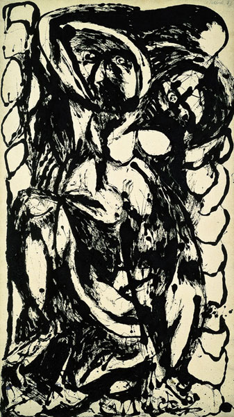
Jackson Pollock
Lee Krasner abstract florals:

http://www.patternpeople.com/pattern-pairs-erdem-x-lee-krasner/

Jose Manuel Broto - Day Celebration 1983

http://www.march.es/arte/palma/coleccion/artistas/jose-manuel-broto.aspx?l=1


Jane Frank, particularly the Aerial Series and Crags and Crevices
Although an abstract expressionist painter, Jane Frank's style of painting is sometimes referred to as 'geomorphic abstraction' (wikipedia - Standing Apart) having a sculptural quality built up with many layers. Described as a laborious process, concerned much with trying to make a three dimensional space on the canvas surface to give the effect of deep voids or passages going back or moving away.
http://en.wikipedia.org/wiki/File:Jane_Frank_Crags_And_Crevices.jpg
http://www.wikiart.org/en/jane-frank

Jaap Wagemaker
http://tunodajyuku2.blogspot.ie/2013/10/jaap-wagemaker-living-desert1957.html
The way Frank and Wagemaker have utilised found materials, I find particularly intriguing.

Angie Zimmerman's fascinating paper sculpture of cast paper pulp (which I would like to make use of in the future), photo collage and wood,  inspired by elements of the natural environment melded together.
http://frankjuarezgallery.files.wordpress.com/2013/01/untitled.jpg


Tuesday, May 20, 2014

Research Point 2: Abstract Expressionism - Tachisme and 'Action Painting'

Famous for his technique of 'all over painting' , Jackson Pollock employed exciting gestural marks - emitting a feeling of almost being able to step into them; they seem both calm and energetic at the same time. These paintings were done on a huge scale, painted on the floor, usually on massive canvases. Greatly inspired by the energy of ethnic art and later, Mexican muralists, European artists like Cezanne and Picasso also had an effect on him. His motivation came from within his head rather than from the real world. He is identified with pioneering the drip technique, very radical at the time and attracting a lot of attention, often criticism. Even so, some work is quite figurative; often I find it possible to discern figures,sometimes faces, in amongst the tangled mass of lines, as in the painting below:


Jackson Pollock, Black and White Number 5, 1952, 142.87x80.645cm, Modern Art Museum of Fort Worth
http://themodern.org/sites/default/files/pollock4a.jpg
His work was generally defined  by liquid paint flicked, dripped and poured onto the huge horizontal unstretched canvases. He would work on all sides, sometimes walking through it. At first glance it was seemingly uncontrolled but looks are sometimes  deceptive, and infact culminated in a complex interrelationship. As he became more experienced with the techniques he was able to precisely control the nature of the lines. Swirling lines appear to go on into infinity. Yet he didn't do preparatory drawing or studies.
Anything to produce the intended effect was used, including tools such as syringes, brushes and sticks in addition to his well known paint pouring from a container, which he sometimes had a hole cut in and swung from the end of a rope suspended from above.
Later on the paintings included a lot of black and white and had echoes of earlier works. Following this period he returned to colour.
Behind the scenes his life followed a destructive pattern which ended prematurely in a violent death.

Tachisme is translated from the French for spot or blob. It was a term first coined around 1951 and has many affinities with Art Informel, often the umbrella heading of Abstract Expressionism - intuitive and spontaneous, though it developed independently.
Paris based artists of note included: Georges Mathieu, Jean Fabrier and Wols. The general difference was their more carefully handled, subtle style than the raw energy of Abstract Expressionism. Franz Kline and Hans Hartung are also closely associated with Tachisme.  I find there are such a vast amount of fascinating artists whose work falls under this category, I can only scratch the surface here. I find them well worthy of further research and that is my intention.
Franz Klines's style was vigorous with large sweeping gestures on a large scale. It was energetic and crisp, even brusque - quite the opposite of subtle. He typically used calligraphic yet bold thick black lines crossing over one another, on a white background, and made many small preliminary brush drawings. These are often referred to as his 'signpost' technique. Tools used were: large decorator's brushes and commercial house paint. He included colour later in life. This one is a good example of his typical style - described as collage but I can't detect any signs. The name is New York 1953:
http://www.wikiart.org/en/franz-kline/black-and-white-png#supersized-artistPaintings-277514
This one is not described as a collage but yet it appears to have been used. Perhaps it was created using an old painting/s. It is simply named Black & White:
http://www.wikiart.org/en/franz-kline/black-and-white-png#supersized-artistPaintings-277497

Hans Hartung had a strong belief that his work should be a reflection on his innermost self, usually extreme emotion. The paintings were often on a large scale and with a plain calm background.
T 1956-9, 1956 180x157cm is painted in an energetic and dramatic manner, setting up a visible tension. Mid toned browns are  trapped between heavily applied dense blacks. It is made up of a web of roughly parallel agitated strokes crossing over one another in slight diagonals from one end of the canvas to the other. They reach out toward the edges, sometimes going off the edges.
http://arttattler.com/Images/Europe/Spain/Barcelona/Museu%20dArt%20Contemporani/B-Bomb/hartung.jpg

http://images.tate.org.uk/sites/default/files/styles/grid-normal-8-cols/public/images/fig-14_0.jpg?itok=PSxCGgA-
Following a stroke in 1986 he became wheelchair bound yet his output was absolutely prolific, producing 360 paintings in his final year (1989)! This is a very interesting article about the experience:
http://www.tate.org.uk/research/publications/tate-papers/very-late-style-hans-hartung

Pierre Soulages   

 Illustrating some of the hallmarks of the artist's style in the early 1950s are:
 http://www.telegraph.co.uk/luxury/art/10024/art-sales-eyes-of-the-world-turn-to-londons-art-fairs.html
http://www.tate.org.uk/art/artworks/soulages-painting-23-may-1953-n06199
  These paintings are dominated by black, interspersed with glimmers of white, pale yellow and bronzes, setting up dramatic contrasts. The backgrounds are calmer which appear to be scumbled on a dark ground.  As with Hartung, bands begin and end within the confines of the picture plane, occasionally crossing over the the edges, resulting in a strong impact. At the height of Abstract Expressionism during the 1950s and 60s he was regarded as a kind of French equivalent to the New York School. To apply  his broad straight swathes of heavily applied paint he uses special rubber spatulas, house painting brushes and rollers.
Soulages still uses a limited colour palette and is often referred to as the Master of Black, quoted as saying:
“Black is the color of the origin of painting — and our own origin. In French, we say the baby ‘sees the day,’ to mean he was born. Before that, of course, we were in the dark.”

Other artists of interest connected with this style of painting:
Gerard Schneider
http://www.wikiart.org/en/gerard-schneider/82c-1958#supersized-artistPaintings-313501
Jean-Paul Riopelle
http://www.tate.org.uk/art/artworks/riopelle-perspectives-t00123
Lee Krasner
http://www.metmuseum.org/toah/works-of-art/1995.595
John Hoyland
http://www.johnhoyland.com/


Hartung - sensuous free-flowing lines
vibrant - thick black

Thursday, May 1, 2014

2 Exercise 2 Dripping, dribbling and spattering

Jackson Pollock, as far as I can ascertain, used enamel gloss paints. These were synthetic resin based paints and new in the U.S. at the time and I think were a factor in why his methods developed as they did. He experimented with the viscosity of the paint and diluted it to differant viscosities to suit the result he wanted. Mostly he diluted them to low viscosity (quite runny) to achieve his signature 'drip' effects.
He applied his 'drip' methods famously using a can or cans of paint with a hole in the bottom attached to a piece of string.

Initially I played around with watery paint on a sketchbook page A4 (above). Paint - watery blue-green on decorator's brush applied loosely, virtually dripped on. Purple-red in spaces in between applied same way and allowed to overlap  blue-green in places - dark margin appeared -  I like the contrast set up by the darker red values and the splattered dark red on same brush against the mid tone blues . It reminds me of woodland or abstracted figures but wasn't conscious of producing anything recognisable. The colours contrast, while not to extremes as are mostly of the same value   - (not quite opposite one another on the colour wheel), they are subdued and I think they work well together.

1. A2 white cartridge paper.
Red and yellow were splattered from large brushes - had to water down the paint sufficiently to get this to work - thick blobs with long streaks emanated. Blue was flicked through fingers - result large and small spots, without streaks. Yellow then poured on from a jar. It mixed appealingly with the paint under, which was wet. Would have been a better idea to have first let it dry.
Some colours intermingle when applied wet on wet. This happened with a watery blue splattered onto yellow and red, resulting in a dull murky brown green. However, being a transparent colour aswell (ultramarine) didn't help. It was also partly to do with the consistency of the paint. At this point I was in two minds about whether to abandon this painting, but I carried on just to see what would happen and was glad I did.  I used another more viscous and opaque blue mixed with acrylic matte medium mixture not containing ultramarine. Although quite runny it held together much better.As I added further layers of colour, some on wet paint, others on dry paint it began to take on a pleasing richness and depth that I hadn't expected. Eventually, after I had added white poured through a 5cm hole in the corner of a freezer bag, the white blobs over the thinner paints below completed the picture nicely, as it were, and I reckoned  it was time to stop. I'm just sorry I didn't use better quality paper.


No. 1

2. A1 black gessoed thick cartridge paper.
Splattered from large brushes and dribbled from containers various reds and blues wet on wet.
It was fascinating to see the way the  blue paint, of different viscosities, intermingled with the  red paint below.
Further mixes of magenta and ultramarine and white  flicked on with side of 5cm brush created lines of spots, flicked from close quarters also developed long thin streaks.
White dripped and flicked a little,  from end of brush mingled interestingly with the more transparent wet purple mix below. The purple crept into some edges developing fascinating delicate veins.
No. 2 with avocado showing scale 

detail on No. 2

3. Surface: dull pink (red/black mix acrylic) painted background of A1 thick cartridge paper.
U'mne/cad yell (green) dripped, spattered. Tried to suggest vague figure of eight - as Pollock sometimes did. After a few minutes some of the yellow part of the mix separated resulting in interesting combination of green and yellow. Attempting a semi-control by placing brush into container while pouring white - became blobs which splattered when touched the paper, merging with previously yellow/blue mix. Two consistencies of white paint were used. Added several more colours - blue, red, yellow. Syringe used to dribble paint, attempting to create continuous thin lines similar to Pollock, but the syringe was too small to cover an A1 sized surface, so I had to work quickly, causing a broken line  of dark red. Tried same process with a green and took out the syringe plunger too early causing large blob, so did the same thing elsewhere so as to balance it out. The more layers and depth that I built up the more their appearance improved. The green didn't look too appealing lying around in large watery puddles, mixing with some of the red, so I dabbed it a little with a rag and voila! it was a success. I couldn't resist adding further white flicked on at close range with fingers. In general I was slightly disappointed at not getting a few longer thin streaks or lines in amongst the marks made.
No. 3 with avocado showing scale

On all three paintings: flicking paint energetically at very close range seemed to work well. I found the immediacy and freedom of this way of painting very liberating and enjoyable and I was very pleased and surprised with the results obtained.


A novel way to use action painting:
Lee Krasner abstract florals:
http://www.patternpeople.com/pattern-pairs-erdem-x-lee-krasner/

This kind of technique could be used to build up interesting surface textures for backgrounds inside or around objects, even over objects. It may need to be masked off if only required in certain areas of a painting.
For making collage papers.
Henri Lamy is a French who artist drops liquid acrylic paint onto the canvas from a knife or throws paint directly at it, combining with his figurative portraits. The facial features appear to be built up with unblended impasto beforehand.
http://figurativeartists.blogspot.ie/2012/11/henri-lamy-figurative-drip-paintings.html
Dave White uses watercolour in a similar way for his animal paintings, culminating in paintings full of vitality, developed out of a most fascinating range of mark making.
http://www.mymodernmet.com/profiles/blogs/dripping-and-splattering-watercolor-paintings
John Worthington drips, sometimes pours and splatters liquid paint over an underlying  framework of shapes forming a realistic landscape.  This process has the effect of  transforming them into something quite poetic, evoking the natural elements. His series 'Low Tide', he says, is layer upon layer poured, wiped away and abraded paint. The pools of liquid paint are often left to dry overnight on the floor. Depending on how they look once dry he decides if they have been successful or not. At least, with practice the happy accidents become more frequent.
 A strong sense of energy and movement is emitted in the series 'Low Tide', by his use of paint pours, drips and splatters over the often strong underlying colours. A great variety of  textures are created by both opaque and watery transparencies. These combine well with calmer flatter areas. I think the stronger base colours and occasional pours in the top layers, help to give a great sense of depth and contrast.
http://johnworthingtonstudio.com/
No. 3 detail
William Baziotes, Gerome Kamrowski and Jackson Pollock did a collaborative painting, 1940-41,  which appears to demonstrate great control over the process of 'action' painting. The calm areas could have been masked off to isolate them from the 'action' painting or painted around afterwards to make defined borders. My guess is it was produced from a combination of these methods and more.
http://www.weinstein.com/artists/gerome-kamrowski/

Advantages (and disadvantages) over more conventional methods of painting:
Could have several paintings on the go at any one time, space permitting - limited by the amount of floor space and protective covering available.
The pre-mixed colours in containers are easy to isolate from one another. Mixing of tonal variations not as important.
If things didn't seem to be working out I found that adding further layersgenerally resolved the situation.
Disadvantage - hard to control the results, I found I just had to go with the flow. However, with plenty further experience I'm sure more control would come about.
Messy process, but this to me is part of the fun - until it's time to clean up that is!