Search This Blog

Friday, December 20, 2013

Exercise 8 Squaring up

Squaring up
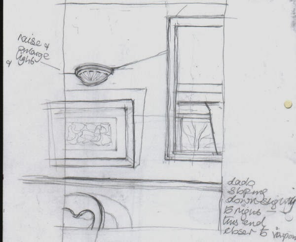
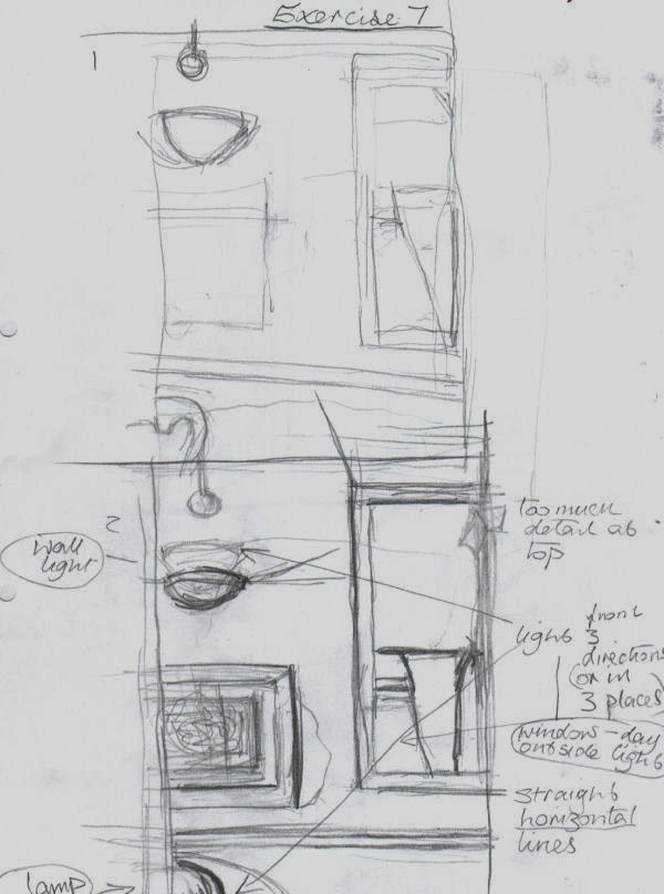
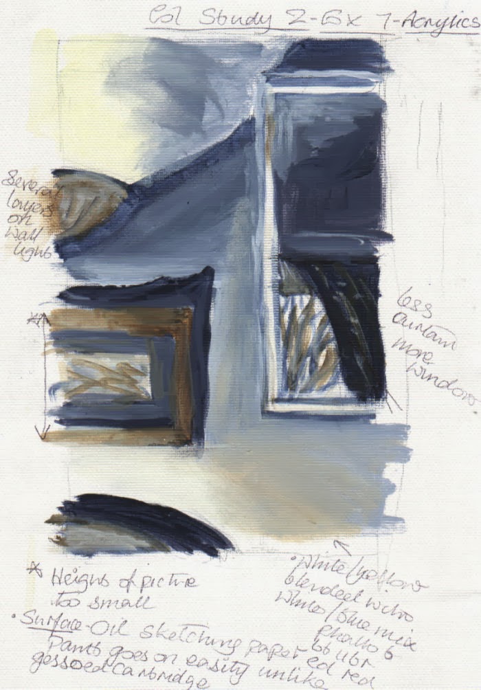
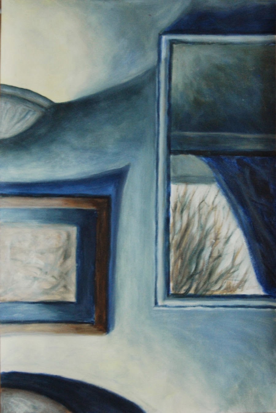
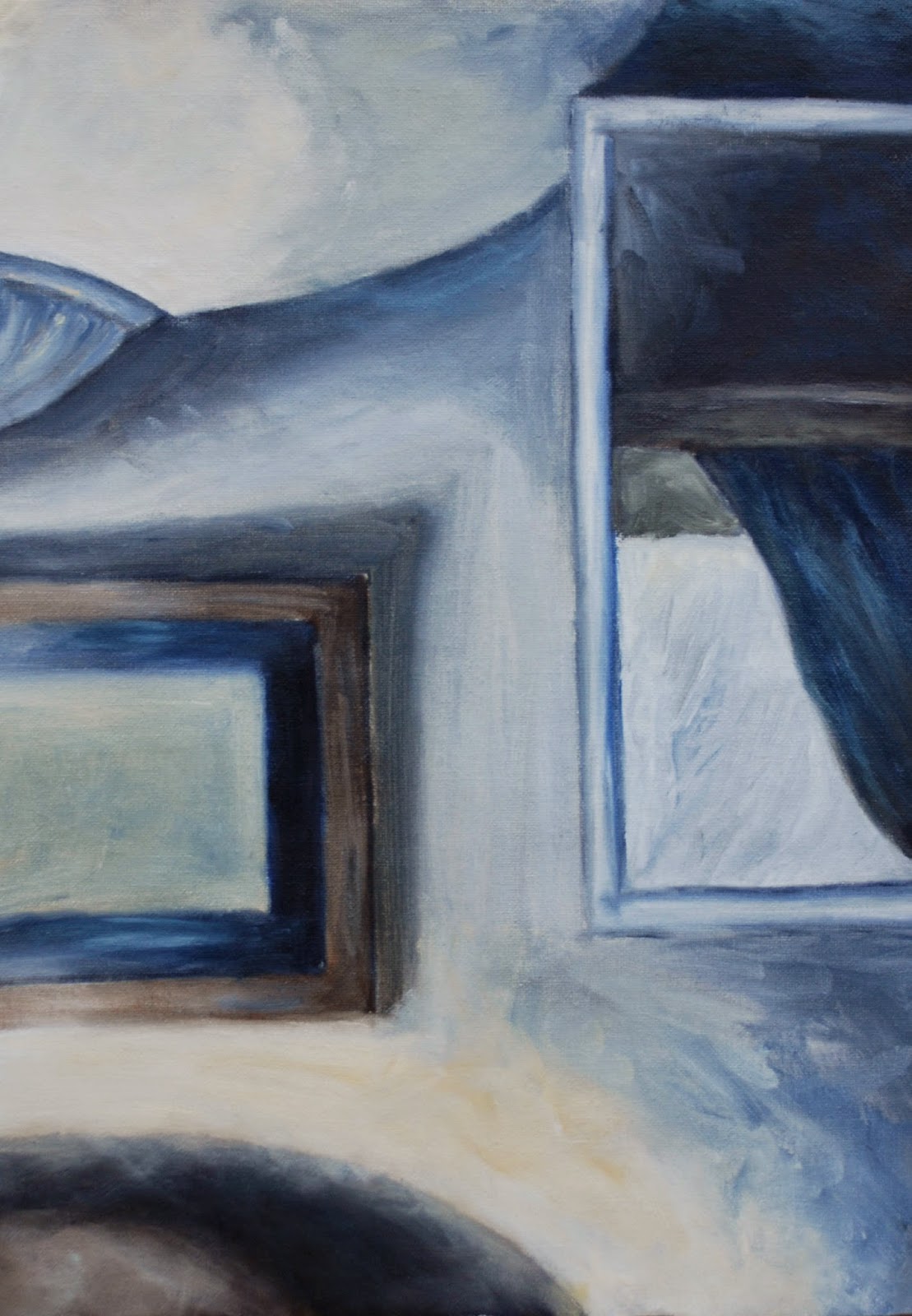
I wanted to use a photograph containing linear perspective to find out if using a grid would make it easier to obtain accuracy. I tried this out with a black and white photo of an art installation, part of which I had cropped from an art journal. I also replaced one or two elements with others taken from another part of the complete photo.


By dividing the height into 10 and the width into 8 equal sized squares and numbering them, it helped me enormously to follow and decide what goes where. It was especially useful to obtain accuracy in linear perspective, though I didn’t get too worried about placing everything in exactly the same place as in the photo.


Friday, December 6, 2013

Exercise 7 Painting from a working drawing

linear sketch 1
Painting from a working drawing
I began by studying several views in my house using a viewfinder to frame them from various angles and to zoom in and out. After tweaking a few elements within my view, of all of them this one appeared to offer the most possibilities. Unfortunately I temporarily lost my instructions for the exercise and the colour studies I made were probably rather more detailed than they should have been, though I think I did describe the objects with minimum detail I thought was necessary. The main concern was getting the colour palette to my liking. The colour study with the plainest palette seemed the most suitable, especially as there was already a lot going on in the lighting of the composition. It was basically a complementary scheme. For the palette I made three different darks – all ultramarine mixed with orange in various quantities. In certain places two, or all three of them were combined until I obtained a tone that looked comfortable in its location. As I progressed through the prep sketches I also moved objects around, adjusted their size and removed them altogether, as with the dado rail.


 Soon after I started the painting I began to realize that despite having thought that some colour sketches were too detailed, ironically they helped me to simplify things. I had quite adequate information from them and didn’t feel any need to also refer to a photograph. In fact if I had used a photograph I think I would have been tempted to put more detail into every element.
After experimenting with the lighting in various ways on the subject I eventually found the most pleasing light and dark balance by  directing it from a lamp on the bottom left – the only source not visible unlike the top left – wall light and the middle right  - reflection of daylight in a wall mirror.

I think the lighting in this composition makes it perhaps fairly unusual. Because the view is on a flat wall surface it could have lacked depth (I did try other viewpoints beforehand but none of them worked) but the view in the mirror helps to alleviate this. For the painting surface I used oil sketching paper, as I had for a colour study, as the acrylic paint goes on with comparative ease. The addition of a drying retarder made blending easy.

colour study 

colour study
 I played down certain detail in the picture to draw more attention to the view of the bare winter tree through window reflected in the mirror. I also like the repeating curves and shapes in this. The shadow above the picture points roughly towards the reflection, but is maybe a bit too pointed.


finished result - 
version 1

Redone - version 2


The first version(1) didn't go down too well with my tutor - I have to agree, it is frustrating that I couldn't see the faults myself, they look so obvious now. Although on plus side there were positive comments about the loose brush marks on the colour study/ies.

In view of the above, I attempted a complete new version (above). The composition was the same but larger. This time, as suggested by the tutor I made an effort to explore the brush marks and leave them visible as opposed to what I did in the first attempt. I allowed a mania for blending/smoothing them away to take over removing any previous potential for personality and basically becomes and exercise in neatness and tidiness. Although the gradations are smooth in the first version it has no liveliness. I have to admit it was a real effort to leave many of the visible brush marks alone. 
Though it appeared to work well in the preliminary stages, I found what complicated matters now was the shadow area above the chair at the bottom left contrasting extremely with the very  light/bright area above. After leaving it alone for a few days I blended it in with the light area above in pale white/yellow, scrubbing on some lighter tones to reduce the hardness and contrast. In this respect it worked but seemed to make other contrasting lights and darks in the picture more exaggerated, so I carefully toned many of the darkest darks down with a little medium to light tones. Hopefully this looks reasonably balanced now, and perhaps even a little painterly.


Saturday, November 30, 2013

Exercise 6 Painting a landscape outside

Painting a landscape outside

On thinking about where to go and what kind of view to use for this painting:
I wanted a location which would be sheltered. As it would most likely be during November when I did the outdoor painting, I took into consideration whether it would sheltered from wind and rain and if isolated and quiet, or busy and noisy. As it happened, I was fortunate enough to spot a location while out walking one day September/October. There were good open views on the side of a haill . it was elevated above a valley, yet sheltered, as surrounded by trees on three sides. It was a quitet spot and there were two long benches end to end. I wasn’t likely to be disturbed by passers-by, especially if I chose a week day.
sketch 1
As far as equipment went I didn’t possess any kind of easel for outdoor painting, so I did a little research on them in books and online. Initially I considered a sketching easel but I found the relatively high price and weight rather off putting. I was more concerned about having something much more maneuverable as well as having a box for storing materials. Fortunately I found the item to meet my preferred criteria when I spotted pochade boxes in a book ‘Oils Workshop’ by Richard Pikesley. In many respects these are designed to be balanced on the knees as they are not self supporting.  However, when doing a comparison between the two it was an easy decision to opt for the latter. Since I would need to walk up quite a steep incline for about 15 to 20 minutes there was no competition really.  Pochade boxes also have the advantage of containing slots in the lid where several painting boards can be stored behind one another with a gap between them.
During my outing to do the painting I found it was fairly easy to transport all the equipment I needed with the assistance of a small rucksack. Just before setting off I discovered that a container of turps had leaked all over the bottom of the bag so it was transferred to another container in kitchen paper and a thick plastic bag.
Firstly I took a few photographs to help me frame the views in one way, then used my viewfinder to help me find views from which I made three sketches from varying angles.
I also used them to zoom the views in and out a little. It was a fresh windy day, but fairly overcast and the sun was shining intermittently from my left. Initially I tried a low horizon line, but raised it after realizing that the sky on that day was relatively uninteresting compared to the ground: hills down to the valley and upwards again to the stone and earth banking just a couple of metres in front to me. So, after the third sketch I decided to raise the horizon line.
sketch 3
outdoor painting
The view that I chose to do was similar to the third sketch, as it seemed to have a good range of interesting features, while not too fussy. After outlining roughly the largest shapes in thin paint I used undiluted paint to lay in the large masses.  There wasn't much contrast of light and shade due to the weather being quite overcast. It wasn't too difficult to make some out on the foreground wooden posts, banking and trees, but I had to half close my eyes, looking hard to pick out the value changes in other areas. I rearranged and altered some of the existing elements to suit my desired composition. I didn’t want to take more than an hour painting, partly because there was the danger of it looking too laboured if I continued beyond a certain stage. It wasn’t such a difficult decision to make as I started to feel the cold and knew before long my hands would be numb, even though I was wearing thin woolly gloves. In total I was there for 1.5 hours, including making the three sketches and a painting. When I got home and looked over the photos I had taken while there, I was surprised to see how much the light had changed during the time as I didn’t notice much then. I felt that the painting looked unfinished, like a quick study. In fact that’s what it was, but it had taken slightly longer – about 30 to 40 minutes.


second version painted indoors
I went ahead with a second version as I had a hankering to try to see how much progress I could make with a longer version based on the first. The second version took a bit longer to do – about two hours. Even then I had omitted a lot of detail and moved some elements around and left out the wooden posts in the foreground. It turned out that I went back to it a couple of days later to finish the detail in the stones because I had been getting the wet on wet paint turning into a muddy mess. I also added further shadows to the lower clouds, and later realized they became too heavy looking.  I should have left them as they were beforehand..

Wednesday, November 20, 2013

Exercise 5 Creating Mood and Atmosphere

On  looking through a book ‘Alla Prima’ by Al Gury I felt quite inspired by his paintings portraying woodlands. To me they evoke differing moods and plenty of atmosphere – intriguing and mysterious. Consequently I couldn’t resist having a try at my own version. Gustav Klimt’s woodland paintings also probably had a part to play.
The next hurdle was to find my own subject material. I had a browse through some woodland photos taken during a walk a couple of miles away from where I live. Eventually found something which appeared to fit the bill.  After a couple of rough sketches from different photos I did a monochrome study. I thought it was a good idea as the source photos looked almost devoid of colour and very dark in the foreground. I reckoned it would be easier to pick out the values for my painting from this, rather than from the photos. I mixed 6 values, initially 8 but found it was too complex, so I cut the number down a little more. Firstly I painted in the darks for the tree trunks and some main branches. These were simplified and reduced somewhat from the photo.
 For the second (colour) study I experimented with oils to get and idea if I would find them suitable for my chosen approach this subject.  Early on in the process I had put on the paint for the middle background. This was a midtone, covering a large area. It was more diffucult to obtain the same amount of brightness from the palest tones as in the upper half, though I kept adding thick paint with a light touch of the brush. Eventually it appeared to work. After finding acrylic worked well on the monochrome study and struggling to avoid dullness, even mud with the oils, I decided on acrylic for the next painting of woodlands.

For this I got the ‘not’ so bright idea of sketching in the forms with inktense blocks first, then covering the ground with yellow ochre acrylic. In the meantime I had forgotten that inktense is not waterproof when wetted, so when a river of mud began to appear I had to try and seal them using dark acrylic, losing time unnecessarily. Fortunately it was relatively plain sailing after this near catastrophe. There was only one further small hiccup along the way: after a fairly short while into the process it became increasingly clear to me that my brushwork looked mechanical in comparison to the previous studies. I remembered that I’d rotated my wrist much more in those studies, so once I did this it soon began to take on a more varied and interesting appearance. I used transparent and opaque paint consistencies in layers, scumbling some areas to blend edges and leaving hard edges in others. I intended all the tree branches to be opaque but as some of them became transparent I decided I quite liked them, so left them alone. I was aiming for an impression of something elusive and curious and hopefully have at least gone a good part of the way to achieving this.
final painting

Friday, November 15, 2013

Part 4 Research Point 2: EXPRESSIVE LANDSCAPE

Expressive Landscape

1.After WW2 the Surrealist Max Ernst moved to Arizona where he began to paint strange landscapes. In 'Europe after the Rain 2', 1941 he used a collage technique which he had invented, called decalcomania. This produces a multilayered effect by pressing gouache  onto a surface with paper. After his bad experiences in Europe during the war he produced this painting very reminiscent of the war. It portrays a twisted landscape in which there appears to be inhabited by ruins, broken figures and wreckage. If this is what the painting is about, it is a powerful denouncement of the ravages of war.
http://uploads7.wikipaintings.org/images/max-ernst/europe-after-the-rain-ii(1).jpg

Giorgio de Chirico I will have to assume this is the original as there are many copies out there apparently:
http://lucaantara.blogspot.ie/2005/11/enigma-of-autumn-afternoon.html
Founded the style of Metaphysical painting in the early 1900s. Had a profound influence on the Surrealists. His early paintings juxtaposed the familiar with the strange or fantastical. This was partly due to influences of Arnold Bocklin and Max Klinger. His paintings became more realistic in style from the 1920s onwards.
The early paintings such as 'Enigma of an Autumn Afternoon' 1910 are strange simplified scenes of old towns, with large empty spaces occasionally inhabited by one or two isolated figures, pieces of old classical sculpture, buildings with exaggerated perspective and foreshortening. Usually the colours are sombre greens, greys and ochres. There is either a distant view, sometimes containing a train in the distance going across a landscape. Sometimes there is a high wall, behind which might be the top of a figure or other object and long shadows as in 'The Long Shadows of an Afternoon'. The skies are  dark, dramatic and threatening.

Salvador Dali  a Surrealist noted as one of the most versatile artists of the 20th century who was successful in many areas from sculpture to fashion design. He was fascinated by classical and Renaissance art, evident in his style of hyper realism. He built up very detailed images with thin layers of paint using thin brushes. The themes he used were symbolic of eroticism, death and decay, influenced by Freuds's theories on psychoanalysis.


2.Paul Nash 'Pillar and Moon'. Nash had an interest in Surrealism. He often placed apparently unrelated objects together in unusual situations, although this isn't as mark in this painting. http://www.tate.org.uk/art/artworks/nash-pillar-and-moon-n05392
Nash was interested in Surrealism and was very affected by his experiences of World War as a soldier and artist. His landscapes were largely symbolic and he often placed apparently unrelated objects together in unusual situations. In 'Pillar and Moon' this isn't as apparent as in others. Dominating the scene is a tall stone crumbling pale toned old pillar with a sphere on the top which is situated almost centrally and reaches almost to the top of the painting. To the right, on the same level is a white yellow ringed full moon in a mid blue sky. This seems to set up a sort of mysterious connection between the two. At the base of the pillar is a stone wall going across from one side to the other. Behind the pillar are lines of tall bare trees receding into the distance, again going across the whole composition. The moon casts a yellow eerie glow onto the large empty space on both sides of the trees. The colours are muted blues, greys, reds and ochres. There is a diagonal downward slope on the far right of the wall, echoing the shadows cast by the trees on the banking filling the large empty space behind it. This combination sets up a desolate looking lonely kind of scene.

John Piper
http://www.tate.org.uk/art/artworks/piper-glaciated-rocks-nant-ffrancon-t06446


Graham Sutherland who, as well as Nash, was also affected by his experiences of World War I. Many of his landscapes contain contorted forms and appear to portray nature's constant struggle.
'Entrance to a Lane' 1939 is semi-abstract in appearance. A certain feeling of tension existing between the elements. It shows a small arched entrance or doorway in the centre with bright toned small amorphous shapes above and to its right suggesting a light source. This is enveloped in tightly knit overhanging shapes in muted colours and tones. The overhanging dark branches and leaves are the only indication that they are trees forming and arched entrance as the forms are more like smooth bending walls. The directional lines and shapes of the 'walls' wrap themselves around the scene like a protective blanket emerge outwards with a strong linear perspective, towards the viewer. On the left, underneath a mysterious object hanging from a branch, and inside a long dark menacing looking shadow, there is a strange reflection from the yellow area in the entrance.
https://www.tate.org.uk/art/artworks/sutherland-entrance-to-a-lane-n06190


3.Gustav Klimt's symbolist landscapes have a characteristically square format and standard size. Many of his woodland paintings appear quite flattened, highly stylized and full of intricate patterning, rather similar to his portraits. 'Fir Forest II' is one such scene - quite dark and claustrophobic, containing  a multitude of tall narrow trees, with only small glimmers of light towards the top. The colours are uniformly muted greens and browns and the tree trunks appear to merge into one another. Although it is very detailed  and I think, is a good example of his pointillist technique:
http://www.klimt.com/en/gallery/landscapes/klimt-tannenwald2-1901.ihtml
'Roses Under the Trees' 1905 is another example of pointillism. This time the colours are more cheerful, though still a flattened composition devoid of light and shadow:
http://www.wikipaintings.org/en/gustav-klimt/roses-under-the-trees


Emil Nolde was for a short time, a member of the Die Brucke group of German Expressionists. When I googled Nolde's landscapes I was taken aback by a veritable feast for the eyes at the stunning vibrancy of colours on display.
During the 1910s Nolde painted powerful almost abstract seascapes in oils,. In 'The Sea III' 1913 depicts an unsettled deep blue sea with dramatically defined surf capped waves rising up in sharp peaks to a high horizon. Moving forwards the waves, topped by chunky white ridges of surf containing hints of green and yellow from the sky, decidedly increase in size, as do the dark and deeply undulating spaces underneath and between. The effect is increased by the use of thickly applied paint. The sky is a relatively small area, but still has great impact as it has been painted in a vivid green over dark blue and contrasts with the dark blue of the sea. To me, these elements combined promote such a strong impression of movement, that if I looked at this image for long enough I could imagine getting sea sickness.
http://www.thearttribune.com/spip.php?page=docbig&id_document=1341
Here is a vivid landscape depicting an isolated vivid and dramatic landscape. I think it has a great sense of space resulting from the large flat area of green, while also claustrophobic from the dark low looming sky:
http://www.thearttribune.com/spip.php?page=docbig&id_document=1337

J

Saturday, October 26, 2013

Exercise 4 Aerial Perspective

This is taken from Wikipedia, which I think sums up the meaning in detail but very clearly: Aerial perspective or atmospheric perspective refers to the effect the atmosphere has on the appearance of an object as it is viewed from a distance. As the distance between an object and a viewer increases, the contrast between the object and its background decreases, and the contrast of any markings or details within the object also decreases. The colours of the object also become less saturated and shift towards the background color, which is usually blue, but under some conditions may be some other color (for example, at sunrise or sunset distant colors may shift towards red).
In addition the colours become gradually  cooler.
.
Before putting together the final painting, I tried out some techniques of aerial perspective in two simple acrylic colour studies of nearby moorland. I found in these it was necessary to try and use all three principles - moving into the distance what we should be able to see is: controlled loss of focus, reduction of contrasts and cooler colours.
no 1 - acrylic

I used the same sequence in all three paintings – beginning with the sky, reducing the size of the clouds towards the horizon line. Next I used a slightly darker mixture on the distant mountains and blended the edges into the sky. I continued in this fashion, gradually adding warmer tones ie. from pale cool blue in the far distance to warm purple-reds or dark yellowy greens in the foreground, thicker more textured paint and stronger contrasts.
Colourwise, I used cool blues in one painting and purples in the two colour studies, adding more white to reduce contrasts towards the horizon. In the colour studies I also added more white paint towards the horizon. The ground is cool blue shade so I didn’t need to add any of this.
no 2 - acrylic

I one of them (no 2) I like the small dark blotches of nearer clouds. They really seem to add  a sense of receding space and movement to the sky. This was an idea inspired by the artist Richard Pikesley who is very fond of doing the same thing with the clouds in his paintings, giving them what I would call a distinctive quirky look.
In the final one (no3) I laid a ground of artist's painting medium (linseed oil and petroleum distillate) on the surface beforehand. I found this idea in a book called All About Techniques in Oils by Parramon publishers, various artists. According to the project instructions, painting over a base of oil helps to create hazy atmospheric effects. Certainly the paint went on smoothly and it was very easy to blend, but not too much so. The only drawback was the extra drying time and the resulting very shiny surface - this could always be alleviated by a matt varnish when the painting is fully dry. The brushes were a combination of flats and a new filbert brush size 6 which I found to be very versatile and best for depicting tree tops and texture in the foreground.  I also moved the still wet paint around in places with paint pushers and fingers. When the acrylic colour studies were partly dry I rubbed off some paint to expose the ground of streaky cyan and ultramarine on gessoed paper.
However of all three paintings I would say my preference is for no.2. I prefer the palette and I think the overall paint application is more interesting.
painting (no3) - oil


Saturday, October 5, 2013

Project Perspective Exercise 3 Linear Perspective

This is a definition of linear perspective taken from the Collins English Dictionary:
n
1. (Art Terms) the branch of perspective in which the apparent size and shape of objects and their position with respect to foreground and background are established by actual or suggested lines converging on the horizon
Collins English Dictionary – Complete and Unabridged © HarperCollins Publishers 1991, 1994, 1998, 2000, 2003


I made use of a nice morning and went to a nearby village to make sketches and take a few photos. When I arrived there despite looking around for quite a while I had a little difficulty in settling on a view which was to my liking. I wanted to find something with curving lines of buildings for added interest and with a low horizon line to give a sense of space and distance, but it seemed impossible to come by. Finally I chose a spot with a good view of some interesting looking old ramshackle buildings in an alleyway off a crossroads on the main street. Somewhere that I could sit down to sketch relatively undisturbed, or so I thought.. Anyhow, the first sketch  focused only on the old buildings. I decided this looked rather closed in and although the building were receding into the distance there wasn't  much depth. When I zoomed out with my viewfinder a bit more so that the view of the street on my side of the crossroads was visible there was a big improvement in this respect. It also brought into view what I thought was an interesting juxtaposition of angles and shapes. There was  a curve on the edge of the pavement and some beer barrels outside a pub on the corner where there was a tall street lamp outside. Also, being a bright clear morning, there were good contrasts of light and shade, evident in the long shadows. Both the sketch displayed on here and the more finished composition were completed using watercolour pencils and crayons.

 As there is a lot going on below the horizon line I didn’t intend to do much with the sky. As it happened it was blue and cloudless at the time. However I did put some scribbly lines in which possibly detract from it. The foreground shadow is very dominant as it is large and dark and runs from one side to the other. I’m not sure if this is acting as a barrier to the elements behind it. Also the beer barrels – they don’t seem to look as spontaneous and convincing as I would like. Otherwise I do like the way the medium has reacted with the surface watercolour paper giving a broken almost shimmering effect.  I think I have the perspective and proportions reasonable accurate and the composition seems to work.


The second sketch in wax crayon of a street in Kinsale.  Thinking about the techniques Giacometti used in his paintings and drawings I decided to add directional perspective lines from the buildings, continuing out to the edges of the paper, in as many places as possible. It was an interesting exercise. I would also like to try out a painting using a similar technique to one Raoul Dufy would often use - to quote a sentence from the exercise guidelines: using painting diluted to washes to create a sense of indeterminate space that is structured just by line. 


Friday, September 20, 2013

Exercise 2 Hard or Soft Landscape

I took this opportunity to do a painting of rock formations by the sea, as it is something I've wanted to try for a long time. For me, materials like plastic cards and palette knives, along with oil paints would have to be instrumental in putting it all together. Although I didn't get this idea until doing a couple of studies in acrylic and realised these materials would be far more suitable for what I had in mind. So I went ahead, after writing out a rough plan and doing a few tests with the intended medium and materials.

To obtain a sense of layers I tried to use strongly contrasting shapes and tonal areas - the sky, water and sand are flat and horizontal and quite smooth, applied with a brush. Whereas plastic cards and knives were used for the hard upright solid forms of many rocks, particularly the largest and most prominent at left centre. I exaggerated the height of the large central rock to add impact and the diagonal angle to increase the sense of perspective. I angled the upper half inwards to make it sharper and more angular. The lower more rounded rocks look soft in comparison. The overlapping shapes of the rocks move across the mid ground from one side to the other. Water and sand in the foreground and the sand in the mid ground form a receding figure of eight which curves and snakes its way backwards. I like the effects of where the cards and knives have been scraped through the still wet paint to reveal some of the dried layers and ground colour producing scratched out lines alternating with built up ridges of paint. Rags came in useful too, as they often do, for obliterating and altering certain passages.

The colours I chose, particularly for the rocks, have been exaggerated.  They are contrasting (blues and deep yellow-oranges) and quite unrealistic, which I thought would look more striking than what was actually there. The sand and water colours are closer to the real thing, unlike in the colour study in which the sand had a rather strong deep tone. I prefer the darks to look more unrealistic than the lights. It also helped with the process of this painting to do a certain amount of work on it, then return and finish it at least a week later, well after the first applications had dried.

finished


Thursday, September 5, 2013

Research Point 1 Evolution of Landscape Painting

Evolution of landscape painting from the eighteenth century to the present day.
Historically landscape painting once ranked quite low on the list of important genres. Indeed painting/sculpture wasn't even considered as 'art' until about 1400.
In Europe it wasn't generally taken seriously in relation to most other genres until the 18th century when 'view' paintings became more fashionable, exemplified by the 'Grand Tour' in Italy, reflecting the climate of prosperity. However, it was an 'ordered' form of landscape compared to what was to follow later. Gainsborough and others would make preparatory sketches on the spot before completing their paintings in the studio. In the late 18th century Jean Baptist-Camille Corot was one artist who benefited from this new found popularity, also partly brought about by the popularity of a book in France by Pierre-Henri de Vallenciennes - 'Elements de perspective practique' which stressed the importance of the study of real nature.

Landscape painting in the 19th century  experienced unprecedented changes and enjoyed a major rise in popularity. This was  brought about by economic and social changes connected with events such as the Industrial Revolution in Britain and the Revolution in France. Idealized classical scenes became less and less important .
Watercolour as a medium became more prominent along with a trend towards feeling in landscape rather than exact representation. John Robert Cozens sought to emphasize the amazing vastness and atmospheric effects of the landscape. Both Alexander Cozens and his son John Robert were leading proponents in this regard. . Alexander Cozens was famous for developing the 'ink blot' technique based on a product of accident as opposed to design and which was quite cutting-edge for the time. Excellent examples and more information shown here:http://www.tate.org.uk/context-comment/blogs/watercolour-alexander-cozens-aka-blot-man
Other artists who dominated watercolour landscape painting at the time were:  John Constable, J.M.W. Turner, John Sell Cotman and Thomas Girtin. Cotman's work was exacting, yet the way he painted shapes and forms was bordering on the abstract.
Turner had a fascination with the elements and his watercolours were also often quite abstract.
Norham Castle, Northumberland: Sunrise. As with many of Turner's paintings there is at least one watercolour version and a painting in oils. It is bathed in a warm golden glow and an atmospheric haze, there is an impression of vast space and minimal detail. In the foreground there are soft warm yet clear contrasts. The tones are warm yellows and subtle pinks and there is a grazing animal in warm orange yellow. Warm yellow tones to each side and in the reflections on the central area of still water  bring the area forward. Moving back, the middleground contains some cooler blues. The horizon is very blurred and colours merge even more. Golden reflection on the water from the sun is quite noticeable and contrasts with the blue of the castle, while it is also very subtle. The background is bluer still and so indistinct as to give only a slight suggestion of a high object (the castle?) and distant hills, giving the illusion of great distance.
http://evermore.pwp.blueyonder.co.uk/artists/images/turner/turner_norham_castle_sunrise.html
Constable like to capture the weather at certain times of day, then used them as references for his watercolour paintings. There's a good range of his work, including many cloud studies, on this link:
By this time artists increasingly sketched out of doors and the immediacy and portability of this medium was ideal for the purpose of capturing fleeting moments. Their watercolours became more experimental, often painting with bold sweeping strokes on rough textured papers. Skies and atmosphere played a prominent part in most of these artist's compositions.

Some of the ways in which modern and contemporary artists have chosen to interpret this genre are through reflecting social, political and environmental concerns for example:

Sophie Iremonger  is one such artist who uses post apocalyptic vision of animals taking over urban landscapes:
http://www.artfetch.com/edition/168/order-in-chaos/

Of her work she is quoted as saying on  http://fagcity.blogspot.ie/2012_08_01_archive.html

"Glamour, the erotic and nostalgia: those are the building blocks of my practice," says painter Sophie Iremonger, who moved to Berlin after finishing art school in her native Dublin in 2008. "I'm not an old master painter," she asserts. "I'm a woman. And I'm here now." Well that's a revelation!


Bernard Pras
Pras uses found discarded objects in his work to recreated classic paintings such as Hokusai's famous woodcut 'The Great Wave'
and Van Gogh's 'Starry Night'.  His technique follows the historic system of anamorphosis. 

A clear description of the term can found on here: http://www.anamorphosis.com/what-is.html
To quote wikipedia: Anamorphosis is a distorted projection or perspective requiring the viewer to use special devices or occupy a specific - . vantage point to reconstitute the image. http://en.wikipedia.org/wiki/Anamorphosis
When viewed from afar they appear like authentic paintings, but on closer inspection, instead of paint or paper collage, we see old drinks cans, barbie dolls, toilet rolls, coloured wires and old plastic bags to name but a few. He takes a photo of the finished work and uses these for display purposes. These huge striking constructions give new purpose to things meant for the landfill.
 http://www.mnn.com/lifestyle/arts-culture/photos/14-artists-with-a-green-message/bernard-pras


Friday, August 30, 2013

Exercise 1 View from a window or doorway

It's easy to find many images online views looking out of windows. Many artists over the years must have been inspired by these views which, if it is a view seen everyday can easily be taken for granted. All of them seem to convey to me a sense of contemplation and solitude. There are adequate views from my own house to choose from but all seemed to have their drawbacks but find it hard to be enthused. I had t o start somewhere, so did a few small sketches and a colour sketch of slightly differing views from kitchen window, dining room - of conifers and finally, from the lounge. A charcoal sketch of this view worked out more to my liking, so went ahead with this. A colour study and a painting later, I feel generally pleased with how things have turned out.

charcoal sketch
A view onto garden from lounge. This has the edge over the other views I think. The elements seem to balance better and there is a line leading the eye into the distant dark shadows behind the white garden pillar. The perspective of the hedge promotes a sense of recession.
Acrylics - on a ground of ultramarine and red mix.
During process I sprayed the canvas surface frequently when needed more time to blend the paint, it worked well.
I discovered that by using a dry brush with the paint on the background trees was very effective with the darks. After applying basic mid tone using repeated layers of paint (not just glazes) the paint kept on sinking into the canvas, virtually drinking it up, despite having three layers of gesso - albeit homemade from emulsion paint and pva. Whereas on paper I've found that the sinking reaction doesn't occur as long as one or two coats are applied first.
The time of day was around late afternoon. The sky looks a bit turbulent with a strange light as though just before a storm - it wasn't but that's how it turned out. As it happened it was a false alarm. I think this appearance is due to the fuzzy edges, especially in the garden, sky and the reflection on the windowsill.

Paul Nash Pink Hyacinth http://www.bbc.co.uk/arts/yourpaintings/paintings/pink-hyacinth-30020
I admire the way he has depicted the vase of flowers on the windowsill, my attention is drawn to this, hence the reason for the title.  It looks to have been done with just a few quick casual lines, asymmetrical, off balance and quirky. Alternating thick black contours balance it up well. It is quite simple looking and has a
very limited palette of muted colours - warm oranges and pinks with just a touch of green.

As a fauvist painter Raoul Dufy's main interests were saturated colour and decorative design. This is certainly evident in his painting 'Interior with Open Windows', where both the interior and exterior seem to have equal prominence. These kind of scenes actually became his hallmark and he was criticized for his paintings lacking substance, yet they were also a reflection of his optimistic personality. They depicted a sunny side of life, inviting luxurious interiors often looking out onto luxurious resort/locations, such as the French Riviera.http://uploads7.wikipaintings.org/images/raoul-dufy/open-window-1928.jpg!Large.jpg

In contrast, Edward Hopper had a spare manner of painting. He depicted realistic scenes of urban life, containing isolated figures and highly contrasting light and shadow. There is almost always a certain sense of isolation about at least one of them even when two of the characters appear to be in conversation with one another, as in 'Nighthawks'. http://en.wikipedia.org/wiki/File:Nighthawks_by_Edward_Hopper_1942.jpg
His viewpoints were often unusual and exude a sense of of mystery and loneliness. Some of the people in his paintings could easily have been on the margins of society in some way.

I noticed that 'Corner of the Artist's Room' by Gwen John, painted during her affair in Paris with Auguste Rodinis, is displayed in several colour schemes on various websites. This one particularly appeals to me, a quiet, almost monochromatic scheme. It seems to be shrouded in a veil of mist, giving a feeling of mysterious isolation, the same time it looks inviting and restful.
https://www.museumwales.ac.uk/en/whatson/?event_id=3648
colour study


completed painting

Tuesday, August 6, 2013

Assignment 3 Self Portrait

Arrangements in portraits are many and varied. They can range from a full figure, or a number of figures, to an extreme close up portion of a face. Described below are several that have helped to give me some inspiration for a self portrait and (hopefully) others in the future: 

Lucien Freud – Self portrait – Reflection with two children 1965. He must have painted this one from a high viewpoint with the mirror very low or even on the floor. He has portrayed himself as a huge domineering figure in relation to his own two tiny children at the bottom left; from this angle his domineering presence is further accentuated. The impression is one of him looking down at them while simultaneously looking at his own reflection in the huge mirror, perhaps a little anxiously. The two lamps, one above his shoulder and the other behind, give a sense that they are high above on the ceiling, contributing to the sense of scale. The colours, in muted, tones tend to add an air of brooding calmness.
http://www.wikipaintings.org/en/lucian-freud/reflection-with-two-children-self-portrait-1965

Freud - Man's Head - self portrait 1963. This is like a halfway house between his early and mature style. Thick buttery paint applied, without the gritty texture of later on. The paint - sensuous and smoothly flowing,  seeming to repeatedly encircle the face and background creating the impression of  turbulence . This negative space is carefully delineated against the face and neck making it more pronounced. Though the background contains mostly the midtones and colours used on the head and neck it has a life of its own. The whole thing has very tactile quality. Painting one's own face from this angle, with eyes looking downward from above, almost inevitably causes one to look a little arrogant, as I have discovered with my own self portrait in this assignment, yet the expression here also looks tired and slightly drawn.
http://www.wikipaintings.org/en/lucian-freud/man-s-head-self-portrait-1963
William Orpen - Self Portrait, Multiple Mirrors 1924.  There is a series of his self portraits displayed on the following linked web page, which were completed at different stages in his career. This particular one is situated roughly half way down the page: 
http://www.articlesandtexticles.co.uk/2006/06/26/painters-i-should-have-known-about-6-william-orpen-part-1/
Orpen's reflection recedes within multiple repetitions of the same mirror, until it almost disappears into the distant skyline, outside the open window behind. He was fond of using all sorts of tricks to created optical illusions in mind bending ways. 
The brushwork appears to have been applied quickly with some transparent washes in the lower half. I think the paint has been applied thickly on the main foreground face. At the same  time it has a certain luminosity. More attention seems to be drawn to this area because of the relatively large amount of detail and the pinky tones, contrasting with the green top.The sky in the background gives a feeling of airiness and space.


A Self Portrait
Thinking back to the early stages of this part of the course, when I tried out some exercises based on Emily Ball's book Drawing and Painting People a Fresh Approach, I was still hankering after trying a portrait or two in paint by using a roughly similar process. The head studies in this book are like nothing I've ever seen. At first glance I wasn't sure about the artwork in the - childlike, even primitive, but now this is what particularly attracts me to them,  they seemed to grow on me as I found out more about the thinking process behind them and corresponding techniques.
Here is an example of one in charcoal (below), in acrylic (right) and another of Vincent Van Gogh I tried out for myself:
The techniques used give extraordinary results to put it mildly - will have to work further on this....

Vincent Van Gogh - sorry Vincent


 In Jeffrey Camp's book - Paint a Manual of Pictorial Thought and Advice, a self portrait by Daniel Millar and the two self portraits by Lucien Freud (above) found the high viewpoints in the three paintings very intriguing, not to mention the brushwork is loose and free. The viewpoints were major factors in my decision to try out a similar angle; using myself as a model rather than another individual was relatively straightforward.

Mostly I chose a self portrait because the last one took me out of my comfort zone in the sense of having to scrutinize my own face at very close quarters, then transferring what I saw onto a surface with paint. I wanted to see if this time round the process would be any easier - it wasn't. Sketches didn't affect me the same way - I think it was the prolonged intensive study of a painting which made the difference. The other reason for a self portrait was having a captive model, so if there was any aspect I wanted to re-check I could easily do so. Otherwise, with another person, they would need to be present, or one would need good photograph/s to refer to, naturally these have their limitations.


another viewpoint
- tonal sketch
Also, I wanted to be more methodical than with some previous colour mixing tests with flesh tones. Two or three short videos on utube helped to steer me back in the right direction. One recommended just using three colours (including white), an earthy red and yellow ochre, pulling colours  into one another to get a full range of skin tones. From another a useful tip was to mix raw umber and ultramarine with white to make general grey tones to reduce the chroma of any mixes which appear too bright.  I found that this didn't really happen on this occasion apart from the rims of the eyes. Conversely a little cadmium red came in handy at times to brighten mixes or 'pinkify' them. These tips were particularly helpful.  I did add a touch of raw umber and ultramarine in various quantities, to thin mixtures of  white and burnt sienna around the outlines of the eyes to tone down. Glazes were also used in one or two other isolated places such as the eyebrows. I like the way the perspective has worked in the background. It plays an important part as it serves to extend the negative space into the distance, adding to the feeling of recession.

Summary
No tonal underpainting on this one - for a change. Proportions were a bit of a struggle in the initial stages, yet I did think I'd solved the conundrum before me until.....almost as soon as I'd finished the painting I realised there still was something wrong. The irony of it was that I think the rough colour study looks much better proportioned, yet no measurements were taken for this - just judged by sight.  I know looking up at the face through a mirror tilted at low angle wasn't exactly the easiest angle to use. But I went ahead with it because I wanted to attempt a different angle from previously, just to see what would happen.
 a colour study
I managed to spot about half way through that the eyebrows were too high, but even after moving the eyebrows down, something was still niggling away that seemed not quite right, yet I could't figure out what. Getting the proportions correct with figures and faces is crucial and when something is out it shows without necessarily identifying itself until later on - exactly what happened here with the eyebrows, but not with the lower face until it was too late to alter things. Despite taking comparative measurements of most areas, there was one I must have forgotten...when I compared by measuring the length of the neck to the face with my own reflection, I found that the lower half of the face is too short in relation to the neck and the upper half of the  head. I thought the neck was too long initially, but it seems to agree with the height of the upper half of the head. This is surprising because I still think it looks too long.  I got a photo taken of my head at the same angle and this helped to confirm things. I am quite irritated with myself for not spotting the discrepancy earlier. At least now I know where I went wrong. 
final painting
before alterations
The outlines of the eyes look too prominent - as if I'm wearing eye liner  which is not the case. It is just shadow, but despite repeated efforts to soften them with various glazes (as above) it isn't enough. And because they looked too light on the colour study I darkened them on the painting, but evidently went over the top. I think the angle of the spotlight on my face tended to iron out some wrinkles and other imperfections, which  is undeniably an aspect I'm in favour of, but admittedly, it is a little removed from reality. The colours are derived from the self portrait of Daniel Millar's. Though he seems to be a virtually  unknown artist I think he's used a great colour combination, giving off a mysteriously moody atmosphere - unfortunately I can't display it for copyright reasons. The brushwork contributes much to this. I think if there is anything else to recommend my own painting, apart from the background area, I think it is the light on the left side of the face, the texture and tones of the hair and the way tones on the lower part  and on the neck seem to swirl round in slightly abstract, rather than realistic way. 

Later alterations - the face is now better proportioned in relation to the neck. I gave the whole painting a makeover and there is now no area completely untouched by alteration or addition of some sort. The rims of the eyes have been softened. The background has been toned down, as advised by my tutor. The neck was too long so I raised the shoulders. I lowered forehead, widened the left nostril and narrowed the left curve of the chin, sketching in lightly with pencil.
The parts to be altered (or re-proportioned) I covered in white paint acrylic, then yellow ochre including the background. The skin tones were too yellow so I 'pinked' them up.
Alterations:
Eye rims - softened using small brush and mal stick with thinned white and yell ochre
Shoulders  re-painted, with burnt sienna and cadmium red.
For flesh tones used a base mix (or mass tone) of white/raw sienna and yellow ochre (touch). I managed to pick up some advice in this regard from an expert on the online forum Wet Canvas. Though I shortly after revised this as it was too yellow even minus the yellow ochre, so I added a small amount of raw umber to the raw sienna and white instead - this appeared to look more in tune with my own basic skin tone.  Following the information I also neutralized the tones under the nose and around the jaw area adding a tiny amount of a mixture of raw umber and black to the mass tone above. The cheeks, nose, lips and ears:
I mixed a touch of cadmium red with the mass tone. Under the chin - touches of alizarin crimson and viridian with the mass tone.
Final painting - post alterations
Note: On my previous attempt, because the warm light was making the flesh tints appear warmer I used an over predominance of yellow ochre in mixes, which include cad red, ultramarine and burnt sienna with white, hence my model (me) had quite a jaundiced look. The reflected light is a little confusing as well as adjacent colours - red  in the top, and green (background. The only reflections i could make out were red from the top onto the neck and lower face. There was no reflection of green as you would expect, because I exaggerated the background green. Hence I manufactured a subtle hint of it later on the skin. I added a retarder to most of the mixes to help prevent the paint drying up too quickly on the palette and so I could work with the paint longer on the painting surface - this helped enormously. I noticed at times, problems with the tonal ranges - often slightly too dark or light, the transitions were jolting. Fortunately I found a magic ingredient - matt gel medium. I didn't appreciate its capabilities at all beforehand, but found that it was very useful in making opaque paint more transparent and easier to blend. It was most useful for semi-transparent mixes used for subtle reflections i.e of the hair colour on parts of the face and neck. 
The light was confusing on the first portrait version. I could see this time that was there was in actuality a good deal of light reflection on the hair and the left side of the face. I lightened some of the hair with burnt sienna and cadmium red adding a little white later to the mix - gel medium added to this appeared to work well for subtle light reflections in the hair. The following glazes enhanced the light reflections on the face and neck and top:
rose pink (cadmium red/raw sienna/white), green (phthalo blue/cadmium red/yellow ochre) then cobalt blue/ yellow ochre - this glaze was thinner and included glazing medium (gloss). I found that the glaze medium was ideal for adding translucency and depth over previous glazes.
The slight changes of skin tone described above, for different areas of the face were something I was prepared to try out and it seemed to work on the whole, despite finding that I needed to alter the occasional small area and go over with a couple of slightly coloured glazes near the end.
I realize what a very subtle balance needs to be achieved with skin tones, for them to look true to the sitter's own and one often has to go through a good deal of trial and error to get there:  the end result (above right)


Wednesday, July 24, 2013

Telling a Story Exercise 9

I decided to shuffle around various photos of figures in different poses - pics collected from magazines etc. Not having cut and pasted magazine images for any composition before, it was a bit of a challenge, but also an enjoyable novelty.


The number of figures kept on increasing. I eventually cut them down to a manageable number but still ended up with at least three different photos, and I invented some of  the background. The stance and expression of one particular large figure made me think of disagreement even confrontation, so I  used red as a ground colour. Something about it made me think of Egon Schiele's  colour choices - these of course are in keeping with turmoil and upset, which I get the impression was certainly running close to the surface in many of his paintings. The rest of the scheme included greens, dark umbers and blues (almost black) and red tinged flesh colours, again I thought, redolent of Schiele's colour choices.
I would say if the colours seem to jar with one another in places, it has had the desired effect.
After several sketches and colour studies (including and alternative much calmer looking scene) I made a start on the painting with the help of multiple references.

At first I had problems with the paint sinking into the canvas, even though I'd applied two coats of gesso and an undercoat of acrylic. But it was the reverse of the side I would normally use. After the first layer the paint was a little easier to apply. It was hours before I was reasonably happy that the the facial details of the two most prominent figures looked convincing enough. The number of figures increased from two to three to five during the preparatory stages. I was thinking about the possible dialogue taking place between them, the posturing and the facial expressions are what fascinated me most of all.


colour study

colour study


Again I was conscious of trying to obtain an effect similar to Diebenkorn's paint application on and around his figures, but yet again, I couldn't manage to pull it off.
The background didn't gel initially, despite my efforts to keep it simple so as not to distract from the interaction of the figures. The centre area looked too busy , I think as it wasn't adequately blended and the tones didn't balance. Hopefully now it has been softened and the floor darkened the balance is working. At least now it doesn't seem to be fighting for attention, while it has the ability of suggestion and to become part of the narrative, which when also taking into consideration the figures, could be interpreted in several ways. The green and blue tones complement the red ground where it shows through, so that is intended to enhance the tense confrontational mood.
finished painting
Now it's completed I see aspects of the colour study on the red ground which I prefer to the finished painting such as the immediacy of the brushwork and more ground colour showing through. Although some things are out of proportion ie. the head of the figure facing out in the right foreground is too small.