Search This Blog

Showing posts with label Exercises. Show all posts

Wednesday, June 25, 2014

6 Project: Towards Abstraction Exercise 6 Abstracting from man made form

Other artists influential for this exercise were again Jaap Wagemaker and Jane Frank, also Jasper Johns - 'Hateras' and collages of Charles Winebrenner, Maury Haseltine and Katherine Chang Liu http://www.collageartists.org/meetingsarchive/2010_03_Katherine_Chang_Liu.html


Subject: zoomed in area of an oil burner - a mechanical part of an oil heating boiler. This was a broken component taken off the house heating boiler and was lying around in the utility room. I concentrated on various zoomed in areas of my subject, but while doing the first four thumbnail sketches (not shown) I again fell into the trap of trying to represent correct perspective, form, scale etc becoming aware that I was somehow missing the point here. I had to change tack - what I have learned about  abstraction  is that important elements would include simplification, distortion, flattening, exaggeration. In other words changing the subject to a point beyond recognition.

Above - three A4
 pages of final sketches

A transition came about when I made a conscious departure from initial sketches and started to play around with selected features of one area in different arrangements - these are shown to the right. During the final few sketches and the colour studies I was mindful of trying to maintain an essence of the subject's character in this area of the component:  the hollowness of the circles and other geometric shapes and hinting at other small mechanical parts within and behind them. Also to suggest the surrounding area of mostly smooth and distressed grey metal surfaces.  This continued into the final painting.
My colour studies were a big influence on what was to follow for the painting. I used the colours from the second study - vermillion, and mixes of crimson, pthallo blue, magenta, raw umber and titanium white.
Paint and materials application was a similar process to the first study in yellow and blue.I tried to evoke the the underlying hues found  in the object, putting a more vibrant slant on them.
Painting from man made form
Towards the end there were areas I needed to resolve before I could say it was finished. After a bit of close scrutiny I tried the following:
toned down parts of the lightest areas  and tried to further integrate certain other areas using watery glazes of purple with dry a brush. I also
introduced more directional shapes and lines to link up the upper left of the large circular shape with the rest of the composition,
enhanced repeated texture and patterns of the smaller rough circles and dk purple/blue colour blocks.


 Right and below - colour studies


Saturday, June 14, 2014

5 Project: Towards Abstraction Exercise 5 Abstraction from natural forms

In the preliminary stages I went through a long succession of ideas and sketches before finally settling on a piece of textured bark.
simplified tonal sketch
The other items I tried out didn't have the same appeal somehow once I tried sketching them. Days went by, doing sketch after sketch, feeling I had made little or no progress, until I finally tried out a few versions of the flat edge of the tree bark. Out of frustration I left them all alone for a few days then returned for another look and it appeared that many had potential. I was still confused about how to proceed  - questions arose around issues of whether and how to make changes like simplification, flattening , exaggeration, distortion etc.
I cast my mind back to a collagraph project  I did with children at the school where I work not long ago and remembered how I drew a simplified image of guitar  then cut the image  into pieces, turned them around in various directions and stuck them down again using as a basis for collagraph prints. I did another tonal sketch (right), this time more angular and simplified than the others.
painting part complete
It eventually transpired that the final painting contains some of these elements, but not so much flattening - a final frontier I haven't been able to conquer yet. Simplification was also quite a challenge, more so than I expected. Aswell as textures I always feel I have to also describe tones. I guess it largely depends on how abstract the intention is.
Media and materials used for the painting:
acrylic, gesso mixed with all purpose pollyfilla, pva, corrugated card, sand, cement dust mixed with pva and used palette paper.


completed painting


I looked at the work of Jaap Wagemaker in the process of this project
http://nl.wikipedia.org/wiki/Jaap_Wagemaker#mediaviewer/Bestand:Jaap_Wagemaker_(1965).jpg

Accidentally found this image - no offence Jaap but I can't help seeing a uncanny similarity with my own, though I have to admit the palette works on this,whereas on mine the pinks look insipid.
http://www.simonis-buunk.com/sold/zoom/Adriaan_Barend_Jaap_Wagemaker_7879.aspx


Sunday, May 25, 2014

Part 5 Project: Adding other materials, Exercise 4: Mixing materials into paint

I mixed rice, sand, eggshells, rice and gravel individually into a number of mid toned paint colours.

To test them out further I decided to find out how they would translate a painting.
A3 sized gessoed mountboard. Rice was the only material I didn't use. As with the previous exercise this one is imaginary.
Before beginning I contemplated Anselm Kiefer's landscapes of high relief textures.
http://seaofgray.com/2011/10/13/the-commonalities-of-salt-flats-and-anselm-kiefer/
I was attracted to the muted palettes and decided I wanted to use a similar palette to that of Kiefer's. By some coincidence the colours were similar in the materials I had already pre-mixed with paint used for the inital test pieces. The mix of black and burnt sienna acrylic around the perimeter came about as I was thinking of a frame of some kind, reminiscent of so many Howard Hodgkin paintings, some impression of looking out or into something. This combined with other elements seems to set up a kind of ambiguity, which is one aspect I find interesting.  I had secured the materials before applying the dark paint around the edges and the remainder. The sand/rusty orange mix, I spread on with a painting knife/plastic card and scratched through much of it with a blunt knife blade. I extended colours of the high relief mixes into other areas, leaving scattered white patches from the base layer. To this I added watery pale blue dripped from a brush and allowed it to run down the board.
As  I approached completion reminded me of a volcanic landscape. An application of pva in selected areas brought out a little more interest.

Saturday, May 10, 2014

3 Exercise 3, Part 5, Preparing a Textured Ground

1.  A4 size gessoed mountboard. Spread heavy gel medium with card to make raised surface with ridges and rough circular shapes. A little course sand sprinkled on sparingly in isolated areas. Flexible Pollyfilla used to make raised broken circle. The theme that appeared in my mind was 'Broken Time'.
Sprinkled on fine salt when semi-dry. Thin paint brushed on with wide brush, manipulated with finger, paint pushers and spoon handle to scrpe off some paint. At this stage it waas too busy. Built up depth with layer of thin paint. Removed some paint by sanding. The 'flexible' pollyfilla I had used to make the broken circle like shap was not amenable to this treatment. I should have used a general purpose version instead. The painting became very dark, so once it was dry I sanded some more . This seemed to work well, bringing out the brightness of the white gesso here and there underneath.


2. On the second painting (on 37x34cm cardboard) I dribbled pva from a container and let it run down the board in thick and thin wavy lines and glued on brown paper wrinkled up, in rough pointed almond shapes. I added a piece of magazine page in a very pale blue, two small blue diamong shaped paper, two pointed elliptical shaped leaves and  a couple of leaf shaped pieces of wallpaper. The pva looked much flatter once it dried, just as acrylic paint would.
Once it was all dry I dipped the board int orunny paint on flexible palettes. This didn't work as well as it had done in previous experiments on watercolour paper. Instead I  picked up the paint on large brushes and allwed it to drip down with the board tilted. During this process it started to remind me of some images of textiles I had been viewing on line, must have had an unconscious influence on me.
I wanted the almond shaped magazine paper as the focal point but it didn't as things elsewhere were far too busy, so calmed it down through a process of adding, removing opaque paint.
I also added a little stamping with thin strips of corrugated card. The leaves were very effective in adding interesting texture. I reinforced the lines shapes made by the pva with further dark paint.
Looking at it afterwards, I find a certain reminiscence with the luxuriant growth in the field hedge not far from my kitchen window.


Thursday, May 1, 2014

2 Exercise 2 Dripping, dribbling and spattering

Jackson Pollock, as far as I can ascertain, used enamel gloss paints. These were synthetic resin based paints and new in the U.S. at the time and I think were a factor in why his methods developed as they did. He experimented with the viscosity of the paint and diluted it to differant viscosities to suit the result he wanted. Mostly he diluted them to low viscosity (quite runny) to achieve his signature 'drip' effects.
He applied his 'drip' methods famously using a can or cans of paint with a hole in the bottom attached to a piece of string.

Initially I played around with watery paint on a sketchbook page A4 (above). Paint - watery blue-green on decorator's brush applied loosely, virtually dripped on. Purple-red in spaces in between applied same way and allowed to overlap  blue-green in places - dark margin appeared -  I like the contrast set up by the darker red values and the splattered dark red on same brush against the mid tone blues . It reminds me of woodland or abstracted figures but wasn't conscious of producing anything recognisable. The colours contrast, while not to extremes as are mostly of the same value   - (not quite opposite one another on the colour wheel), they are subdued and I think they work well together.

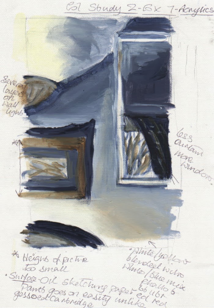
1. A2 white cartridge paper.
Red and yellow were splattered from large brushes - had to water down the paint sufficiently to get this to work - thick blobs with long streaks emanated. Blue was flicked through fingers - result large and small spots, without streaks. Yellow then poured on from a jar. It mixed appealingly with the paint under, which was wet. Would have been a better idea to have first let it dry.
Some colours intermingle when applied wet on wet. This happened with a watery blue splattered onto yellow and red, resulting in a dull murky brown green. However, being a transparent colour aswell (ultramarine) didn't help. It was also partly to do with the consistency of the paint. At this point I was in two minds about whether to abandon this painting, but I carried on just to see what would happen and was glad I did.  I used another more viscous and opaque blue mixed with acrylic matte medium mixture not containing ultramarine. Although quite runny it held together much better.As I added further layers of colour, some on wet paint, others on dry paint it began to take on a pleasing richness and depth that I hadn't expected. Eventually, after I had added white poured through a 5cm hole in the corner of a freezer bag, the white blobs over the thinner paints below completed the picture nicely, as it were, and I reckoned  it was time to stop. I'm just sorry I didn't use better quality paper.


No. 1

2. A1 black gessoed thick cartridge paper.
Splattered from large brushes and dribbled from containers various reds and blues wet on wet.
It was fascinating to see the way the  blue paint, of different viscosities, intermingled with the  red paint below.
Further mixes of magenta and ultramarine and white  flicked on with side of 5cm brush created lines of spots, flicked from close quarters also developed long thin streaks.
White dripped and flicked a little,  from end of brush mingled interestingly with the more transparent wet purple mix below. The purple crept into some edges developing fascinating delicate veins.
No. 2 with avocado showing scale 

detail on No. 2

3. Surface: dull pink (red/black mix acrylic) painted background of A1 thick cartridge paper.
U'mne/cad yell (green) dripped, spattered. Tried to suggest vague figure of eight - as Pollock sometimes did. After a few minutes some of the yellow part of the mix separated resulting in interesting combination of green and yellow. Attempting a semi-control by placing brush into container while pouring white - became blobs which splattered when touched the paper, merging with previously yellow/blue mix. Two consistencies of white paint were used. Added several more colours - blue, red, yellow. Syringe used to dribble paint, attempting to create continuous thin lines similar to Pollock, but the syringe was too small to cover an A1 sized surface, so I had to work quickly, causing a broken line  of dark red. Tried same process with a green and took out the syringe plunger too early causing large blob, so did the same thing elsewhere so as to balance it out. The more layers and depth that I built up the more their appearance improved. The green didn't look too appealing lying around in large watery puddles, mixing with some of the red, so I dabbed it a little with a rag and voila! it was a success. I couldn't resist adding further white flicked on at close range with fingers. In general I was slightly disappointed at not getting a few longer thin streaks or lines in amongst the marks made.
No. 3 with avocado showing scale

On all three paintings: flicking paint energetically at very close range seemed to work well. I found the immediacy and freedom of this way of painting very liberating and enjoyable and I was very pleased and surprised with the results obtained.


A novel way to use action painting:
Lee Krasner abstract florals:
http://www.patternpeople.com/pattern-pairs-erdem-x-lee-krasner/

This kind of technique could be used to build up interesting surface textures for backgrounds inside or around objects, even over objects. It may need to be masked off if only required in certain areas of a painting.
For making collage papers.
Henri Lamy is a French who artist drops liquid acrylic paint onto the canvas from a knife or throws paint directly at it, combining with his figurative portraits. The facial features appear to be built up with unblended impasto beforehand.
http://figurativeartists.blogspot.ie/2012/11/henri-lamy-figurative-drip-paintings.html
Dave White uses watercolour in a similar way for his animal paintings, culminating in paintings full of vitality, developed out of a most fascinating range of mark making.
http://www.mymodernmet.com/profiles/blogs/dripping-and-splattering-watercolor-paintings
John Worthington drips, sometimes pours and splatters liquid paint over an underlying  framework of shapes forming a realistic landscape.  This process has the effect of  transforming them into something quite poetic, evoking the natural elements. His series 'Low Tide', he says, is layer upon layer poured, wiped away and abraded paint. The pools of liquid paint are often left to dry overnight on the floor. Depending on how they look once dry he decides if they have been successful or not. At least, with practice the happy accidents become more frequent.
 A strong sense of energy and movement is emitted in the series 'Low Tide', by his use of paint pours, drips and splatters over the often strong underlying colours. A great variety of  textures are created by both opaque and watery transparencies. These combine well with calmer flatter areas. I think the stronger base colours and occasional pours in the top layers, help to give a great sense of depth and contrast.
http://johnworthingtonstudio.com/
No. 3 detail
William Baziotes, Gerome Kamrowski and Jackson Pollock did a collaborative painting, 1940-41,  which appears to demonstrate great control over the process of 'action' painting. The calm areas could have been masked off to isolate them from the 'action' painting or painted around afterwards to make defined borders. My guess is it was produced from a combination of these methods and more.
http://www.weinstein.com/artists/gerome-kamrowski/

Advantages (and disadvantages) over more conventional methods of painting:
Could have several paintings on the go at any one time, space permitting - limited by the amount of floor space and protective covering available.
The pre-mixed colours in containers are easy to isolate from one another. Mixing of tonal variations not as important.
If things didn't seem to be working out I found that adding further layersgenerally resolved the situation.
Disadvantage - hard to control the results, I found I just had to go with the flow. However, with plenty further experience I'm sure more control would come about.
Messy process, but this to me is part of the fun - until it's time to clean up that is!

Thursday, April 10, 2014

1 Exercise 1 PART 5 IMPASTO and SGRAFITTO

a) Using a brush - a simple still life.  Oils, colours: burnt sienna, raw sienna, cadmium yellow, cadmium red, ultramarine, titanium white on oil sketching paper. I was a bit confused about the instructions regarding mixing of colours - not sure if the idea was to use unmixed tube colours only or not, but I suspect it was. I know this wasn't exactly what the exercise was about either, but in the end the temptation to mix colours on the palette got the better of me as I wasn't comfortable with the thought of them turning out looking totally unrealistic. For the first attempt I set up an apple, a pear and a banana. The first pear attempt was a disaster as I placed one colour over another so they merged together. They were certainly thick smears as requested in the manual, but they mixed together too early on. The second pear was a little easier and the banana, no problem. By the time I reached the fourth attempt at a piece of fruit: an apple there was a slight improvement in technique as I managed to keep the colours slightly more separate, though the shadow at the base went a little haywire. The paint seemed to have quite a lively appearance, despite colours merging here and there. Although I set up the composition carefully this care soon went into oblivion as I struggled to handle the paint.

b) Acrylics: avocado, mango and onion on canvas paper. The paint was unmixed tube colours this time. I did however mix in heavy body medium to thicken the colours. The process was going okay, apart from when I left it alone for half an hour after applying the darks, so they were virtually dry on my return. I added the mid and light tones and blended the edges a little in the darks. I added a few more darks over the darks so I could blend the edges with other colours. Of course I found it impossible to obtain to obtain accurate matching of the actual colours and tones on my arrangement. I felt more confident this time than I did  with the oils. It could have been due to the different medium - acrylics. I was more certain of where to put the appropriate colours and keep them confined to intended areas.
c) Oils. fruit: apple, pear, lime, banana. Cols: cad red, cad yell, mixed green, white. banana, cols: cad yell, yell ochre, white, touch ultramarine,  pear: raw sienna, cad yell, touch u/mne. and lime, cad yell, touch u/marine and touch viridian - this was ideal to lift the dullness of the green mix I had. on canvas paper. Burnt umber and u/mne for some darks. The colours were mixed this occasion rather using straight from tube.
The paint didn't sink into the surface as the acrylics did, but I was guilty of fiddling about for too long with the paint in attempt to obtain a convincing representation - what it was not for a good part of the process.
The brush sizes ranged between no.s 4 - 8 - a mix of flats, rounds and a filbert.
d) Acrylics. Banana, apple, lime and avocado. Used mostly tube colours, mixing occasionally for dark red and green shades. I couldn't help going over the lime and parts of the apple on the dried paint as the previous colours and tones didn't look at all convincing. Though I employed very rough brushwork and, as with the other three thick paint the acrylic did sink into the surface a bit, unlike oils. Acrylic is deceptive in the sense that also shrinks on drying.

2. Using a painting knife. Oils were used for all of these experiments. I basically just messed around with various styles of painting knife.
They are great for defined ridged or smooth contours and edges. Also fantastic for quicly obtaining texture with two or more colours wet on wet yet the colours don't blend as they would with a brush. Each colour seems to keep its own integrity.
Paint was pulled along  to make parallel lines with a flat straight blade. This produced thick straight linear marks. A rather three dimensional effect resulted.I twisted it from side to side in different ways - one of which produced interesing wiggly lines rather like a gnarled tree trunk and  branches.Another was hit and miss smooth and ighly textured surface in parallel lines reminiscent of aged posts or columns perhaps. When I pulled the paint and knife across these at 45 degrees.  When the paint was double loaded (two colours on the knife blade) they went on adjacent to one another. When I pulled and pushed the flat of the blade from side to side the colours intermixed gave off a beautiful effect.


In a simple woodland landscape I used a knife and scratching with end of a brush handle/crochet hook or fishing hook. Used various knives - including thin rectangular bladed one for the tree branches. Dark thick paint over light base of acrylic. Easily able to sculpt and scrape the paint producing very raised and textural surface. And for extended time due using oils. Acrylics would have needed retarder to do this and would shrink when dry. However the oil paint used in this took several weeks before it was even touch dry in the thickest parts. Having said that I think this method and medium would have improved a previous woodland painting I did in Part 4 I think would have been tactile and more expressive with both brush and/or knives. I used cards to apply the paint on some rocks in another landscape painting in Part4 (Ex2 hard/soft landscape), though I think the whole painting looking at it now, was completely overdone. Also some previous still life exercises in Part 2, but I got the impression the emphasis in the course manual was on using just brushes. The particular painting was of an onion and garlic, using oil paints . I did obtain some raised texture but I did use a knife to increase the raised effect. I tried scratching the paint in the garlic but wasn't enough contrast with the colour of the underlayer and the paint could have been thicker without fighting with the onion for attention. I had some trouble with both acrylic and oil on canvas. Though surface was well prepared the paint sunk in. Think could have enhanced some light areas with a painting knife. Knowing what I know now I would have used a surface like primed paper or card, not canvas, and a much darker underlayer. Again in this section, with another experiment on thick paper, I tried out a quick study of a vase useng fairly thick light toned oil paint on a smooth textured surface. I scratched away some of the paint around the contours and patterned areas to reveal the dark base layer. Using this method proved easy to obtain an effect I was happy with. I would certainly like to use oils again in this way.
The simple landscapes from imagination, I did at the start of this course, I think could have been made a bit more expressive if I had used other ways of applying paint apart from brushes, as indeed could many other exercises.
Partly because it  was on my mind, at the end of this exercise I did an experimental painting of imaginary still life - bottles and 'other' objects in acrylics. I used a card and rough loose brushmarks of white, pink, red and green paint on a dried green painted ground. Plus scratched into semi-dry paint on the left bottle and tonked wet red paint - using pressure to remove paint with a piece of paper. The process of chance and discovery was quite fun, some accidental effects emanated. The end result leaves a bit to the imagination,  which I was pleased about, leaving me with a keenness to try and approach more of my work in the same way - not so easy when I know something's going to be critiqued though.
Another part of my motive was that I had been looking at some of Cy Twombley, Willem de Kooning and Howard Hodgkin's work and was in admiration of the loose gestural brushmarks. I was also intrigued by the way de Kooning and Hodgkin used the effect of a frame or opening into a room or entrance or view on something. There was also some influence there, I think of Mel McCuddin (described as a figurative expressionist) in the way he paints his quirky figures from the imagination, akin to carving positive shapes out of negative space.
http://www.spokanehowsbusiness.com/news/archiveStory.asp?theArticle=1054


SGRAFFITO is a technique of ornamentation in which the surface layer of paint is scratched into to reveal areas (usually contrasting) of the surface underneath. Historically it has been used in several areas, such as in wall design and ceramics and glass manufacture for many centuries, where it has been used to scratch back an area of glazing or plaster.
Cy Twombley is a notable 20th century artist who made use of this technique in his multi layered paintings, using many different media and materials. 
http://www.theartsdesk.com/visual-arts/twombly-and-poussin-arcadian-painters-dulwich-picture-gallery

As a contemporary artist using scraffito, part of Robert Joyner's technique is often to scratch back into the paint as part of his loose and painterly style.http://napavalleyartcamp.blogspot.ie/2011/07/making-lines-with-robert-joyner.html


I scratched back through the wet oil paint
into the dried dark backgroundof acrylic in this quick study
of a vase.
Scraffito could be described as scratching into a layer of usually wet thick paint with a tool such as the end of a brush handle, a piece of card or even a fingernail to reveal a layer or layers of an underlying surface. The colour or tone of this surface usually contrasts with the paint being scraped off. It can be used for a whole range of effects, from complex pattern to a single thin line. This technique can even work with dry paint using very sharp tools and as long as the support is sufficiently resilient and thick to withstand the pressure. Wet impasto oil paint is a typical example of where it would be easy to use. Dried acrylic would take a bit more working out.


Sunday, January 5, 2014

Exercise 9 Working from a photograph

Version 1 - not for assessment.
For an increasingly irritating amount of time I was looking for a photo to use. Nothing I saw seemed ‘quite right’ – trees in the mid ground or hills/mountains in the background. Ironically after all the searching round I settled on a view of a field just next to my house. It appeared to contain all the right elements. The photo is a few years old from a time when there were fence posts receding to the mid ground. These have now disappeared and the track is now more well used and worn. The field is all crop stubble, whereas it was pastureland before. Now I have plenty photos of both of views, taken from various angles.
 Not long after, I found another photo I wanted to try, from a newspaper.  Its allure was the dark silhouetted trees and buildings, but most of all the mist.


This looks like a field containing a crop of some kind, so I mixed dried crushed leaves with pva and applied these to the foreground area for texture and thinner mixture in middleground field and the line of trees. If there are any leaves on the trees, the leaves echo probably these. I took a little used stay wet palette paper with dried on paint and stuck these down for some texture in the trees.
I tried to break away from the original photo by cropping it with a viewfinder and masking off the area I decided to use.

version 1
Just by using sketches, I couldn’t seem to obtain satisfactory results with from the misty look. I suggested faint directional tracks like those on the first sketch, these weren’t in the photo but they looked out of place. So, I felt compelled to keep referring back to the photo to try and work out where I was going wrong, adding glaze after glaze, over the opaque paint base, scumble after scumble, rubbing some back with a rag just before dry, but none appeared to solve things. Funnily enough, after the point I think may be beyond repair I discovered Tonalism, but all the examples I found were done using oil paints. I may make a further attempt at improving it after some thinking time has passed.

I regretted slightly that I didn't choose an oil painting medium as a base and oil paints over the top, as I think the medium with the oil paint would be more conducive to creating a misty atmospheric effect. This is something I will have to try out on another occasion.


Version 2 -assessment
Two colour sketches
The reference photo for this as taken at a warmer time of year on a sunny day. It is a view of silage bales in a nearby field. This was the first painting I did totally using knives. I kept to a strictly limited palette and quite small surface dimensions because of the large amount of paint needed for each colour. This can also create with adequate room for mixing on the palette itself. I usually find I need at least two large tear of palettes. I also wanted to focus on practicing knife techniques here rather than worry too much about the colour palette. I found this to be one of the more enjoyable paintings. One major fault is the aerial perspective I think is lost a little due to the darkness of the distant mountains against the deep yellow next to it across the middle distance. However, I think the linear marks of the field patterns help to balance this out to some degree, lending perspective and give a look of recession into the far distance.
Changes:
As the sky was very blue all the way to the horizon, I took the advice of my tutor again and practised with some quick studies of skies as loosely as I could allow myself. Colours used cobalt blue, then prussian blue, both mixed with  a little burnt umber, gradually adding more whit approaching the horizon and a little yellow ochre - this was added to reflect the ochres of the earth tone in the field stubble. The mountains were very dark so I lightened them a little with some sky tones and to give them light reflection from the sky. This, and the gradation in the sky gave the background further depth and recession. The touch of yellow ochre has a warming effect without advancing unduly. The white, yellow ochre and prussian blue produced  attractive muted hues, compared to ultramarine used alone for instance, which is very intense.


finished version before alterations to the sky


After alterations to sky - there 
is quite a lot of light reflection off this photograph;
I don't think the sky is so bright in actuality.
The photo was dulled
down slightly


Friday, December 20, 2013

Exercise 8 Squaring up

Squaring up
I wanted to use a photograph containing linear perspective to find out if using a grid would make it easier to obtain accuracy. I tried this out with a black and white photo of an art installation, part of which I had cropped from an art journal. I also replaced one or two elements with others taken from another part of the complete photo.


By dividing the height into 10 and the width into 8 equal sized squares and numbering them, it helped me enormously to follow and decide what goes where. It was especially useful to obtain accuracy in linear perspective, though I didn’t get too worried about placing everything in exactly the same place as in the photo.


Friday, December 6, 2013

Exercise 7 Painting from a working drawing

linear sketch 1
Painting from a working drawing
I began by studying several views in my house using a viewfinder to frame them from various angles and to zoom in and out. After tweaking a few elements within my view, of all of them this one appeared to offer the most possibilities. Unfortunately I temporarily lost my instructions for the exercise and the colour studies I made were probably rather more detailed than they should have been, though I think I did describe the objects with minimum detail I thought was necessary. The main concern was getting the colour palette to my liking. The colour study with the plainest palette seemed the most suitable, especially as there was already a lot going on in the lighting of the composition. It was basically a complementary scheme. For the palette I made three different darks – all ultramarine mixed with orange in various quantities. In certain places two, or all three of them were combined until I obtained a tone that looked comfortable in its location. As I progressed through the prep sketches I also moved objects around, adjusted their size and removed them altogether, as with the dado rail.


 Soon after I started the painting I began to realize that despite having thought that some colour sketches were too detailed, ironically they helped me to simplify things. I had quite adequate information from them and didn’t feel any need to also refer to a photograph. In fact if I had used a photograph I think I would have been tempted to put more detail into every element.
After experimenting with the lighting in various ways on the subject I eventually found the most pleasing light and dark balance by  directing it from a lamp on the bottom left – the only source not visible unlike the top left – wall light and the middle right  - reflection of daylight in a wall mirror.

I think the lighting in this composition makes it perhaps fairly unusual. Because the view is on a flat wall surface it could have lacked depth (I did try other viewpoints beforehand but none of them worked) but the view in the mirror helps to alleviate this. For the painting surface I used oil sketching paper, as I had for a colour study, as the acrylic paint goes on with comparative ease. The addition of a drying retarder made blending easy.

colour study 

colour study
 I played down certain detail in the picture to draw more attention to the view of the bare winter tree through window reflected in the mirror. I also like the repeating curves and shapes in this. The shadow above the picture points roughly towards the reflection, but is maybe a bit too pointed.


finished result - 
version 1

Redone - version 2


The first version(1) didn't go down too well with my tutor - I have to agree, it is frustrating that I couldn't see the faults myself, they look so obvious now. Although on plus side there were positive comments about the loose brush marks on the colour study/ies.

In view of the above, I attempted a complete new version (above). The composition was the same but larger. This time, as suggested by the tutor I made an effort to explore the brush marks and leave them visible as opposed to what I did in the first attempt. I allowed a mania for blending/smoothing them away to take over removing any previous potential for personality and basically becomes and exercise in neatness and tidiness. Although the gradations are smooth in the first version it has no liveliness. I have to admit it was a real effort to leave many of the visible brush marks alone. 
Though it appeared to work well in the preliminary stages, I found what complicated matters now was the shadow area above the chair at the bottom left contrasting extremely with the very  light/bright area above. After leaving it alone for a few days I blended it in with the light area above in pale white/yellow, scrubbing on some lighter tones to reduce the hardness and contrast. In this respect it worked but seemed to make other contrasting lights and darks in the picture more exaggerated, so I carefully toned many of the darkest darks down with a little medium to light tones. Hopefully this looks reasonably balanced now, and perhaps even a little painterly.


Saturday, November 30, 2013

Exercise 6 Painting a landscape outside

Painting a landscape outside

On thinking about where to go and what kind of view to use for this painting:
I wanted a location which would be sheltered. As it would most likely be during November when I did the outdoor painting, I took into consideration whether it would sheltered from wind and rain and if isolated and quiet, or busy and noisy. As it happened, I was fortunate enough to spot a location while out walking one day September/October. There were good open views on the side of a haill . it was elevated above a valley, yet sheltered, as surrounded by trees on three sides. It was a quitet spot and there were two long benches end to end. I wasn’t likely to be disturbed by passers-by, especially if I chose a week day.
sketch 1
As far as equipment went I didn’t possess any kind of easel for outdoor painting, so I did a little research on them in books and online. Initially I considered a sketching easel but I found the relatively high price and weight rather off putting. I was more concerned about having something much more maneuverable as well as having a box for storing materials. Fortunately I found the item to meet my preferred criteria when I spotted pochade boxes in a book ‘Oils Workshop’ by Richard Pikesley. In many respects these are designed to be balanced on the knees as they are not self supporting.  However, when doing a comparison between the two it was an easy decision to opt for the latter. Since I would need to walk up quite a steep incline for about 15 to 20 minutes there was no competition really.  Pochade boxes also have the advantage of containing slots in the lid where several painting boards can be stored behind one another with a gap between them.
During my outing to do the painting I found it was fairly easy to transport all the equipment I needed with the assistance of a small rucksack. Just before setting off I discovered that a container of turps had leaked all over the bottom of the bag so it was transferred to another container in kitchen paper and a thick plastic bag.
Firstly I took a few photographs to help me frame the views in one way, then used my viewfinder to help me find views from which I made three sketches from varying angles.
I also used them to zoom the views in and out a little. It was a fresh windy day, but fairly overcast and the sun was shining intermittently from my left. Initially I tried a low horizon line, but raised it after realizing that the sky on that day was relatively uninteresting compared to the ground: hills down to the valley and upwards again to the stone and earth banking just a couple of metres in front to me. So, after the third sketch I decided to raise the horizon line.
sketch 3
outdoor painting
The view that I chose to do was similar to the third sketch, as it seemed to have a good range of interesting features, while not too fussy. After outlining roughly the largest shapes in thin paint I used undiluted paint to lay in the large masses.  There wasn't much contrast of light and shade due to the weather being quite overcast. It wasn't too difficult to make some out on the foreground wooden posts, banking and trees, but I had to half close my eyes, looking hard to pick out the value changes in other areas. I rearranged and altered some of the existing elements to suit my desired composition. I didn’t want to take more than an hour painting, partly because there was the danger of it looking too laboured if I continued beyond a certain stage. It wasn’t such a difficult decision to make as I started to feel the cold and knew before long my hands would be numb, even though I was wearing thin woolly gloves. In total I was there for 1.5 hours, including making the three sketches and a painting. When I got home and looked over the photos I had taken while there, I was surprised to see how much the light had changed during the time as I didn’t notice much then. I felt that the painting looked unfinished, like a quick study. In fact that’s what it was, but it had taken slightly longer – about 30 to 40 minutes.


second version painted indoors
I went ahead with a second version as I had a hankering to try to see how much progress I could make with a longer version based on the first. The second version took a bit longer to do – about two hours. Even then I had omitted a lot of detail and moved some elements around and left out the wooden posts in the foreground. It turned out that I went back to it a couple of days later to finish the detail in the stones because I had been getting the wet on wet paint turning into a muddy mess. I also added further shadows to the lower clouds, and later realized they became too heavy looking.  I should have left them as they were beforehand..

Wednesday, November 20, 2013

Exercise 5 Creating Mood and Atmosphere

On  looking through a book ‘Alla Prima’ by Al Gury I felt quite inspired by his paintings portraying woodlands. To me they evoke differing moods and plenty of atmosphere – intriguing and mysterious. Consequently I couldn’t resist having a try at my own version. Gustav Klimt’s woodland paintings also probably had a part to play.
The next hurdle was to find my own subject material. I had a browse through some woodland photos taken during a walk a couple of miles away from where I live. Eventually found something which appeared to fit the bill.  After a couple of rough sketches from different photos I did a monochrome study. I thought it was a good idea as the source photos looked almost devoid of colour and very dark in the foreground. I reckoned it would be easier to pick out the values for my painting from this, rather than from the photos. I mixed 6 values, initially 8 but found it was too complex, so I cut the number down a little more. Firstly I painted in the darks for the tree trunks and some main branches. These were simplified and reduced somewhat from the photo.
 For the second (colour) study I experimented with oils to get and idea if I would find them suitable for my chosen approach this subject.  Early on in the process I had put on the paint for the middle background. This was a midtone, covering a large area. It was more diffucult to obtain the same amount of brightness from the palest tones as in the upper half, though I kept adding thick paint with a light touch of the brush. Eventually it appeared to work. After finding acrylic worked well on the monochrome study and struggling to avoid dullness, even mud with the oils, I decided on acrylic for the next painting of woodlands.

For this I got the ‘not’ so bright idea of sketching in the forms with inktense blocks first, then covering the ground with yellow ochre acrylic. In the meantime I had forgotten that inktense is not waterproof when wetted, so when a river of mud began to appear I had to try and seal them using dark acrylic, losing time unnecessarily. Fortunately it was relatively plain sailing after this near catastrophe. There was only one further small hiccup along the way: after a fairly short while into the process it became increasingly clear to me that my brushwork looked mechanical in comparison to the previous studies. I remembered that I’d rotated my wrist much more in those studies, so once I did this it soon began to take on a more varied and interesting appearance. I used transparent and opaque paint consistencies in layers, scumbling some areas to blend edges and leaving hard edges in others. I intended all the tree branches to be opaque but as some of them became transparent I decided I quite liked them, so left them alone. I was aiming for an impression of something elusive and curious and hopefully have at least gone a good part of the way to achieving this.
final painting