Search This Blog

Friday, August 30, 2013

Exercise 1 View from a window or doorway

It's easy to find many images online views looking out of windows. Many artists over the years must have been inspired by these views which, if it is a view seen everyday can easily be taken for granted. All of them seem to convey to me a sense of contemplation and solitude. There are adequate views from my own house to choose from but all seemed to have their drawbacks but find it hard to be enthused. I had t o start somewhere, so did a few small sketches and a colour sketch of slightly differing views from kitchen window, dining room - of conifers and finally, from the lounge. A charcoal sketch of this view worked out more to my liking, so went ahead with this. A colour study and a painting later, I feel generally pleased with how things have turned out.

charcoal sketch
A view onto garden from lounge. This has the edge over the other views I think. The elements seem to balance better and there is a line leading the eye into the distant dark shadows behind the white garden pillar. The perspective of the hedge promotes a sense of recession.
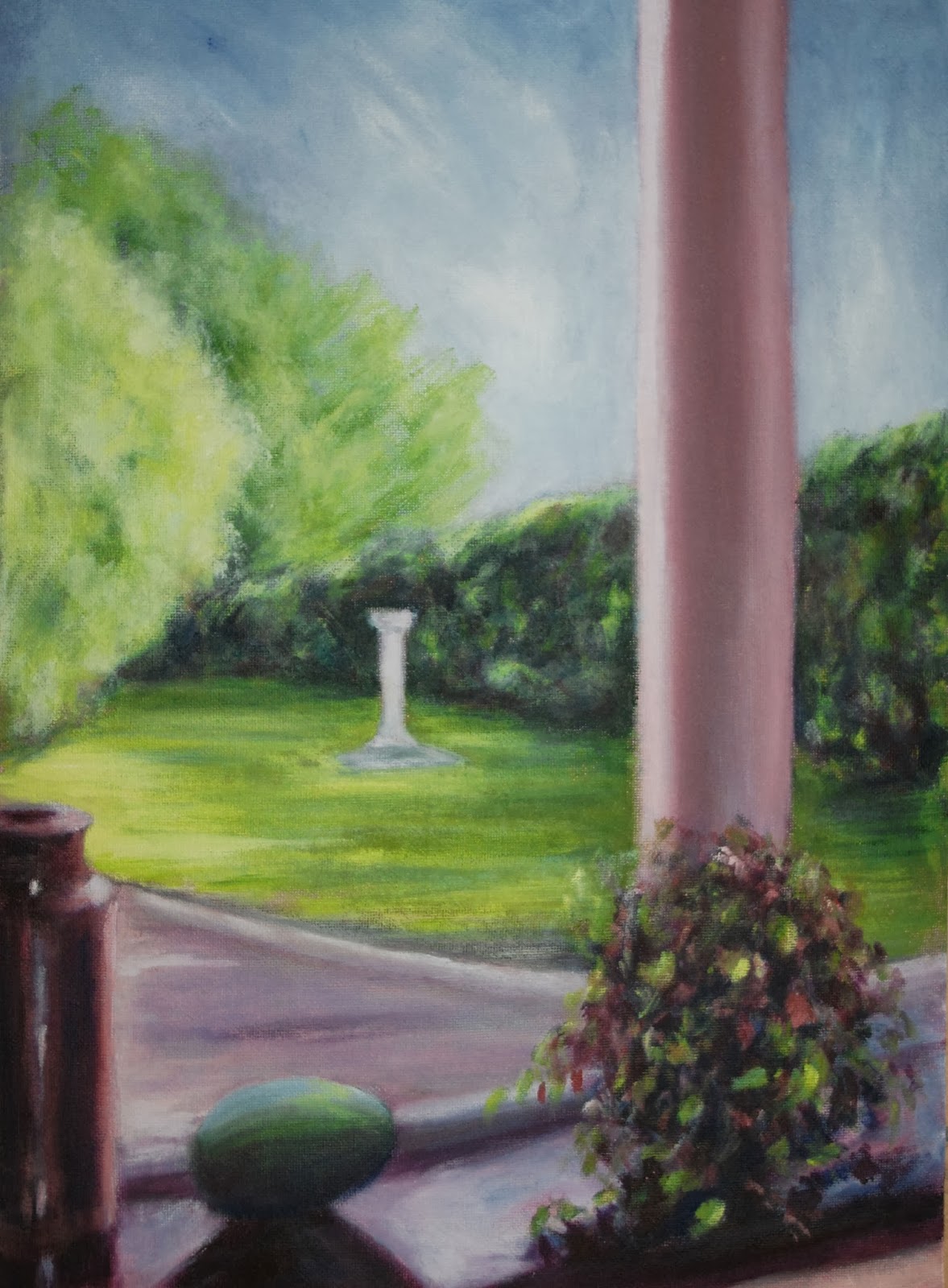
Acrylics - on a ground of ultramarine and red mix.
During process I sprayed the canvas surface frequently when needed more time to blend the paint, it worked well.
I discovered that by using a dry brush with the paint on the background trees was very effective with the darks. After applying basic mid tone using repeated layers of paint (not just glazes) the paint kept on sinking into the canvas, virtually drinking it up, despite having three layers of gesso - albeit homemade from emulsion paint and pva. Whereas on paper I've found that the sinking reaction doesn't occur as long as one or two coats are applied first.
The time of day was around late afternoon. The sky looks a bit turbulent with a strange light as though just before a storm - it wasn't but that's how it turned out. As it happened it was a false alarm. I think this appearance is due to the fuzzy edges, especially in the garden, sky and the reflection on the windowsill.

Paul Nash Pink Hyacinth http://www.bbc.co.uk/arts/yourpaintings/paintings/pink-hyacinth-30020
I admire the way he has depicted the vase of flowers on the windowsill, my attention is drawn to this, hence the reason for the title.  It looks to have been done with just a few quick casual lines, asymmetrical, off balance and quirky. Alternating thick black contours balance it up well. It is quite simple looking and has a
very limited palette of muted colours - warm oranges and pinks with just a touch of green.

As a fauvist painter Raoul Dufy's main interests were saturated colour and decorative design. This is certainly evident in his painting 'Interior with Open Windows', where both the interior and exterior seem to have equal prominence. These kind of scenes actually became his hallmark and he was criticized for his paintings lacking substance, yet they were also a reflection of his optimistic personality. They depicted a sunny side of life, inviting luxurious interiors often looking out onto luxurious resort/locations, such as the French Riviera.http://uploads7.wikipaintings.org/images/raoul-dufy/open-window-1928.jpg!Large.jpg

In contrast, Edward Hopper had a spare manner of painting. He depicted realistic scenes of urban life, containing isolated figures and highly contrasting light and shadow. There is almost always a certain sense of isolation about at least one of them even when two of the characters appear to be in conversation with one another, as in 'Nighthawks'. http://en.wikipedia.org/wiki/File:Nighthawks_by_Edward_Hopper_1942.jpg
His viewpoints were often unusual and exude a sense of of mystery and loneliness. Some of the people in his paintings could easily have been on the margins of society in some way.

I noticed that 'Corner of the Artist's Room' by Gwen John, painted during her affair in Paris with Auguste Rodinis, is displayed in several colour schemes on various websites. This one particularly appeals to me, a quiet, almost monochromatic scheme. It seems to be shrouded in a veil of mist, giving a feeling of mysterious isolation, the same time it looks inviting and restful.
https://www.museumwales.ac.uk/en/whatson/?event_id=3648
colour study


completed painting

Tuesday, August 6, 2013

Assignment 3 Self Portrait

Arrangements in portraits are many and varied. They can range from a full figure, or a number of figures, to an extreme close up portion of a face. Described below are several that have helped to give me some inspiration for a self portrait and (hopefully) others in the future: 

Lucien Freud – Self portrait – Reflection with two children 1965. He must have painted this one from a high viewpoint with the mirror very low or even on the floor. He has portrayed himself as a huge domineering figure in relation to his own two tiny children at the bottom left; from this angle his domineering presence is further accentuated. The impression is one of him looking down at them while simultaneously looking at his own reflection in the huge mirror, perhaps a little anxiously. The two lamps, one above his shoulder and the other behind, give a sense that they are high above on the ceiling, contributing to the sense of scale. The colours, in muted, tones tend to add an air of brooding calmness.
http://www.wikipaintings.org/en/lucian-freud/reflection-with-two-children-self-portrait-1965

Freud - Man's Head - self portrait 1963. This is like a halfway house between his early and mature style. Thick buttery paint applied, without the gritty texture of later on. The paint - sensuous and smoothly flowing,  seeming to repeatedly encircle the face and background creating the impression of  turbulence . This negative space is carefully delineated against the face and neck making it more pronounced. Though the background contains mostly the midtones and colours used on the head and neck it has a life of its own. The whole thing has very tactile quality. Painting one's own face from this angle, with eyes looking downward from above, almost inevitably causes one to look a little arrogant, as I have discovered with my own self portrait in this assignment, yet the expression here also looks tired and slightly drawn.
http://www.wikipaintings.org/en/lucian-freud/man-s-head-self-portrait-1963
William Orpen - Self Portrait, Multiple Mirrors 1924.  There is a series of his self portraits displayed on the following linked web page, which were completed at different stages in his career. This particular one is situated roughly half way down the page: 
http://www.articlesandtexticles.co.uk/2006/06/26/painters-i-should-have-known-about-6-william-orpen-part-1/
Orpen's reflection recedes within multiple repetitions of the same mirror, until it almost disappears into the distant skyline, outside the open window behind. He was fond of using all sorts of tricks to created optical illusions in mind bending ways. 
The brushwork appears to have been applied quickly with some transparent washes in the lower half. I think the paint has been applied thickly on the main foreground face. At the same  time it has a certain luminosity. More attention seems to be drawn to this area because of the relatively large amount of detail and the pinky tones, contrasting with the green top.The sky in the background gives a feeling of airiness and space.


A Self Portrait
Thinking back to the early stages of this part of the course, when I tried out some exercises based on Emily Ball's book Drawing and Painting People a Fresh Approach, I was still hankering after trying a portrait or two in paint by using a roughly similar process. The head studies in this book are like nothing I've ever seen. At first glance I wasn't sure about the artwork in the - childlike, even primitive, but now this is what particularly attracts me to them,  they seemed to grow on me as I found out more about the thinking process behind them and corresponding techniques.
Here is an example of one in charcoal (below), in acrylic (right) and another of Vincent Van Gogh I tried out for myself:
The techniques used give extraordinary results to put it mildly - will have to work further on this....

Vincent Van Gogh - sorry Vincent


 In Jeffrey Camp's book - Paint a Manual of Pictorial Thought and Advice, a self portrait by Daniel Millar and the two self portraits by Lucien Freud (above) found the high viewpoints in the three paintings very intriguing, not to mention the brushwork is loose and free. The viewpoints were major factors in my decision to try out a similar angle; using myself as a model rather than another individual was relatively straightforward.

Mostly I chose a self portrait because the last one took me out of my comfort zone in the sense of having to scrutinize my own face at very close quarters, then transferring what I saw onto a surface with paint. I wanted to see if this time round the process would be any easier - it wasn't. Sketches didn't affect me the same way - I think it was the prolonged intensive study of a painting which made the difference. The other reason for a self portrait was having a captive model, so if there was any aspect I wanted to re-check I could easily do so. Otherwise, with another person, they would need to be present, or one would need good photograph/s to refer to, naturally these have their limitations.


another viewpoint
- tonal sketch
Also, I wanted to be more methodical than with some previous colour mixing tests with flesh tones. Two or three short videos on utube helped to steer me back in the right direction. One recommended just using three colours (including white), an earthy red and yellow ochre, pulling colours  into one another to get a full range of skin tones. From another a useful tip was to mix raw umber and ultramarine with white to make general grey tones to reduce the chroma of any mixes which appear too bright.  I found that this didn't really happen on this occasion apart from the rims of the eyes. Conversely a little cadmium red came in handy at times to brighten mixes or 'pinkify' them. These tips were particularly helpful.  I did add a touch of raw umber and ultramarine in various quantities, to thin mixtures of  white and burnt sienna around the outlines of the eyes to tone down. Glazes were also used in one or two other isolated places such as the eyebrows. I like the way the perspective has worked in the background. It plays an important part as it serves to extend the negative space into the distance, adding to the feeling of recession.

Summary
No tonal underpainting on this one - for a change. Proportions were a bit of a struggle in the initial stages, yet I did think I'd solved the conundrum before me until.....almost as soon as I'd finished the painting I realised there still was something wrong. The irony of it was that I think the rough colour study looks much better proportioned, yet no measurements were taken for this - just judged by sight.  I know looking up at the face through a mirror tilted at low angle wasn't exactly the easiest angle to use. But I went ahead with it because I wanted to attempt a different angle from previously, just to see what would happen.
 a colour study
I managed to spot about half way through that the eyebrows were too high, but even after moving the eyebrows down, something was still niggling away that seemed not quite right, yet I could't figure out what. Getting the proportions correct with figures and faces is crucial and when something is out it shows without necessarily identifying itself until later on - exactly what happened here with the eyebrows, but not with the lower face until it was too late to alter things. Despite taking comparative measurements of most areas, there was one I must have forgotten...when I compared by measuring the length of the neck to the face with my own reflection, I found that the lower half of the face is too short in relation to the neck and the upper half of the  head. I thought the neck was too long initially, but it seems to agree with the height of the upper half of the head. This is surprising because I still think it looks too long.  I got a photo taken of my head at the same angle and this helped to confirm things. I am quite irritated with myself for not spotting the discrepancy earlier. At least now I know where I went wrong. 
final painting
before alterations
The outlines of the eyes look too prominent - as if I'm wearing eye liner  which is not the case. It is just shadow, but despite repeated efforts to soften them with various glazes (as above) it isn't enough. And because they looked too light on the colour study I darkened them on the painting, but evidently went over the top. I think the angle of the spotlight on my face tended to iron out some wrinkles and other imperfections, which  is undeniably an aspect I'm in favour of, but admittedly, it is a little removed from reality. The colours are derived from the self portrait of Daniel Millar's. Though he seems to be a virtually  unknown artist I think he's used a great colour combination, giving off a mysteriously moody atmosphere - unfortunately I can't display it for copyright reasons. The brushwork contributes much to this. I think if there is anything else to recommend my own painting, apart from the background area, I think it is the light on the left side of the face, the texture and tones of the hair and the way tones on the lower part  and on the neck seem to swirl round in slightly abstract, rather than realistic way. 

Later alterations - the face is now better proportioned in relation to the neck. I gave the whole painting a makeover and there is now no area completely untouched by alteration or addition of some sort. The rims of the eyes have been softened. The background has been toned down, as advised by my tutor. The neck was too long so I raised the shoulders. I lowered forehead, widened the left nostril and narrowed the left curve of the chin, sketching in lightly with pencil.
The parts to be altered (or re-proportioned) I covered in white paint acrylic, then yellow ochre including the background. The skin tones were too yellow so I 'pinked' them up.
Alterations:
Eye rims - softened using small brush and mal stick with thinned white and yell ochre
Shoulders  re-painted, with burnt sienna and cadmium red.
For flesh tones used a base mix (or mass tone) of white/raw sienna and yellow ochre (touch). I managed to pick up some advice in this regard from an expert on the online forum Wet Canvas. Though I shortly after revised this as it was too yellow even minus the yellow ochre, so I added a small amount of raw umber to the raw sienna and white instead - this appeared to look more in tune with my own basic skin tone.  Following the information I also neutralized the tones under the nose and around the jaw area adding a tiny amount of a mixture of raw umber and black to the mass tone above. The cheeks, nose, lips and ears:
I mixed a touch of cadmium red with the mass tone. Under the chin - touches of alizarin crimson and viridian with the mass tone.
Final painting - post alterations
Note: On my previous attempt, because the warm light was making the flesh tints appear warmer I used an over predominance of yellow ochre in mixes, which include cad red, ultramarine and burnt sienna with white, hence my model (me) had quite a jaundiced look. The reflected light is a little confusing as well as adjacent colours - red  in the top, and green (background. The only reflections i could make out were red from the top onto the neck and lower face. There was no reflection of green as you would expect, because I exaggerated the background green. Hence I manufactured a subtle hint of it later on the skin. I added a retarder to most of the mixes to help prevent the paint drying up too quickly on the palette and so I could work with the paint longer on the painting surface - this helped enormously. I noticed at times, problems with the tonal ranges - often slightly too dark or light, the transitions were jolting. Fortunately I found a magic ingredient - matt gel medium. I didn't appreciate its capabilities at all beforehand, but found that it was very useful in making opaque paint more transparent and easier to blend. It was most useful for semi-transparent mixes used for subtle reflections i.e of the hair colour on parts of the face and neck. 
The light was confusing on the first portrait version. I could see this time that was there was in actuality a good deal of light reflection on the hair and the left side of the face. I lightened some of the hair with burnt sienna and cadmium red adding a little white later to the mix - gel medium added to this appeared to work well for subtle light reflections in the hair. The following glazes enhanced the light reflections on the face and neck and top:
rose pink (cadmium red/raw sienna/white), green (phthalo blue/cadmium red/yellow ochre) then cobalt blue/ yellow ochre - this glaze was thinner and included glazing medium (gloss). I found that the glaze medium was ideal for adding translucency and depth over previous glazes.
The slight changes of skin tone described above, for different areas of the face were something I was prepared to try out and it seemed to work on the whole, despite finding that I needed to alter the occasional small area and go over with a couple of slightly coloured glazes near the end.
I realize what a very subtle balance needs to be achieved with skin tones, for them to look true to the sitter's own and one often has to go through a good deal of trial and error to get there:  the end result (above right)